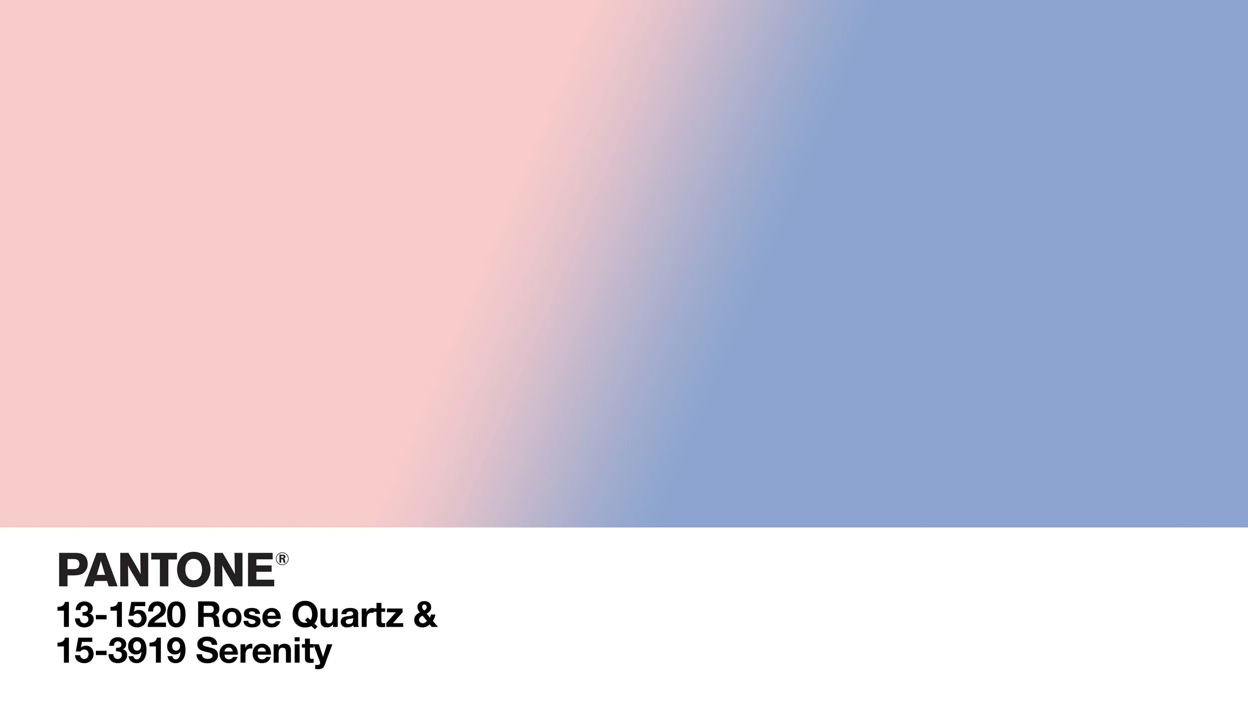
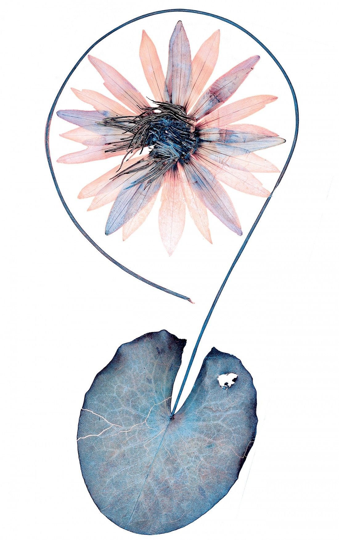
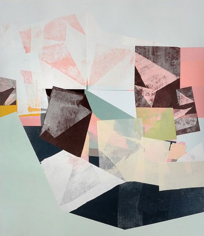
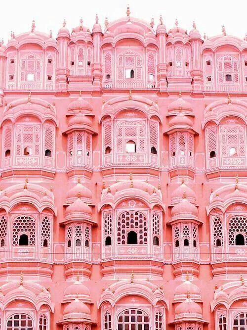
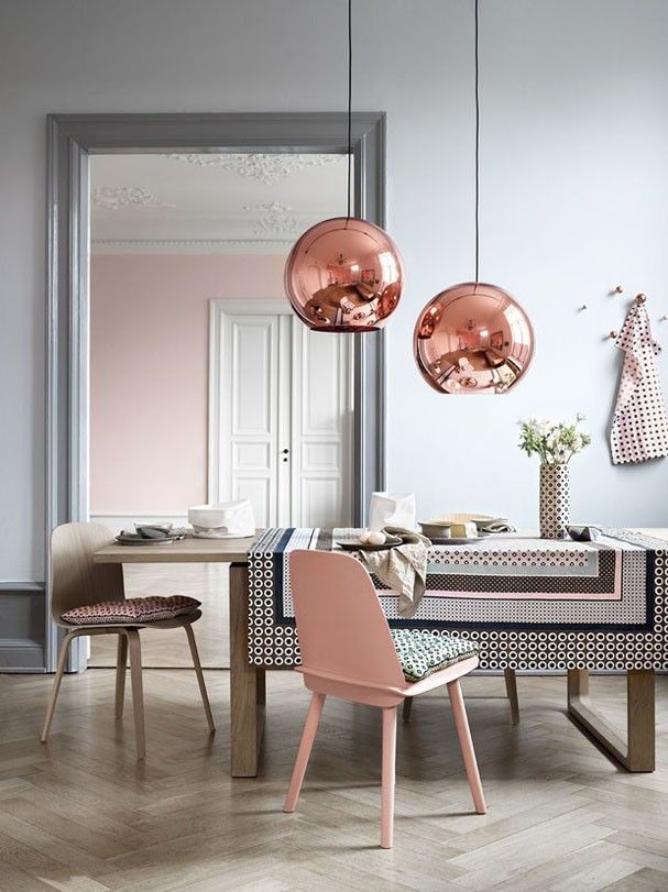
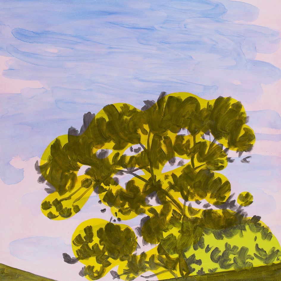
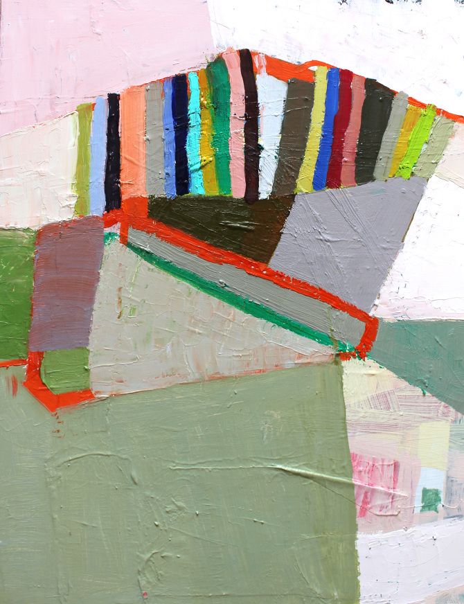
"Colors this [year] transcend cultural and gender norms. Vivid brights give way to excitement and optimism, though quiet stability prevails in this season’s palette."
For the first time since it's Color of the Year nominations started (inaugural year was 2000), PANTONE, the accepted authority on international color standards, has chosen not one, but two colors for 2016.
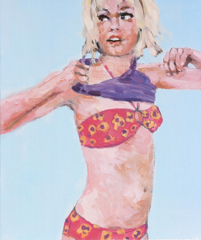
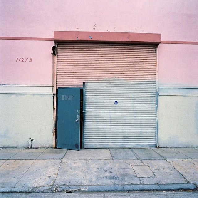
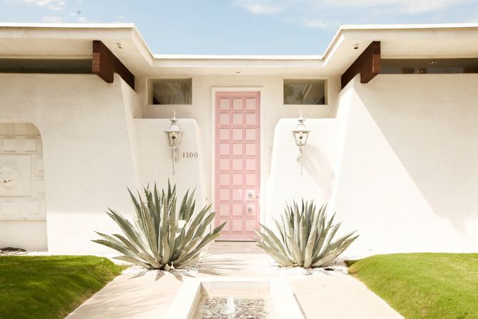
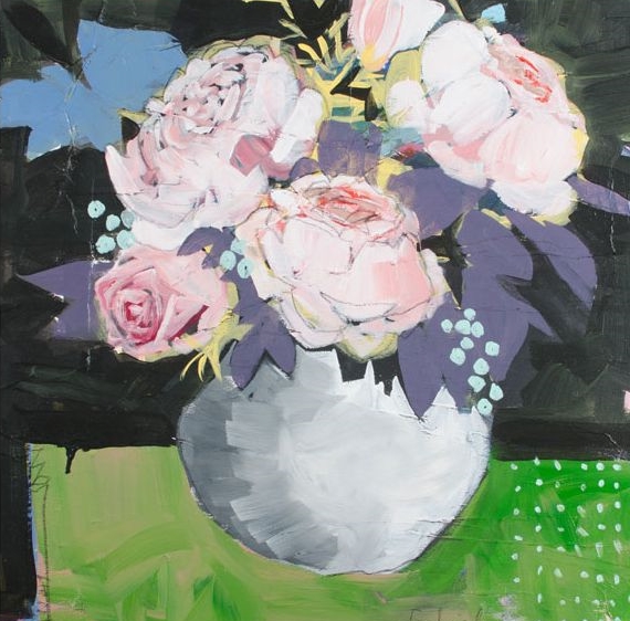
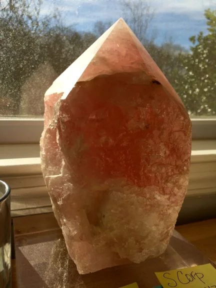
While not to discredit Serenity, I was especially delighted to see Rose Quartz as the choice for this year. I like the color because it is feminine, modern, romantic and clean. These are all qualities I seek out in design, especially where there can be a culmination of all of these qualities in one project.
I like clean, crisp spaces that also have a lived-in appeal. I love seeing the sharp line of a ceiling beam behind organic plant leaves. I love a crisply made bed in front of rustic wooden boards. Rose Quartz can be the organic in that picture of the modern.
Not to mention it's retro appeal...
Said to relieve stress and to calm the energy around us, the Rose Quartz color is in perfect tandem with the periwinkle blue that PANTONE has dubbed for us as Serenity. Can the visual effects of these colors lull us to an improved emotional state? Can these colors open us to greater tolerance and compassion towards ourselves and others?
. . .

