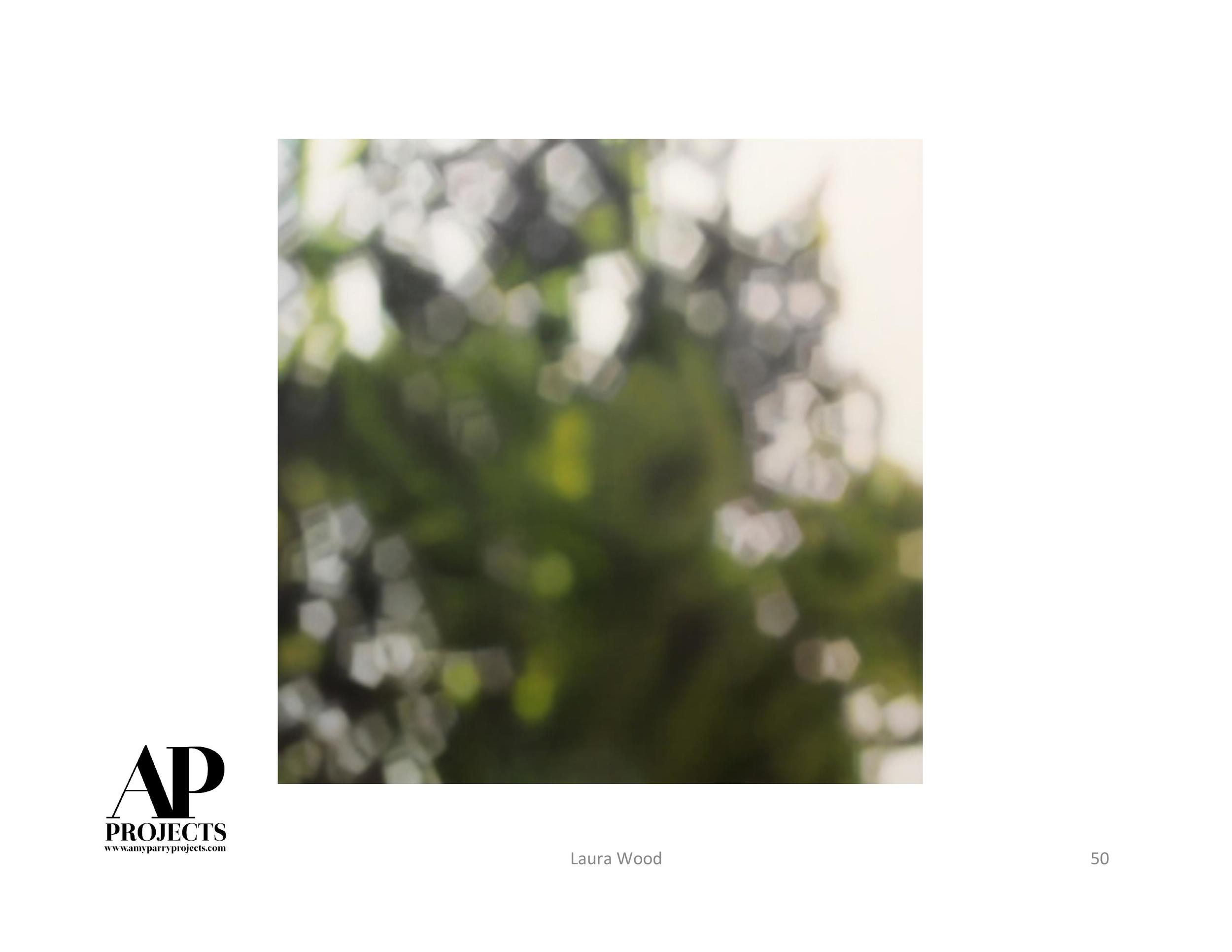
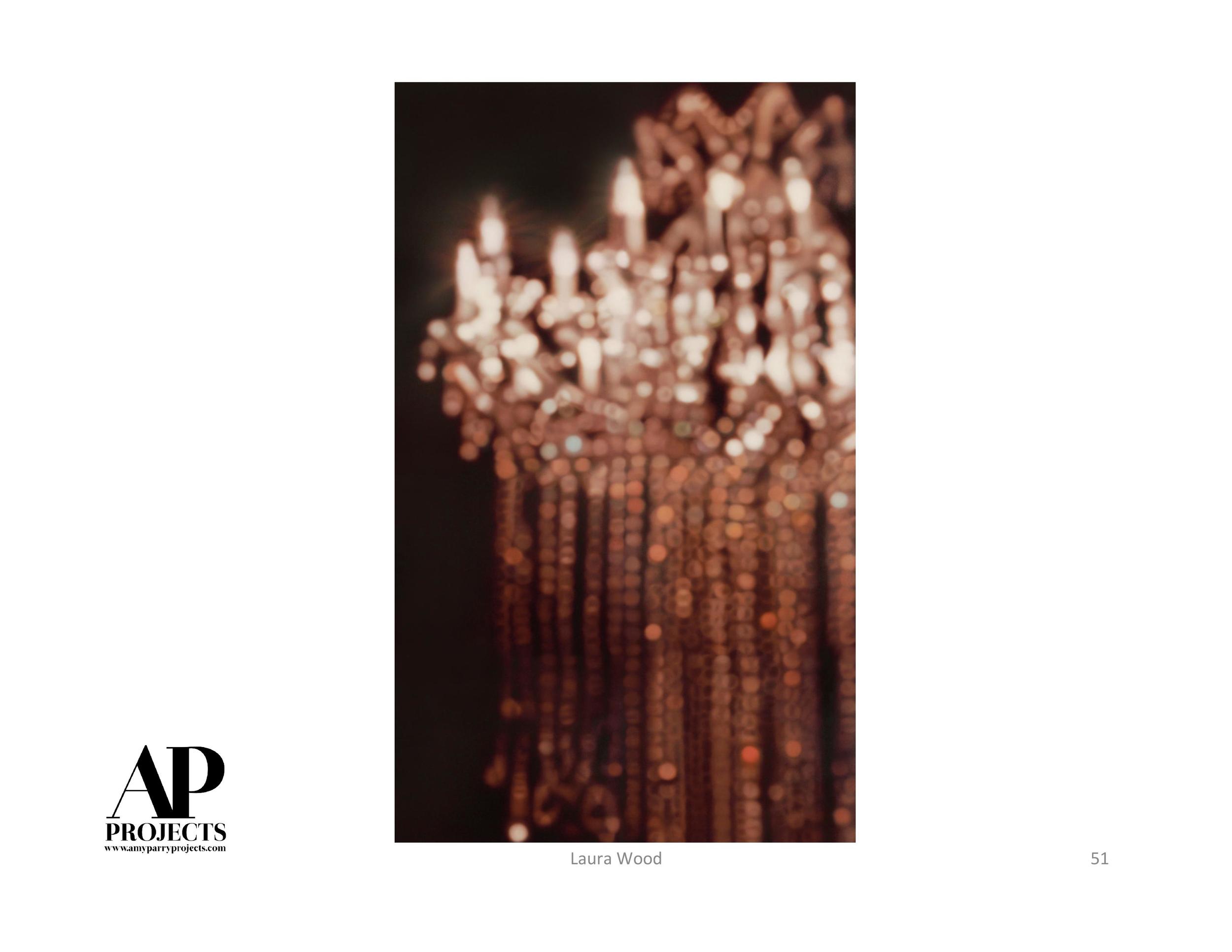
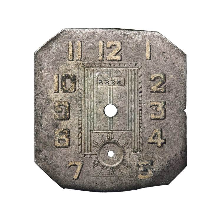
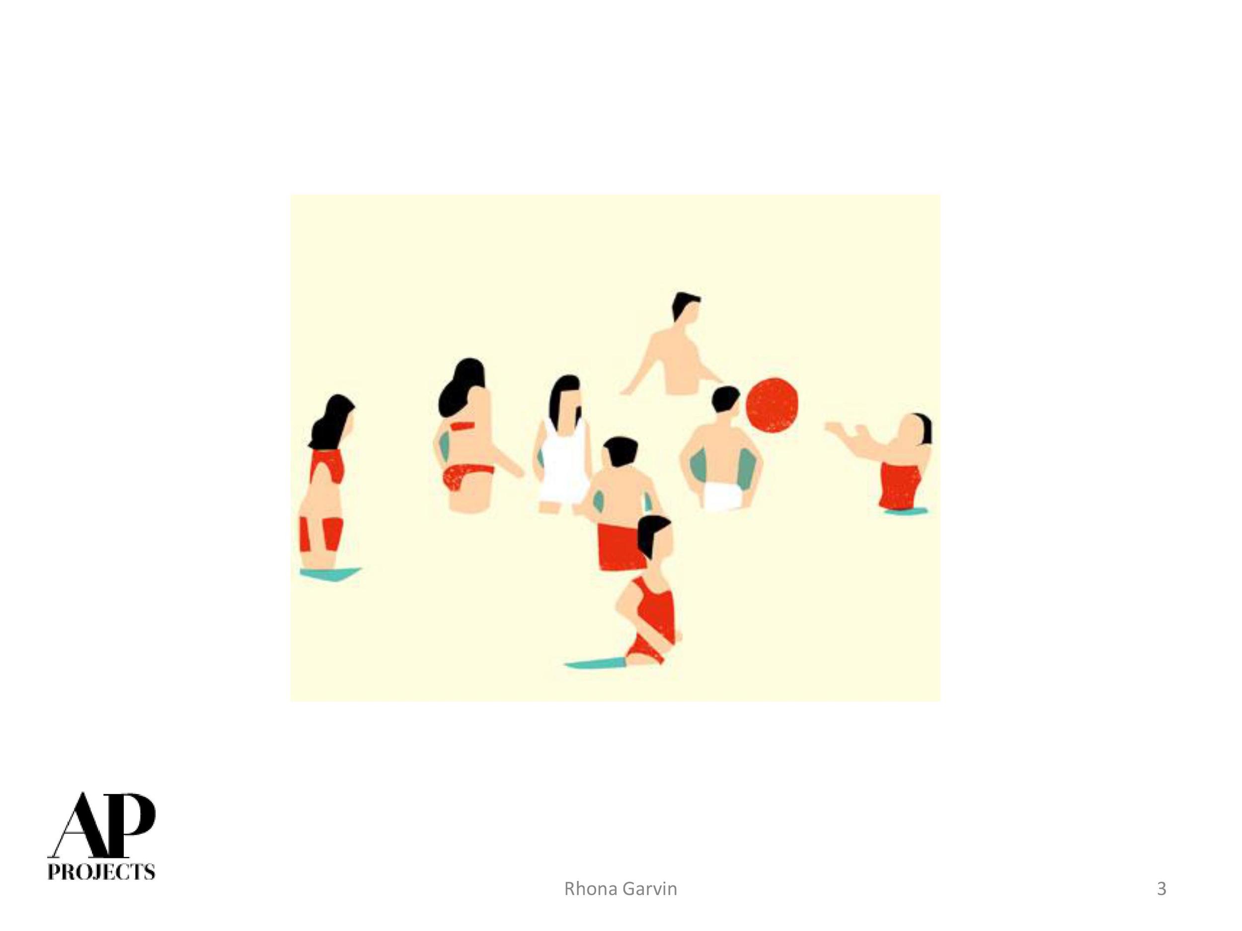
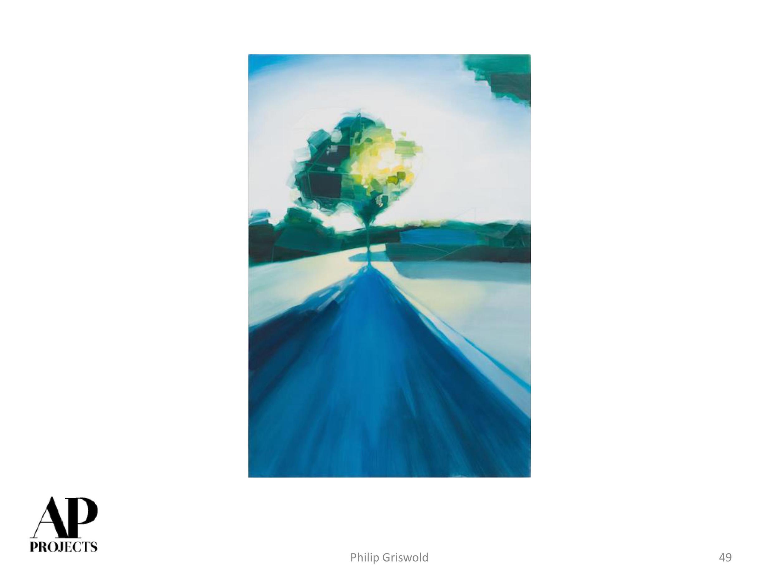
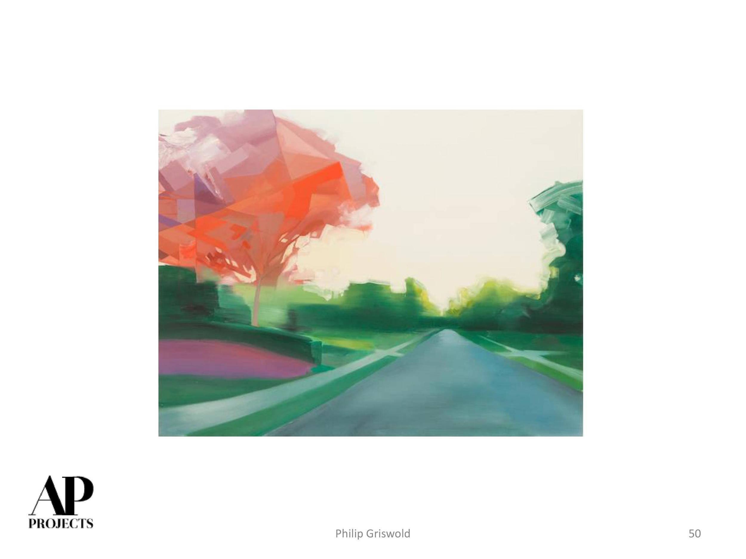
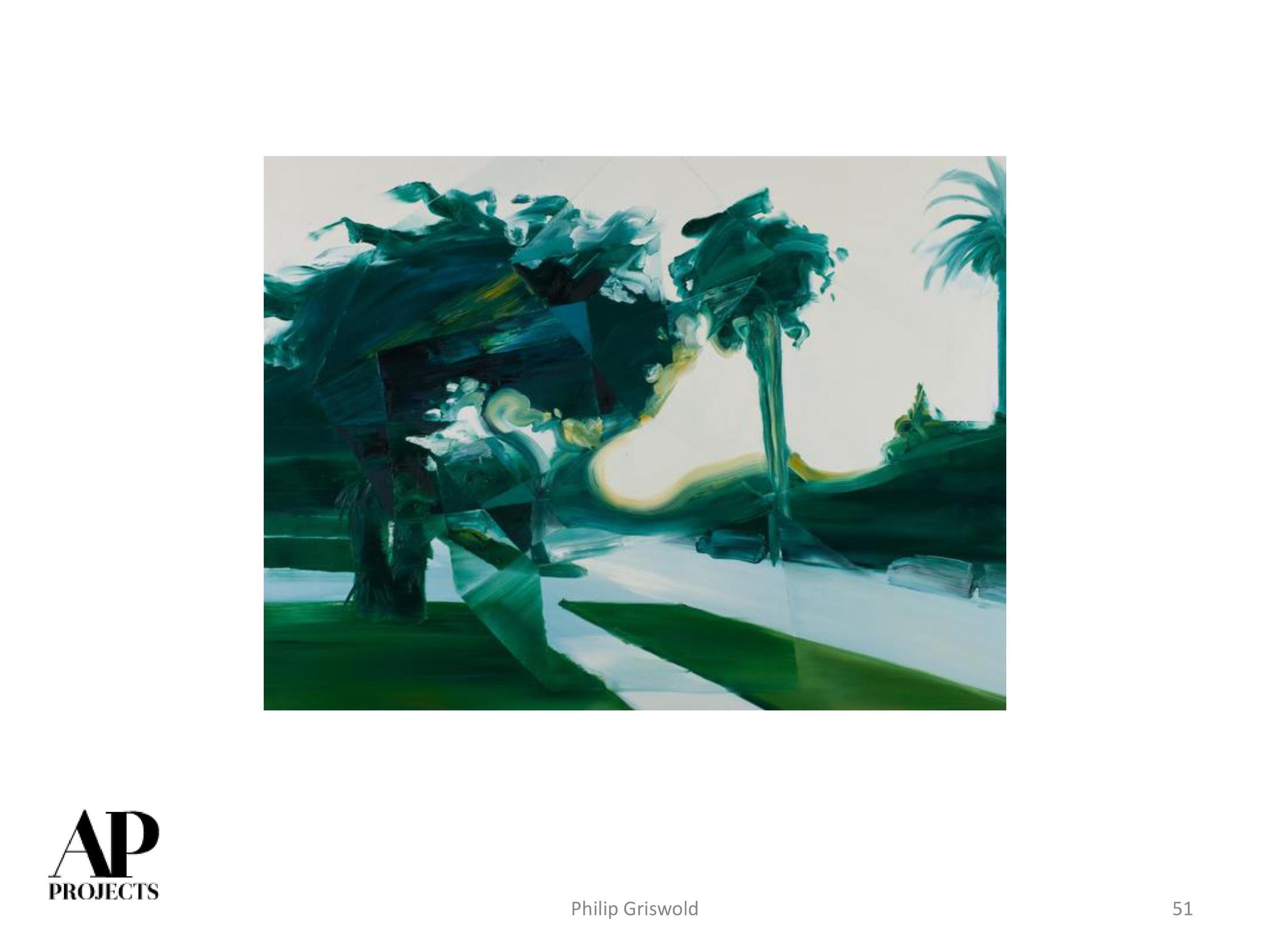
We are officially in December! Being the last month of the year, just like on a Friday, we cannot help but get excited about all there is to come. Please flip through these beautiful selections and enjoy the "most wonderful" time of the year!


Your Custom Text Here

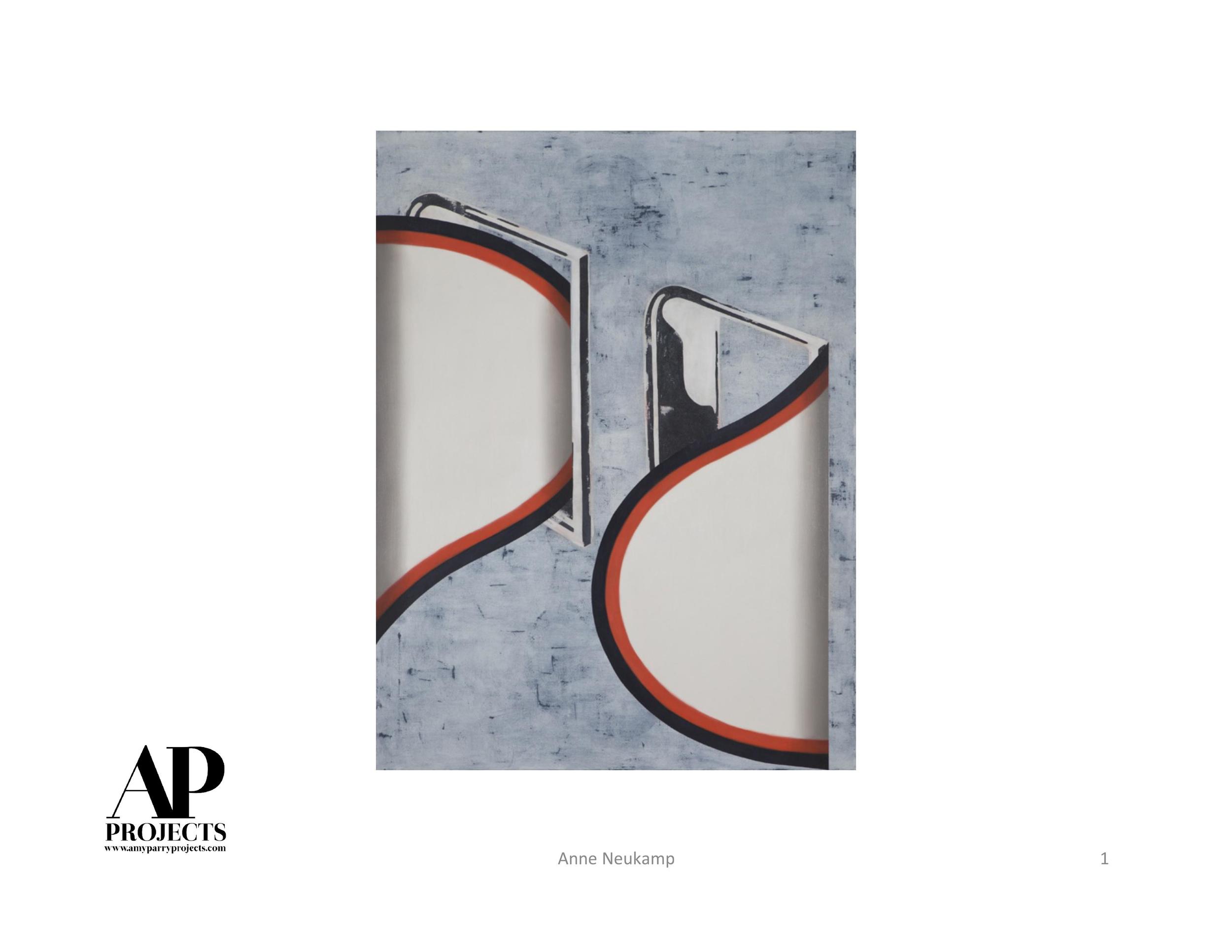
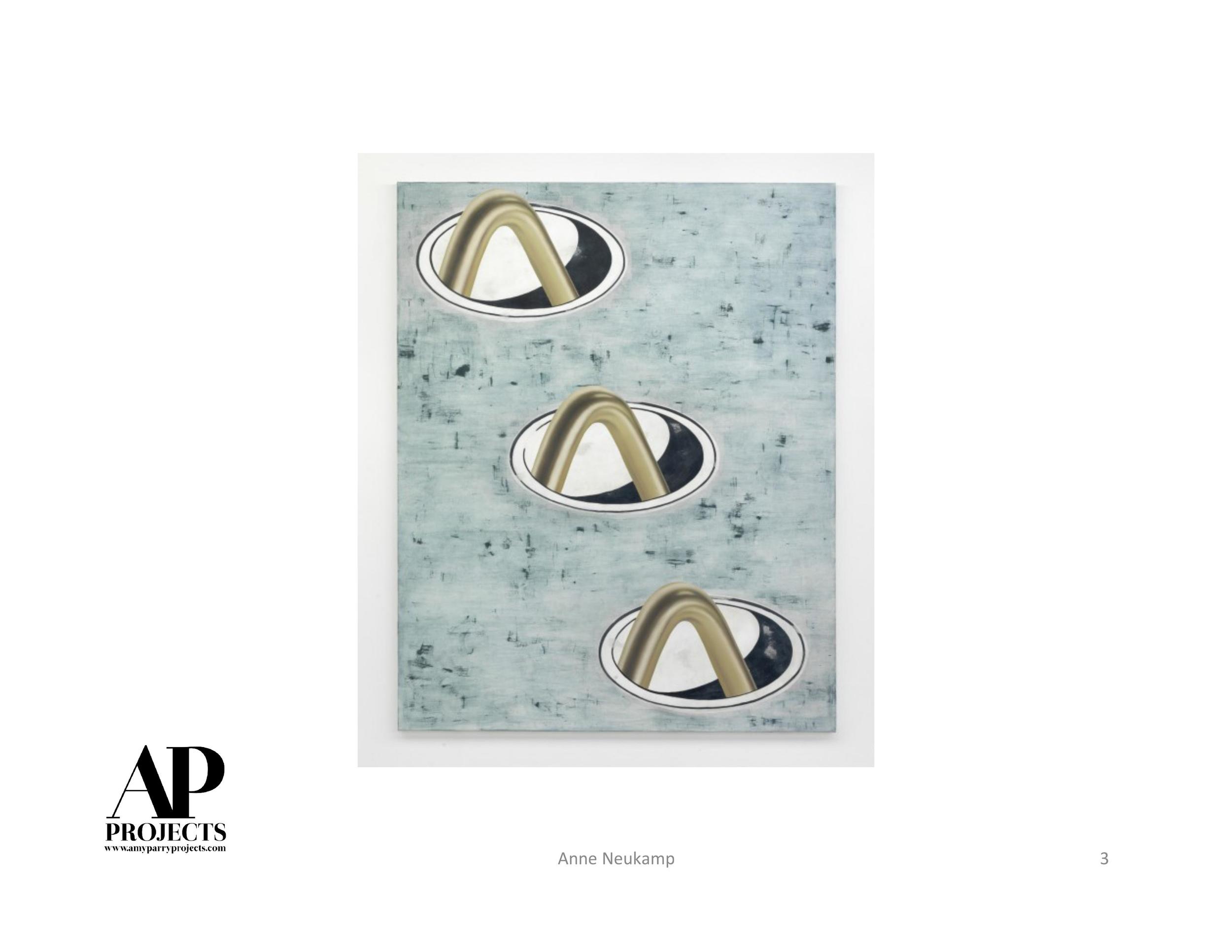
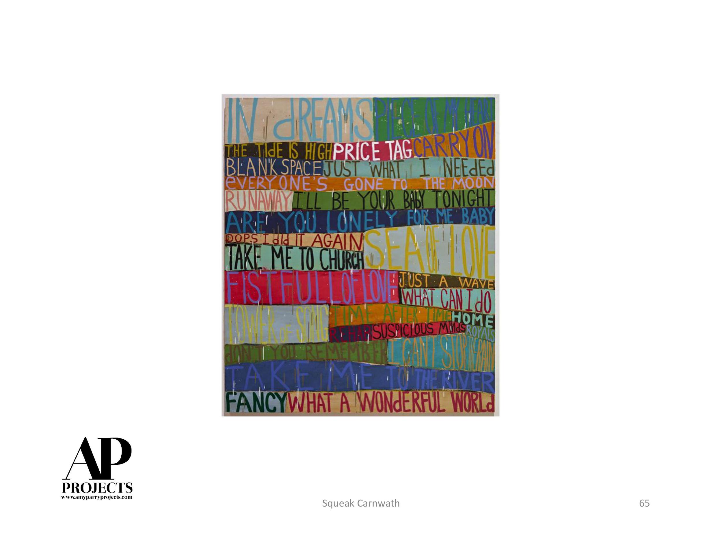
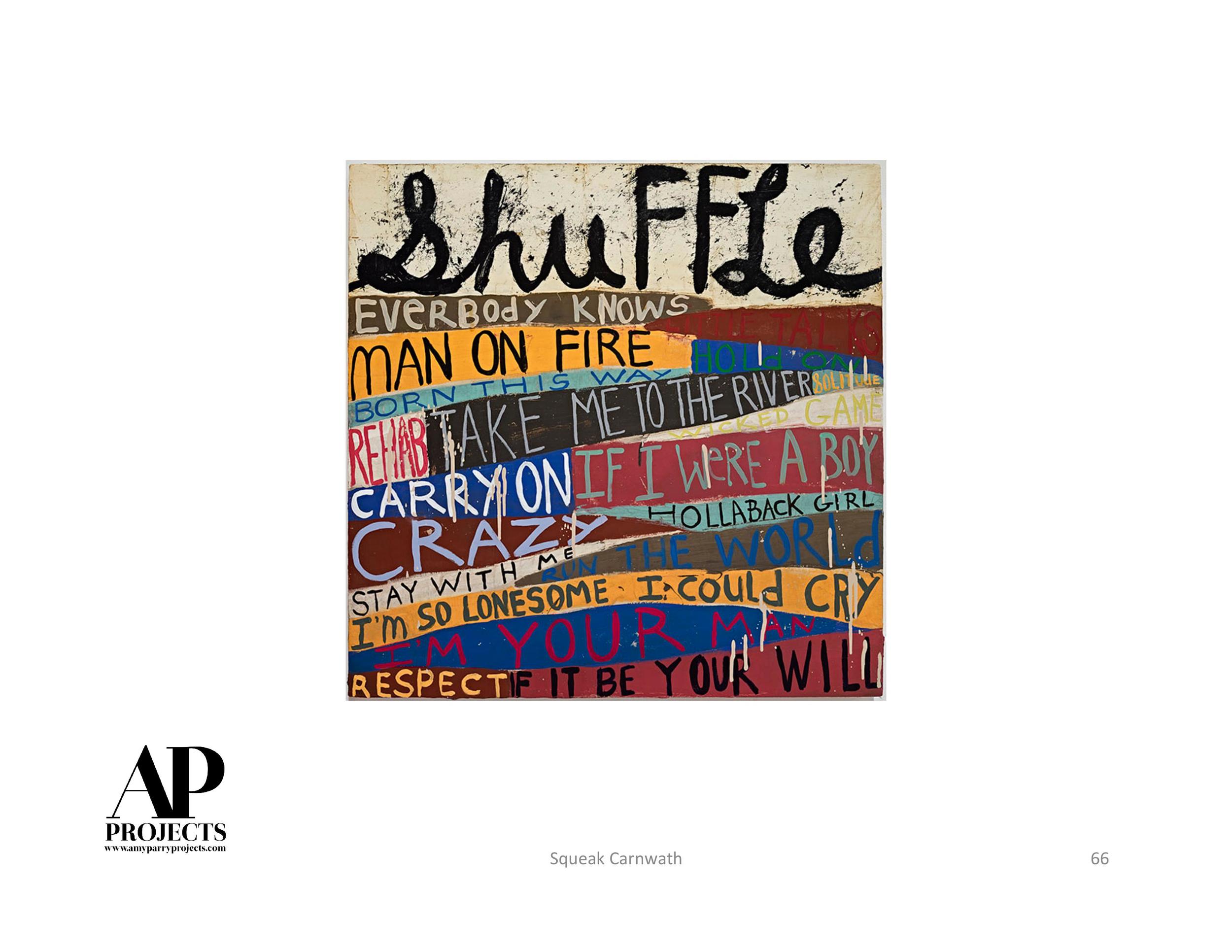
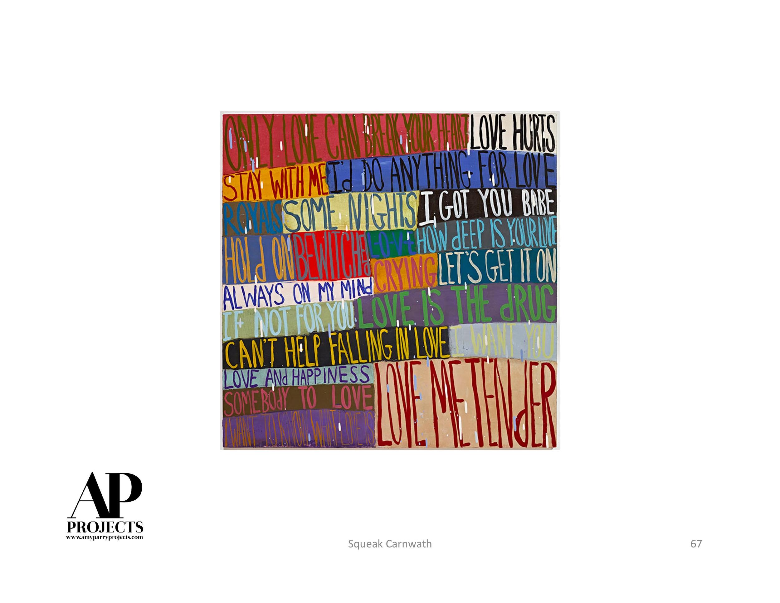
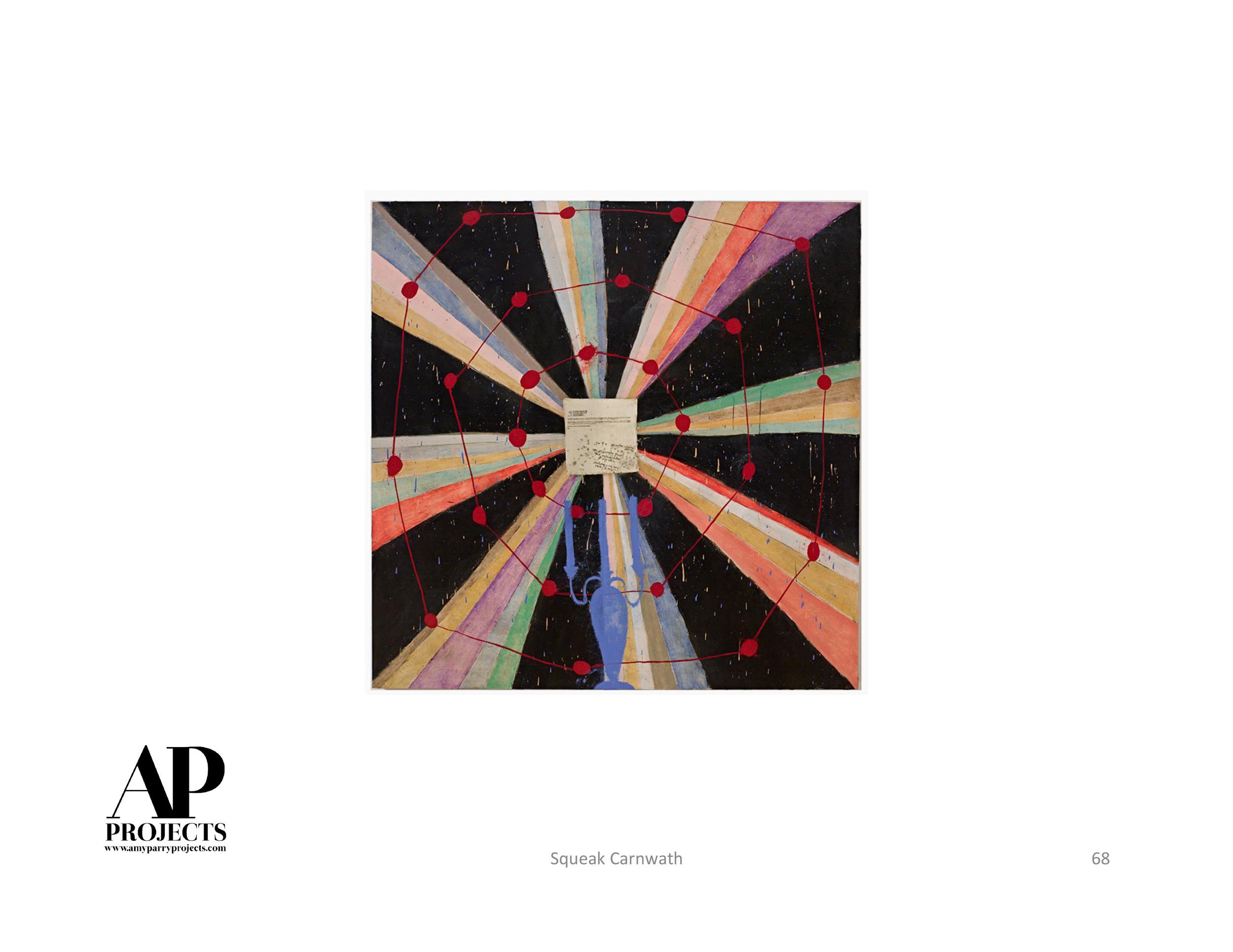
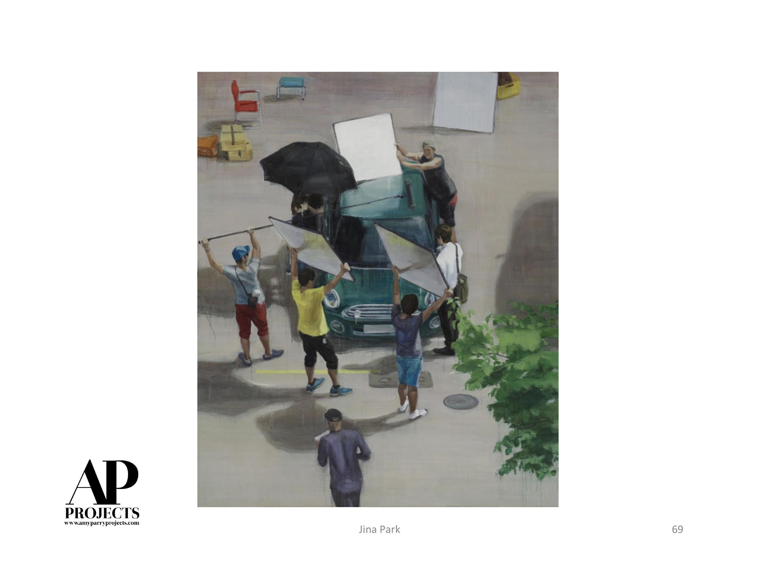
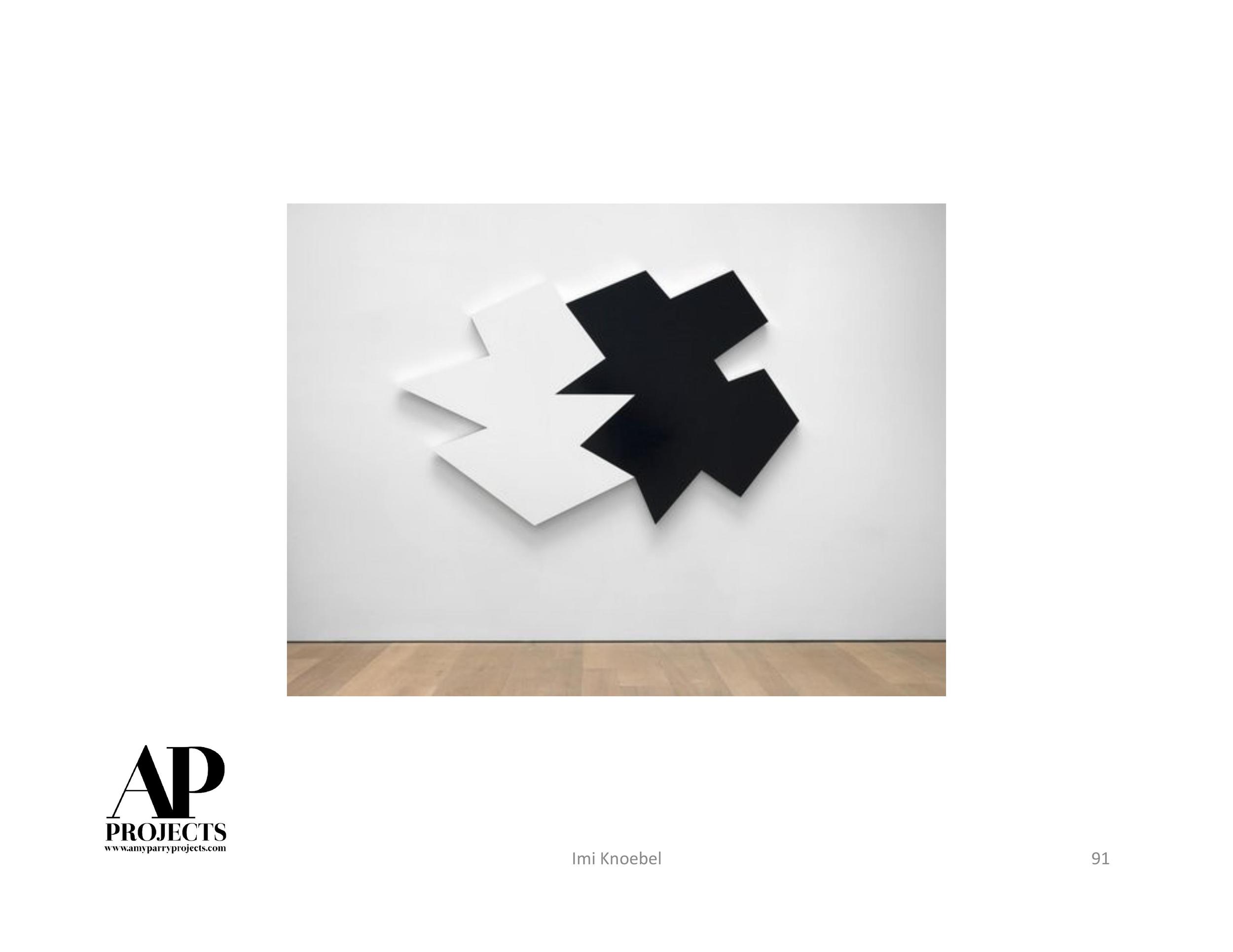
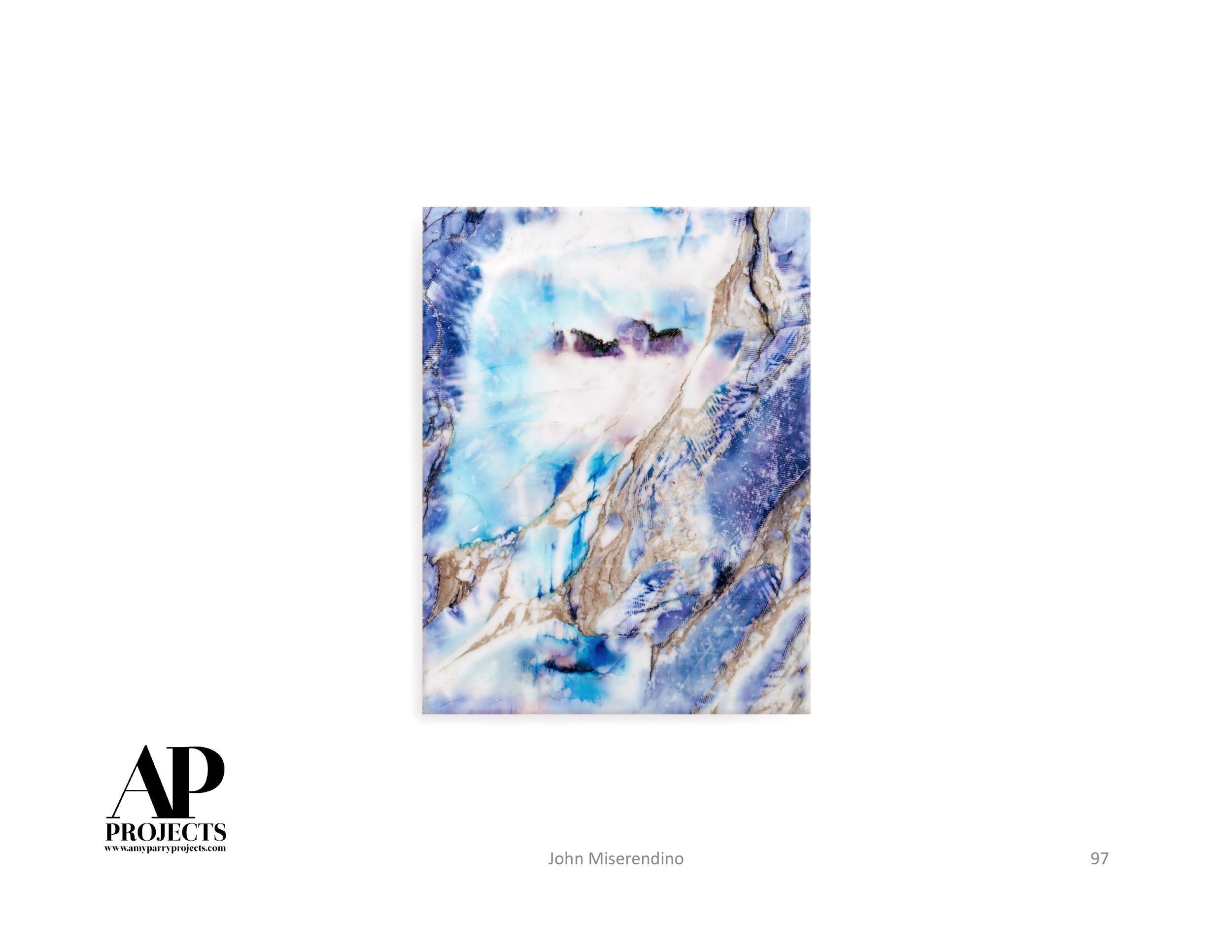
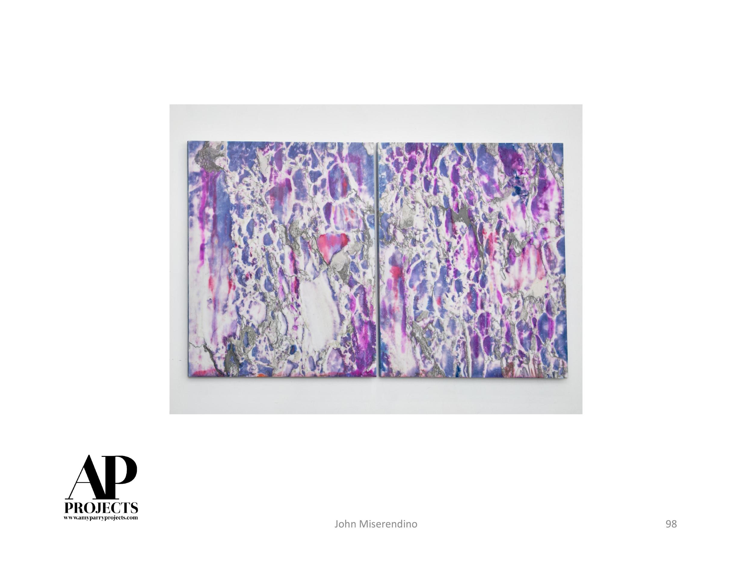
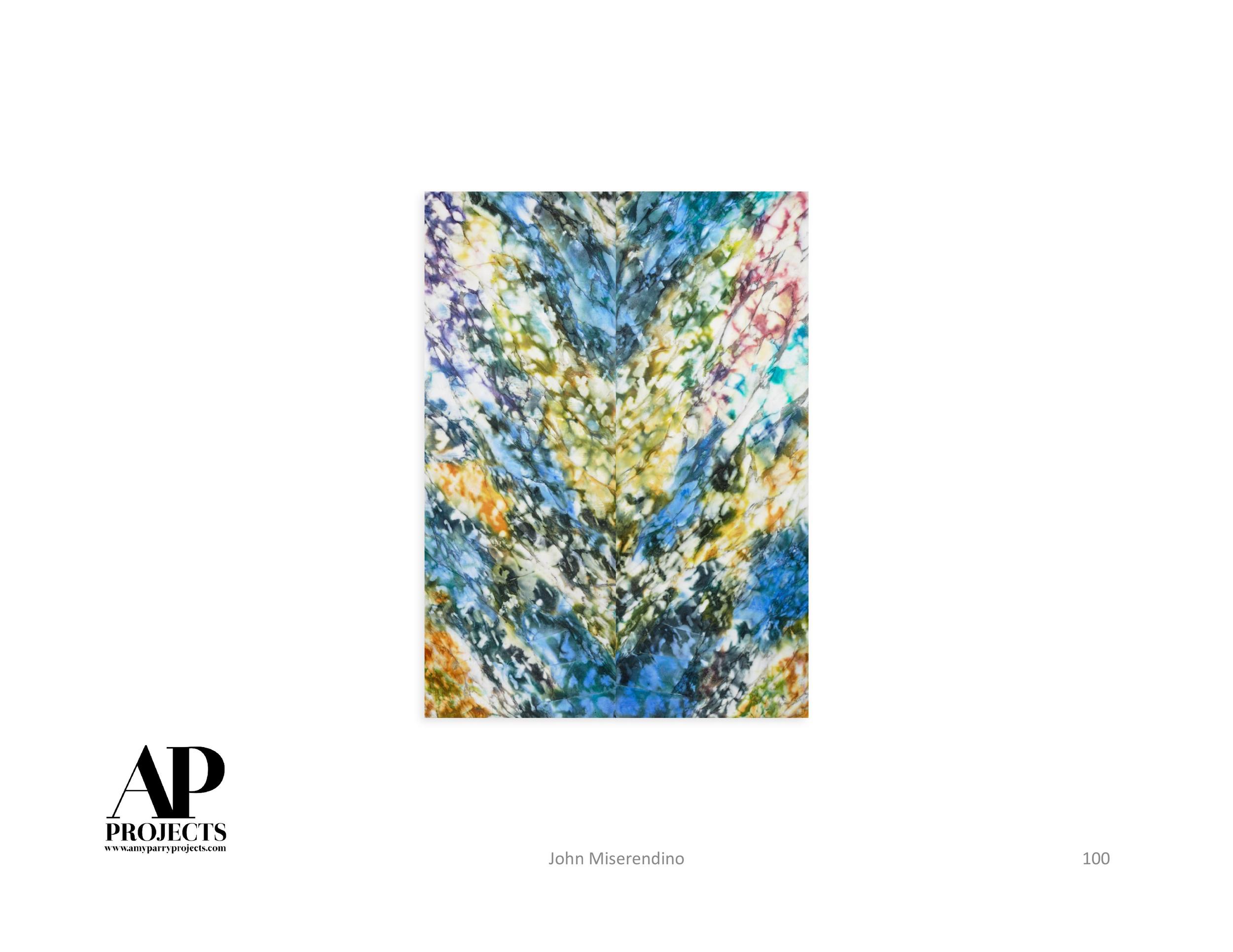
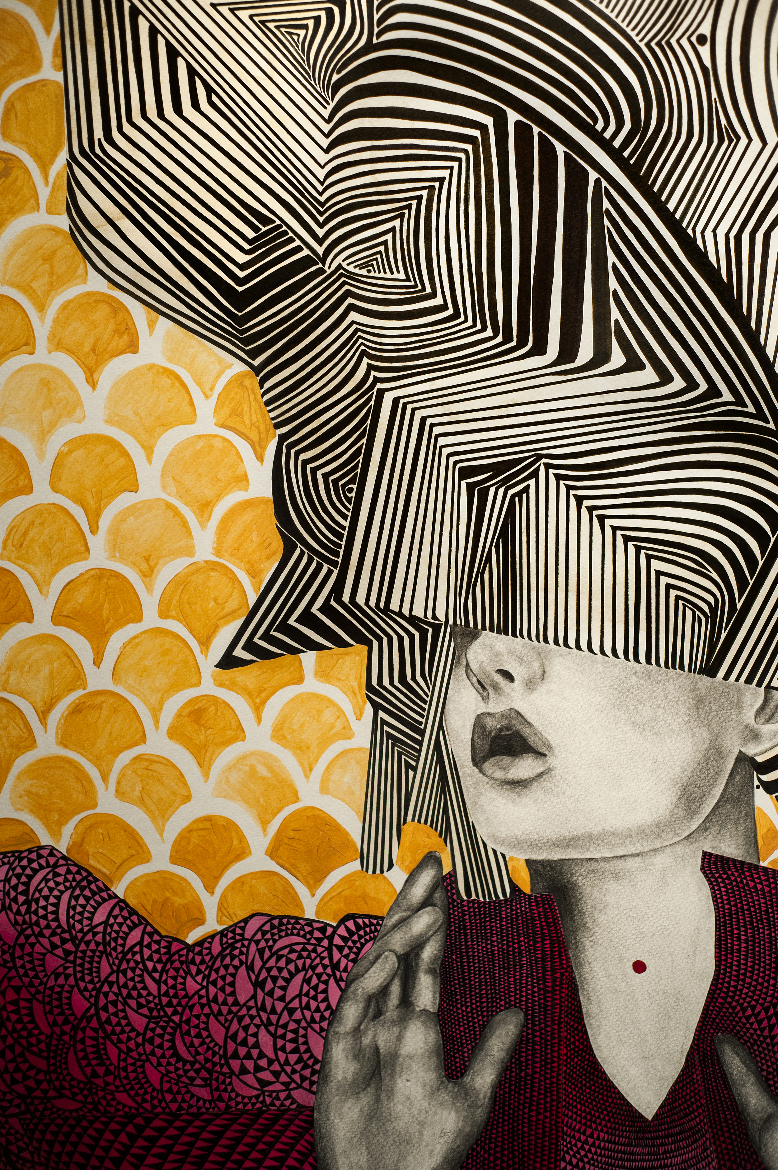
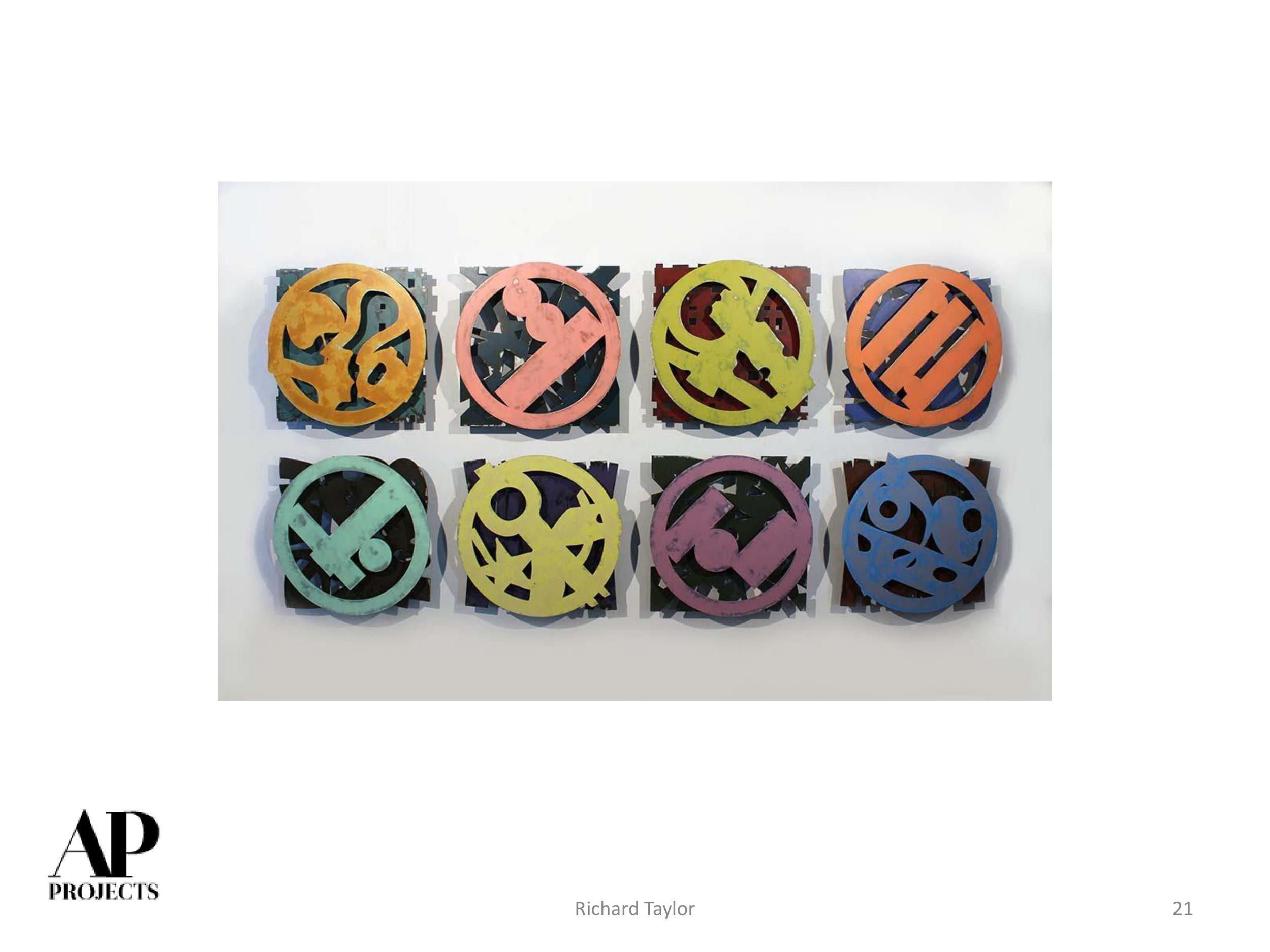
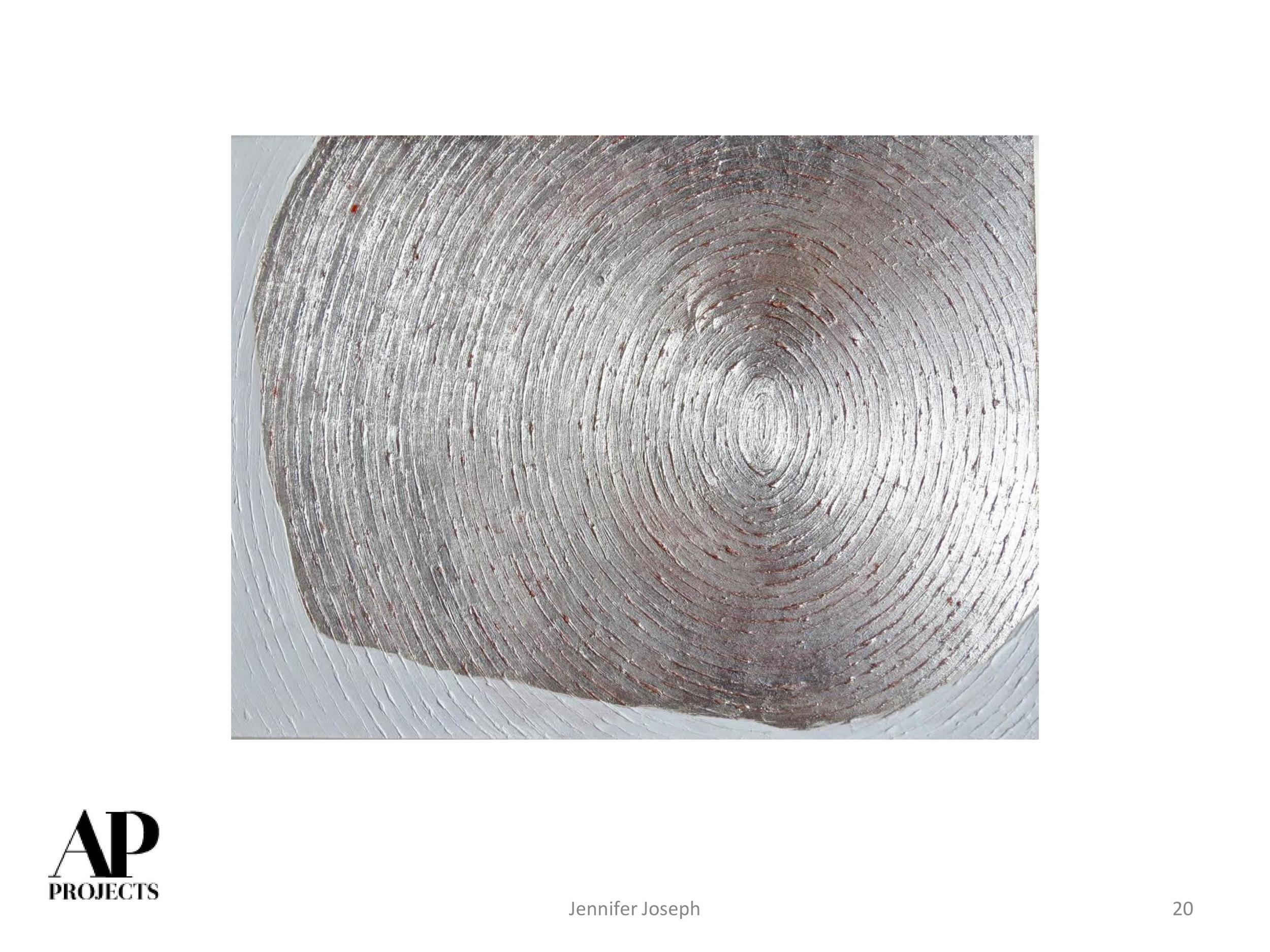
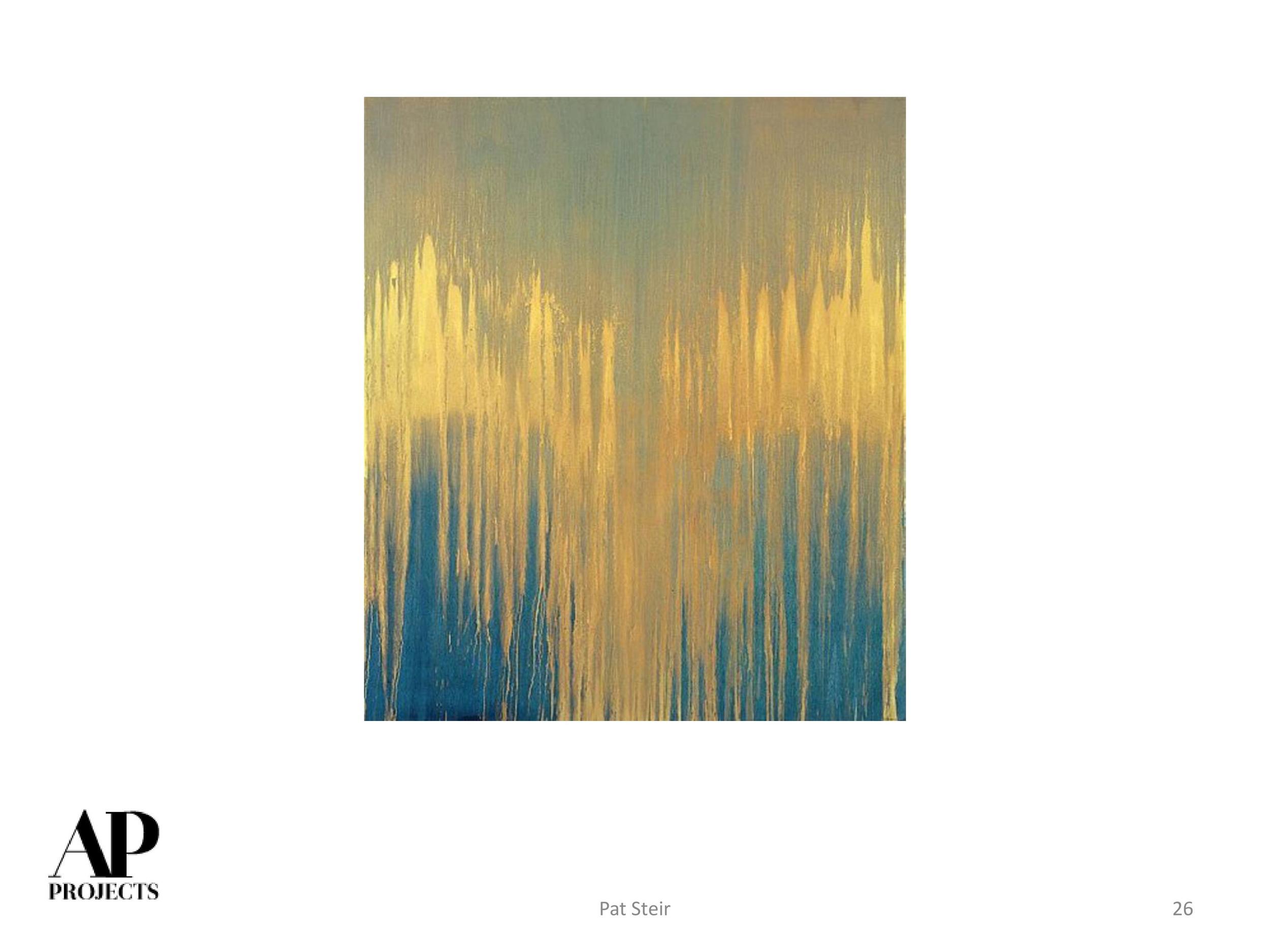
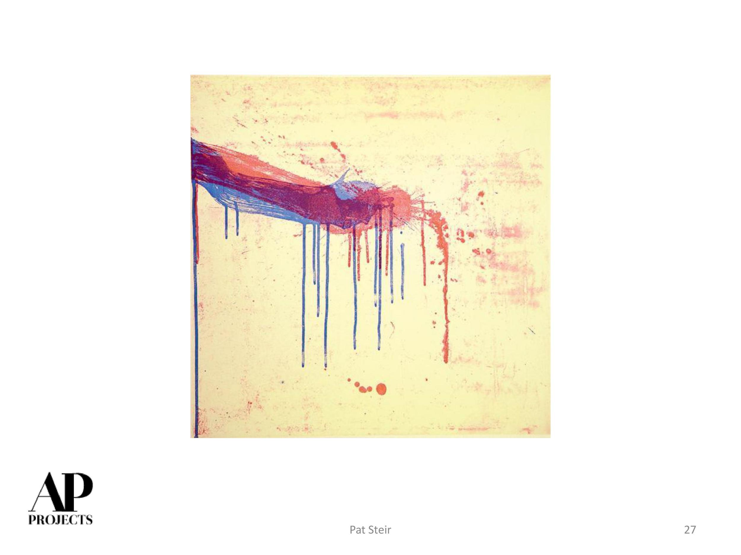
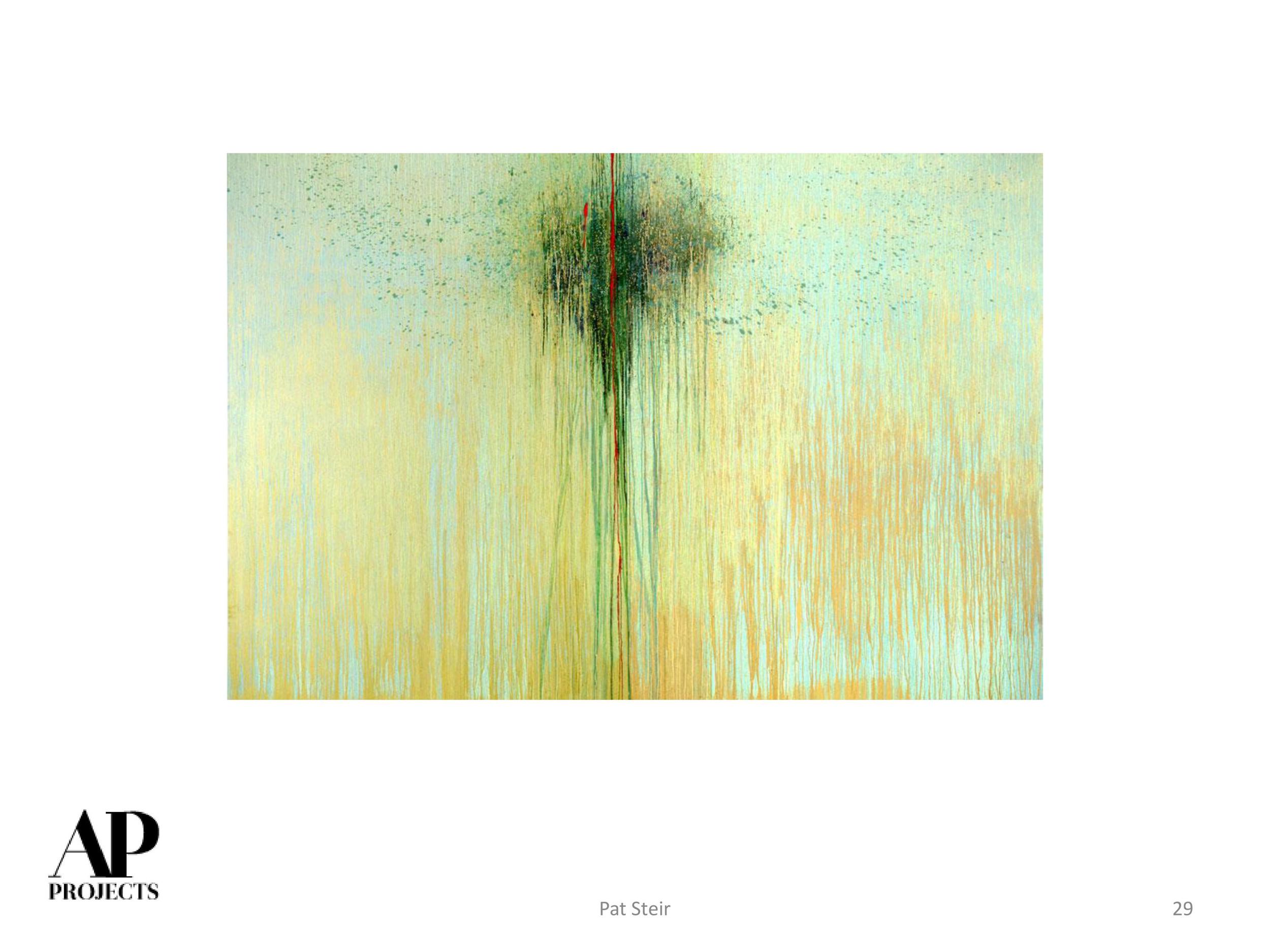
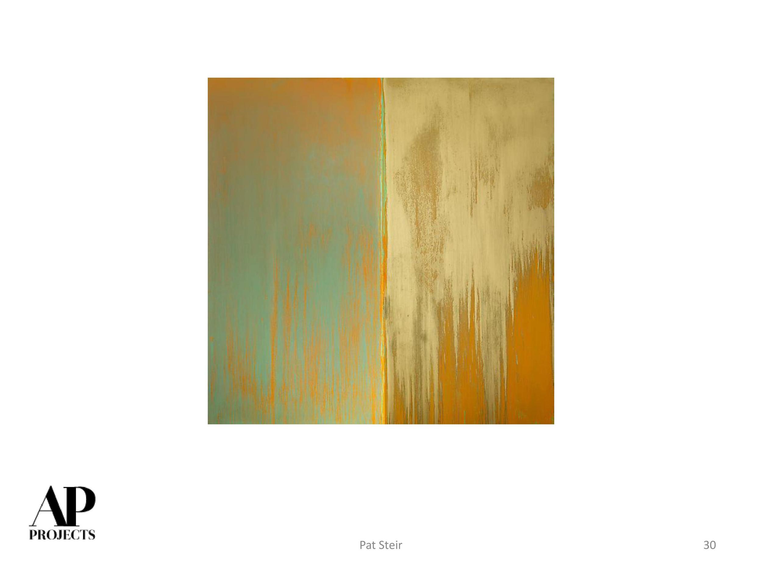
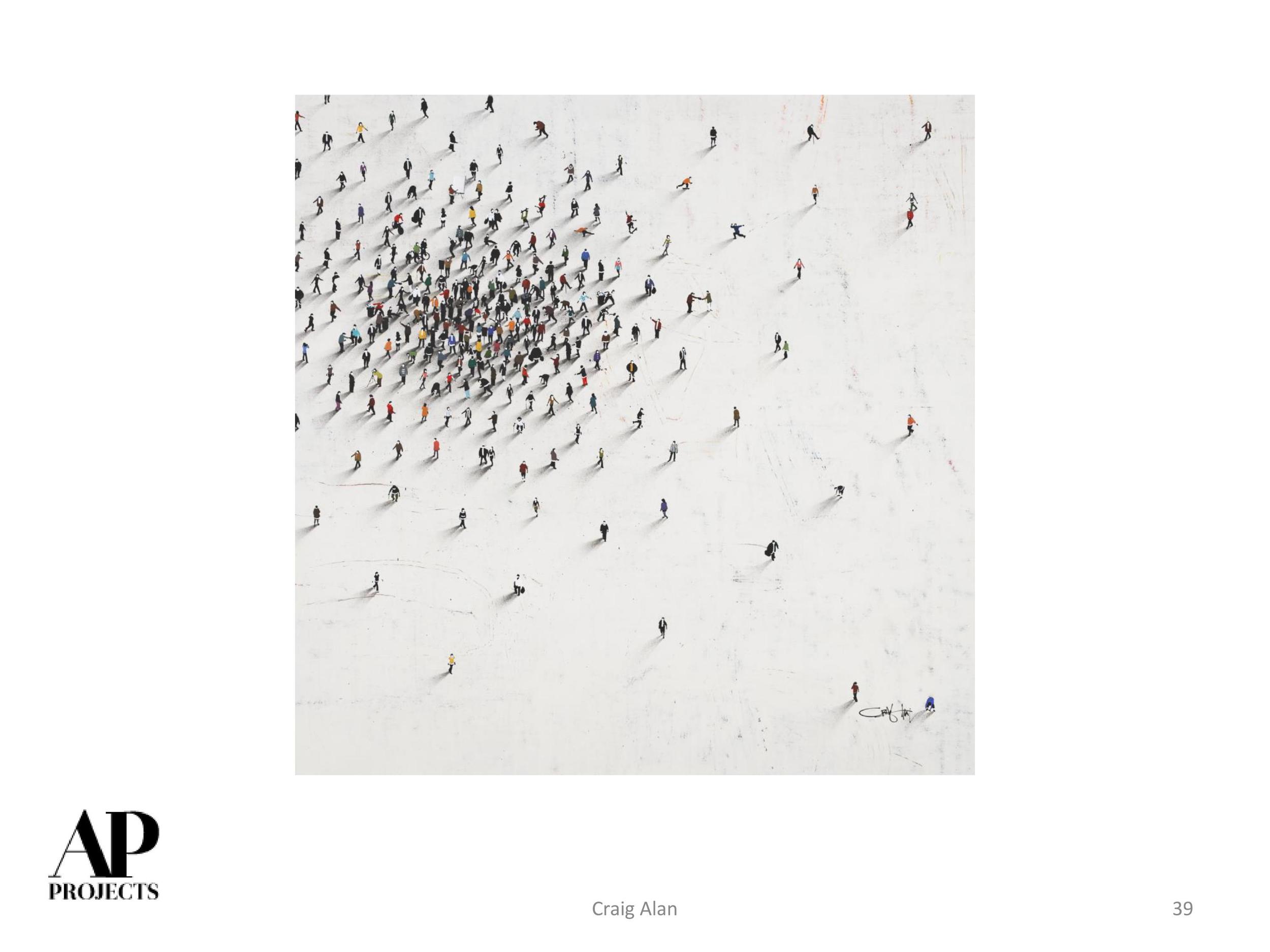
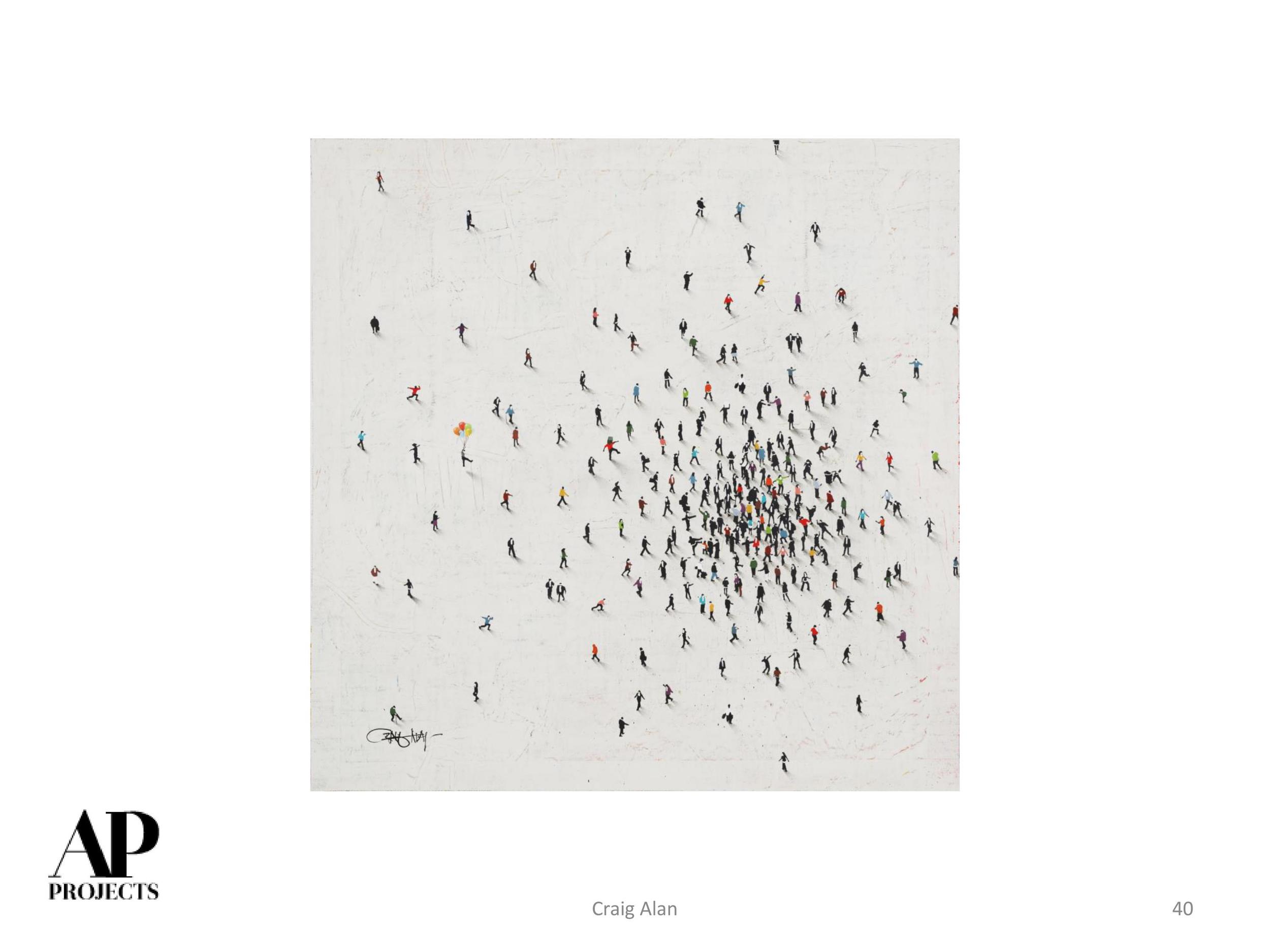
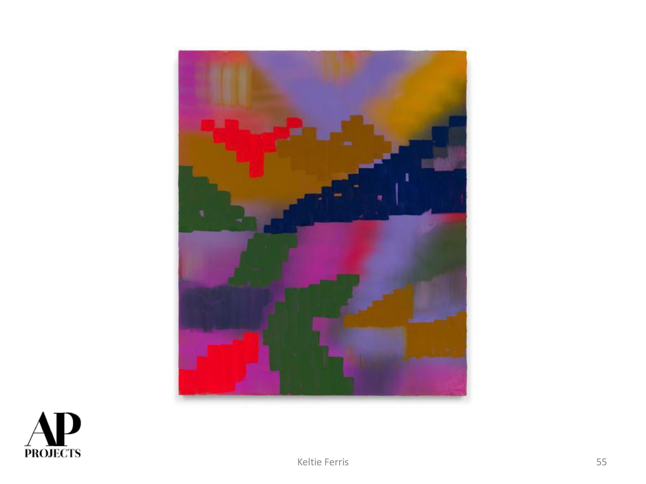
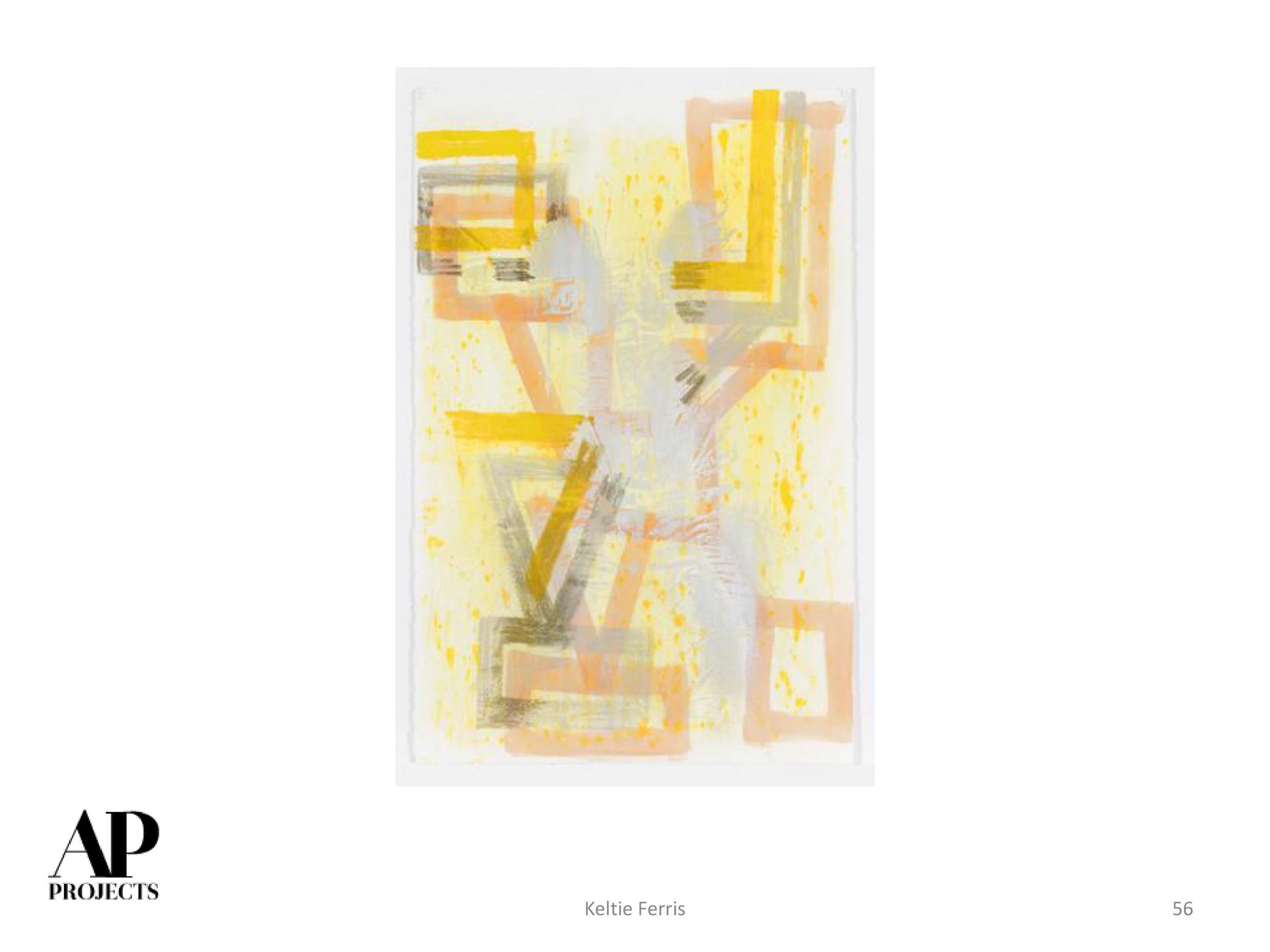
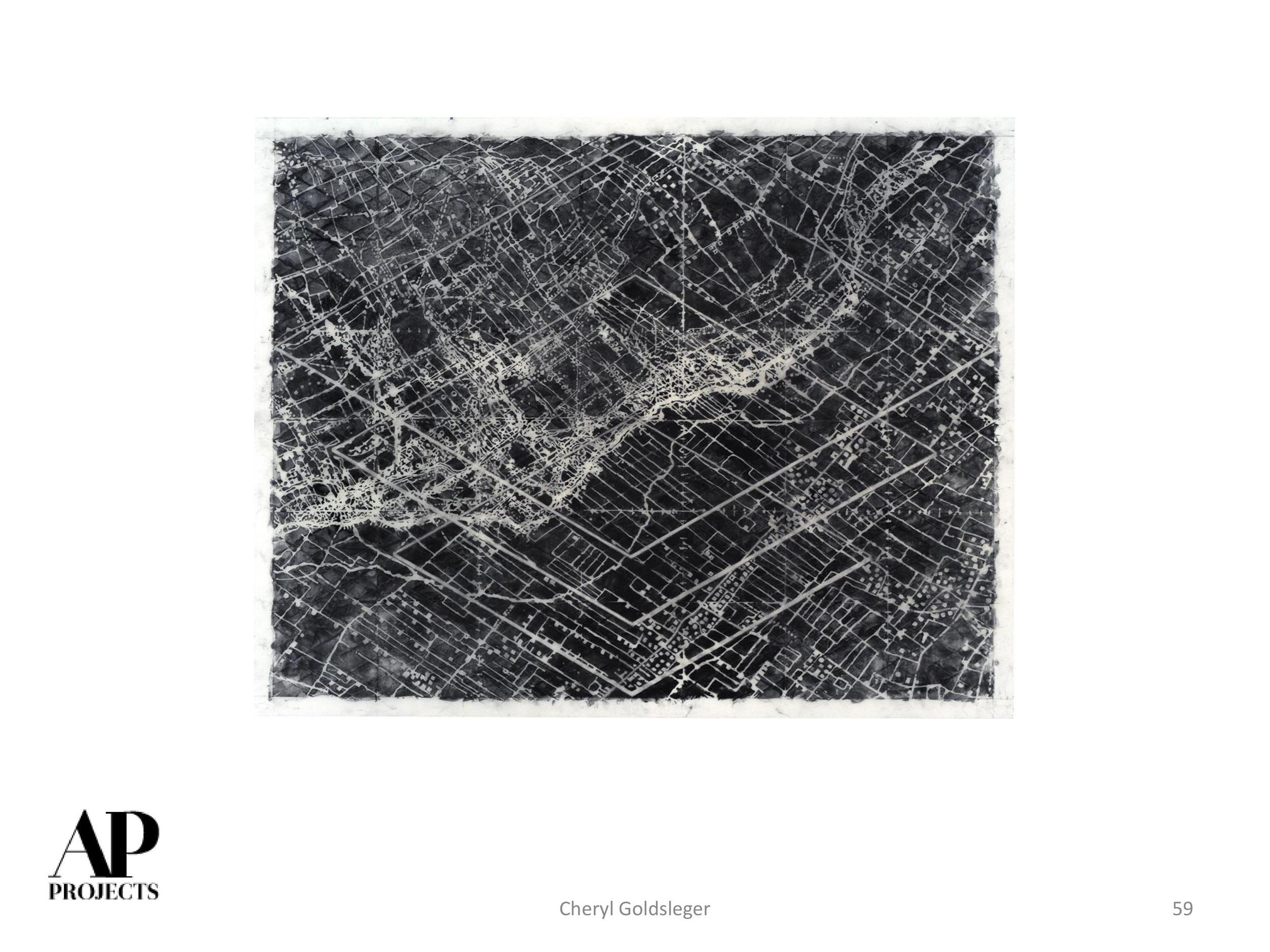
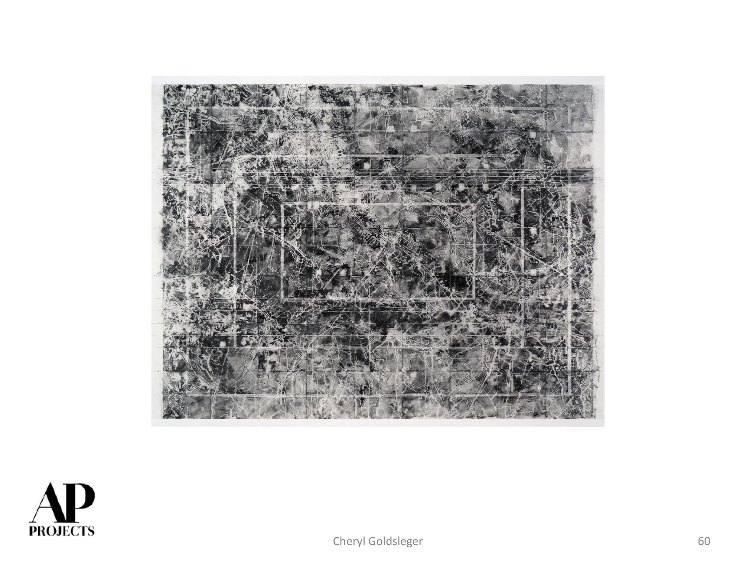
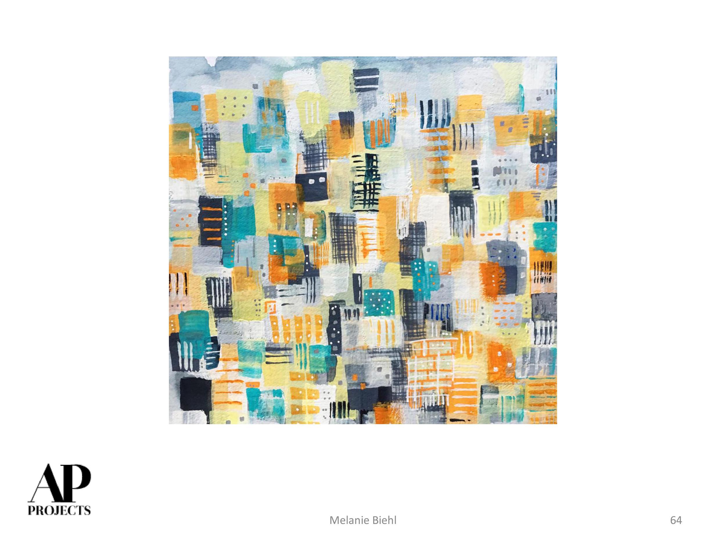
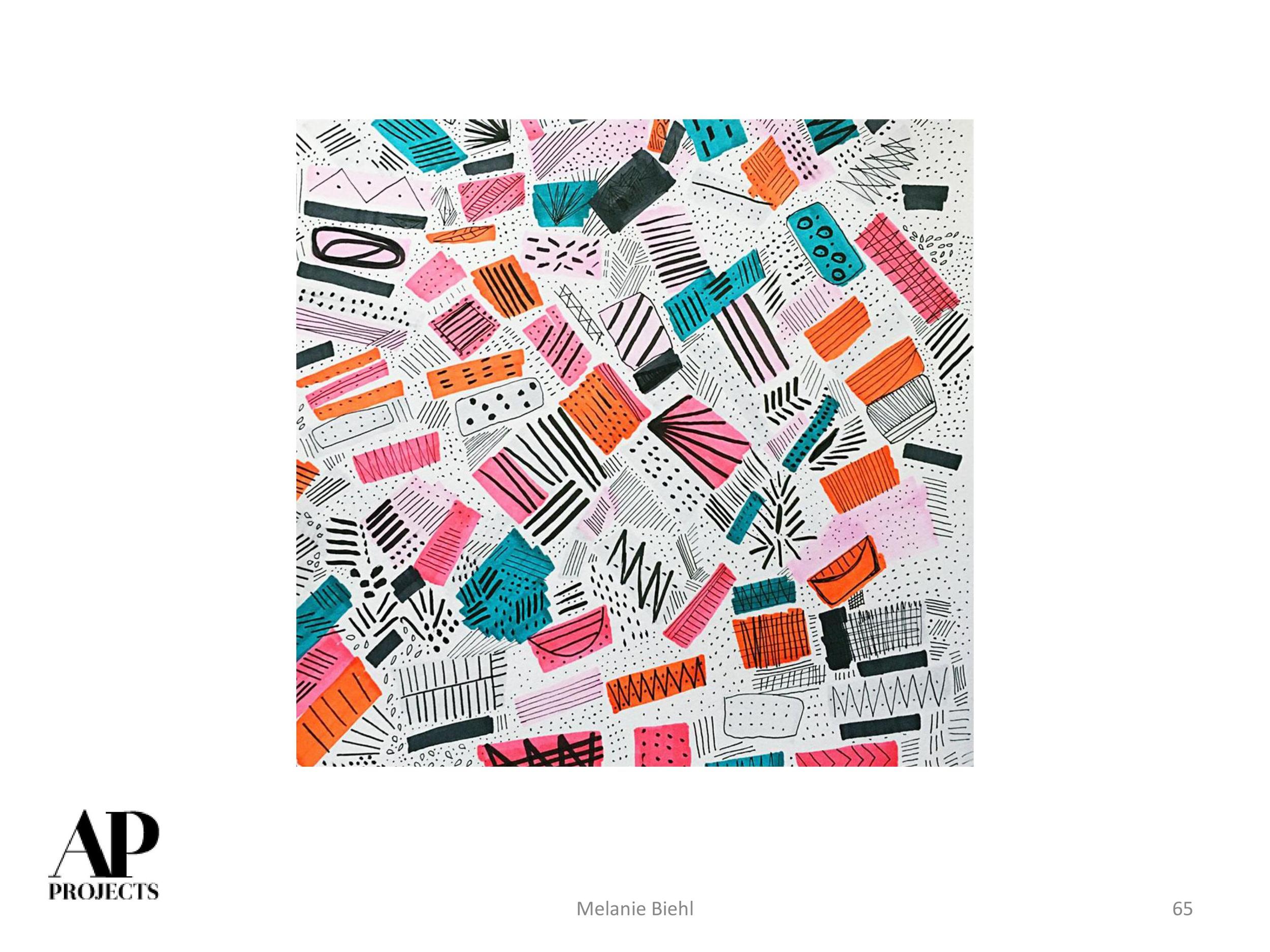
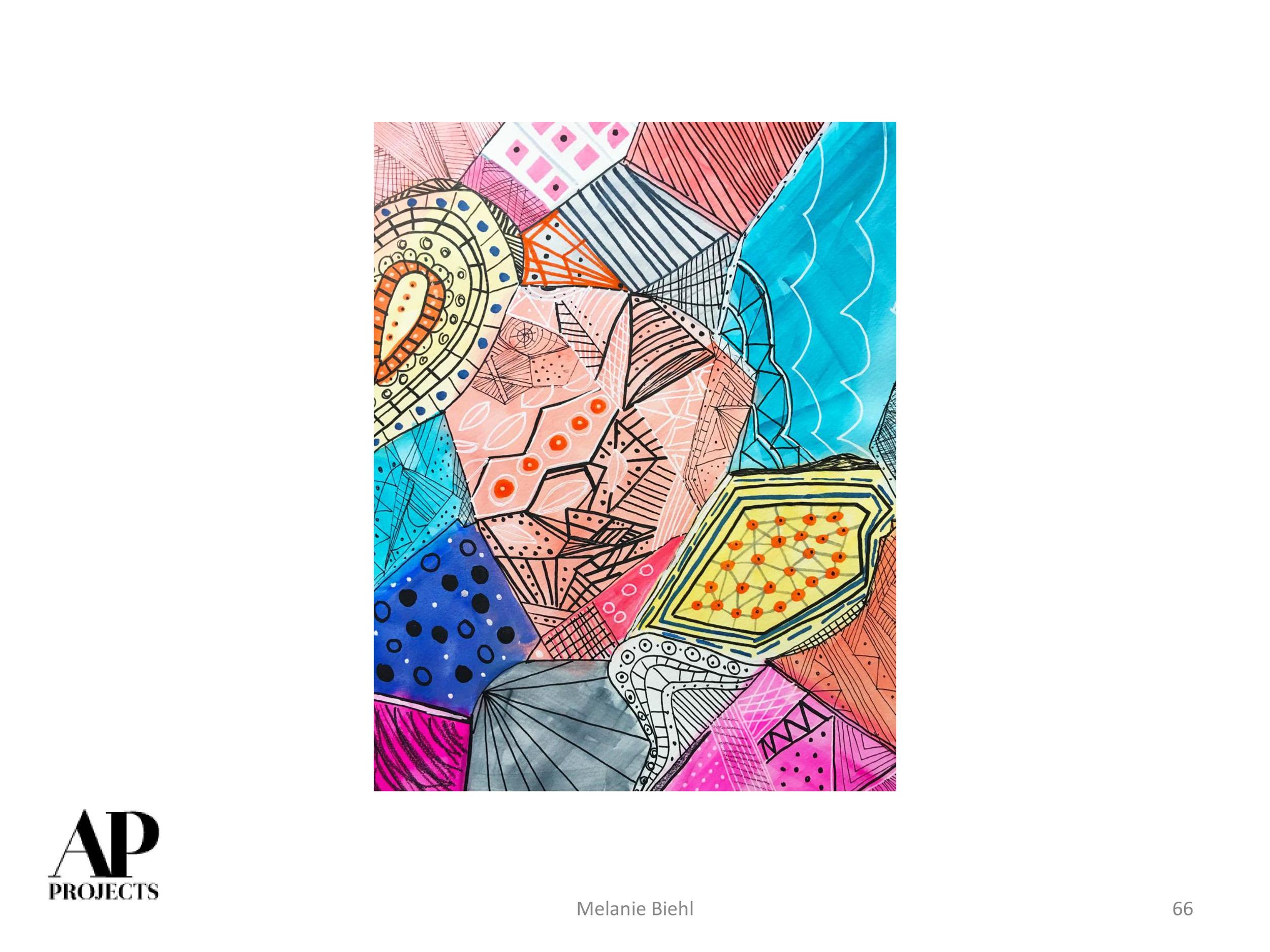
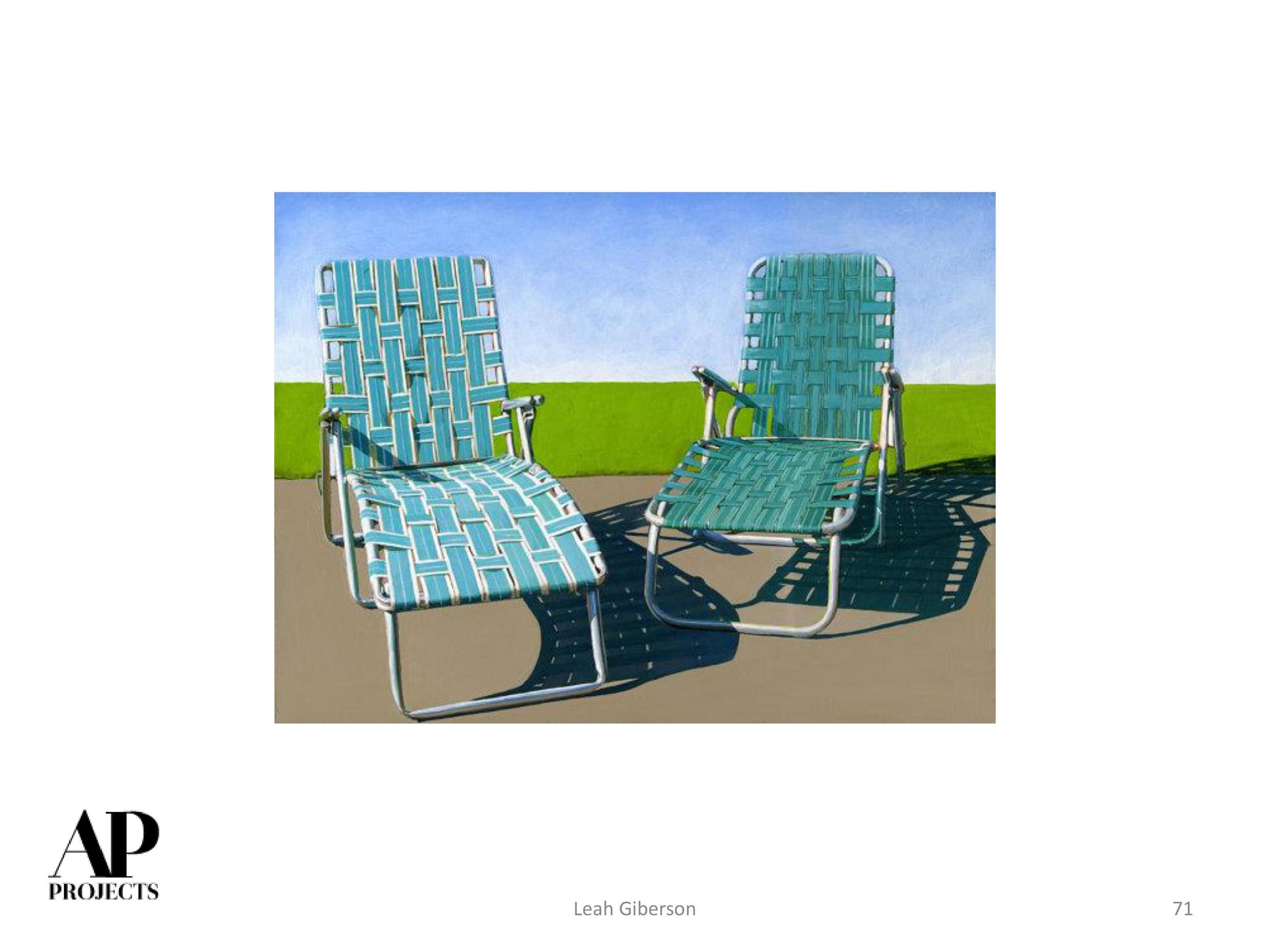
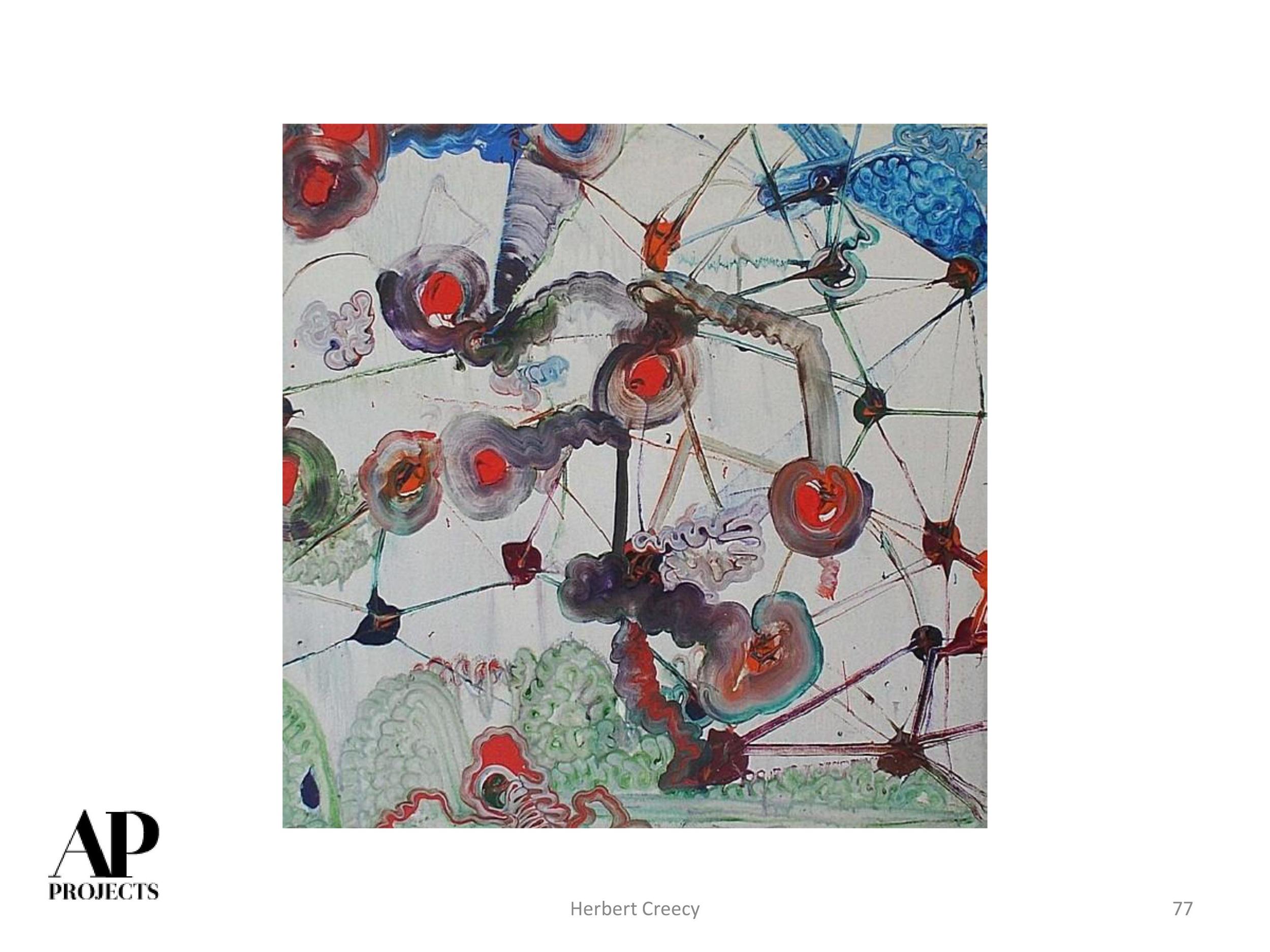
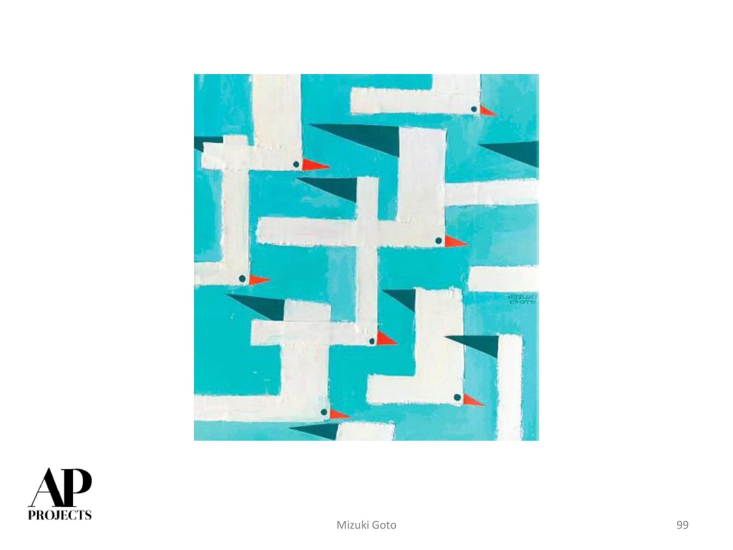
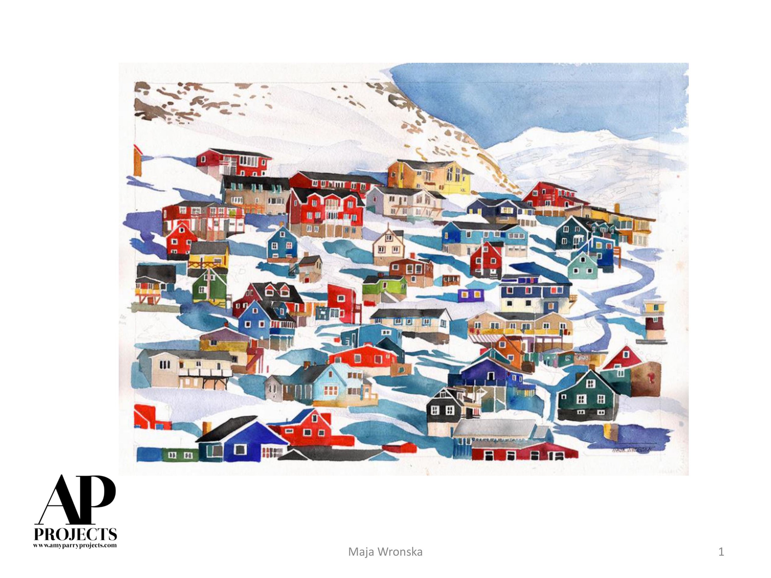
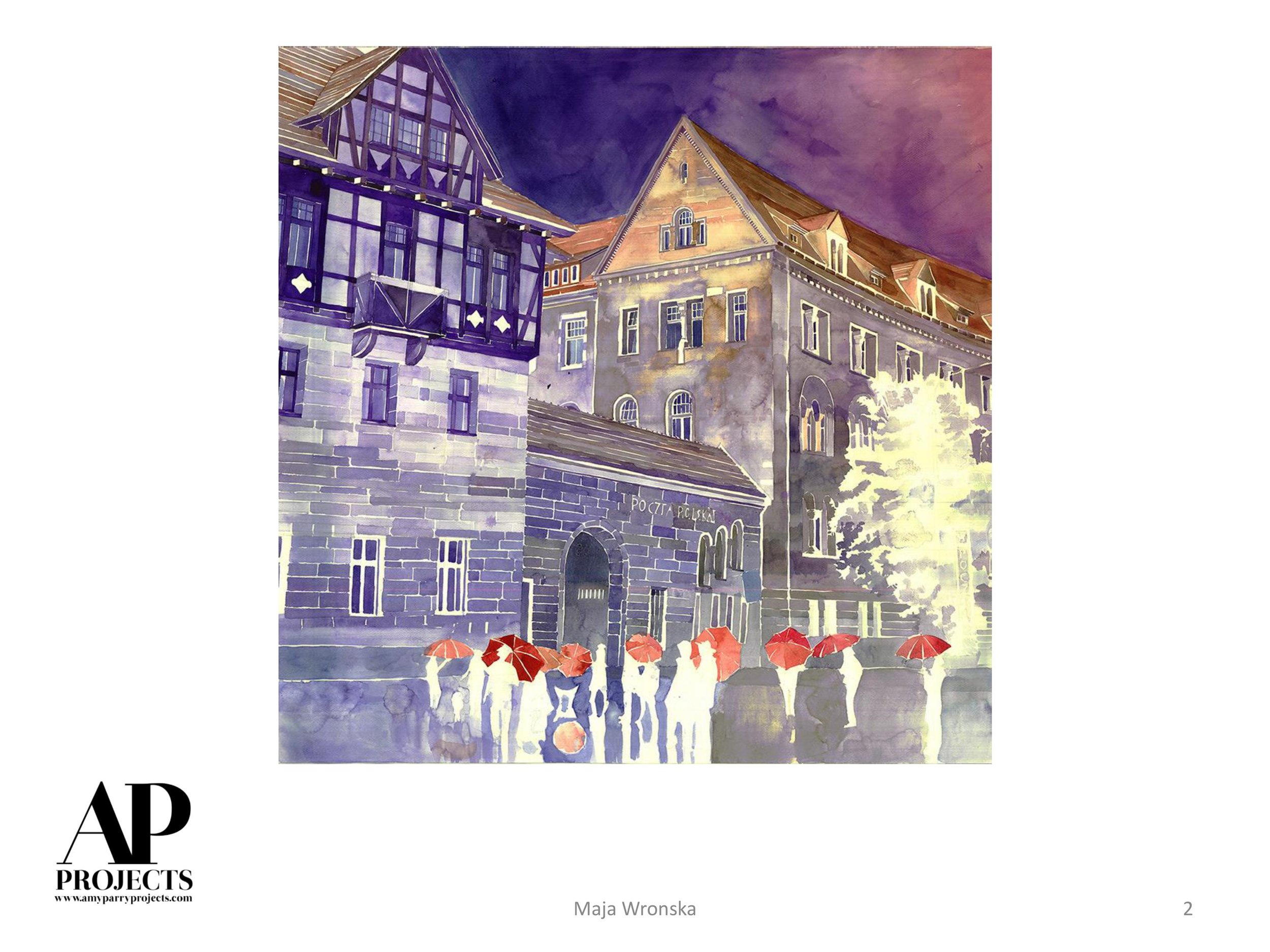
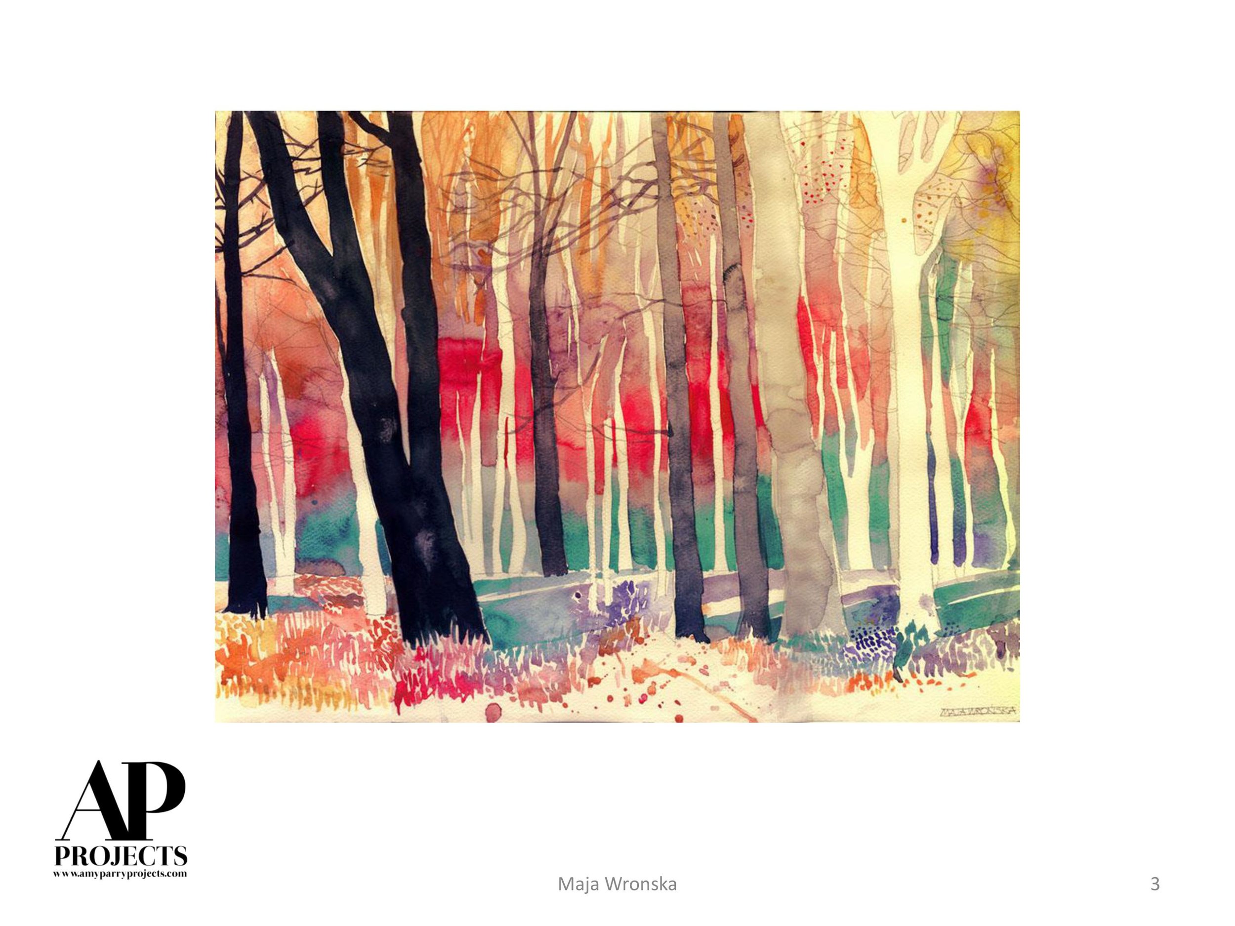
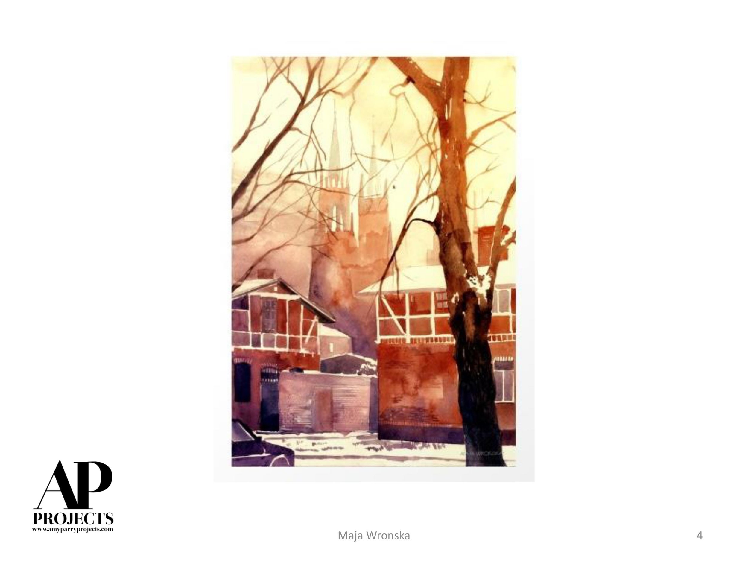
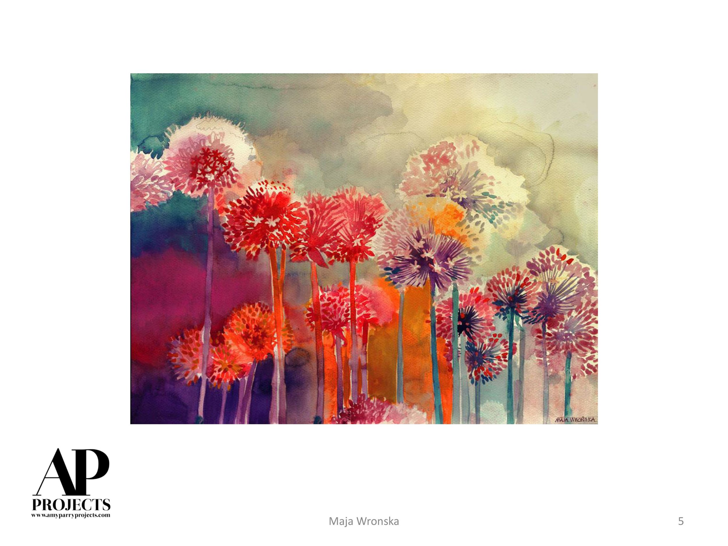
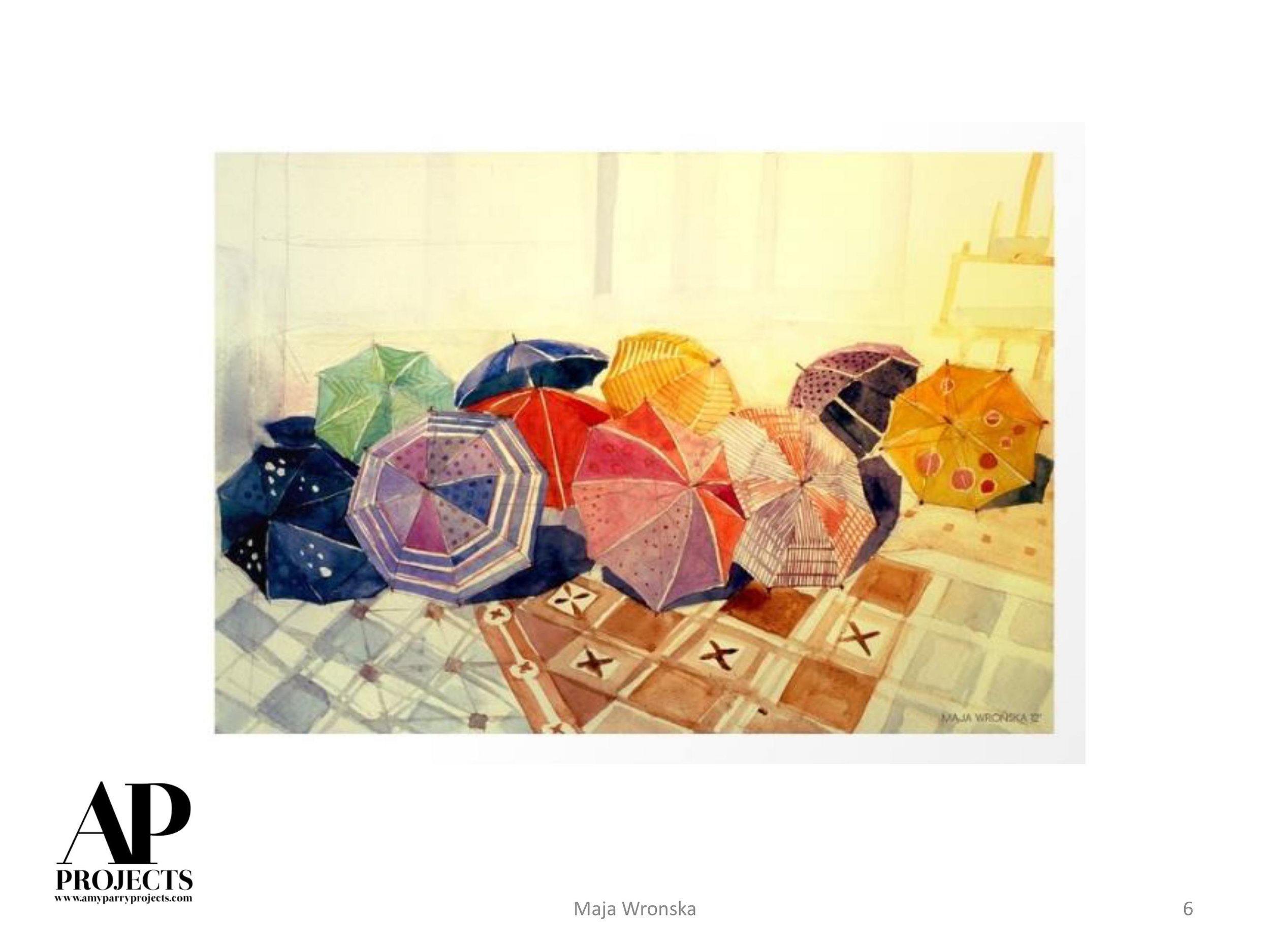
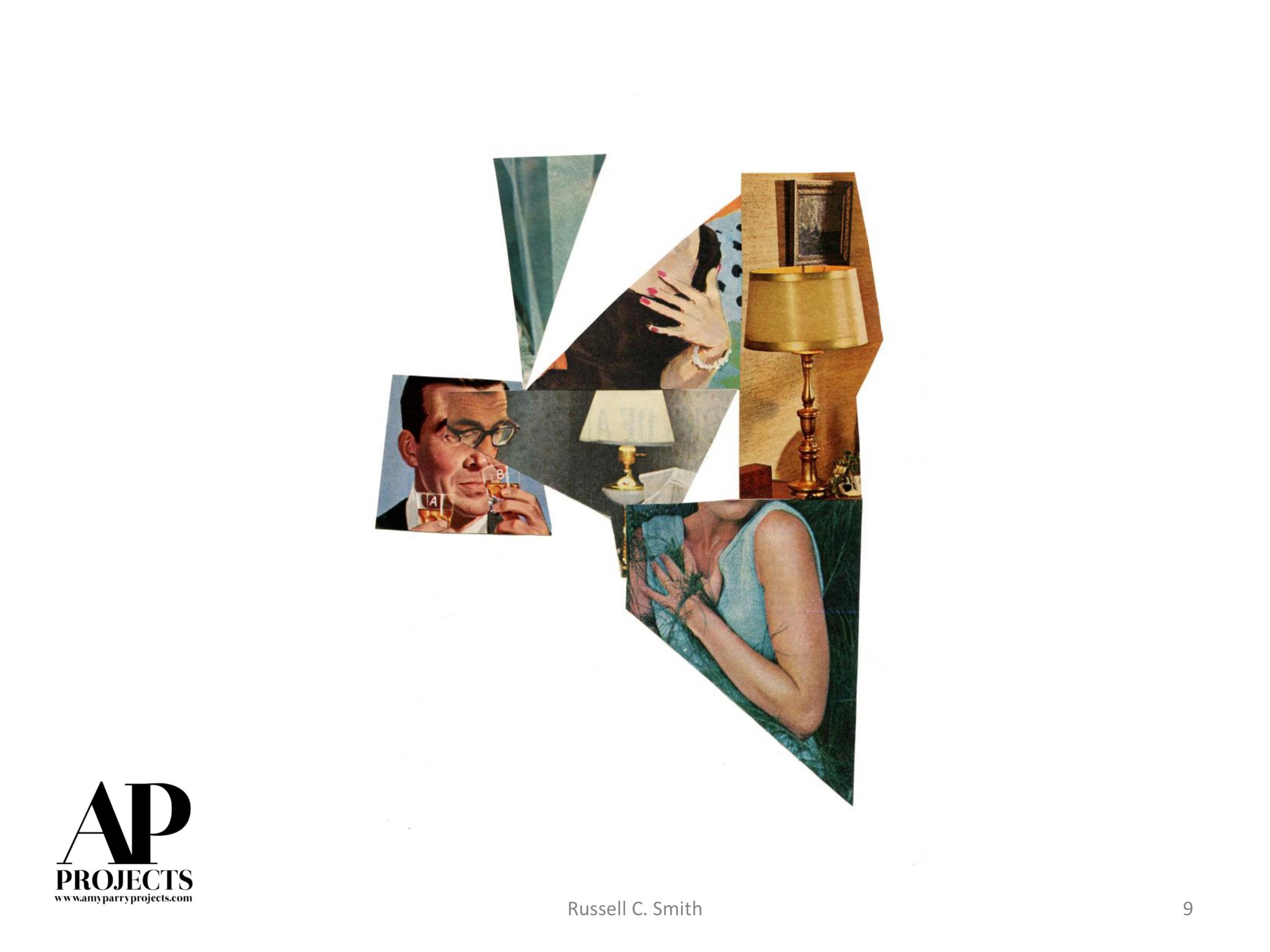
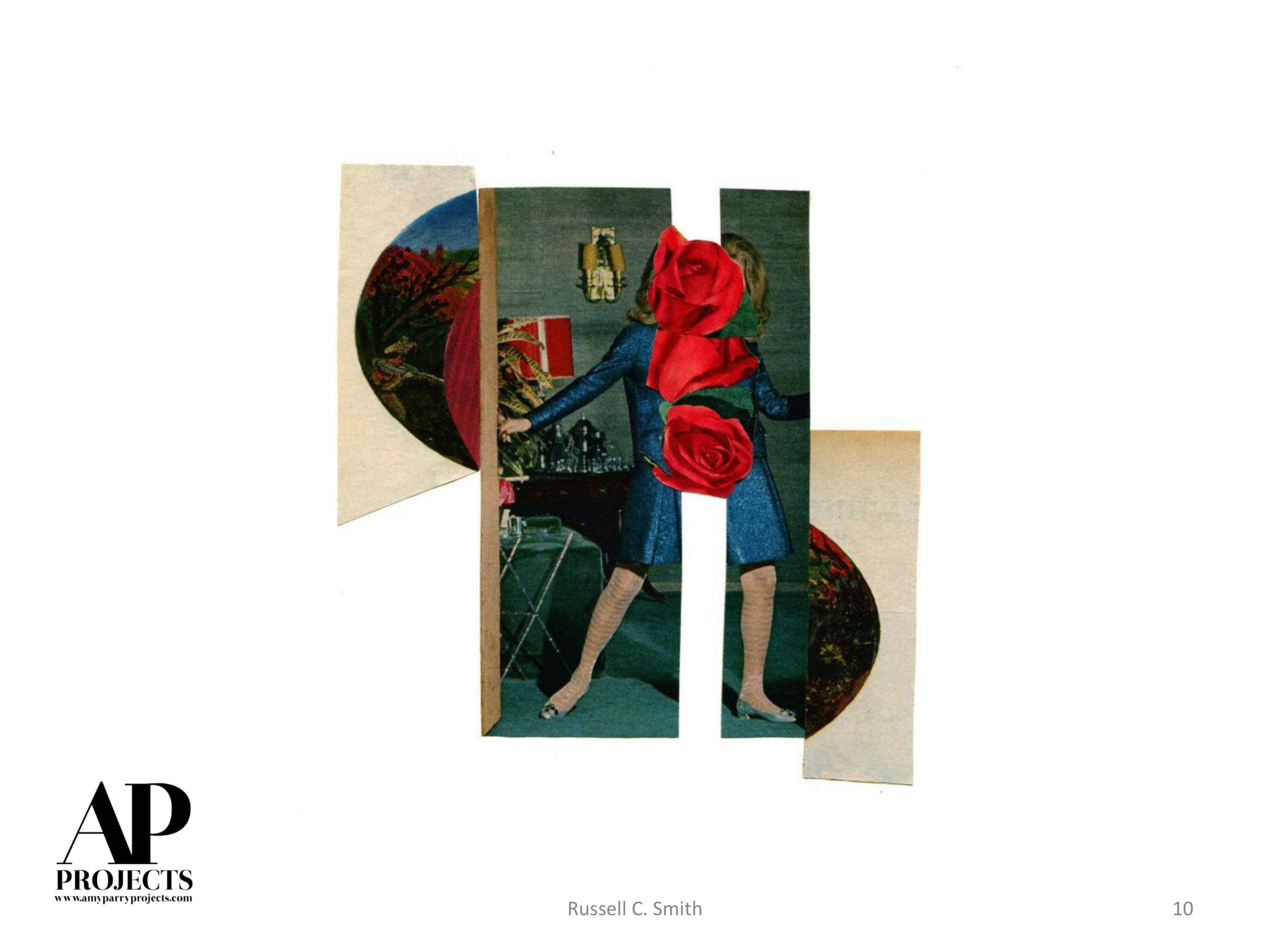
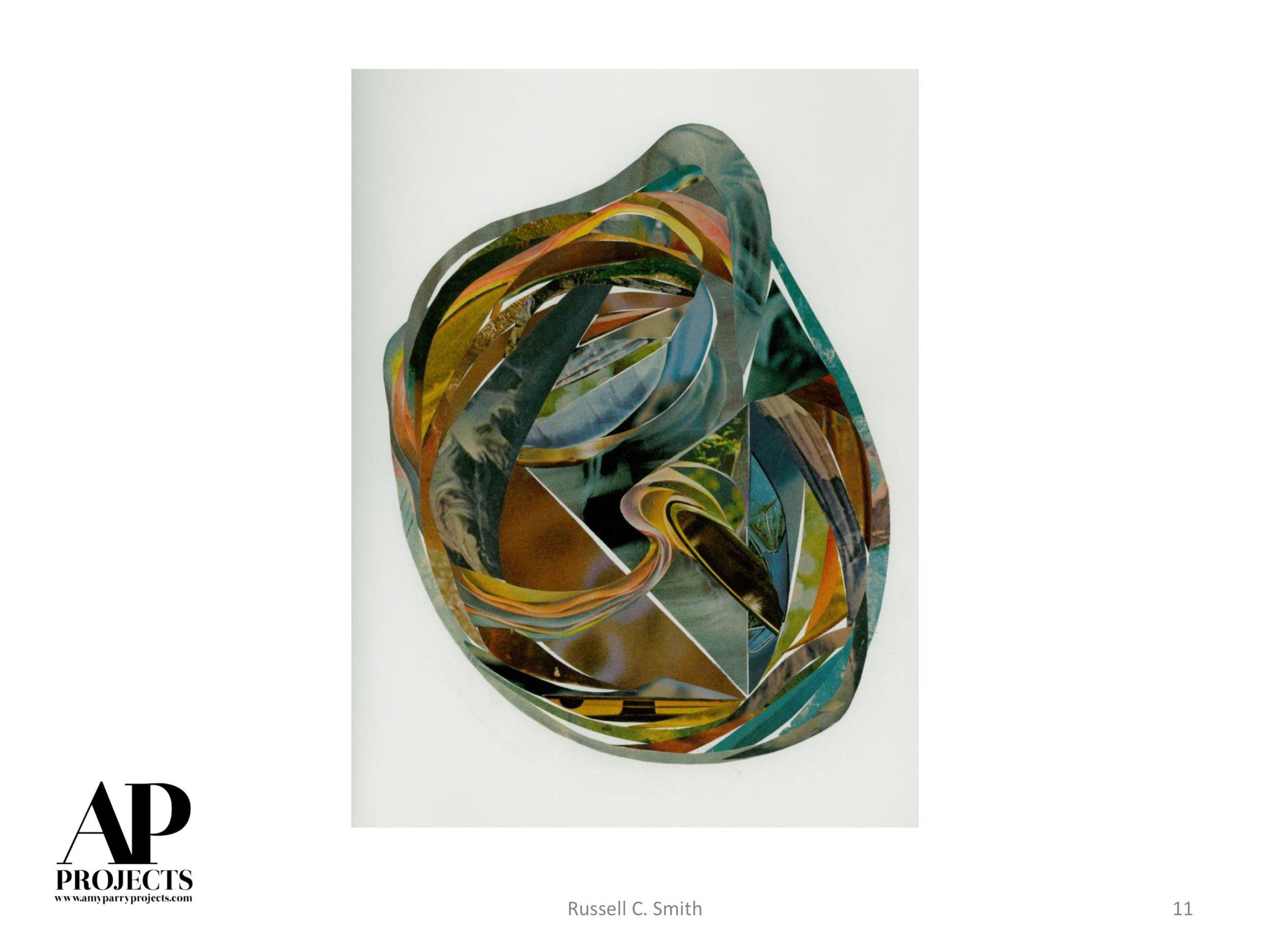
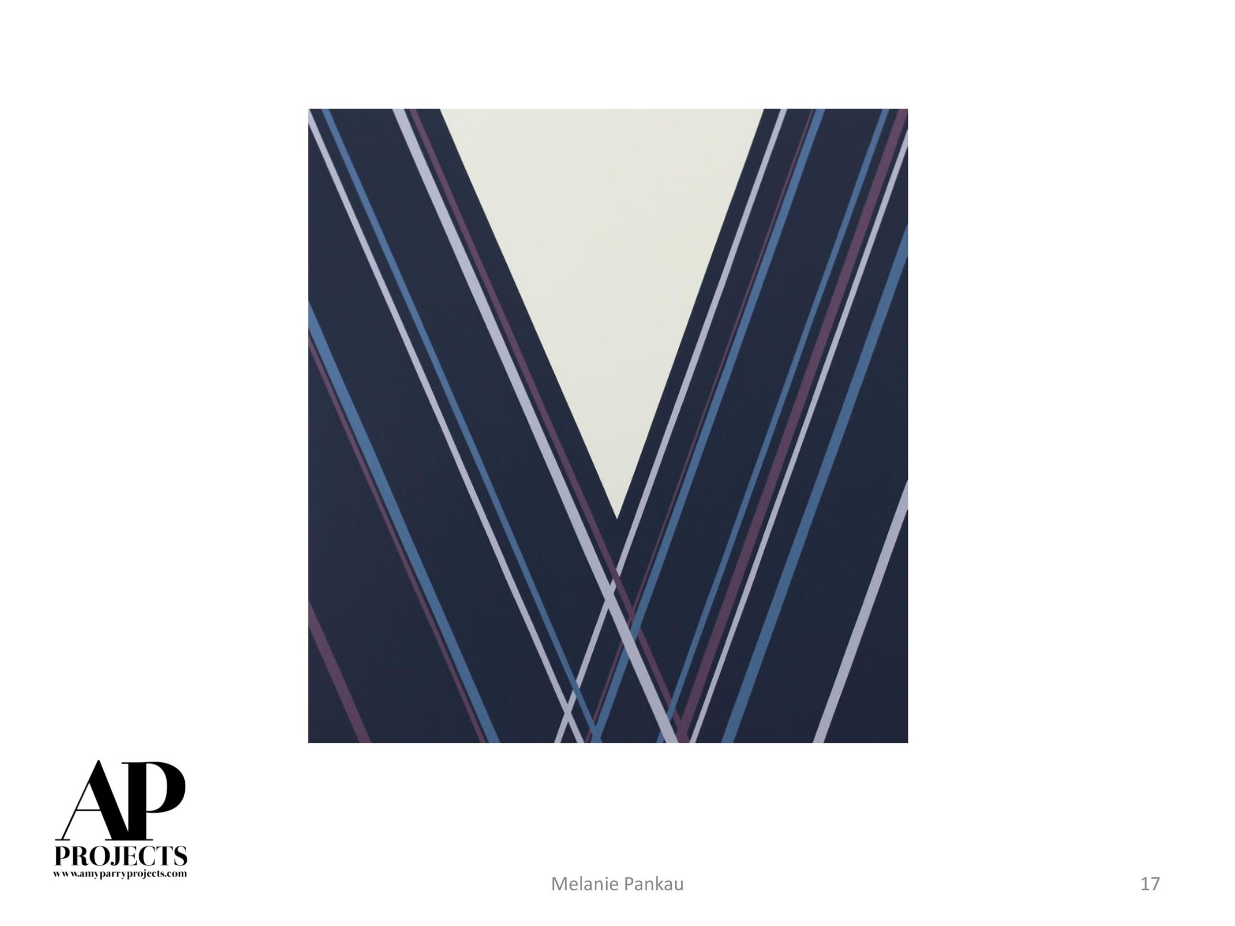
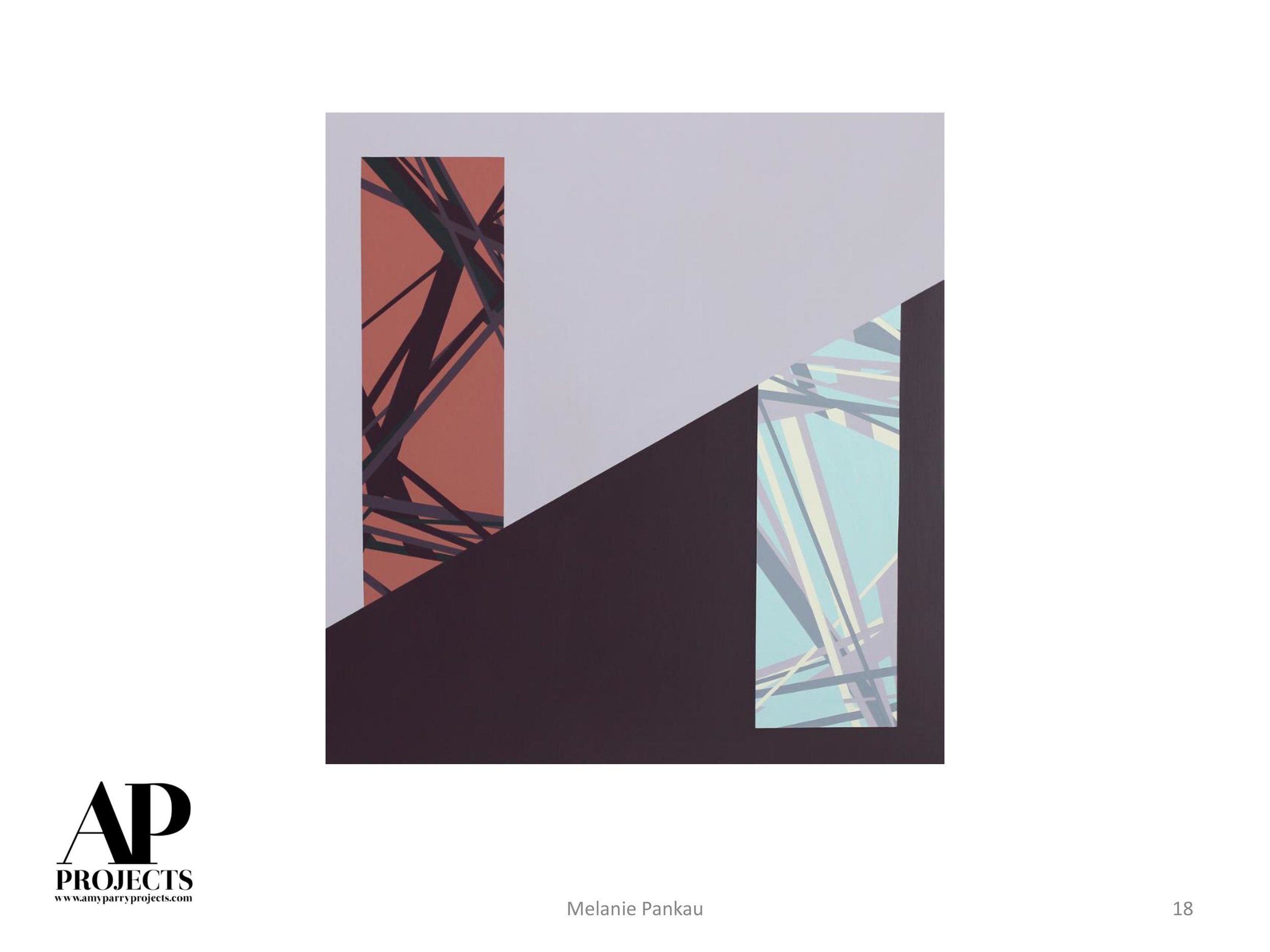
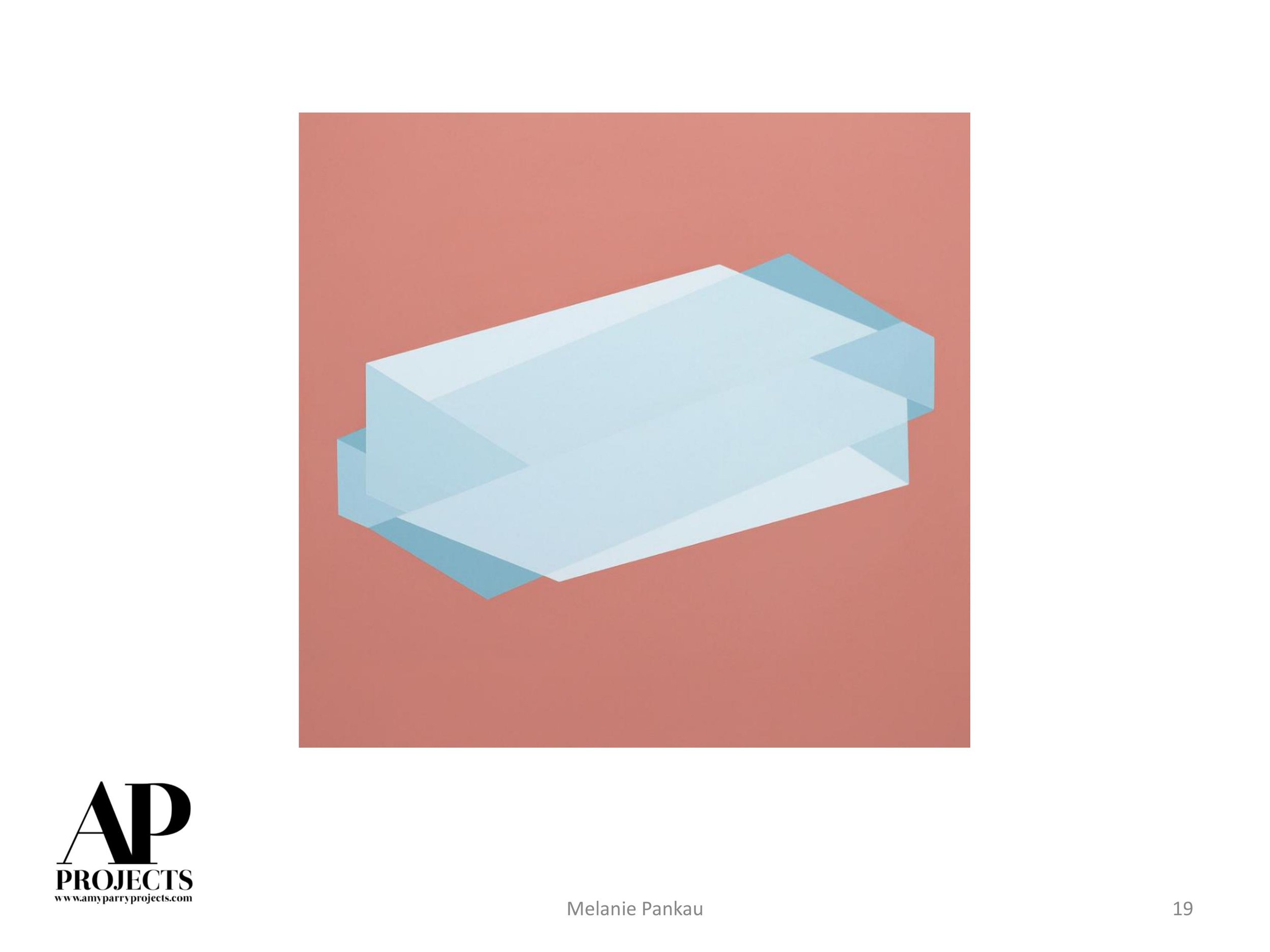
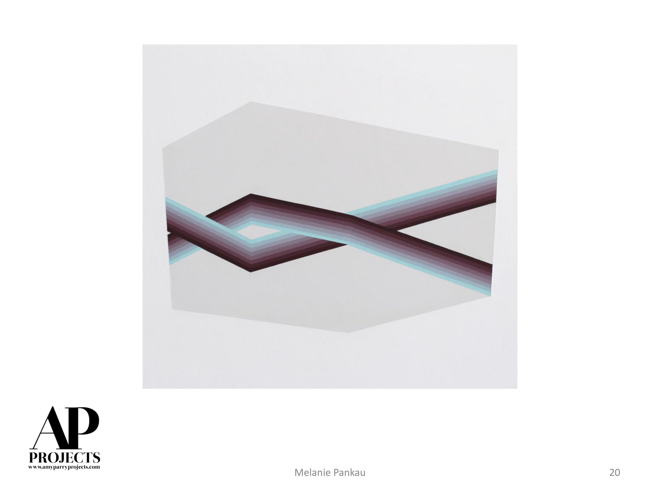
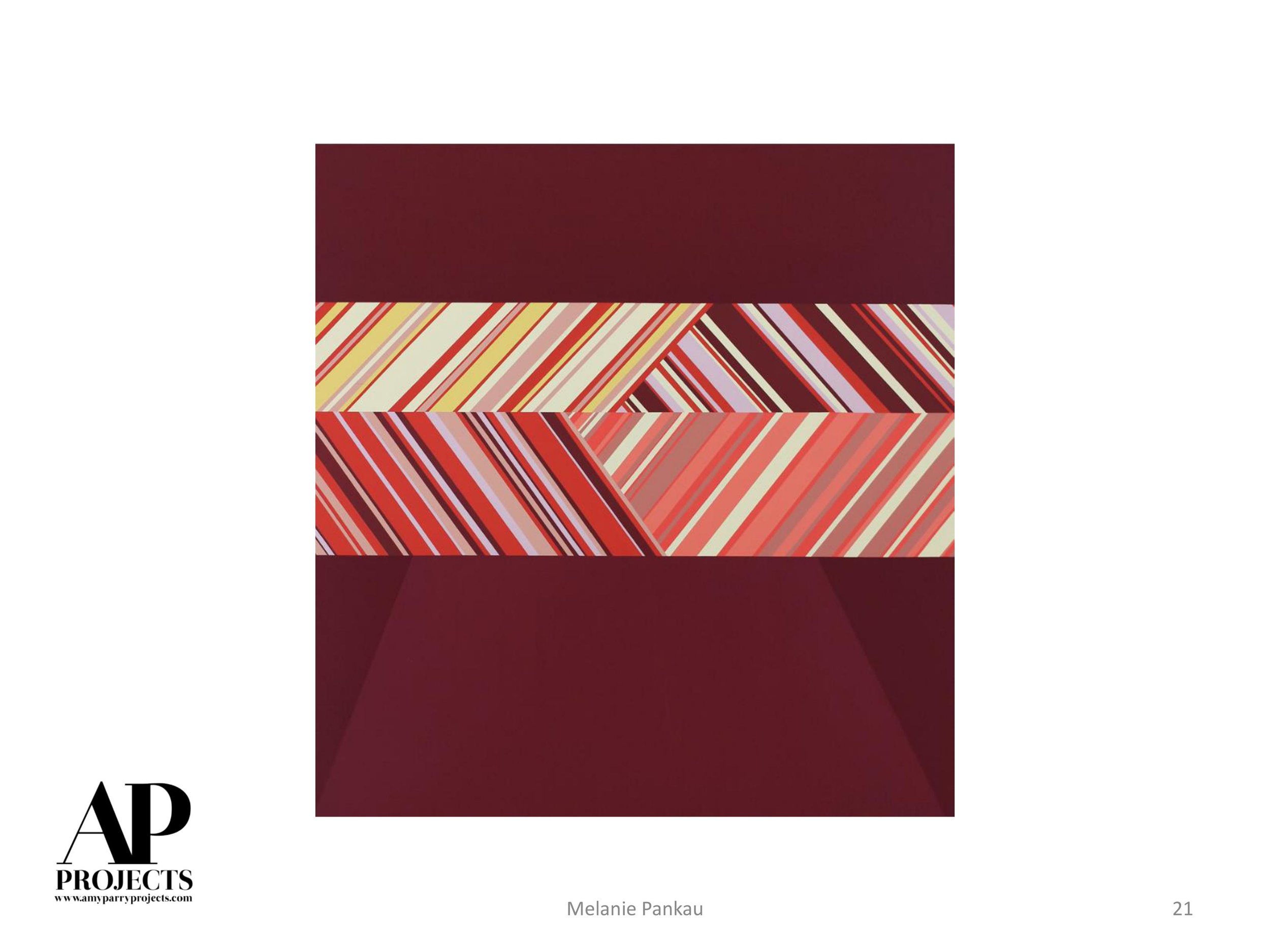
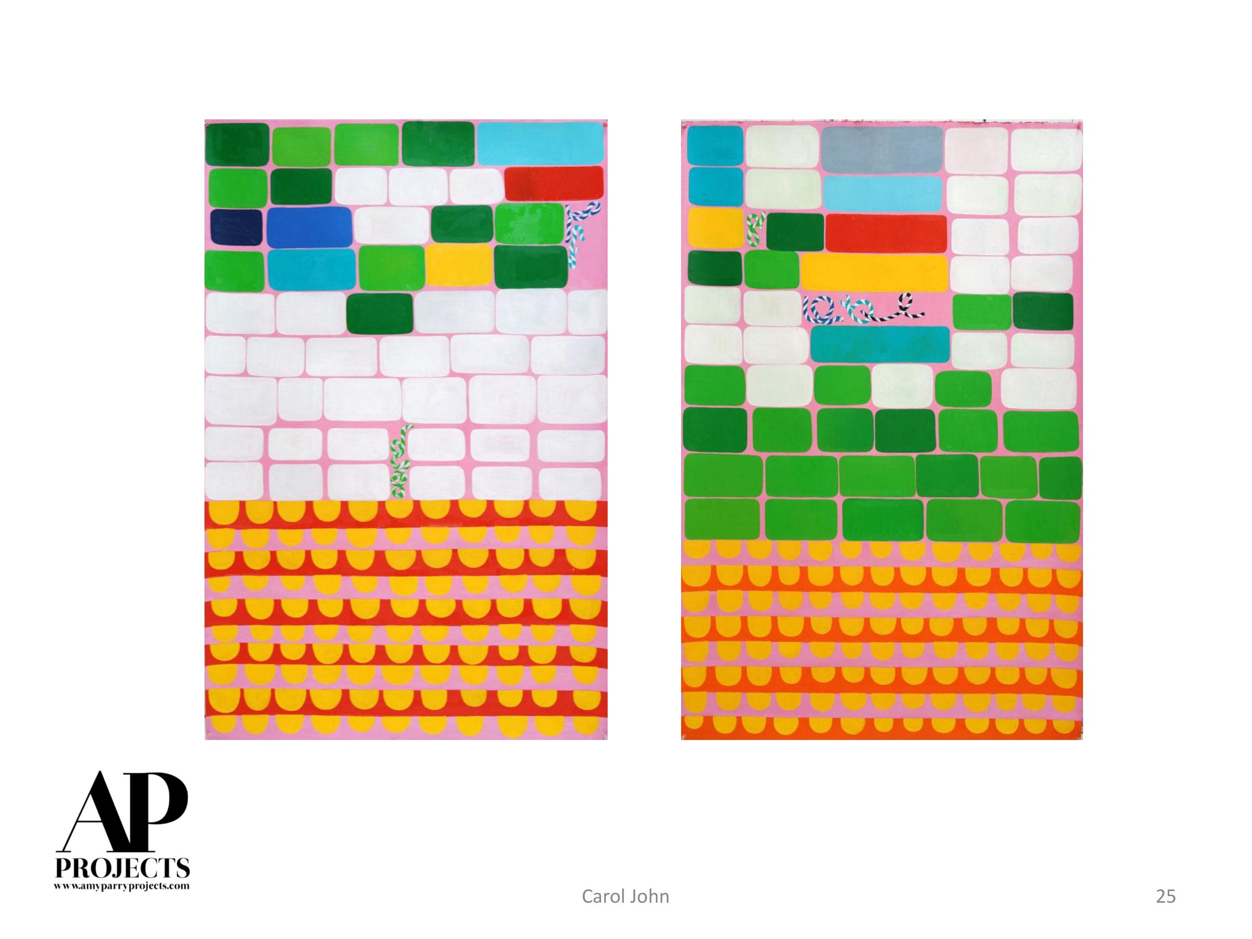
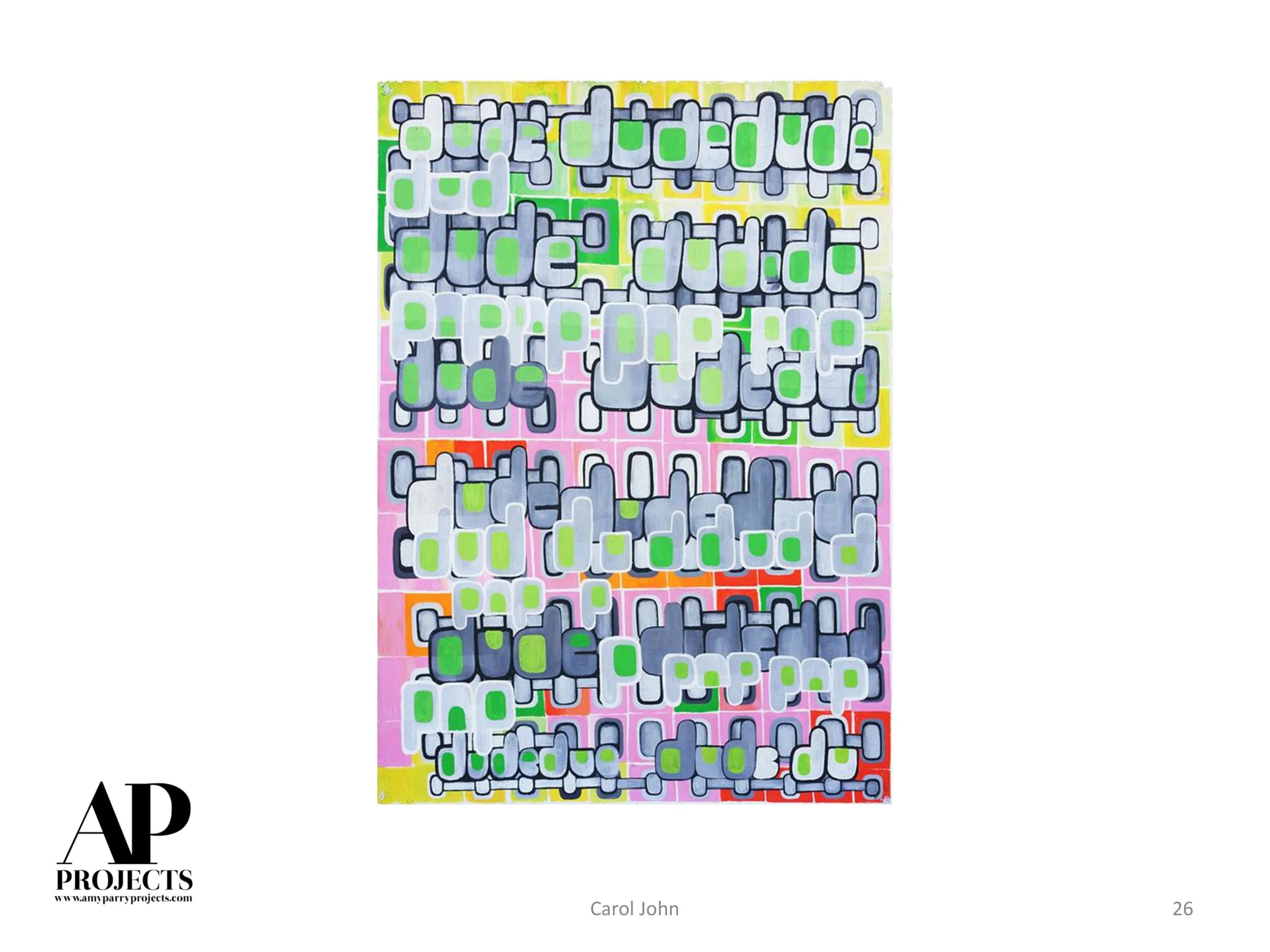
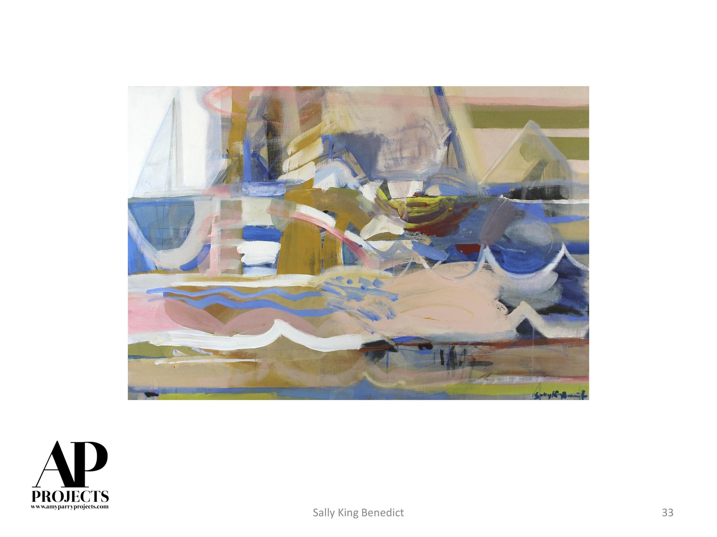
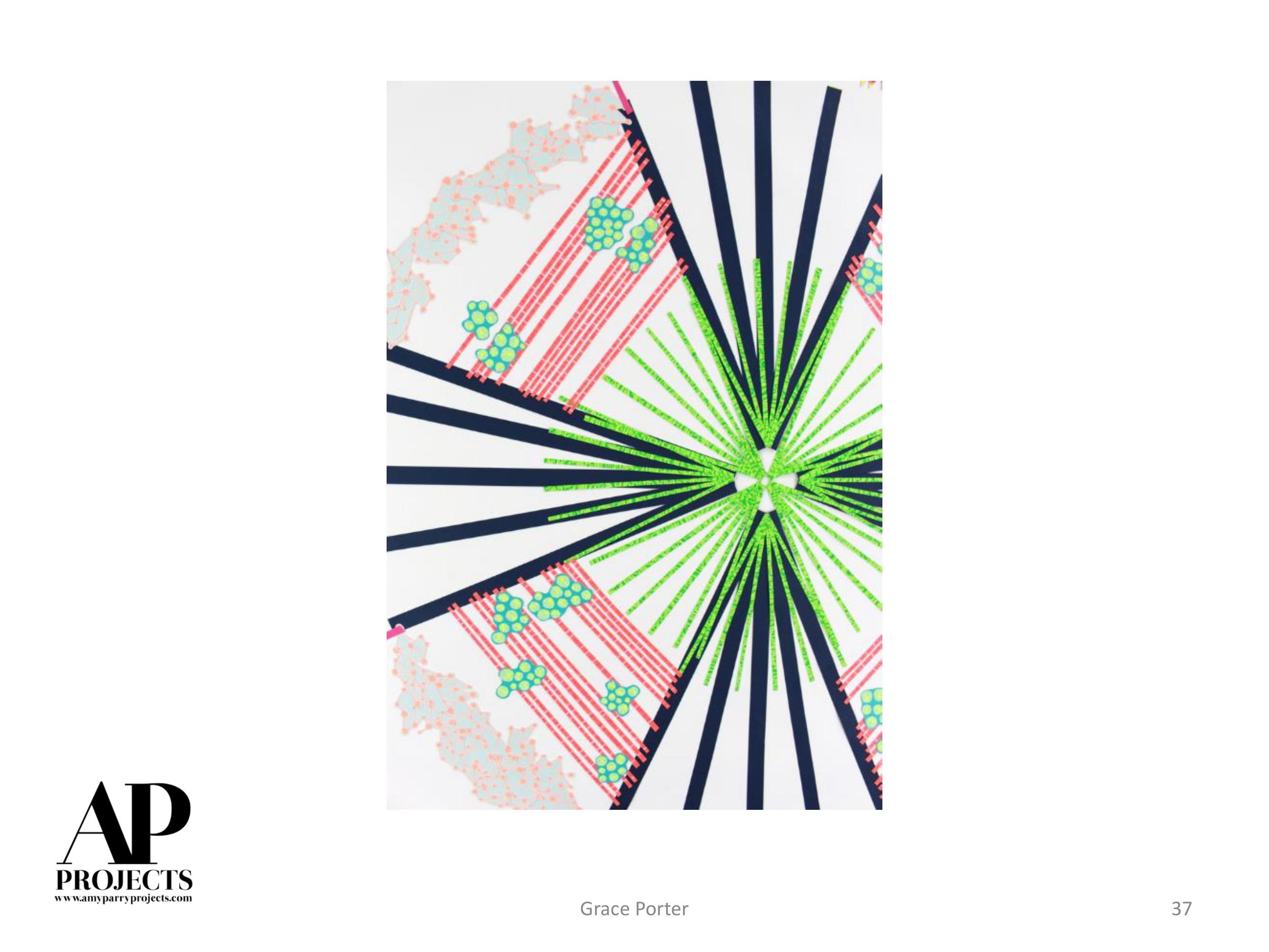
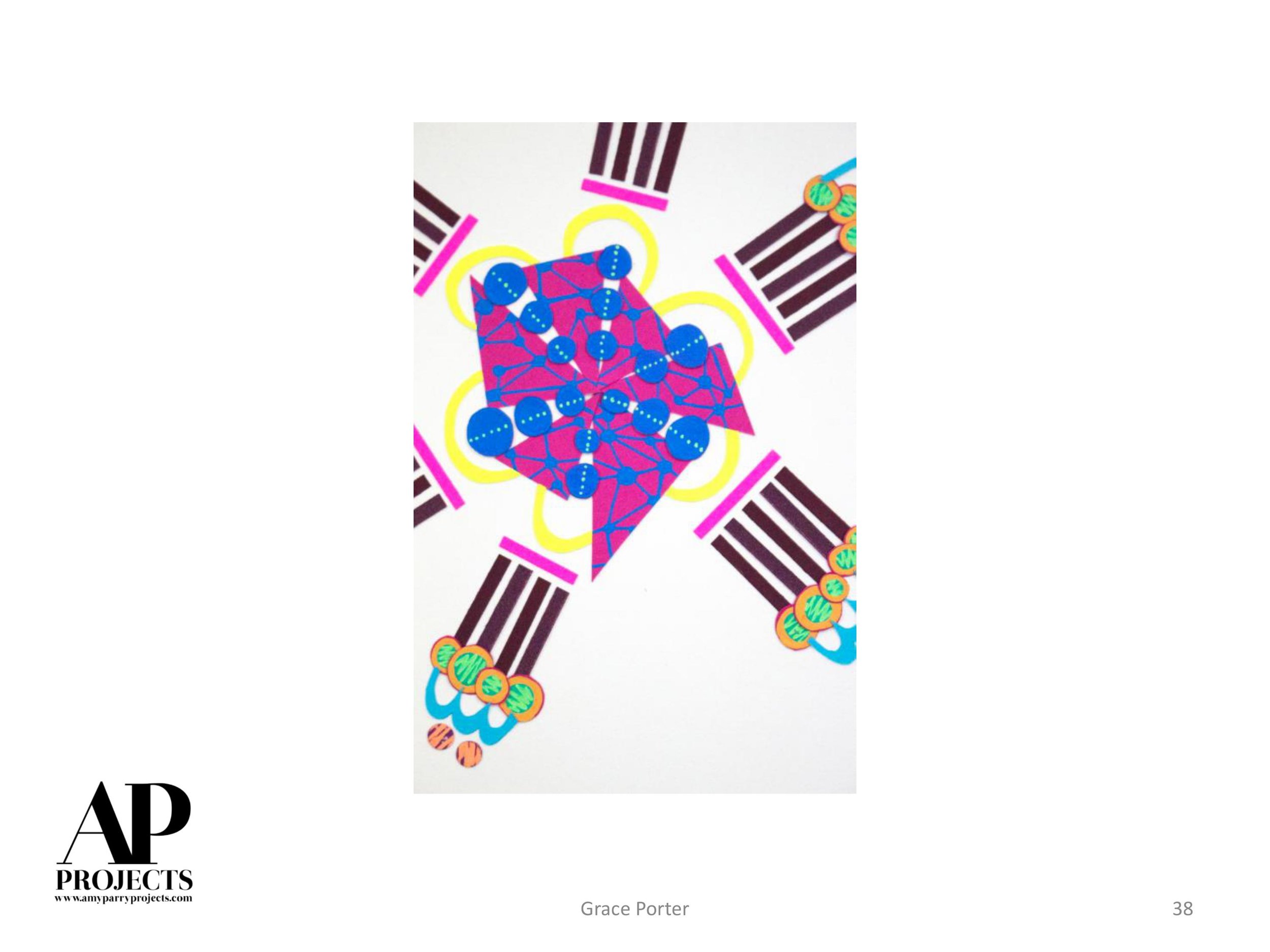
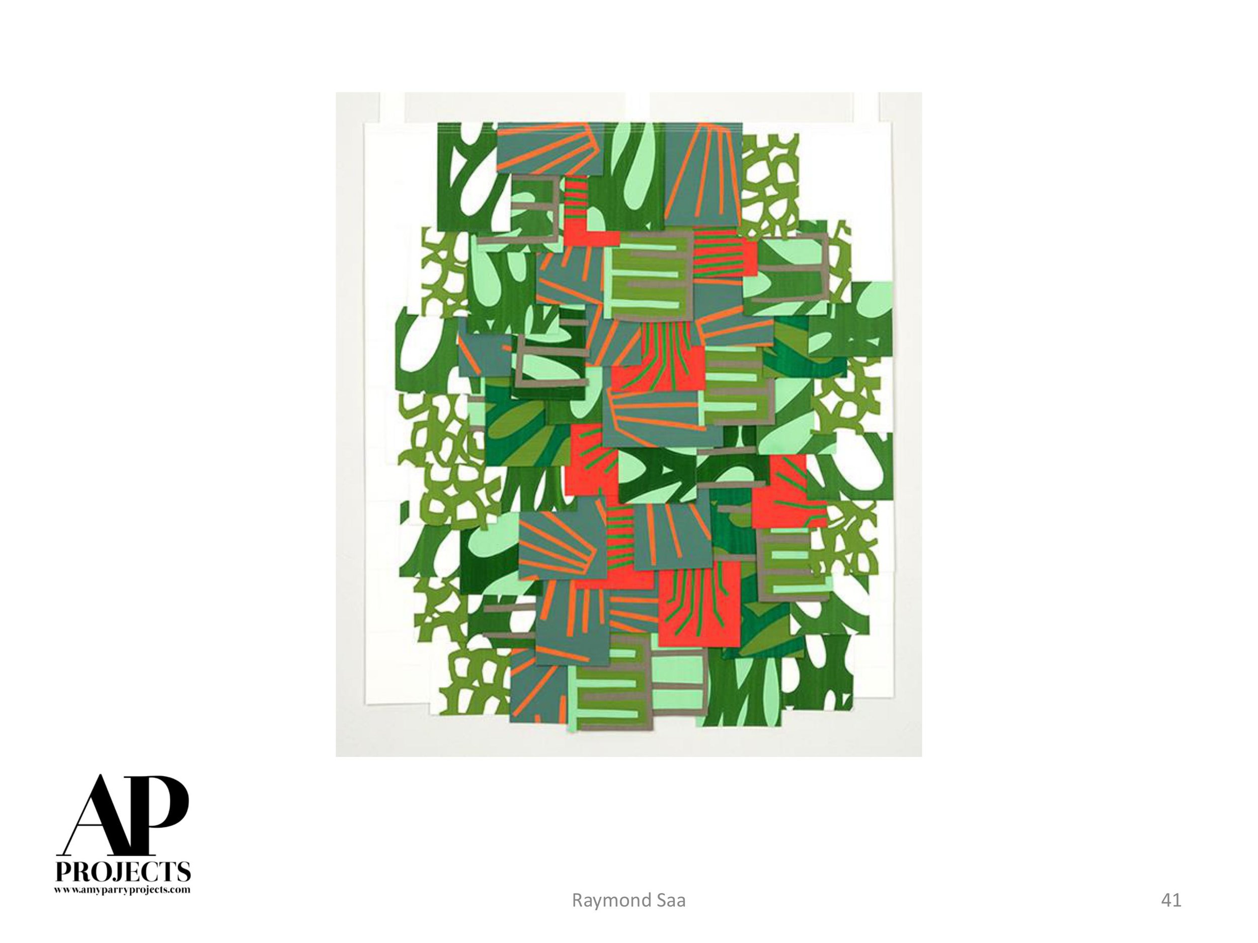
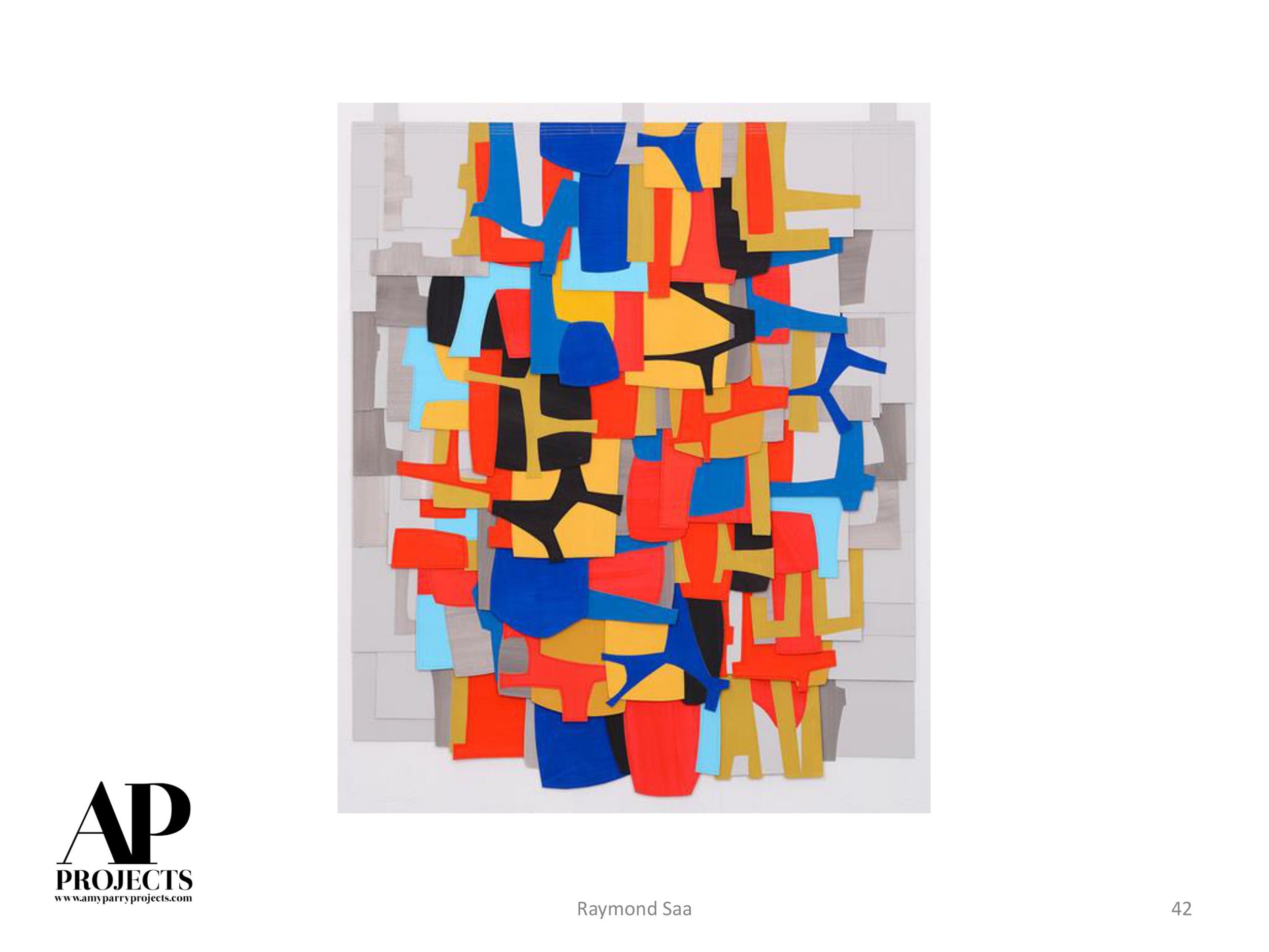
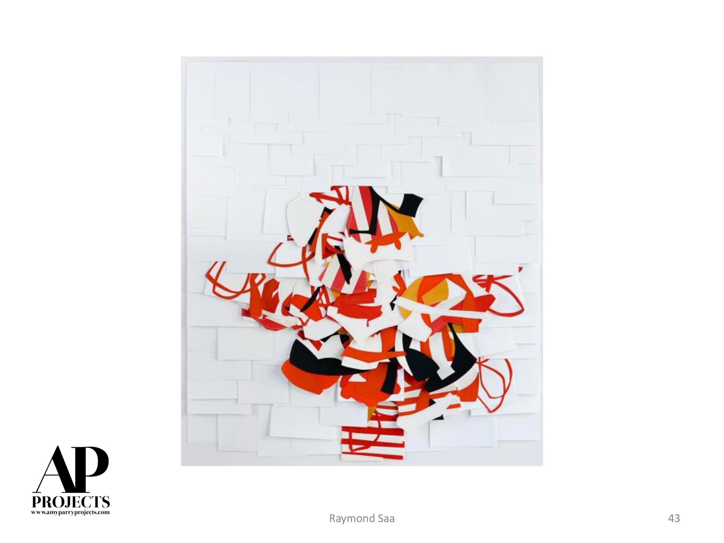
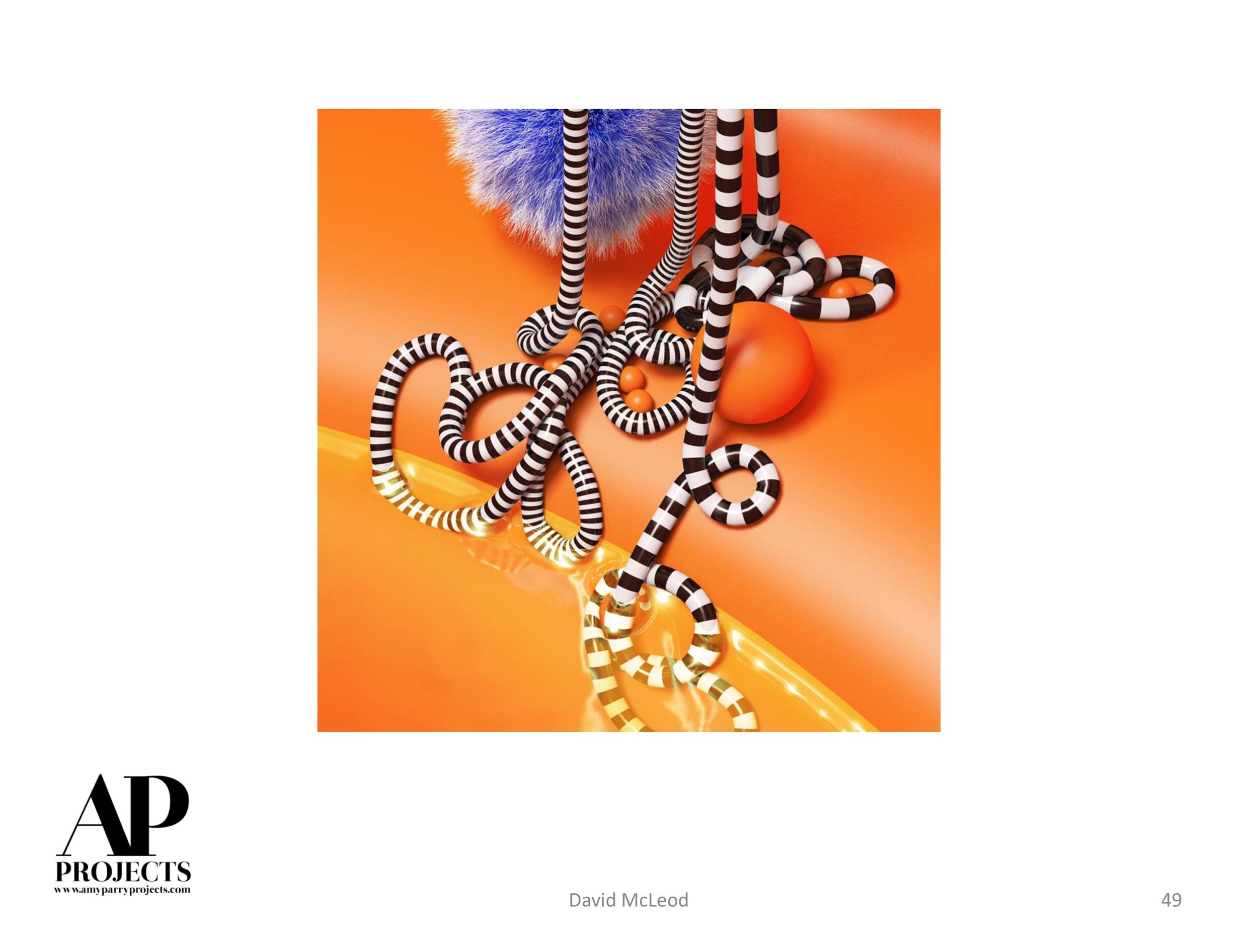
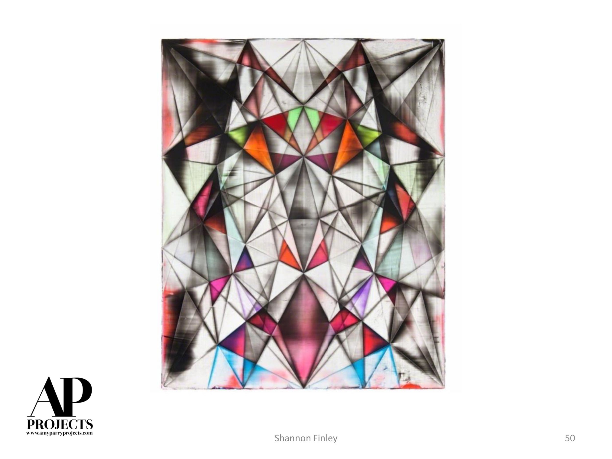
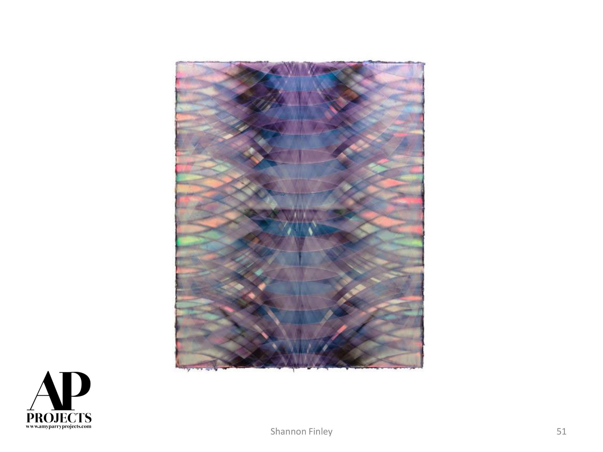
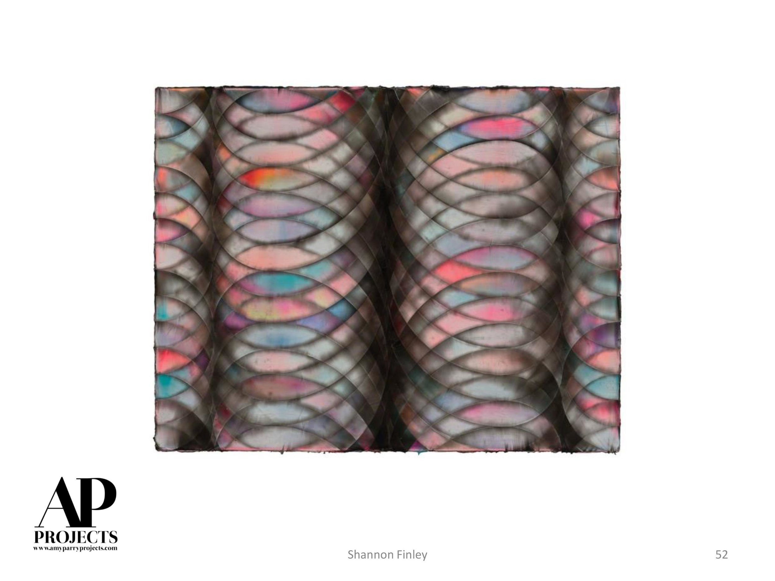
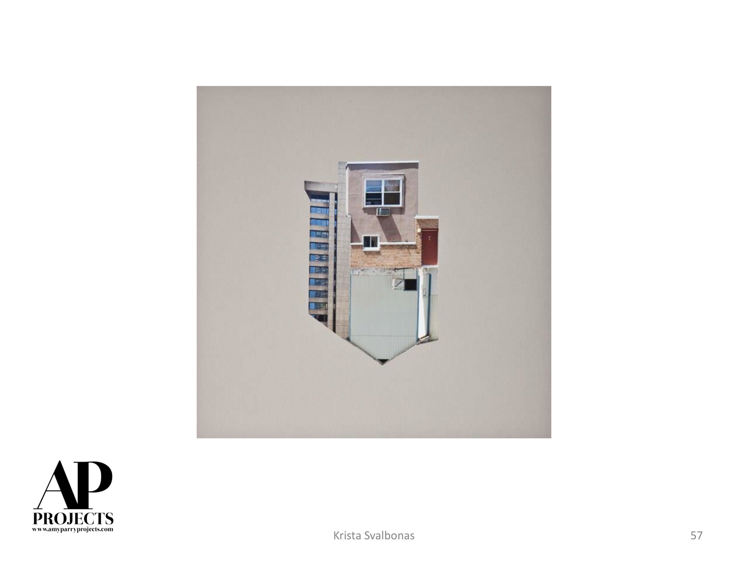
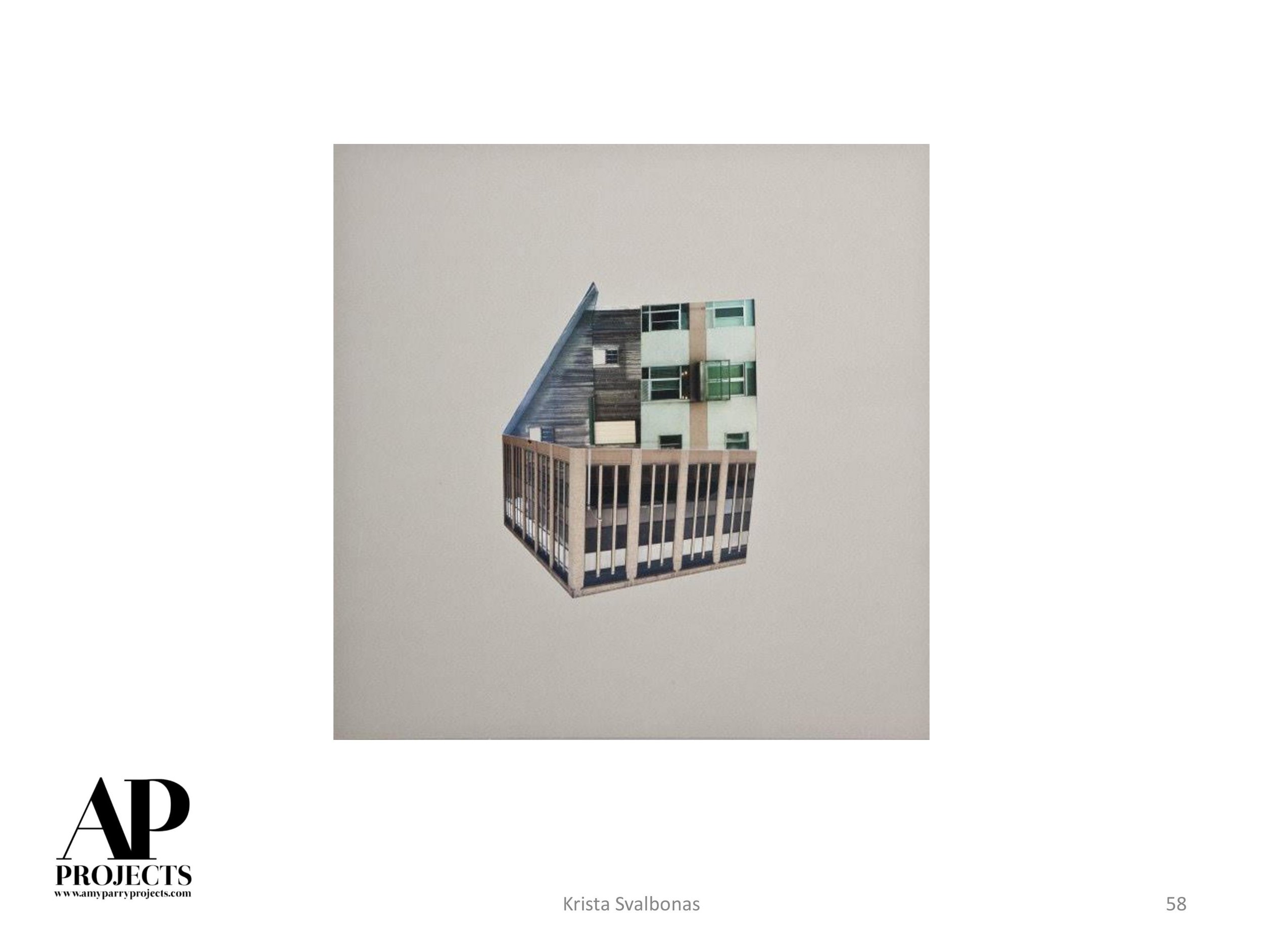
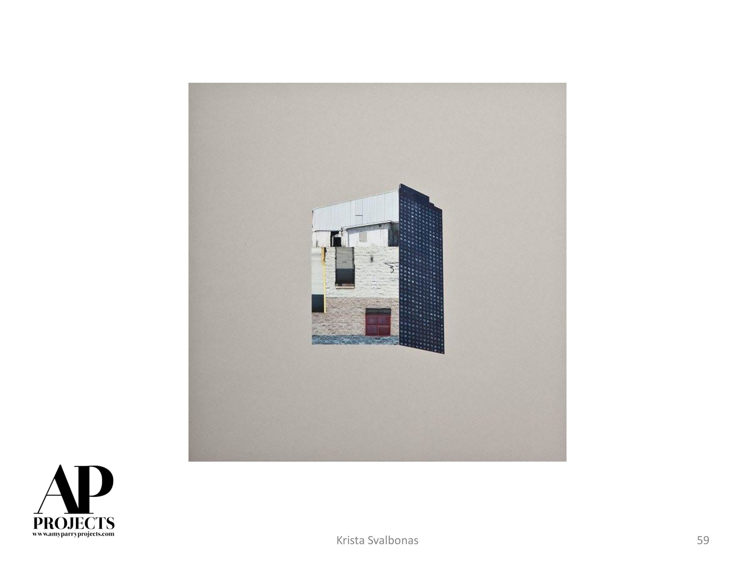
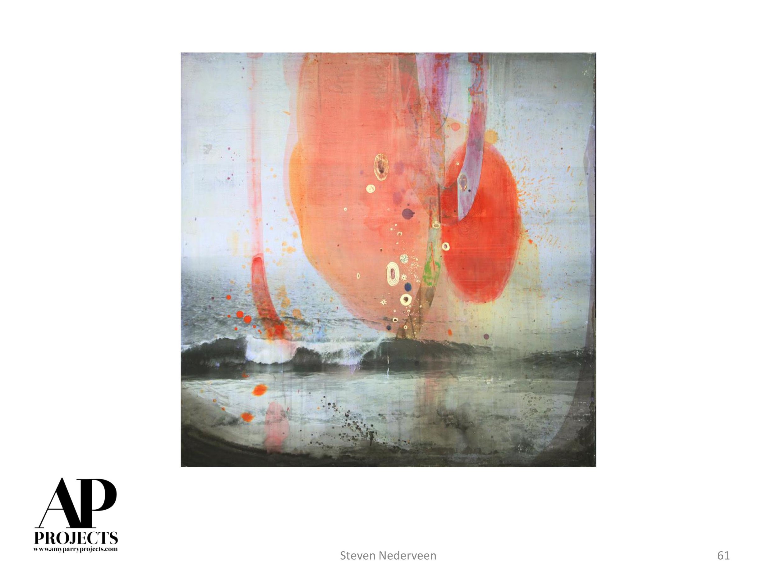
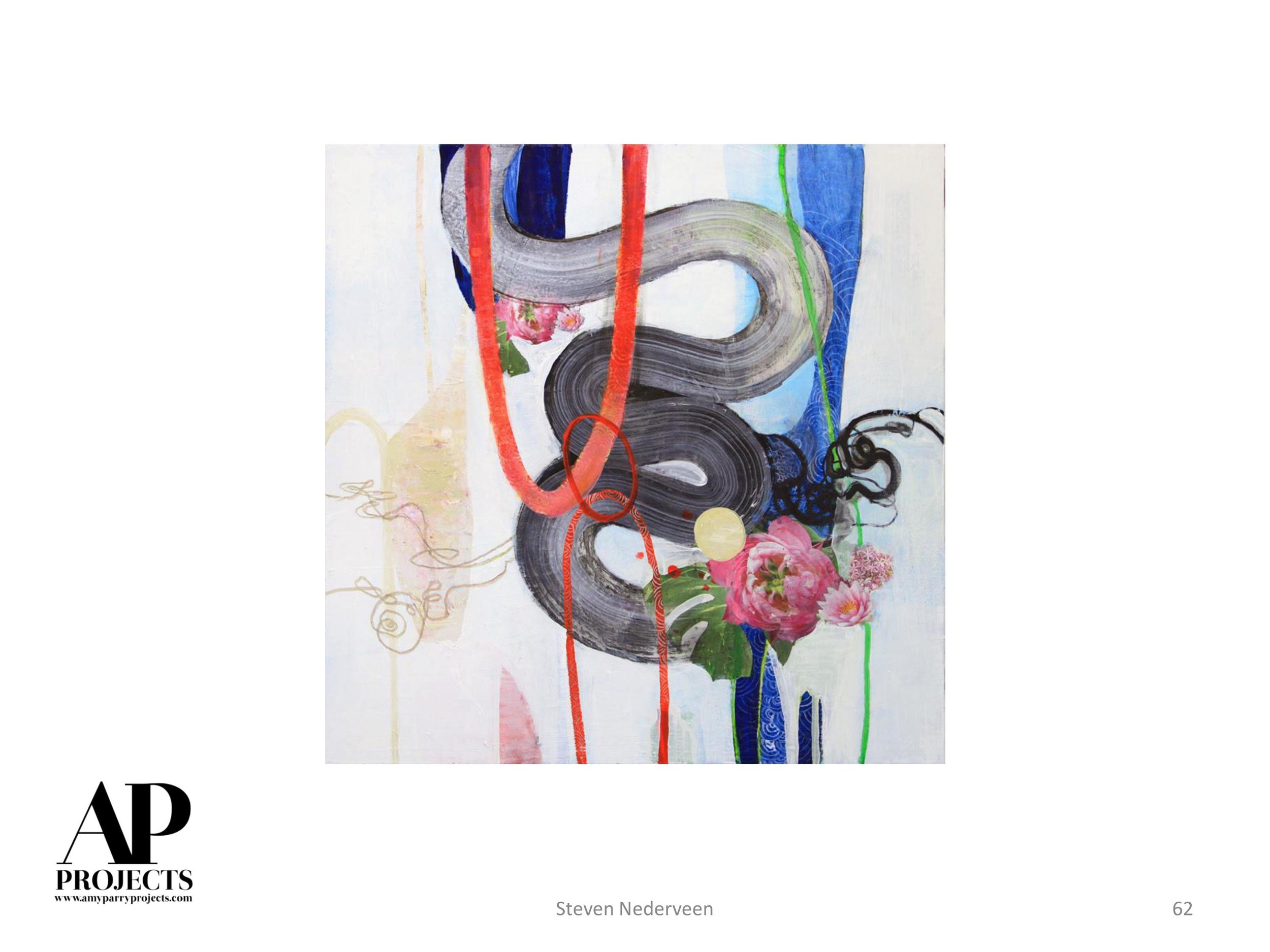
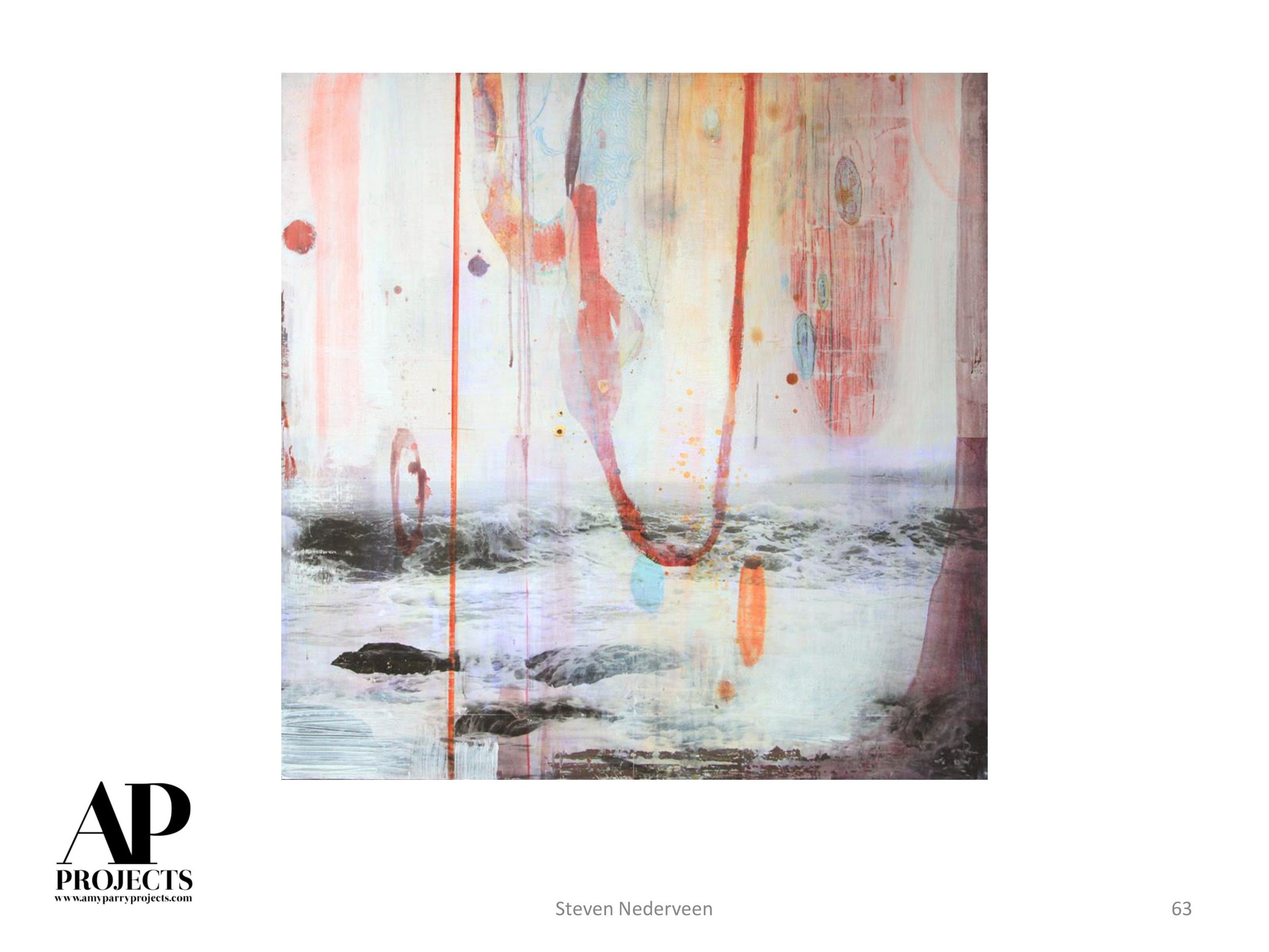
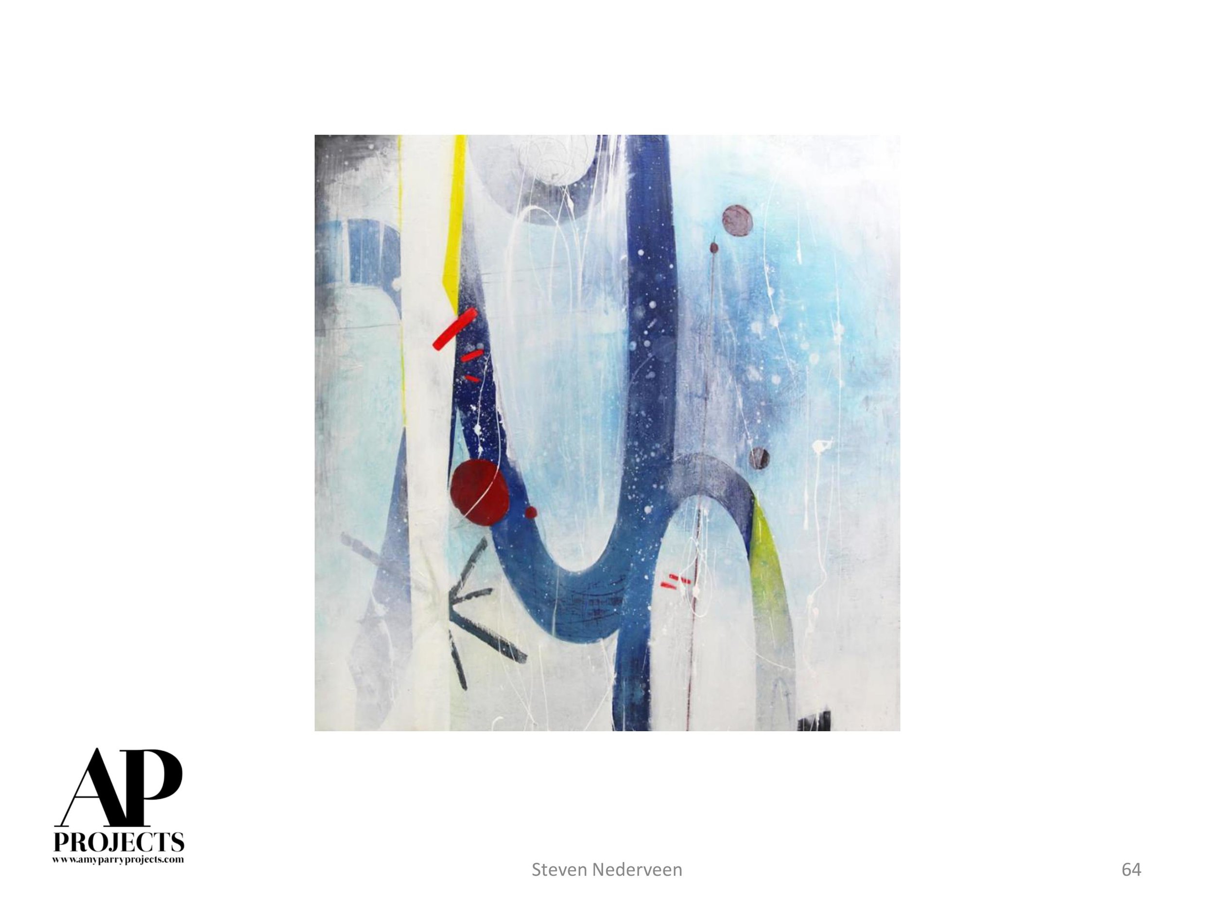
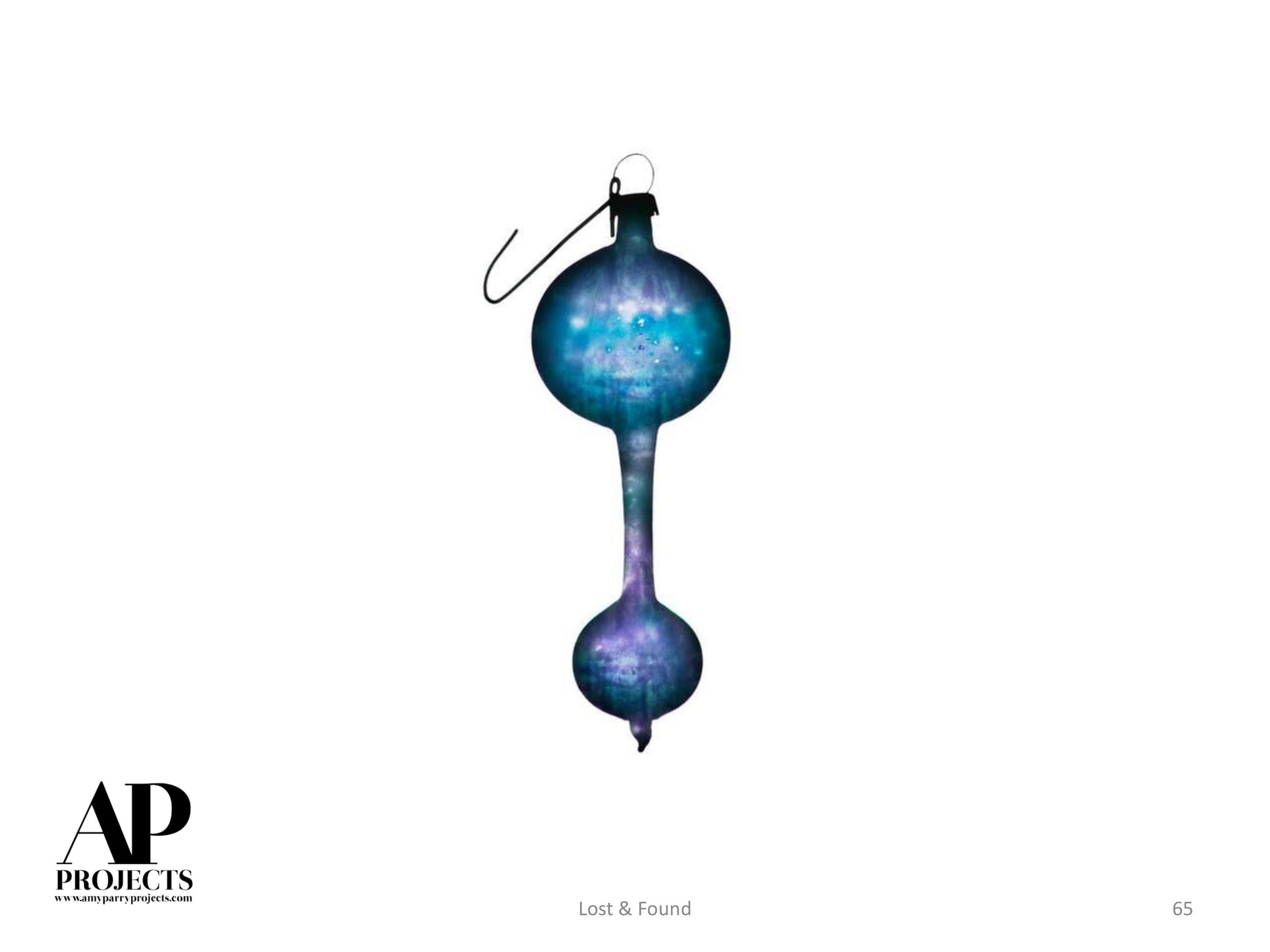
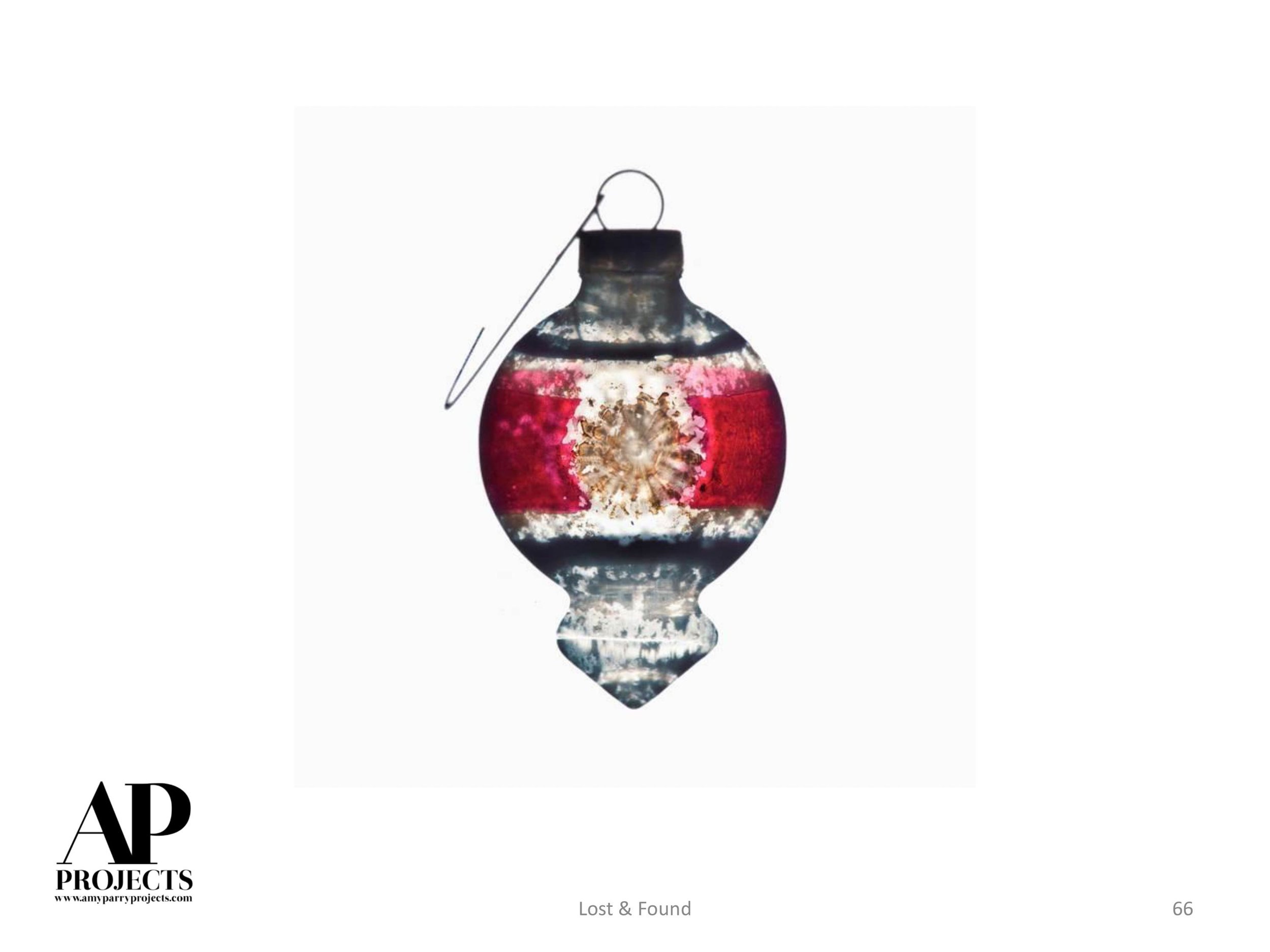
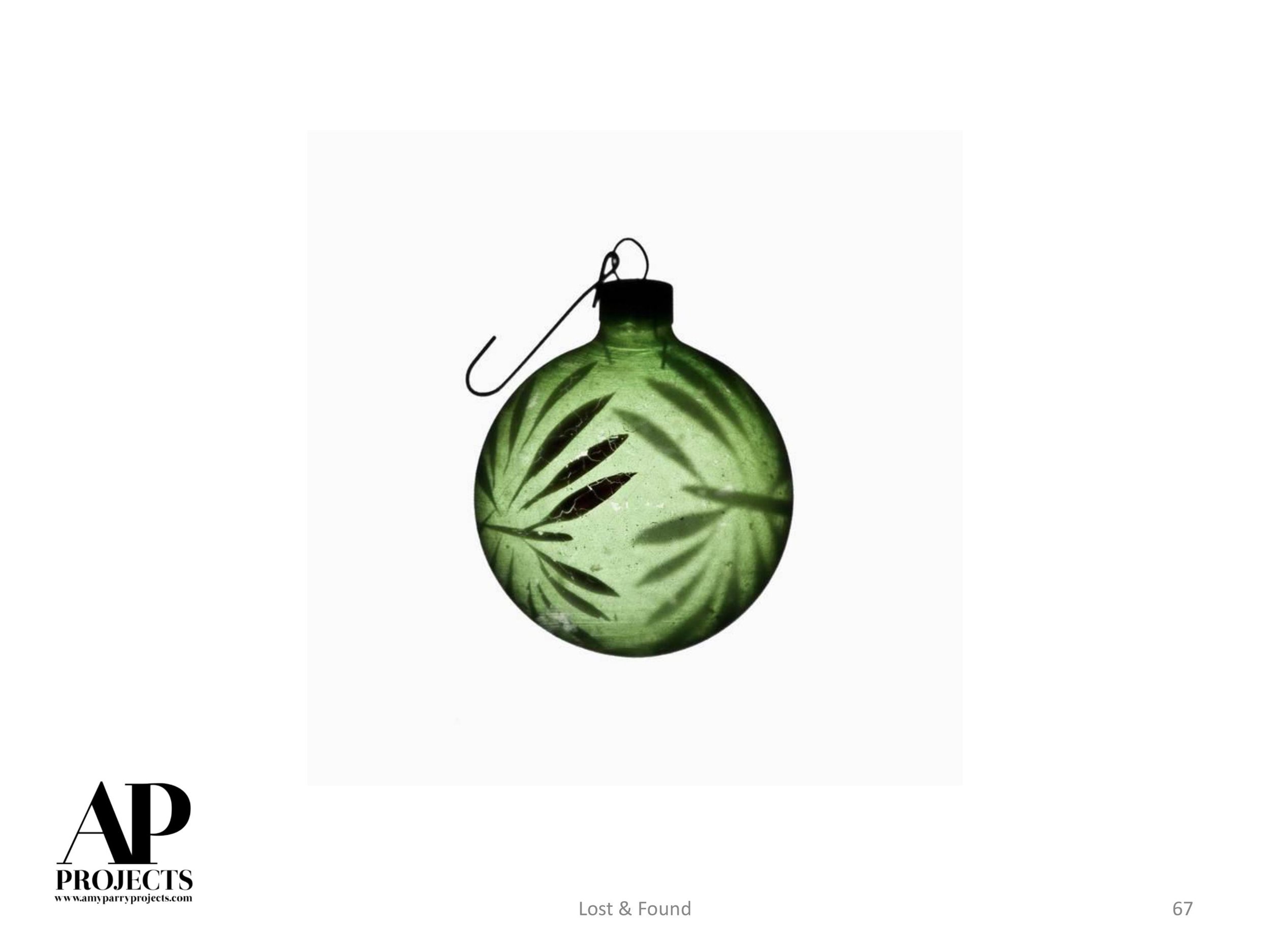
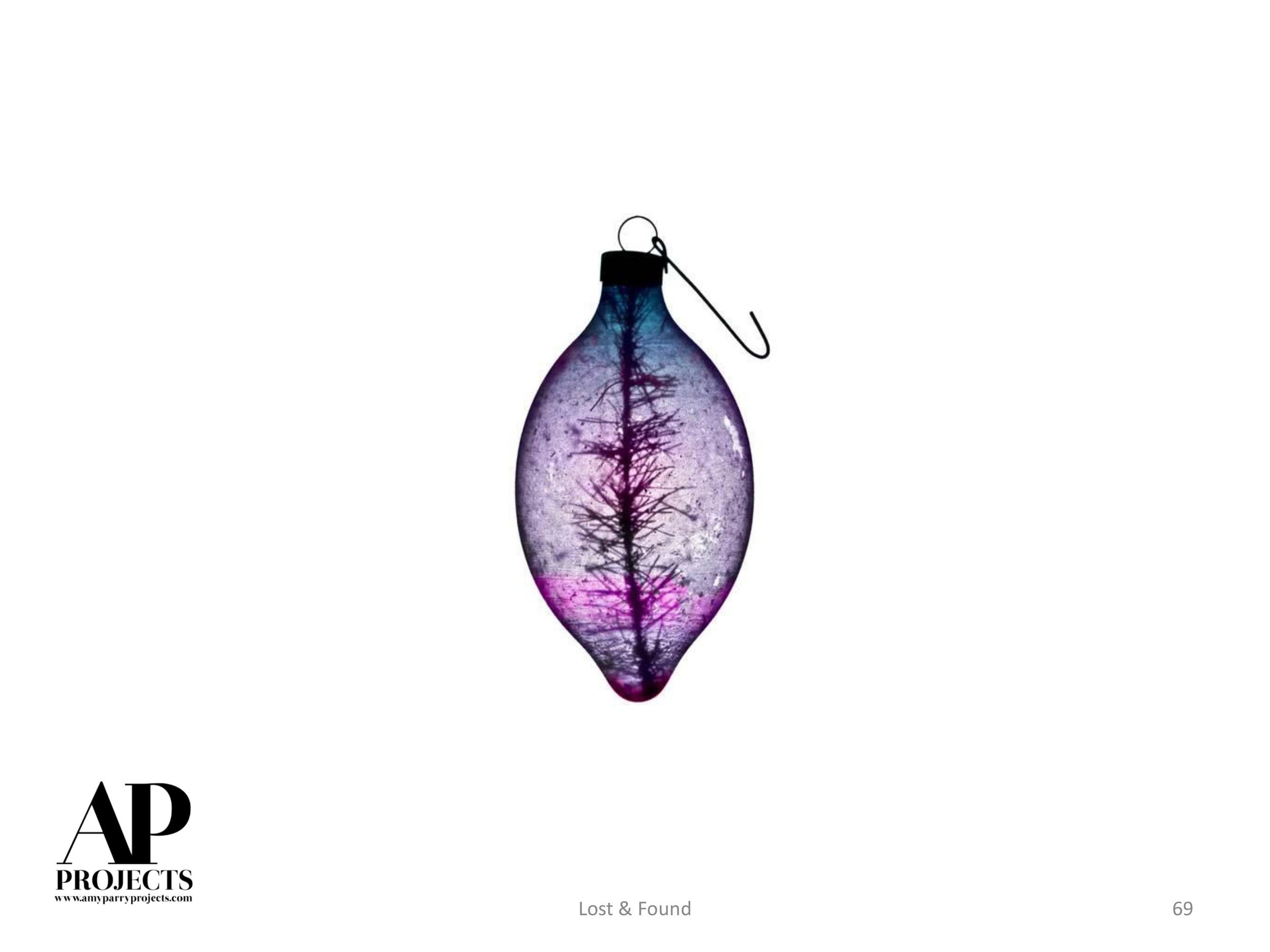
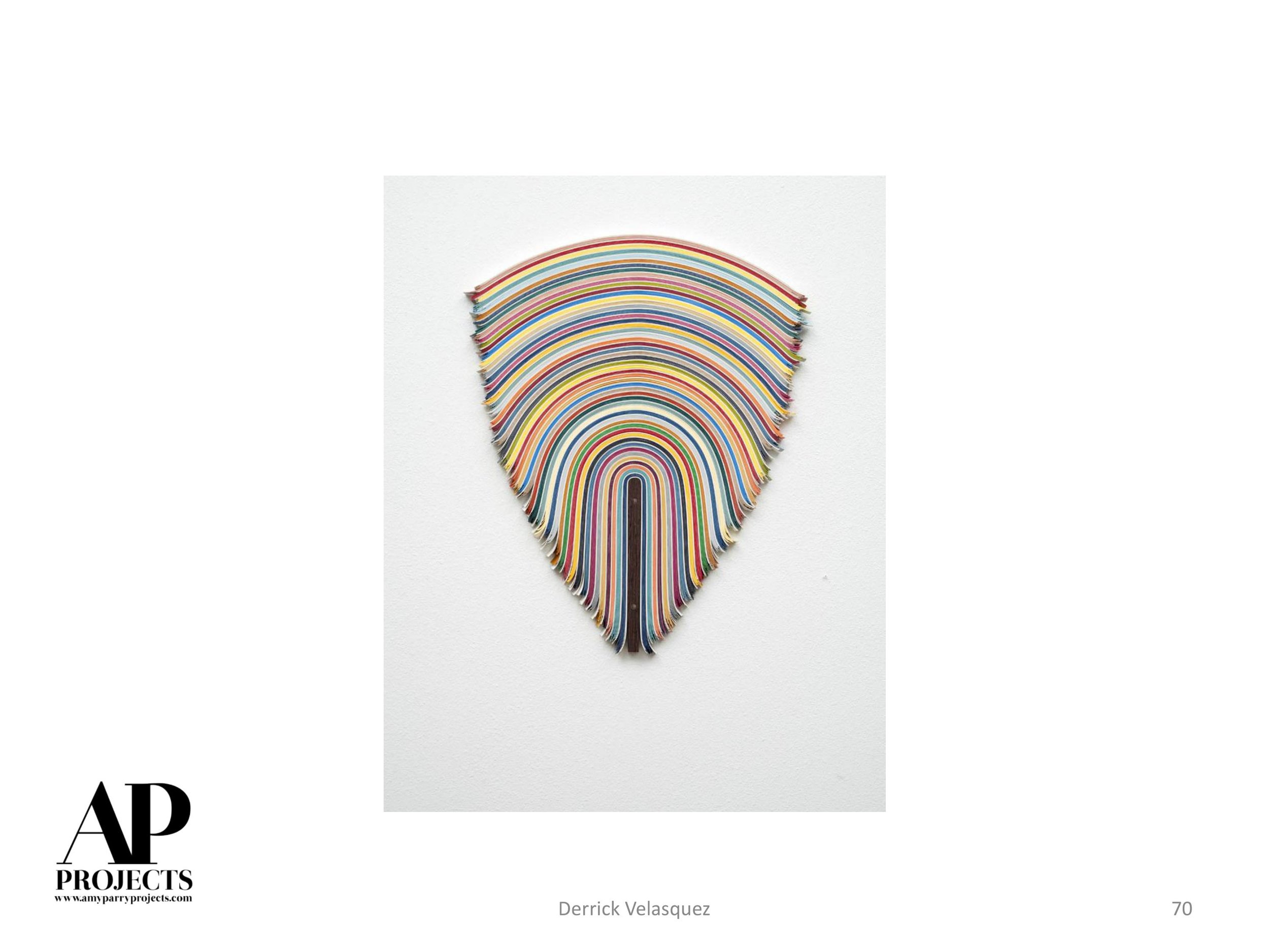
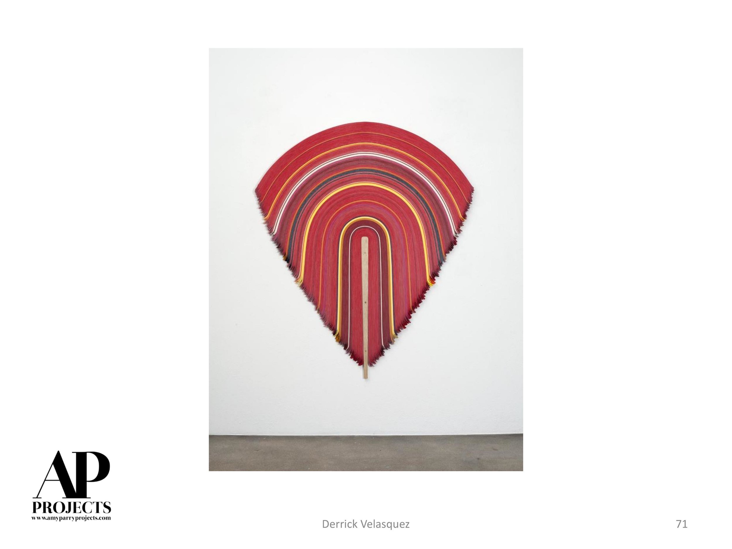
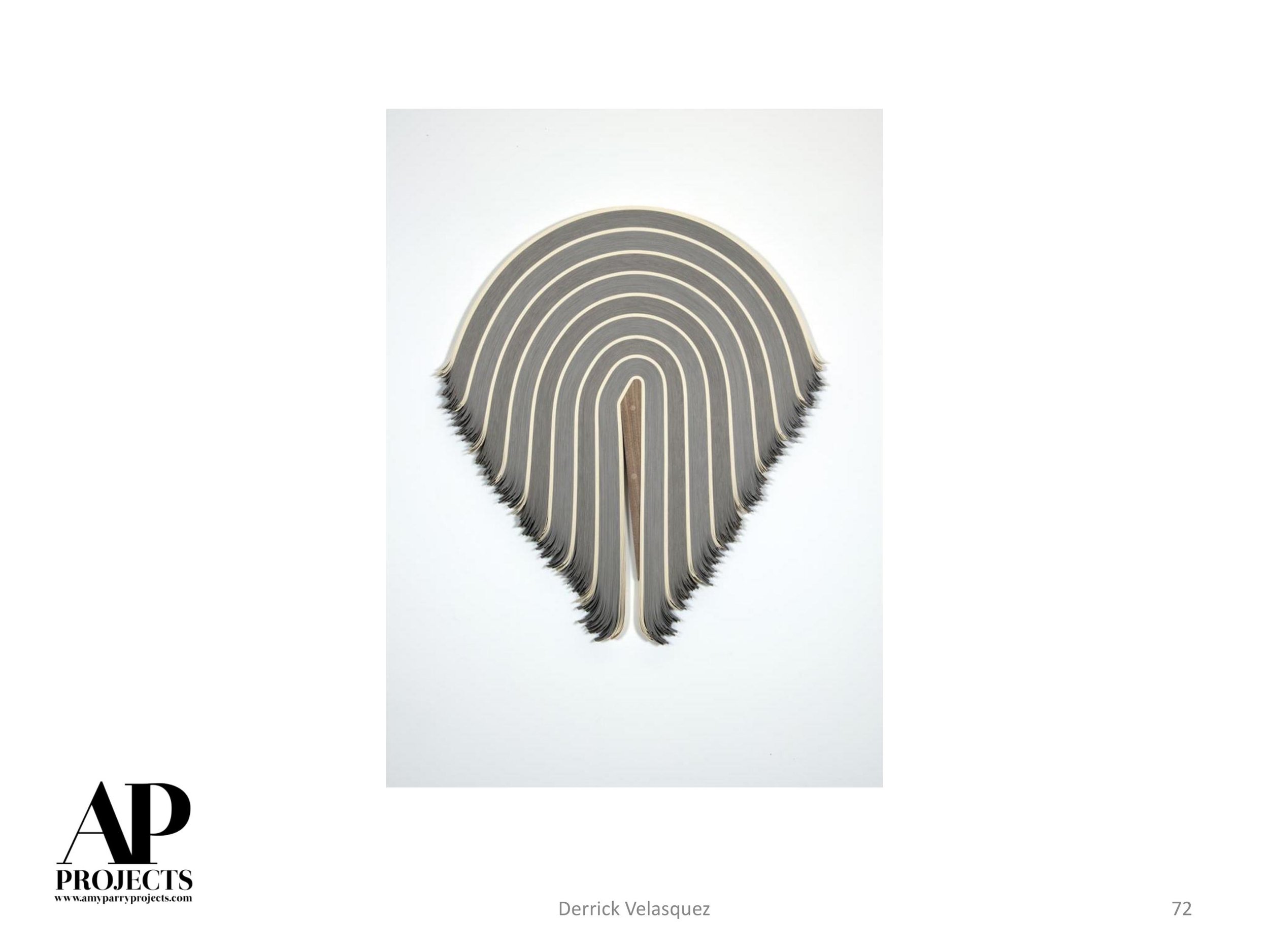
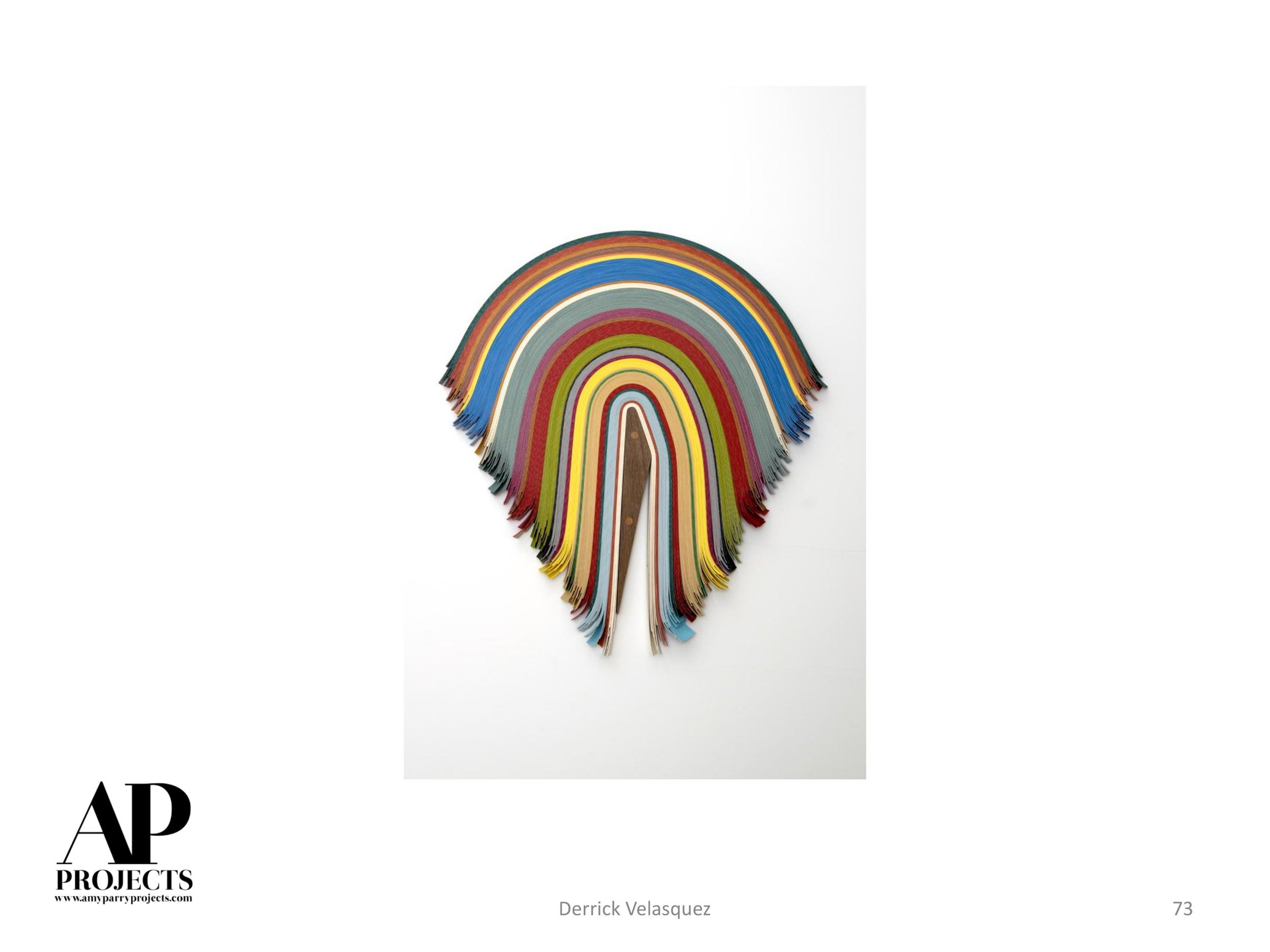
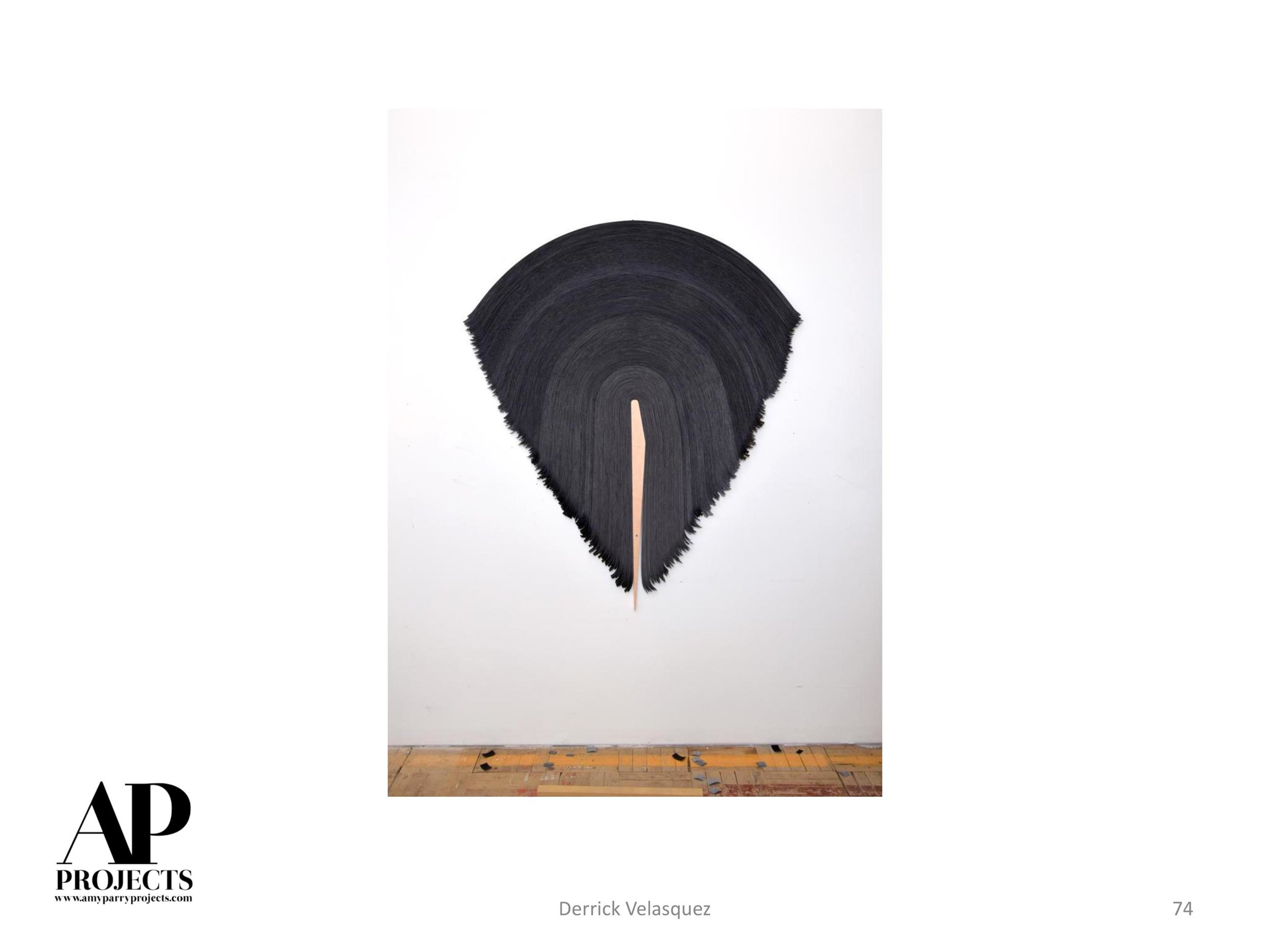
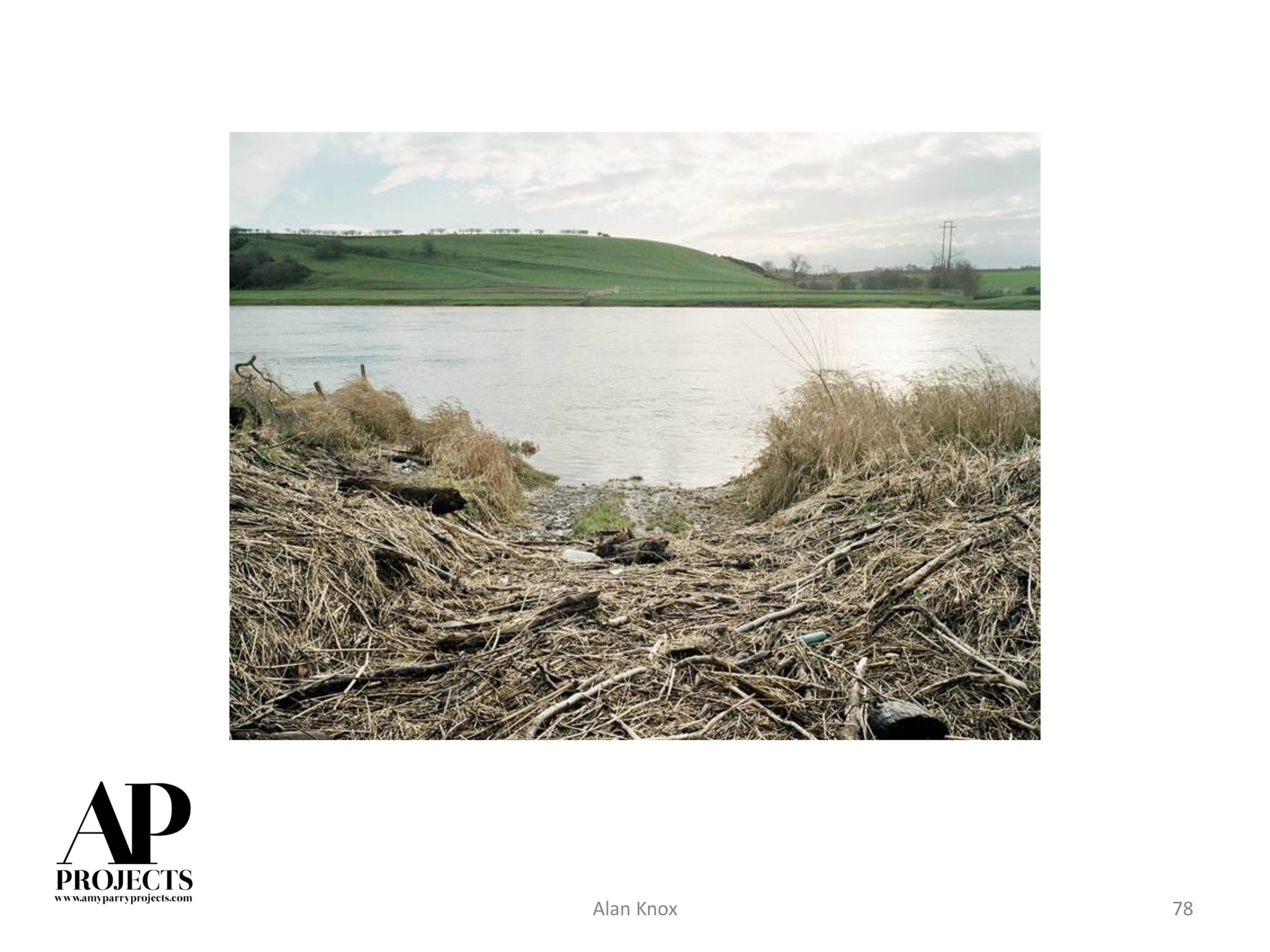
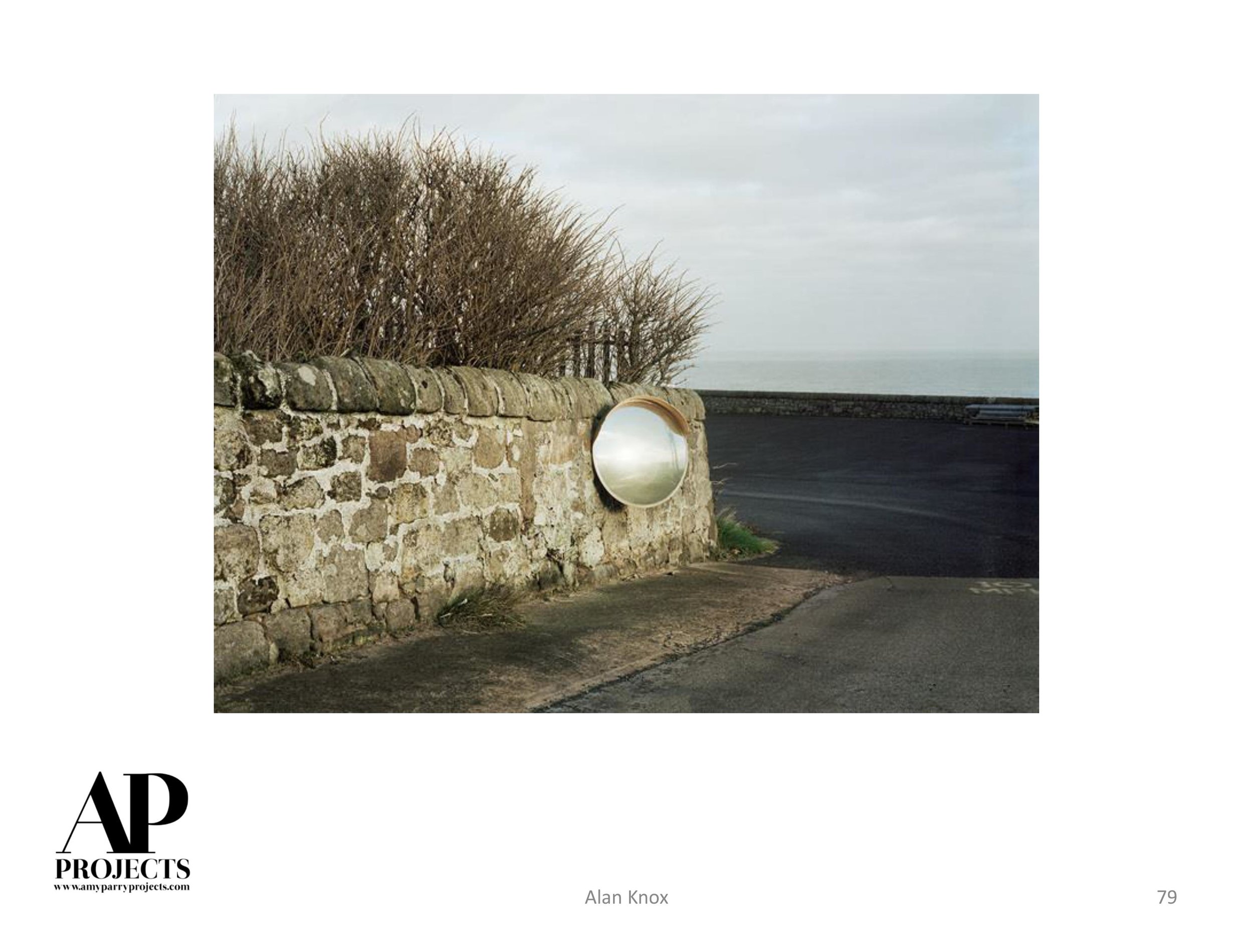
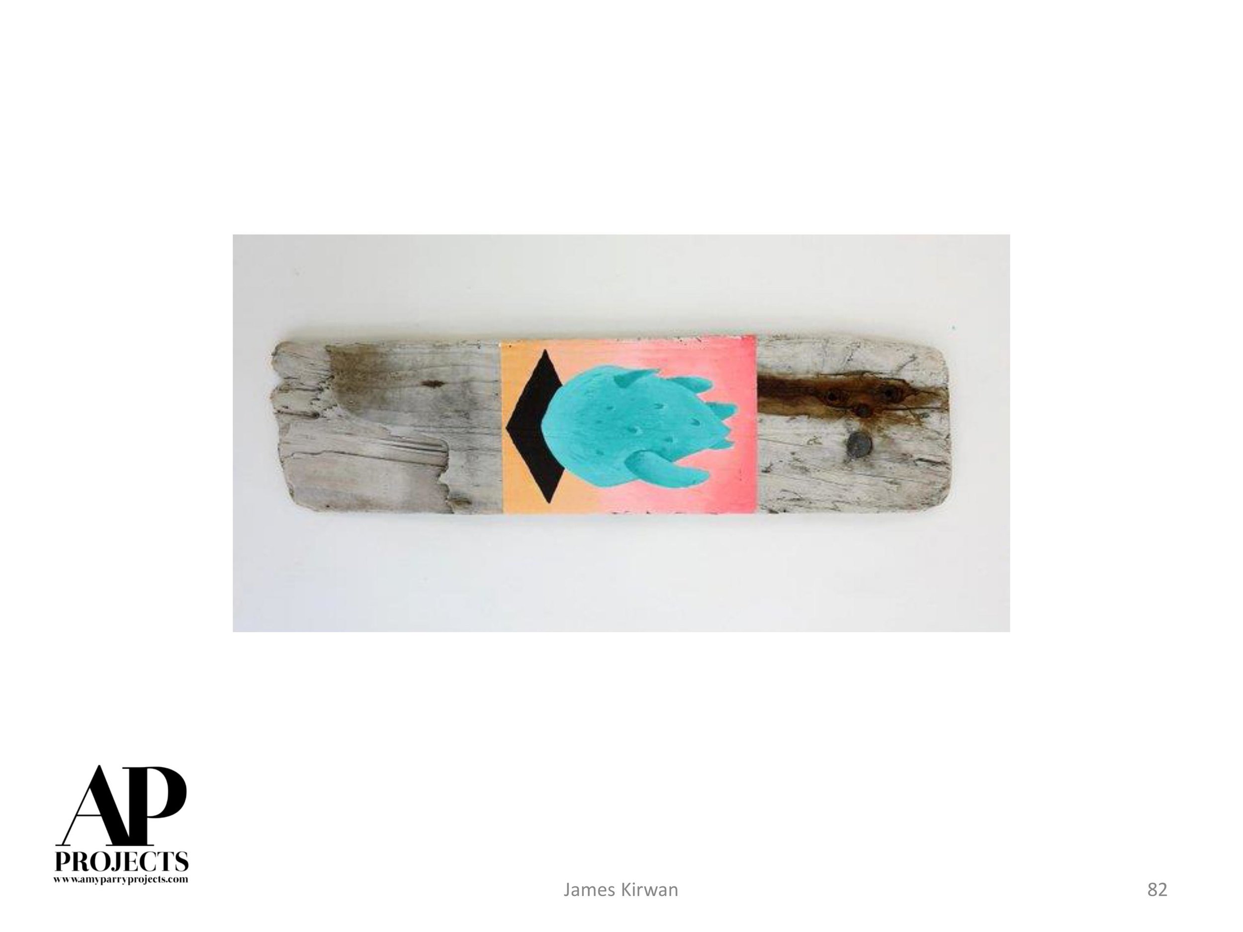
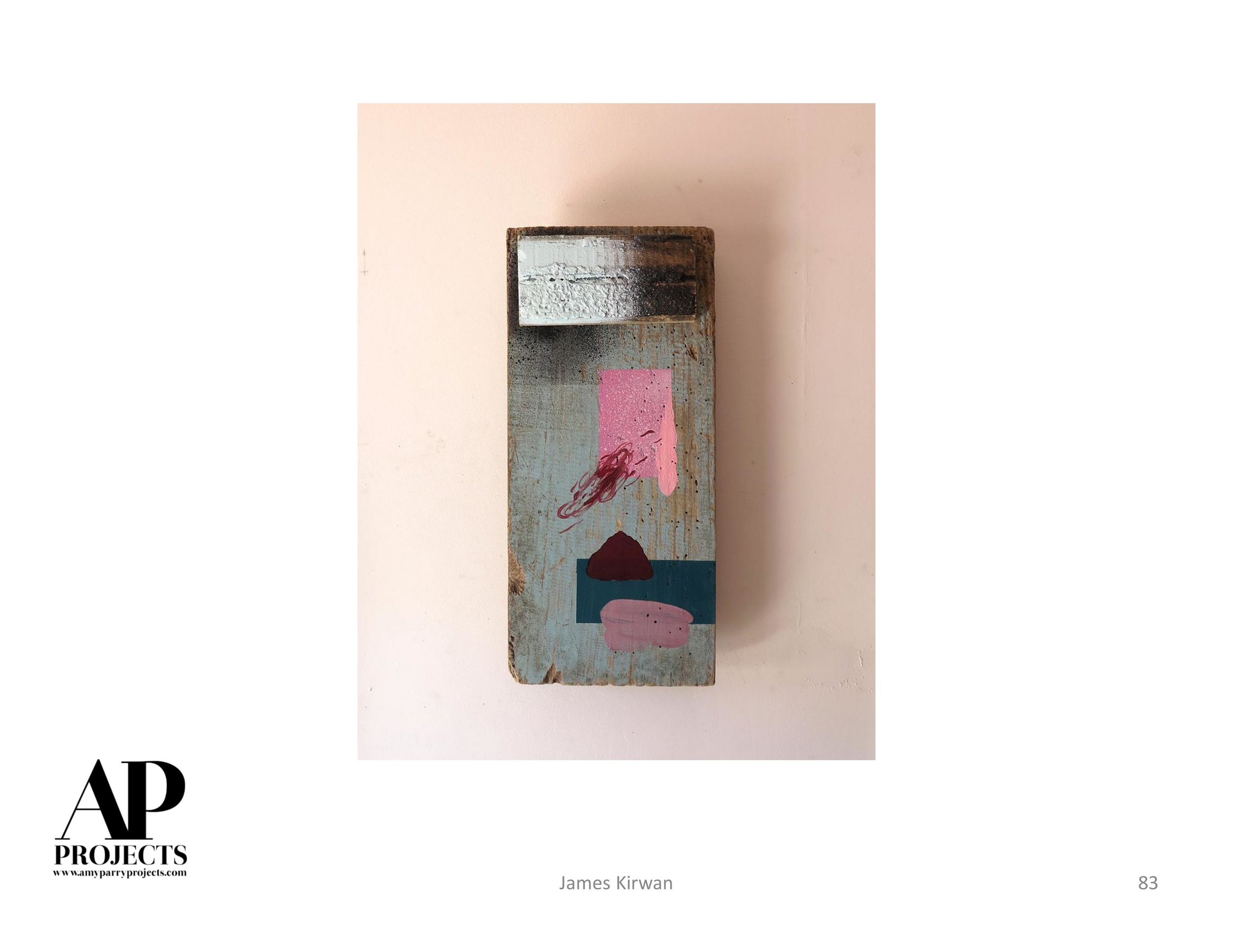
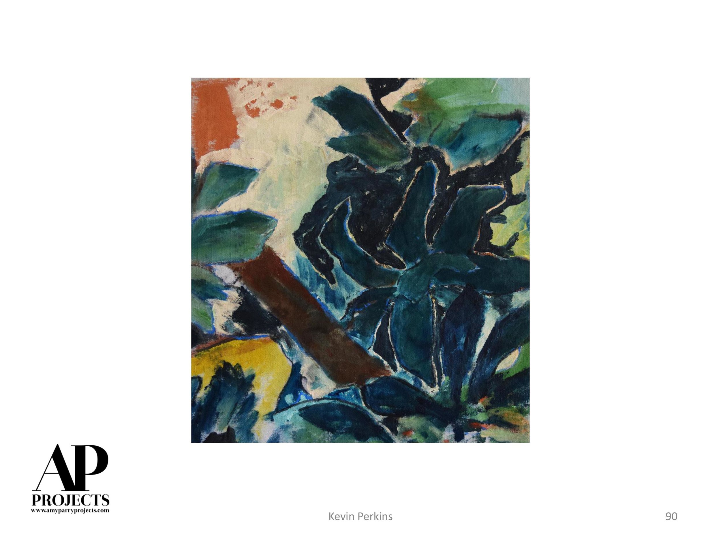
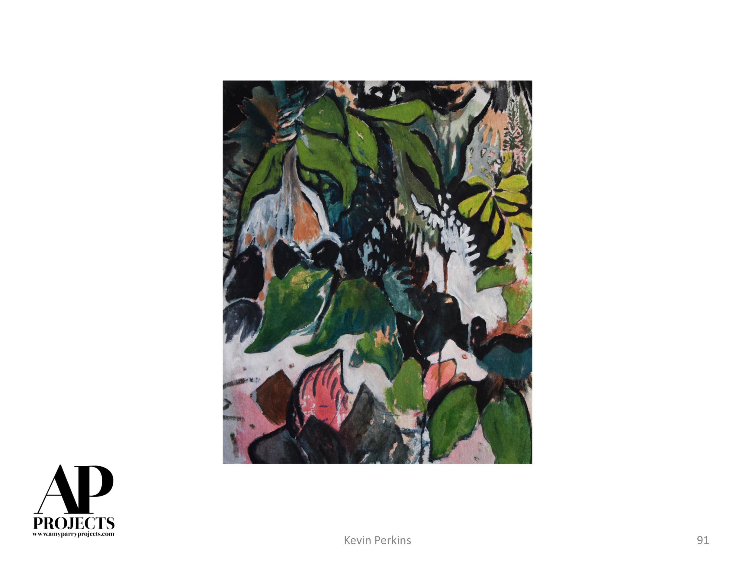
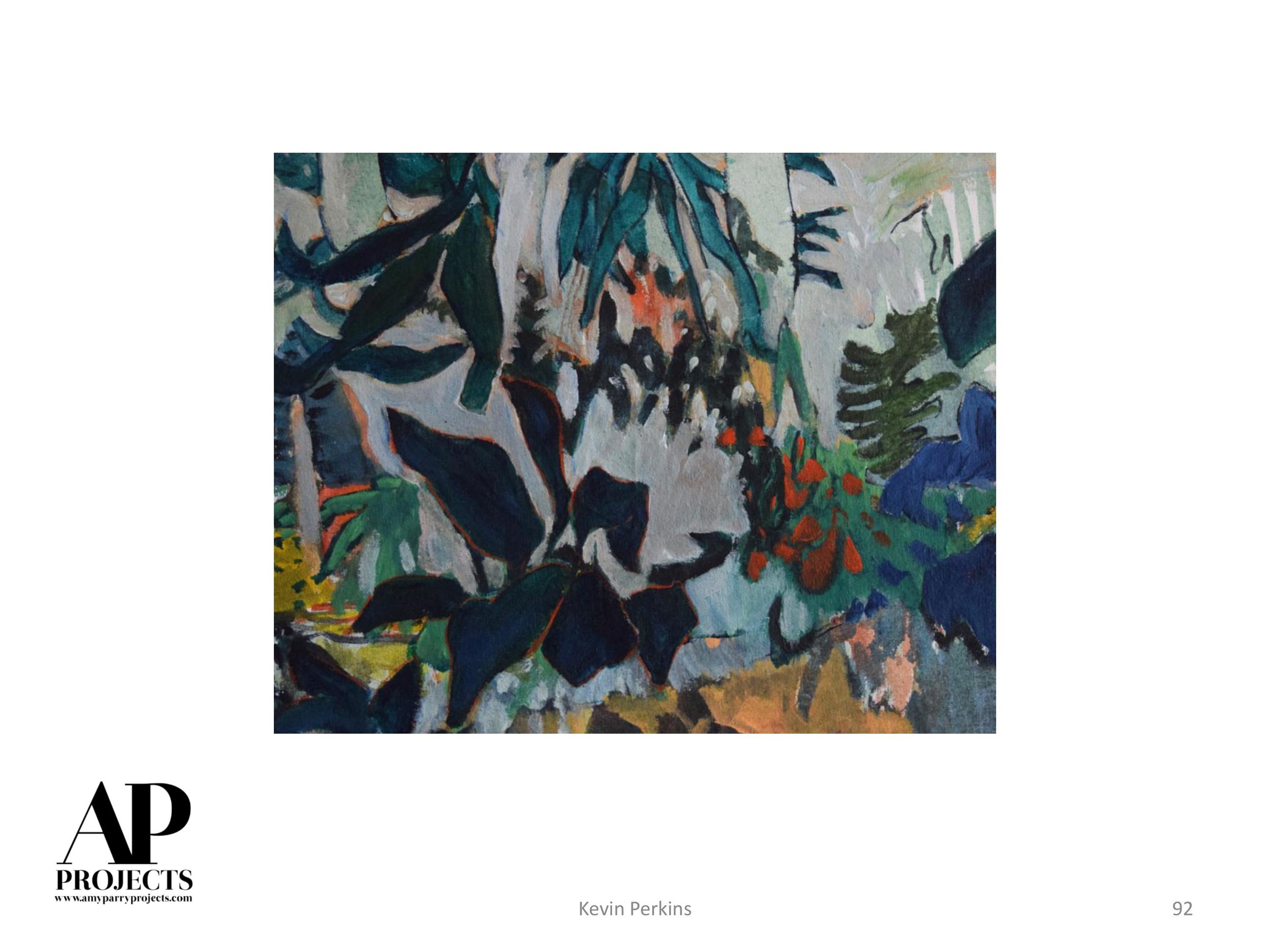
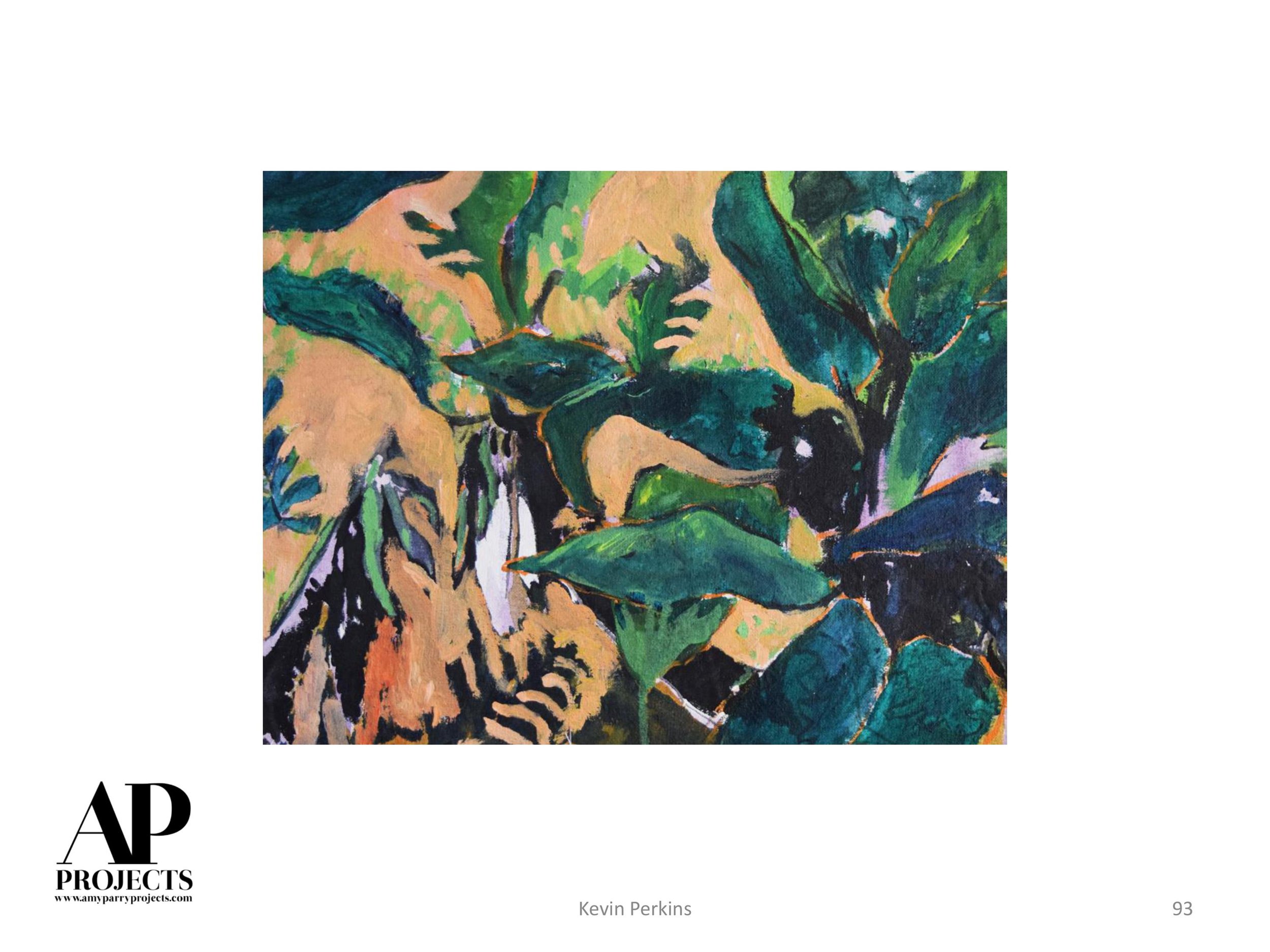
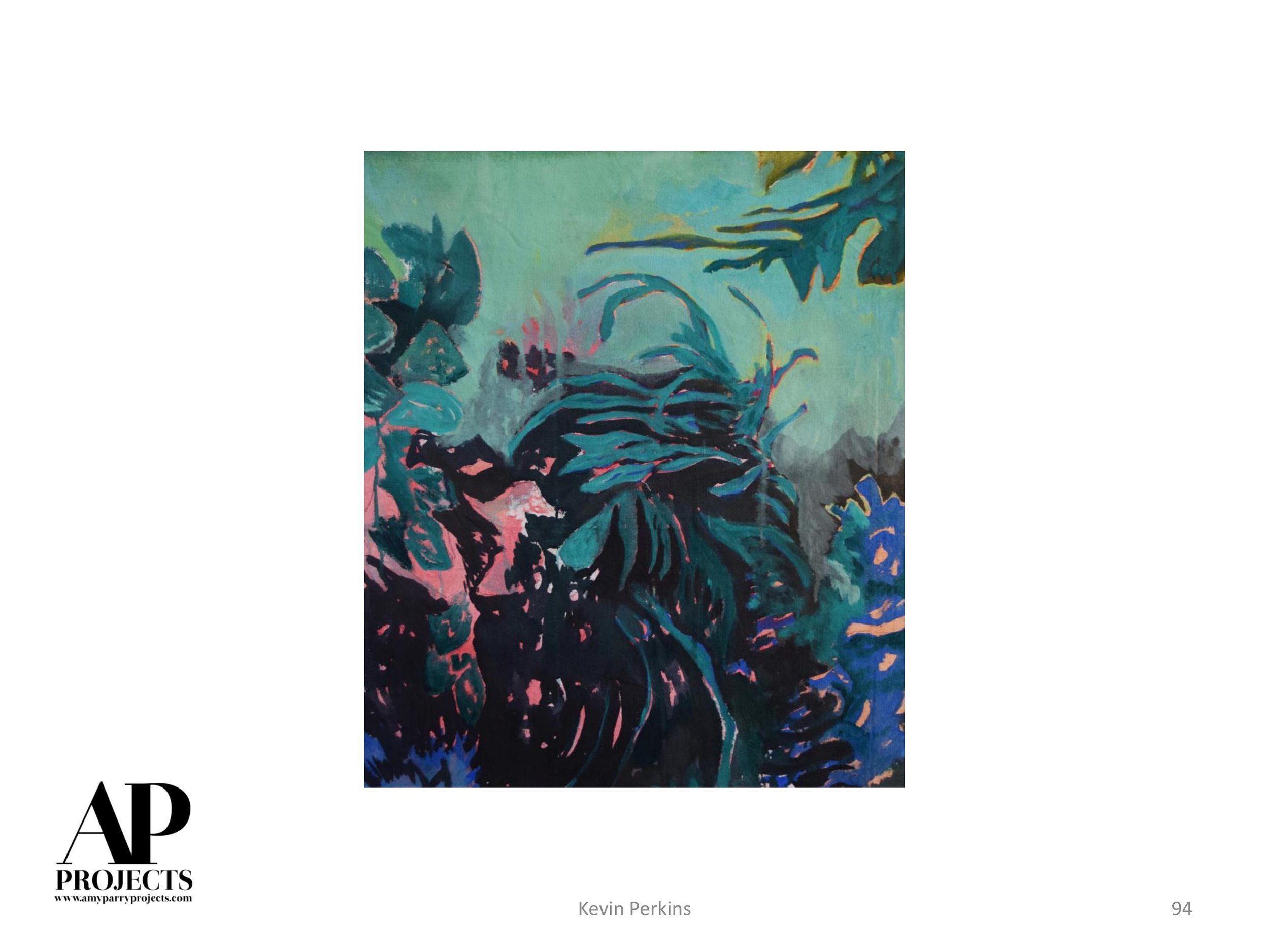
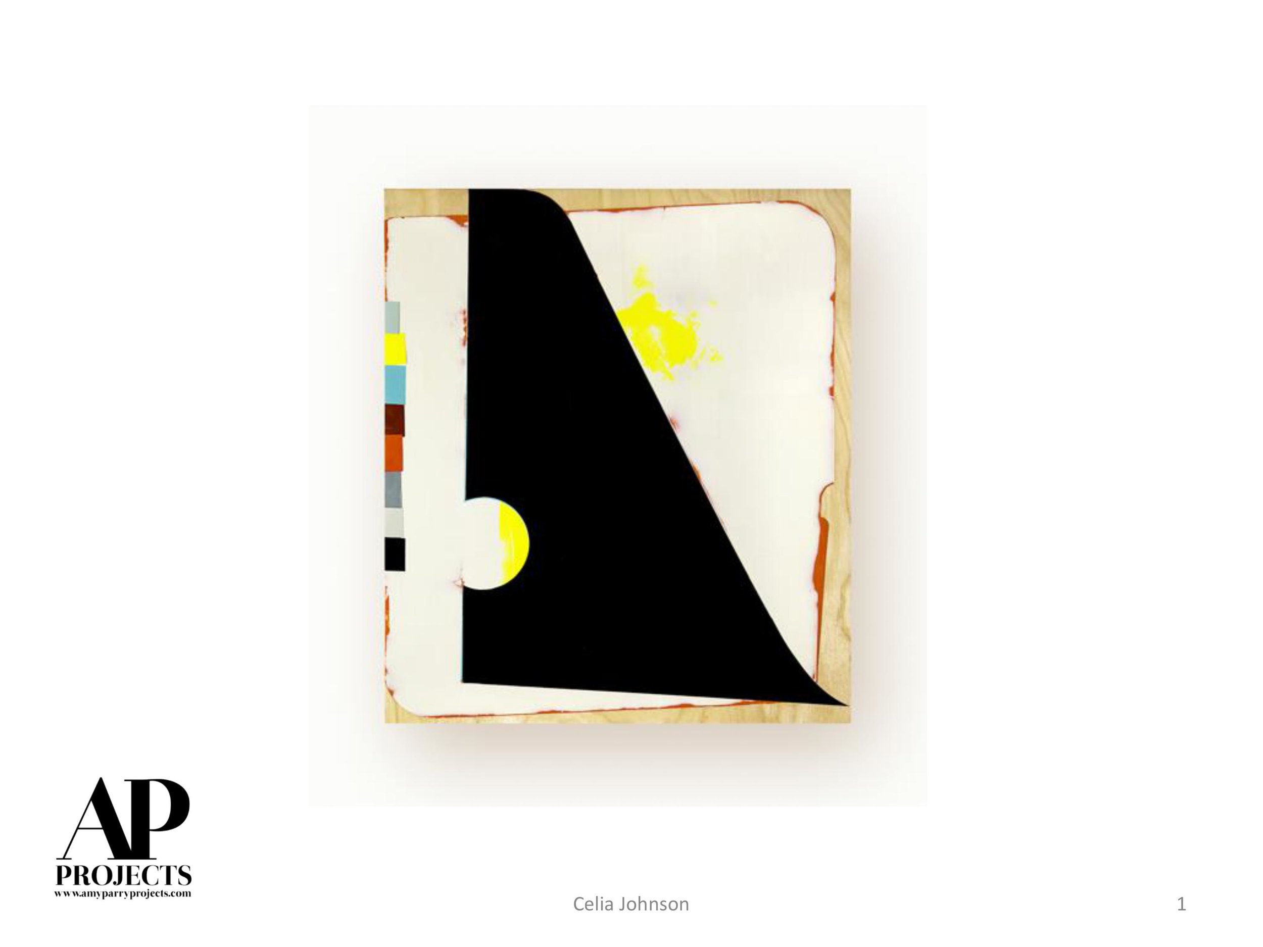
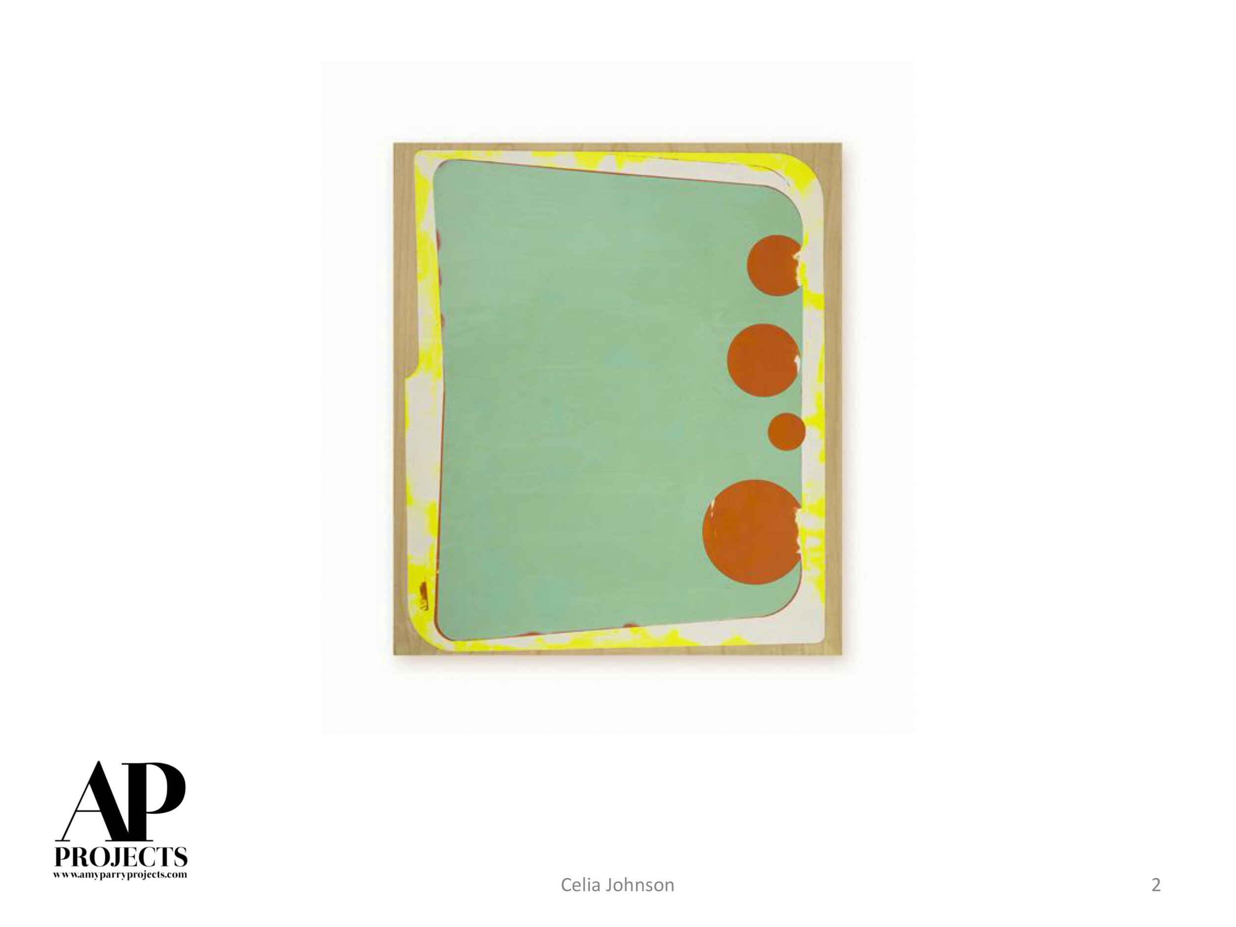
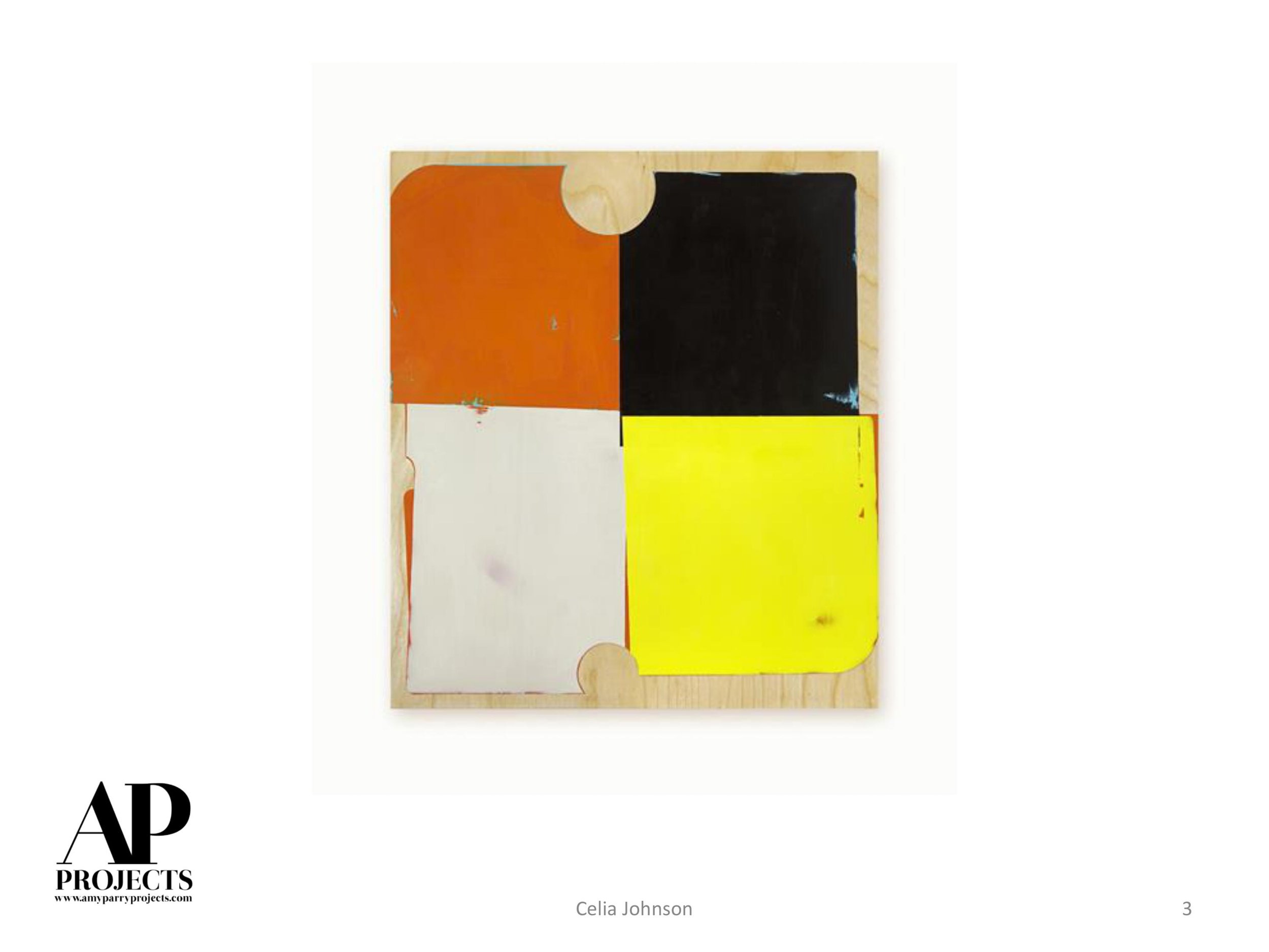
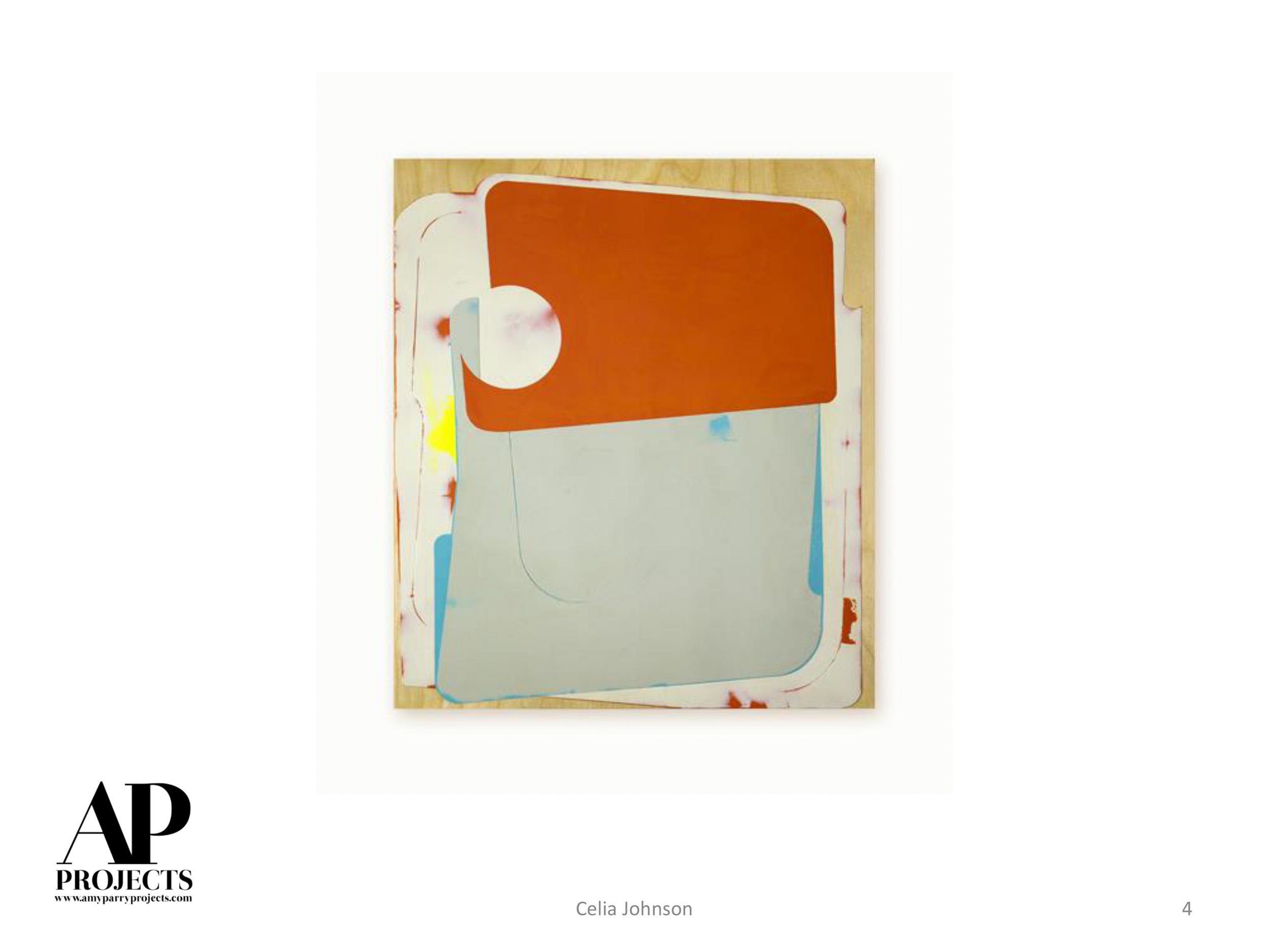
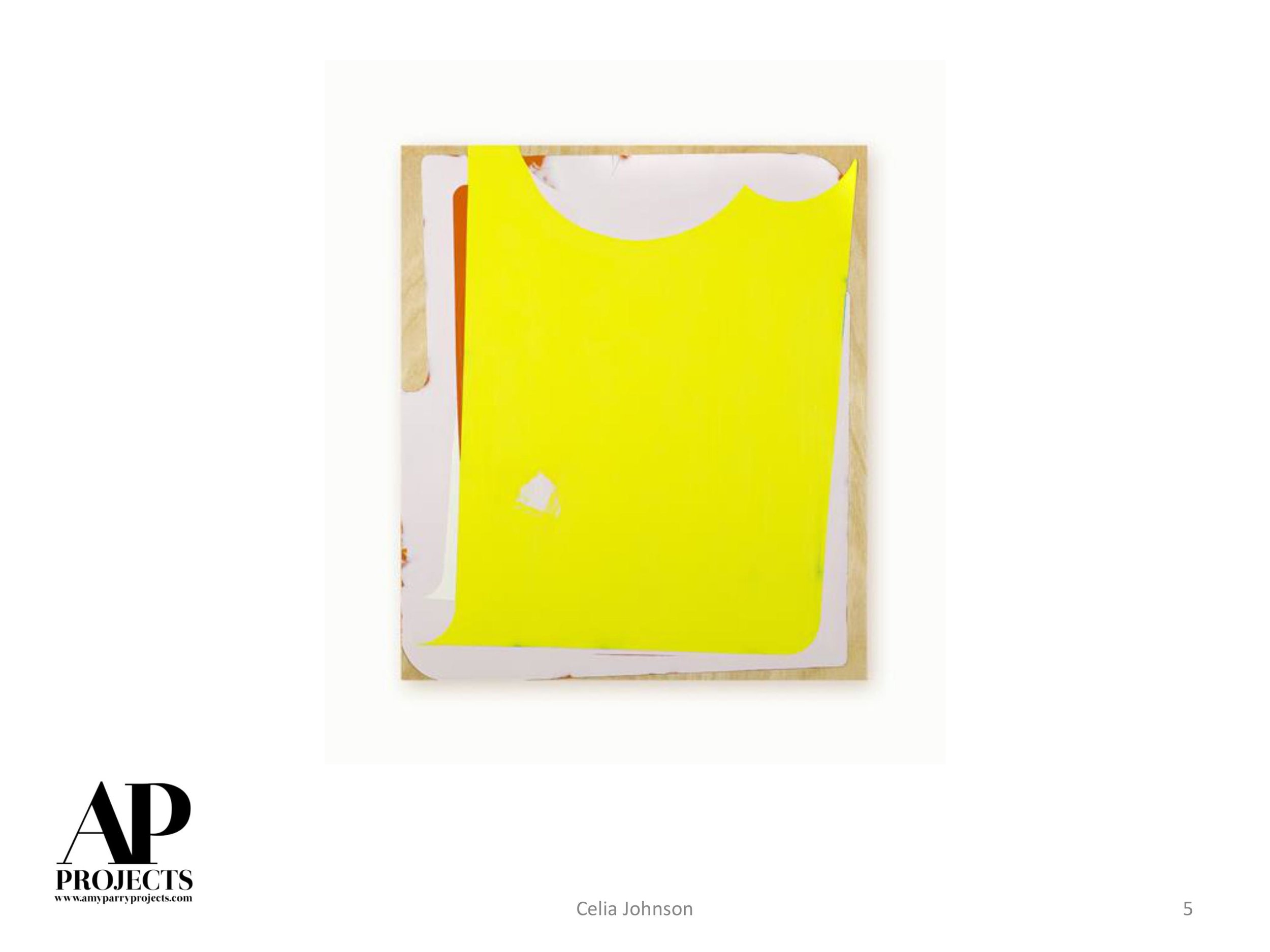
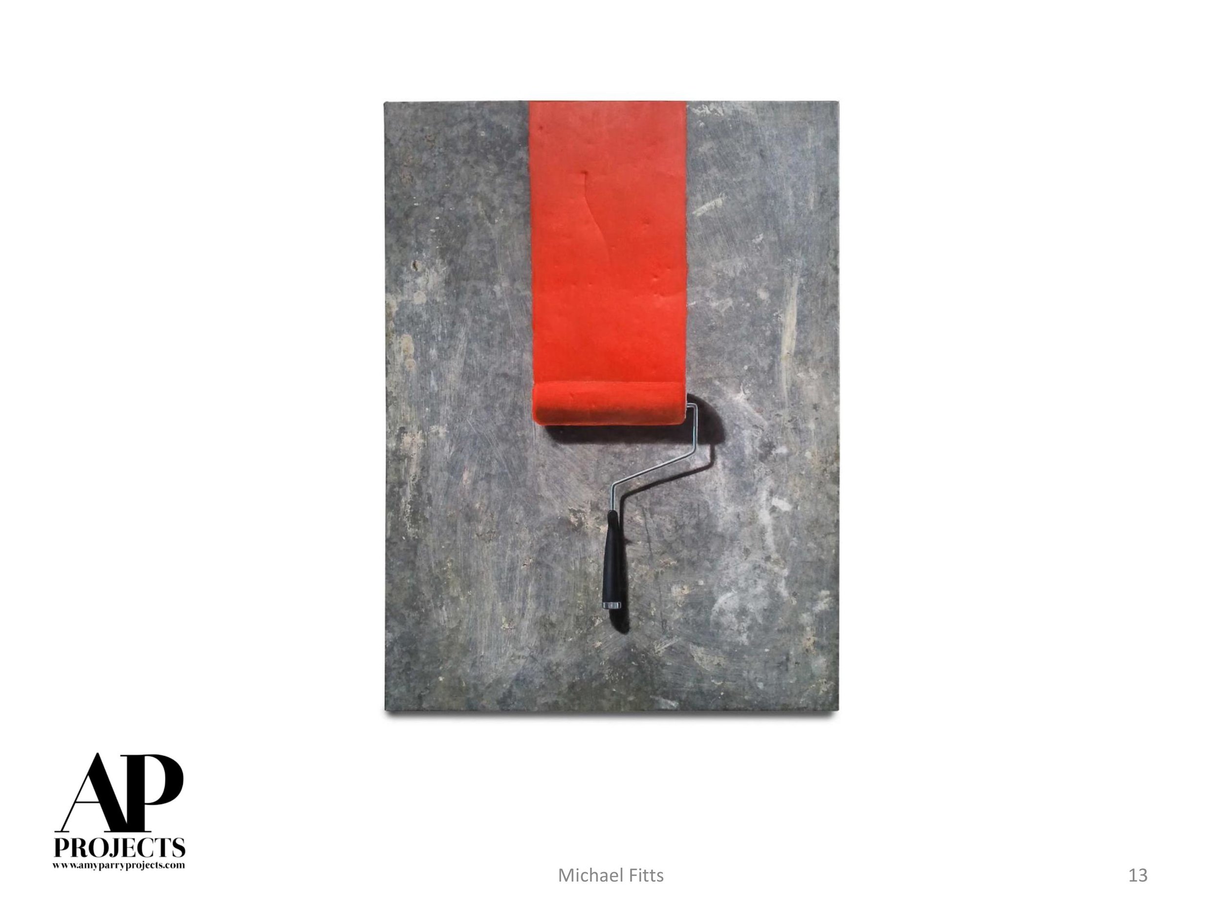
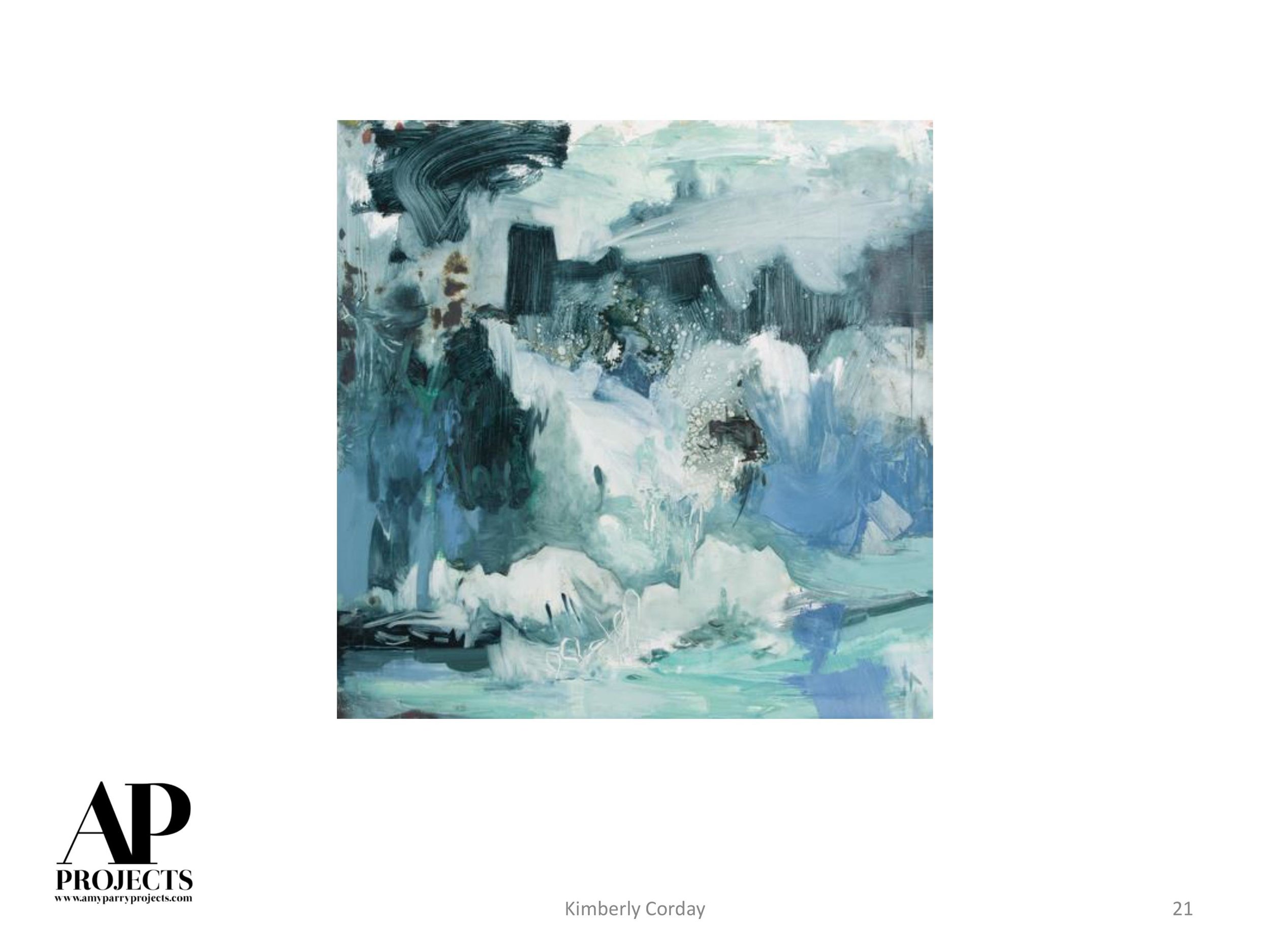
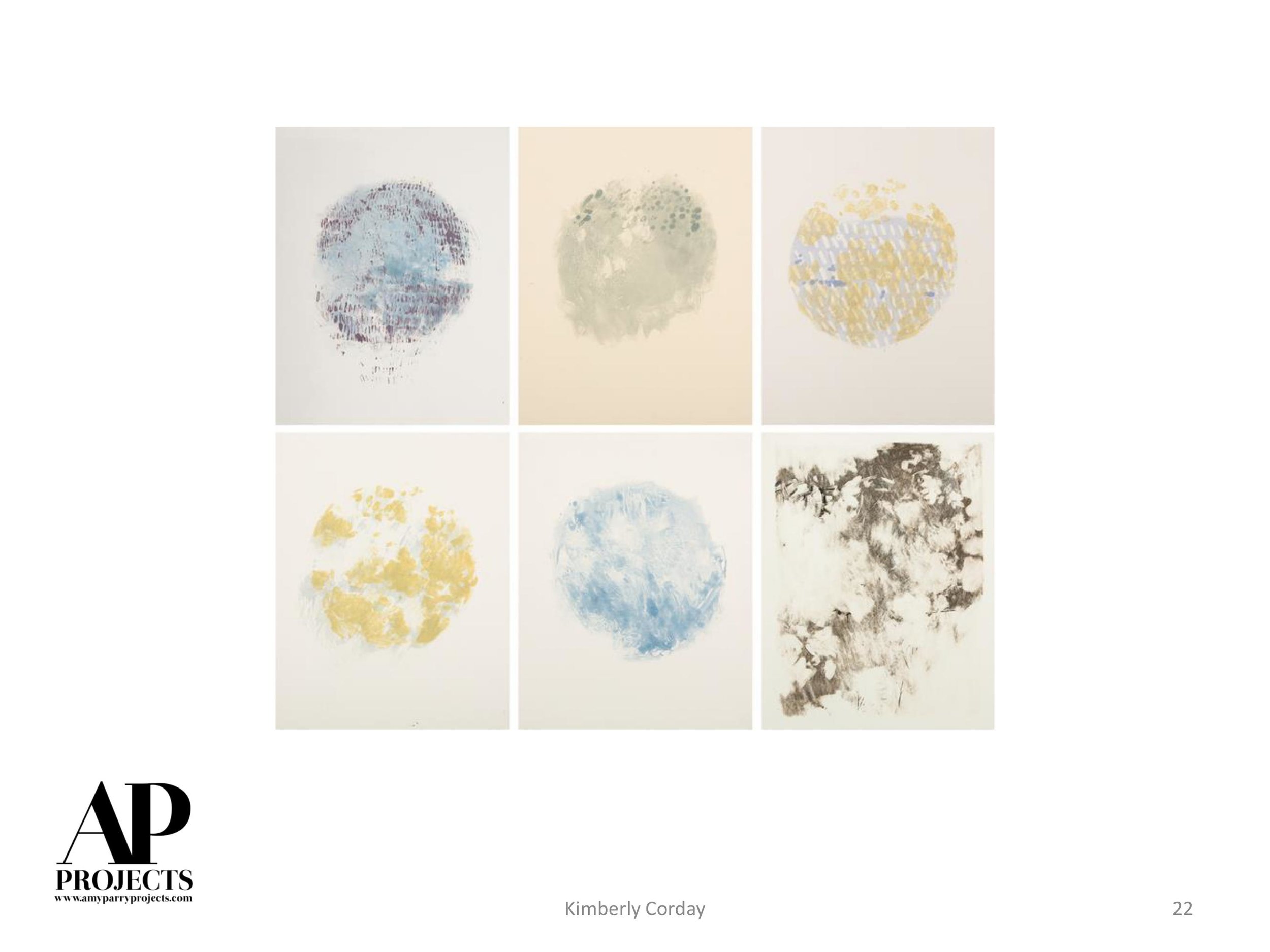
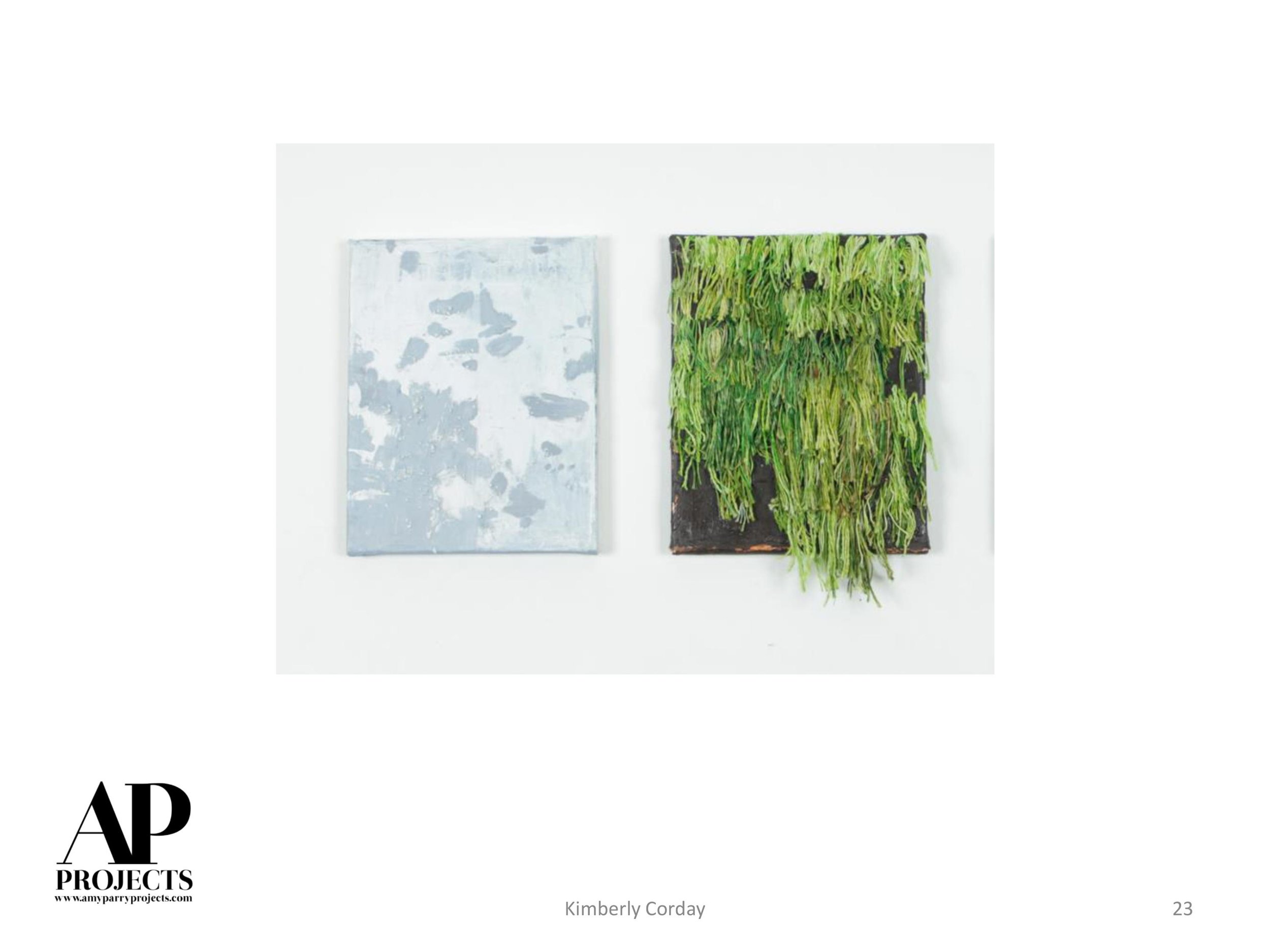
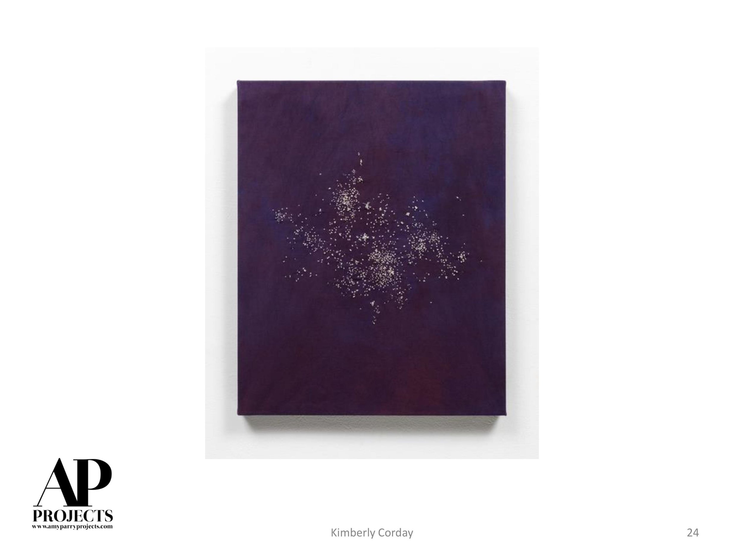
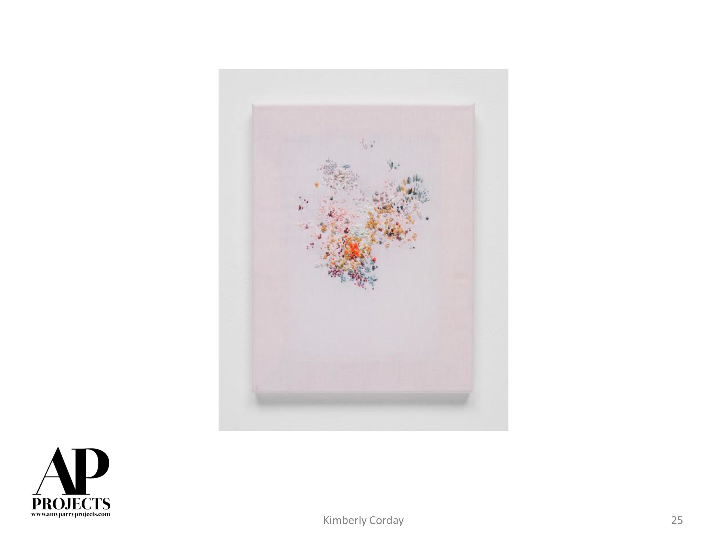
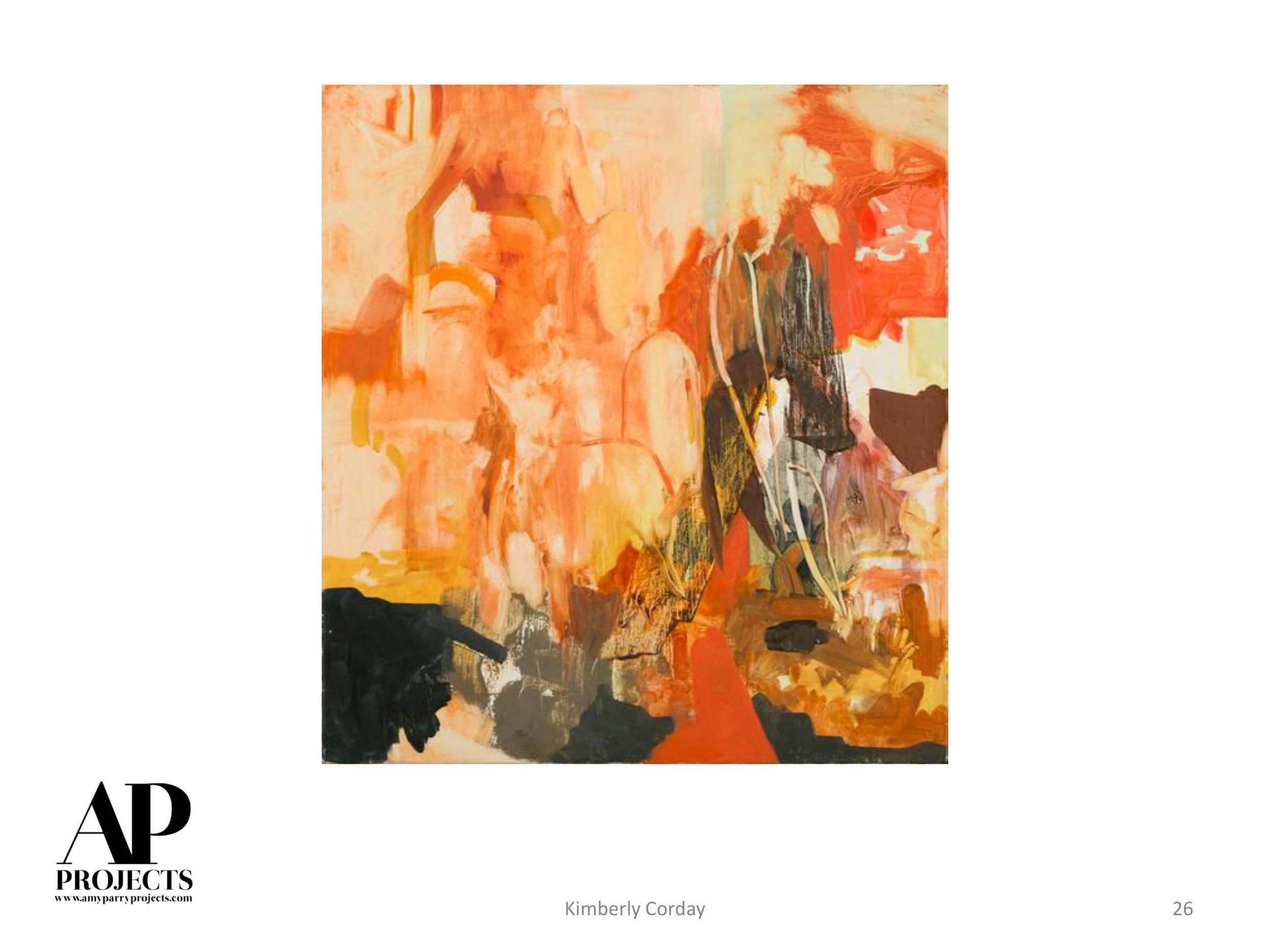
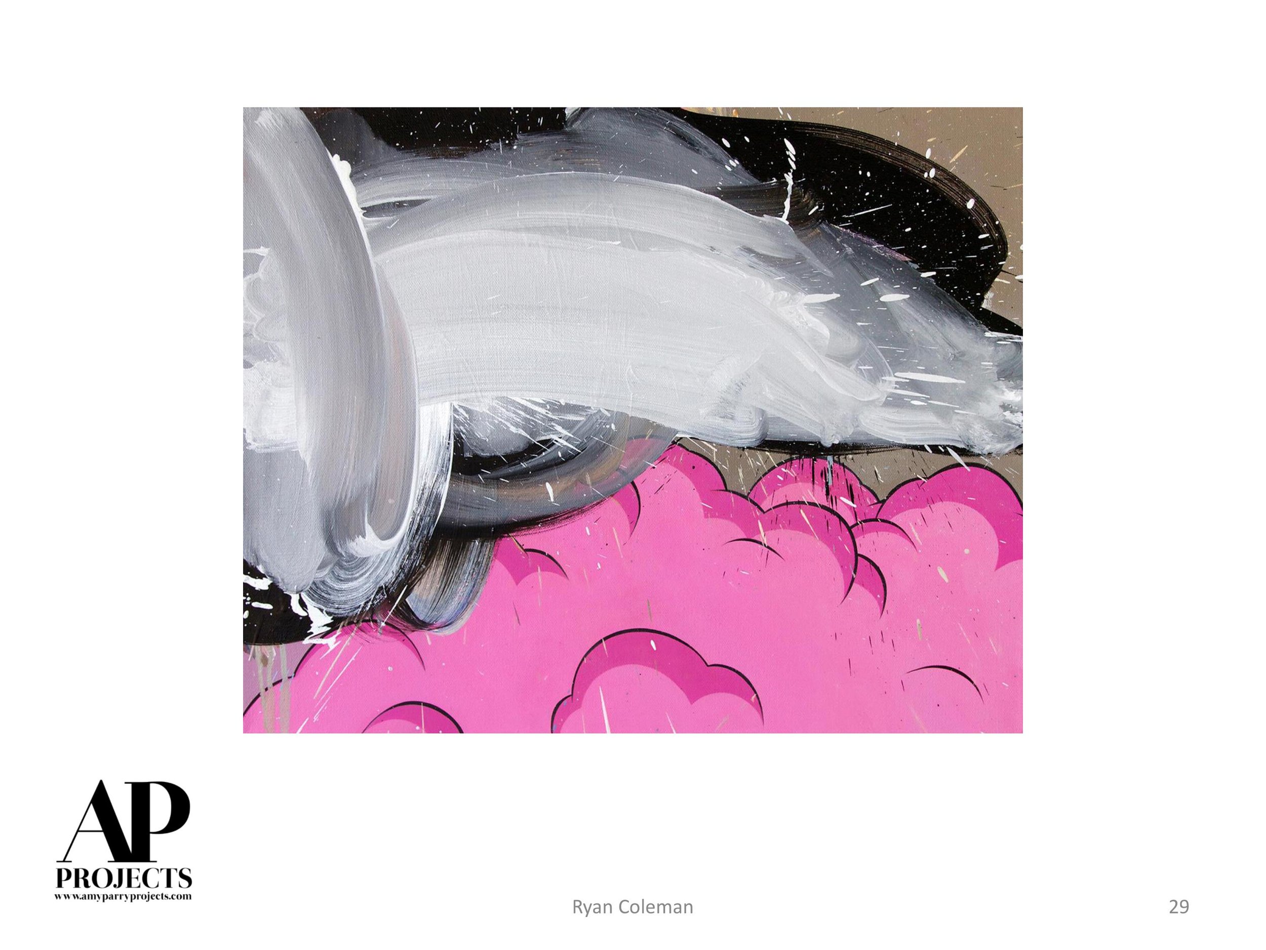
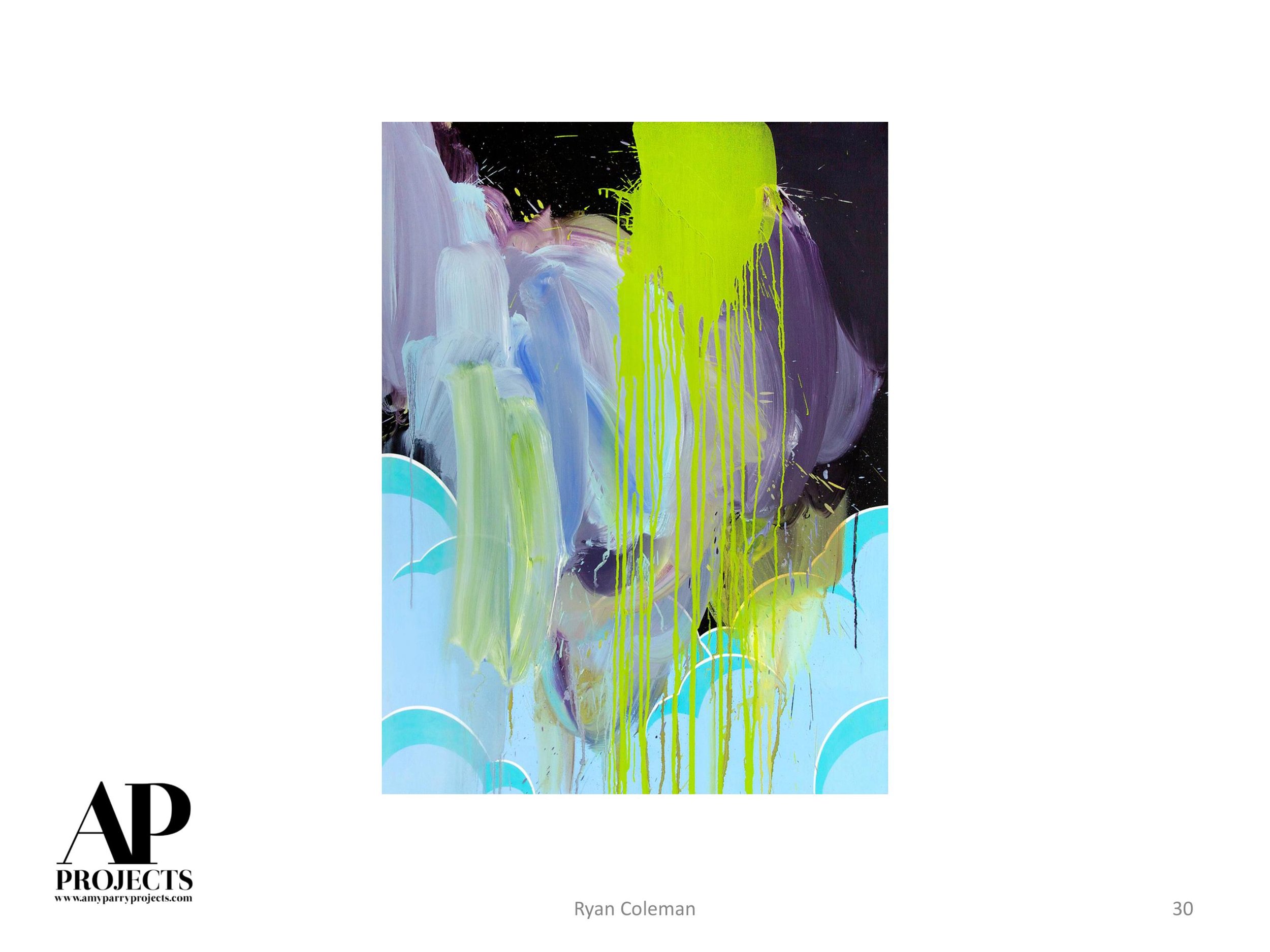
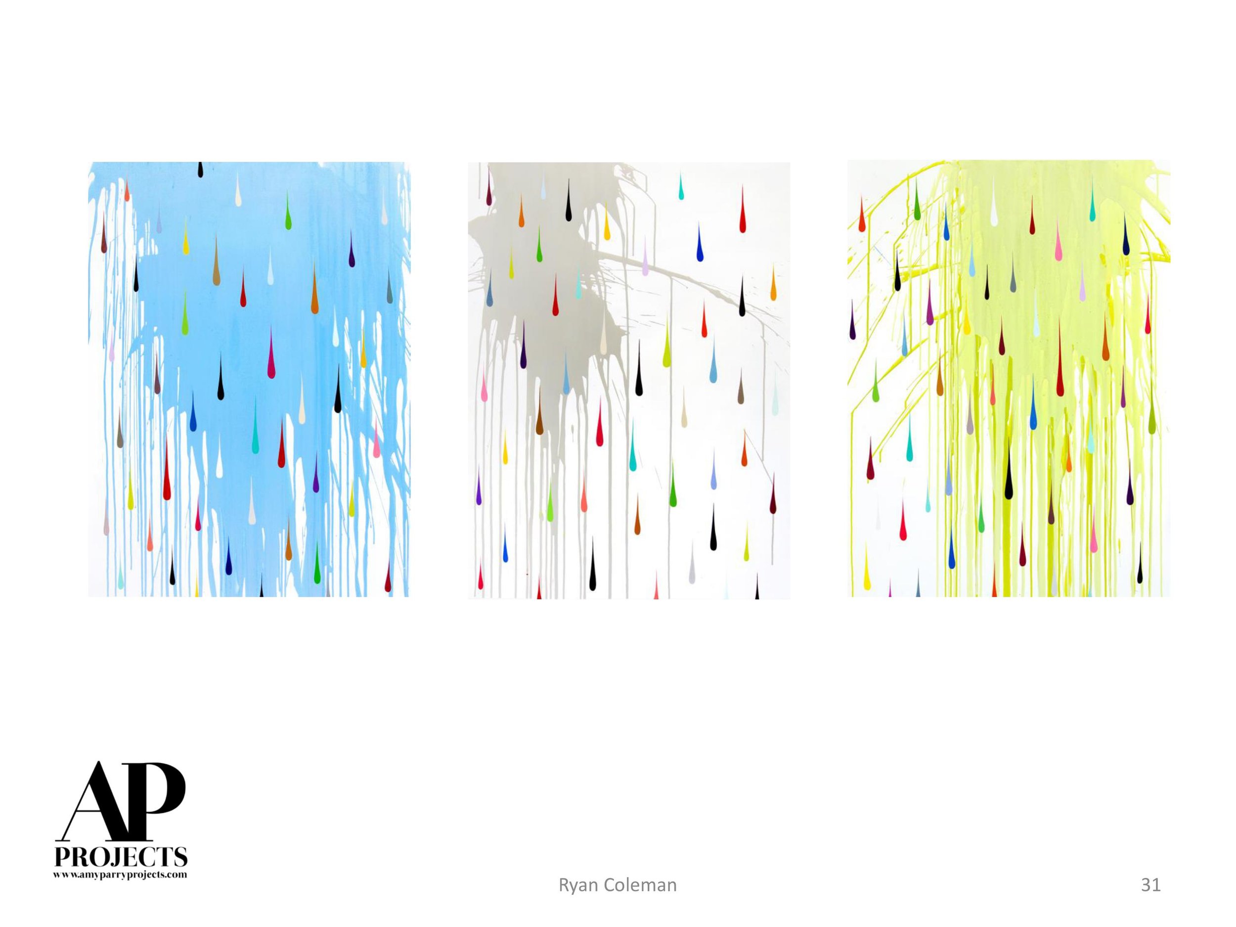
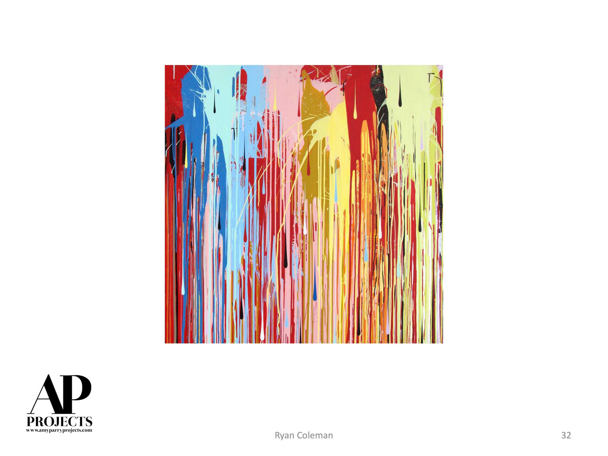
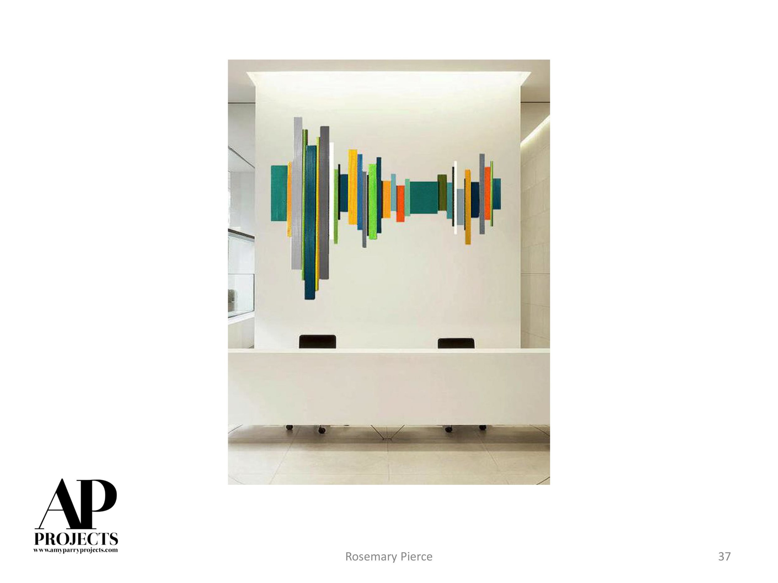
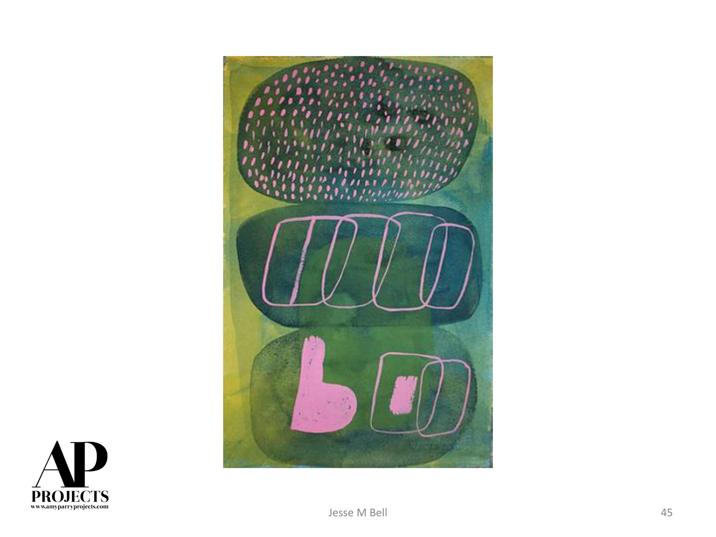
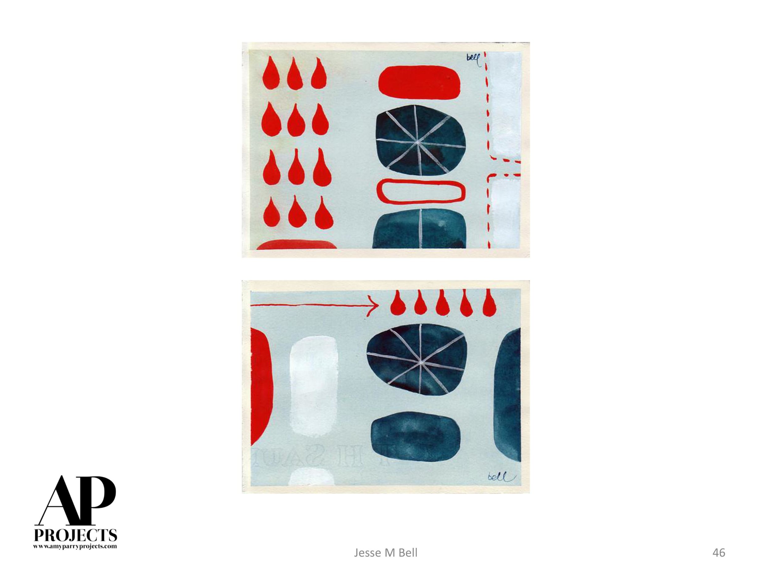
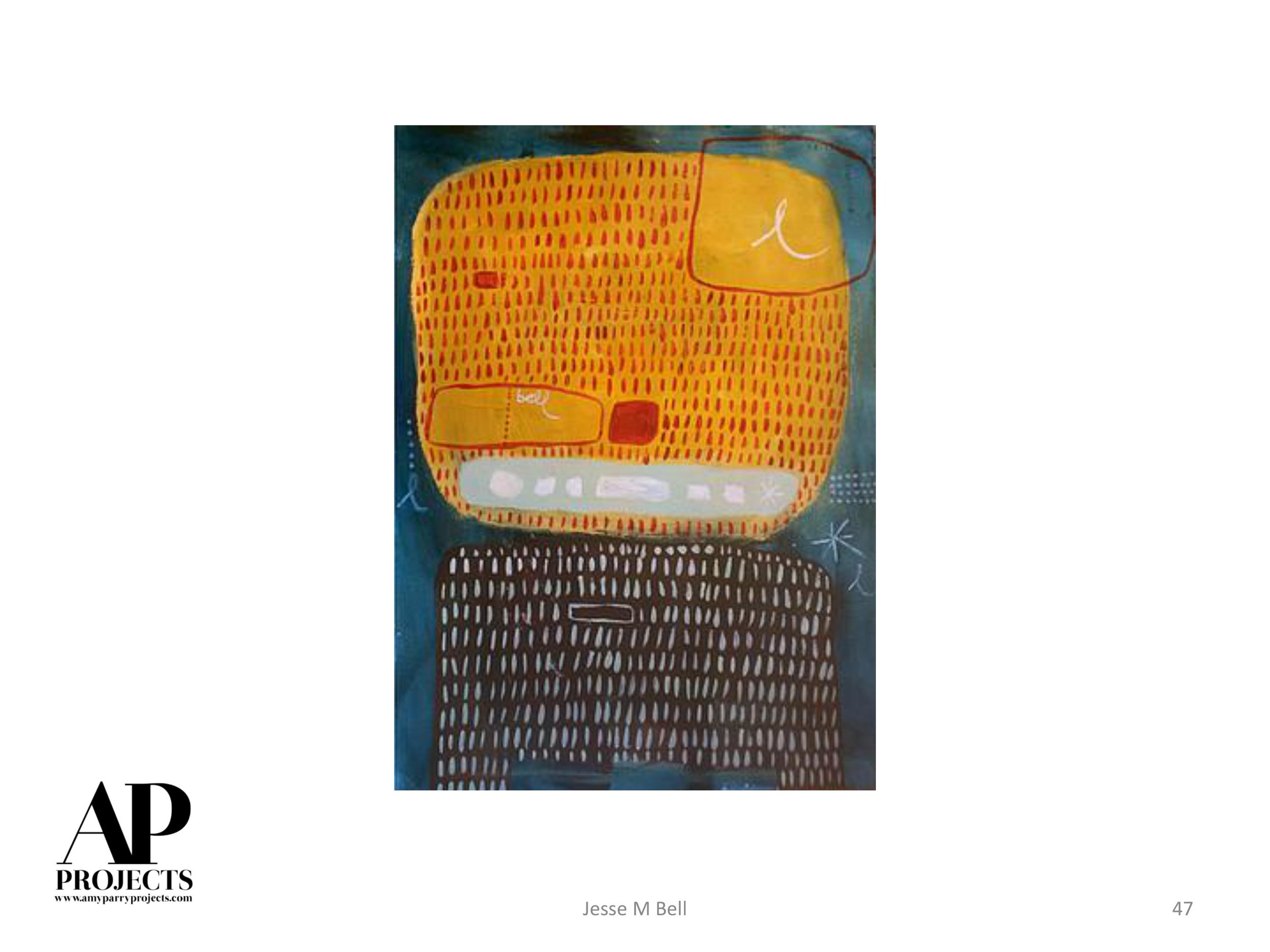
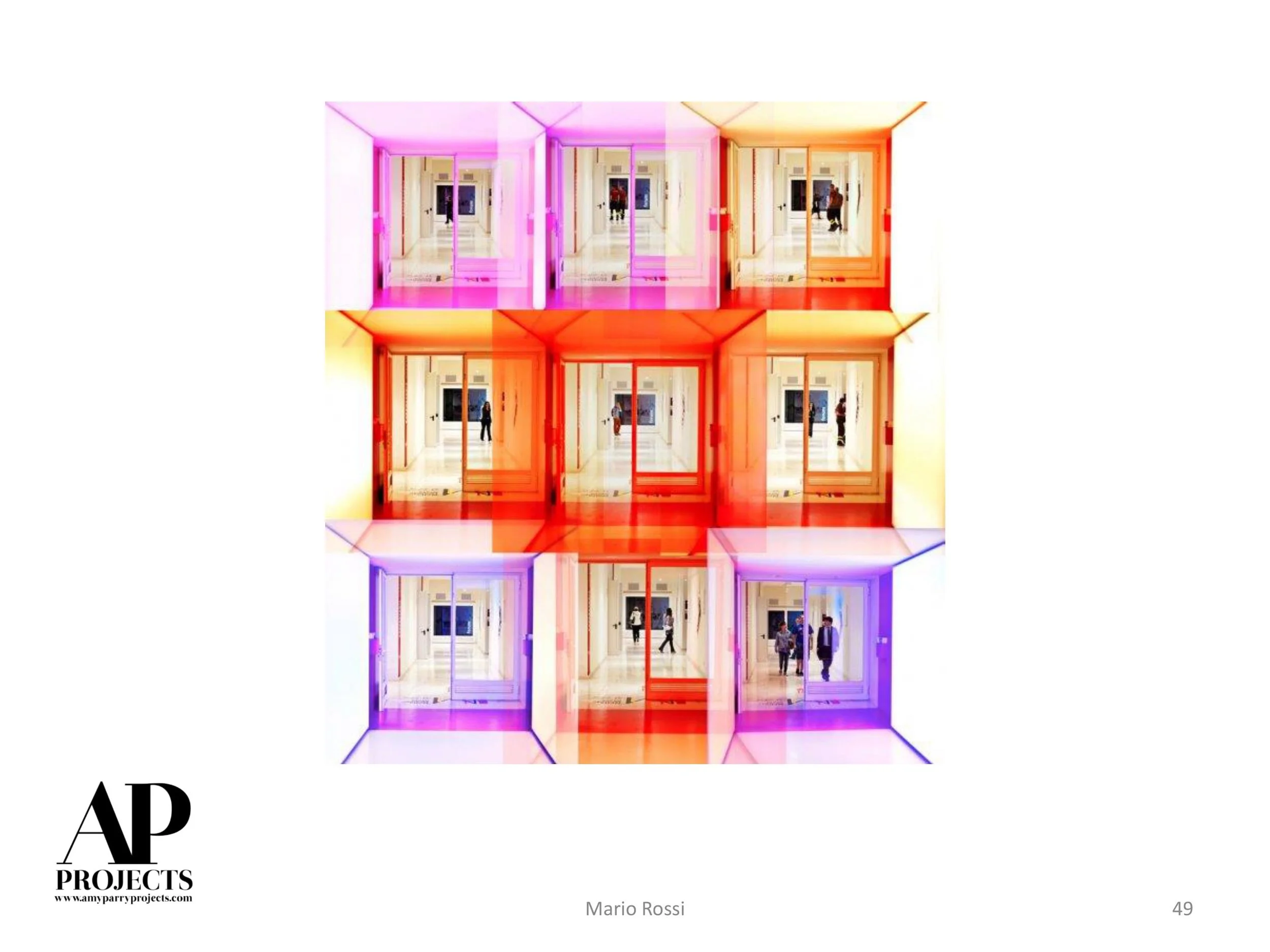
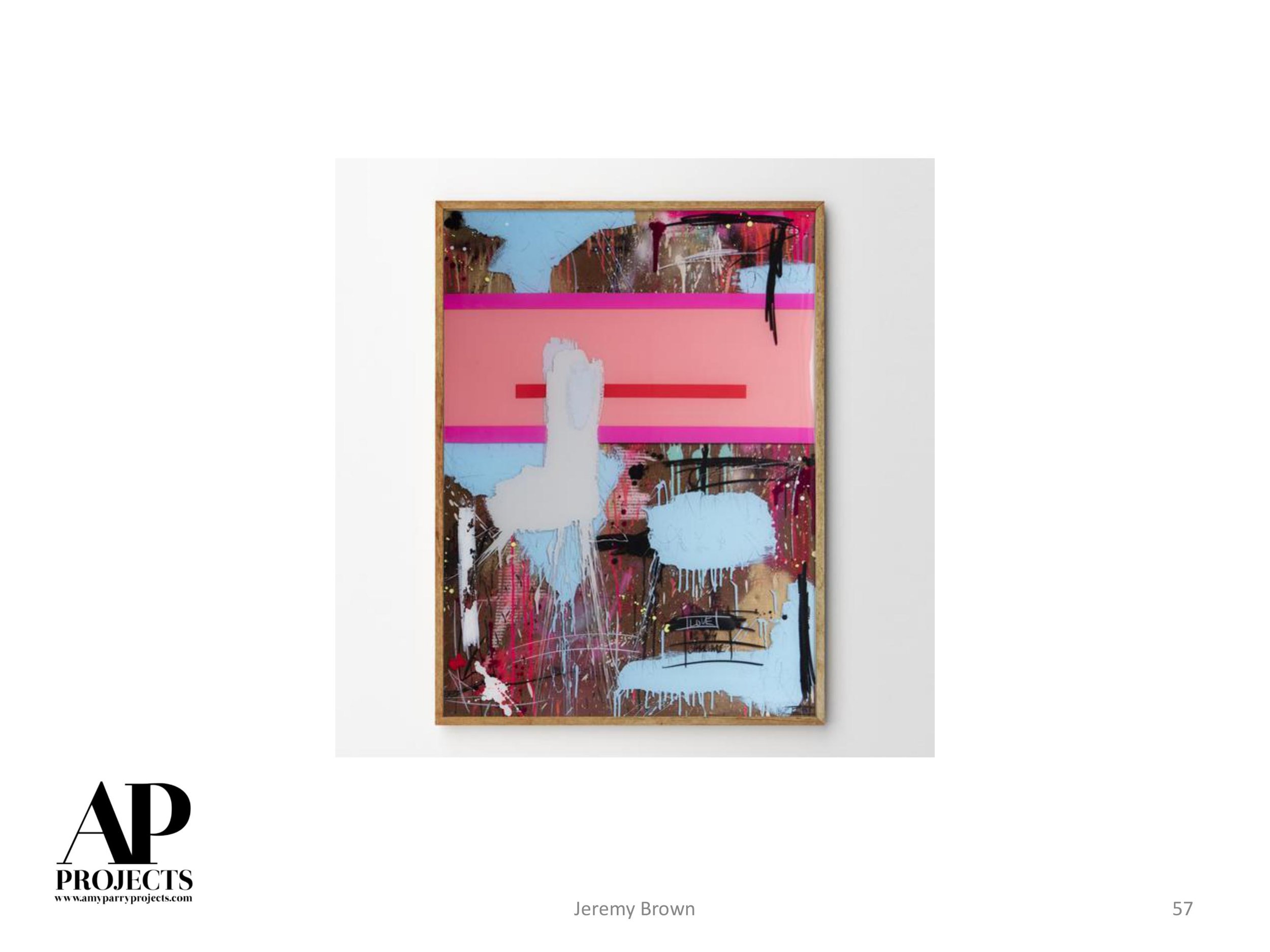
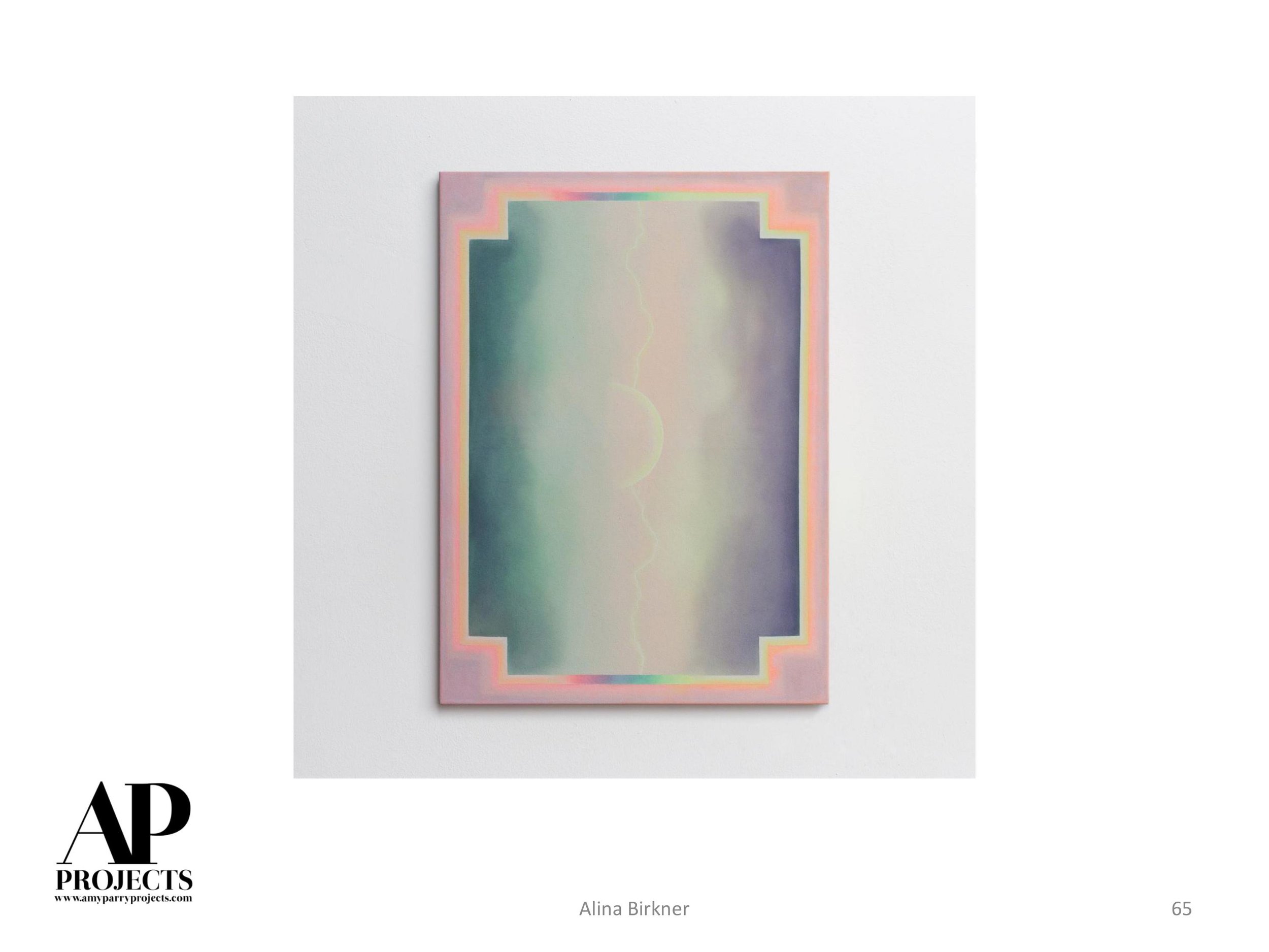
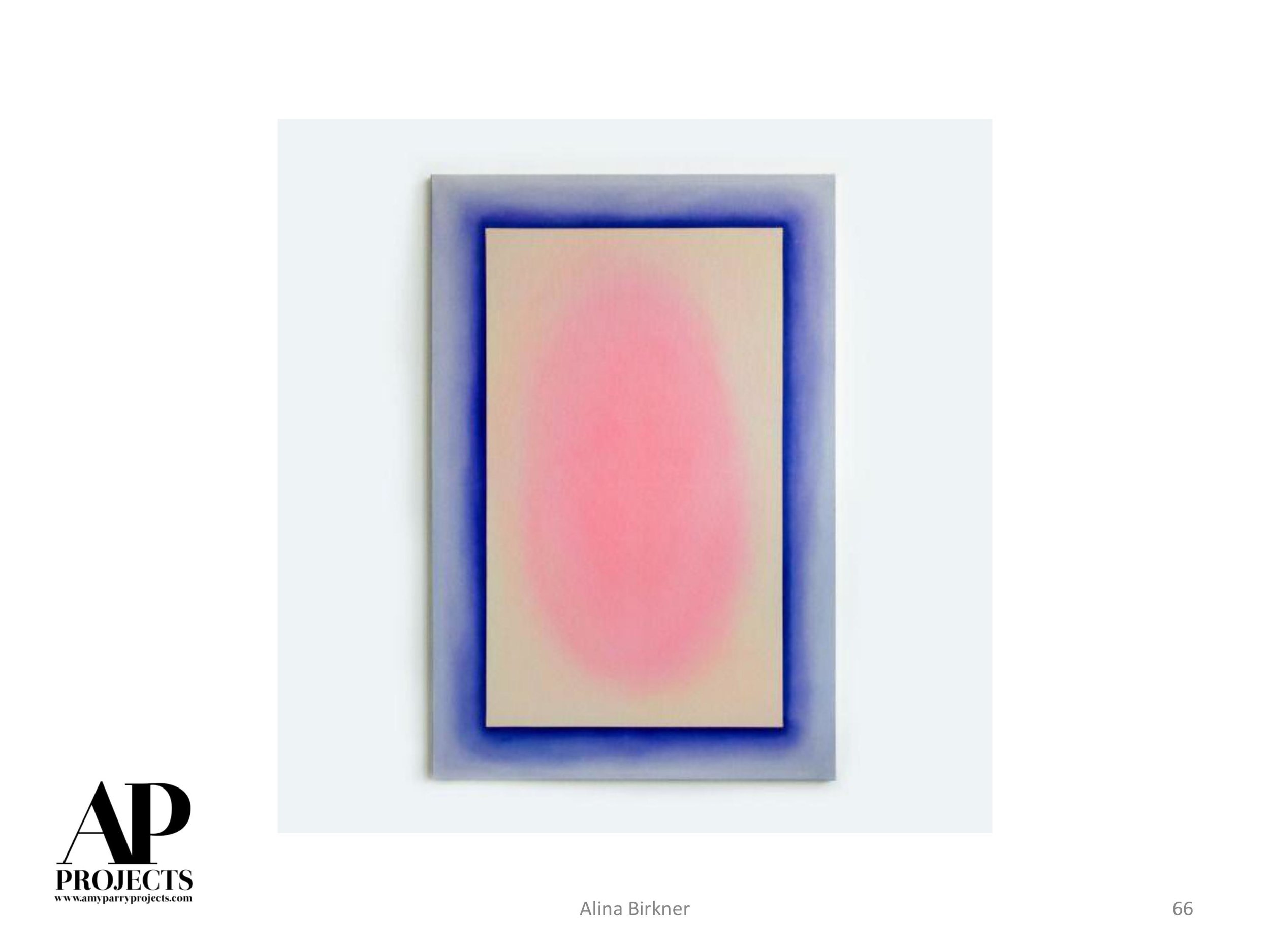
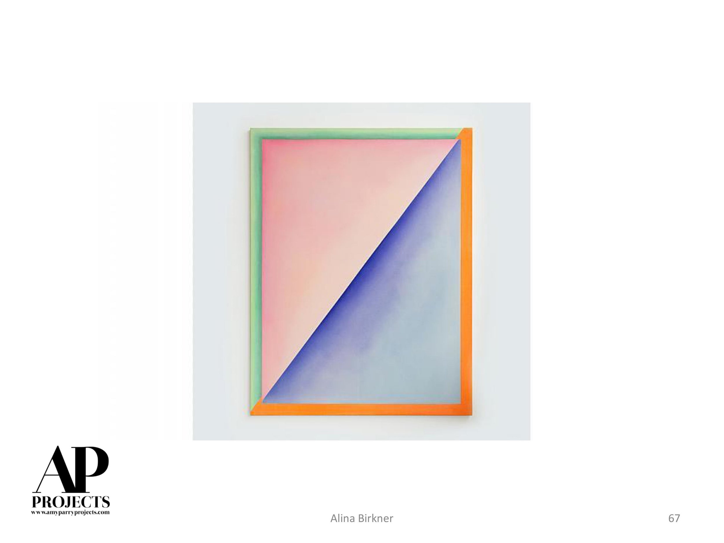
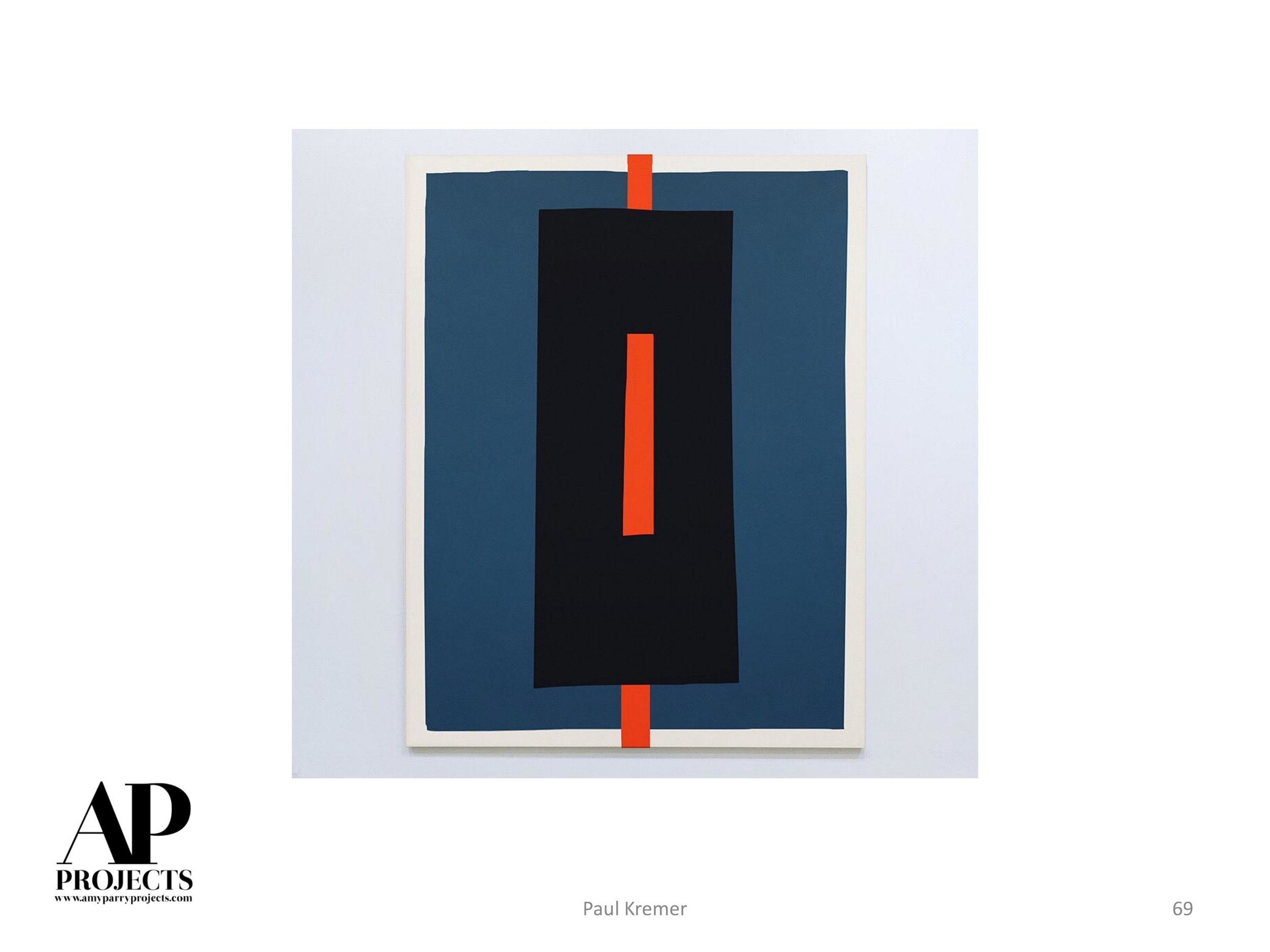
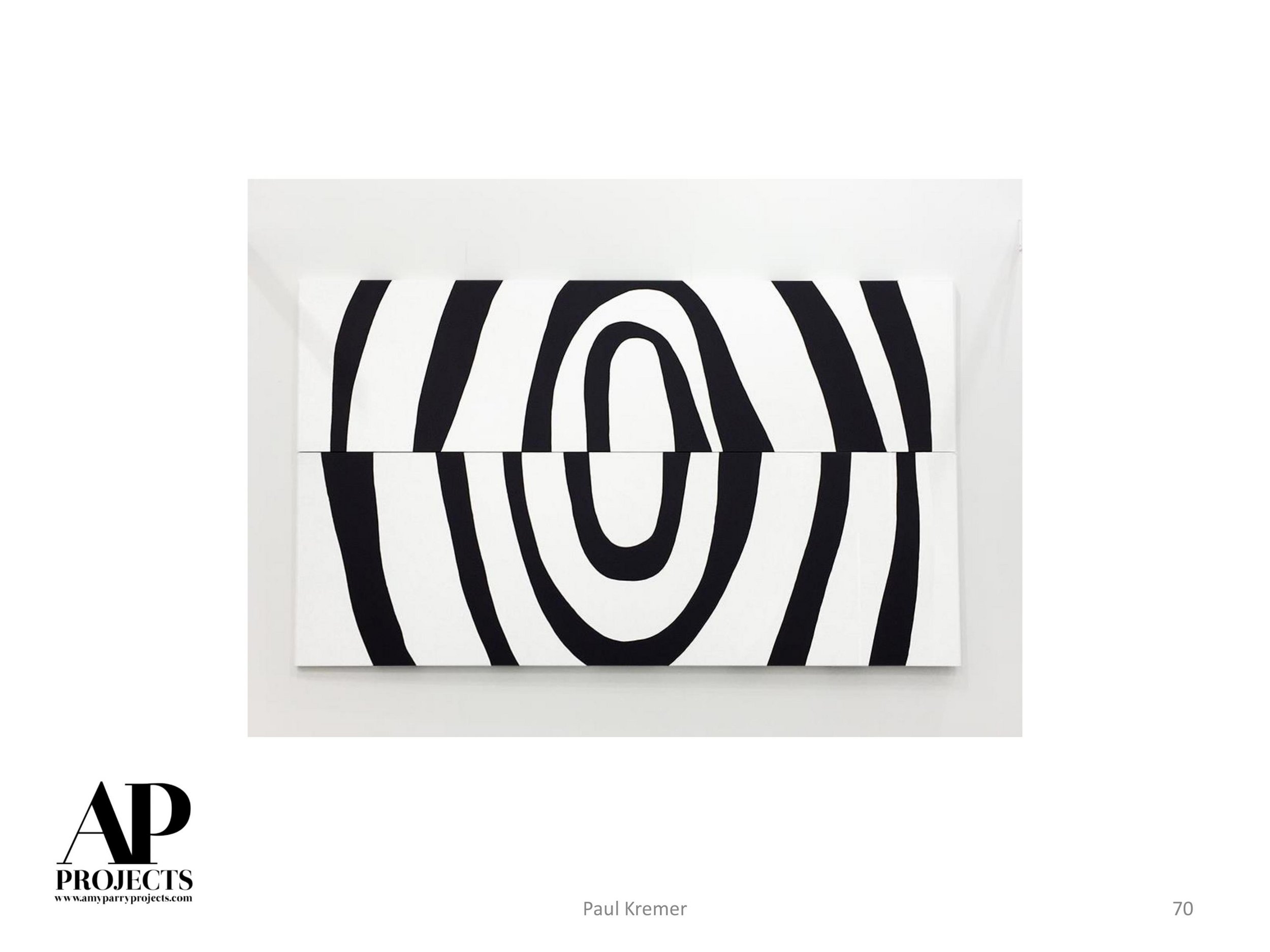
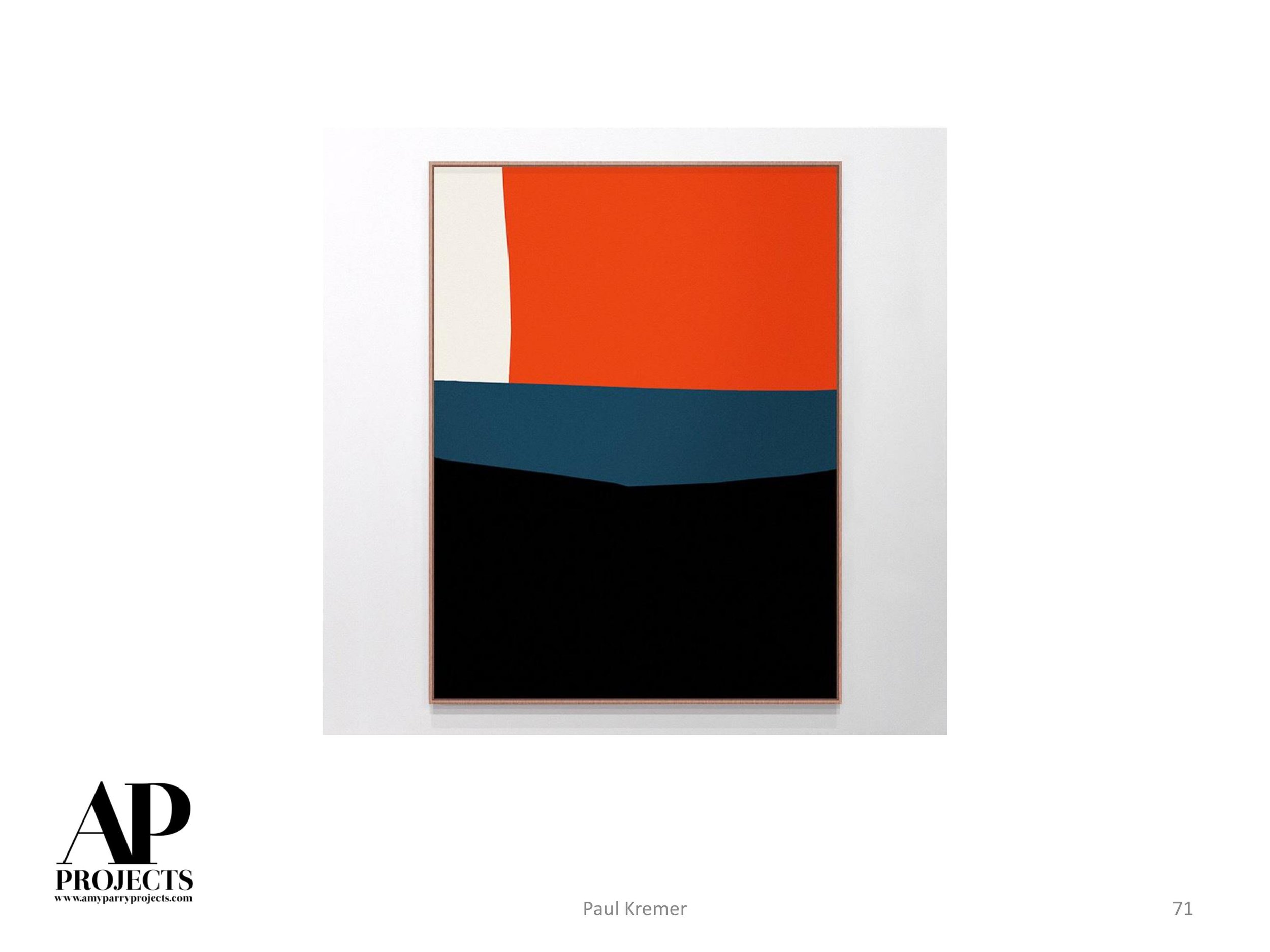
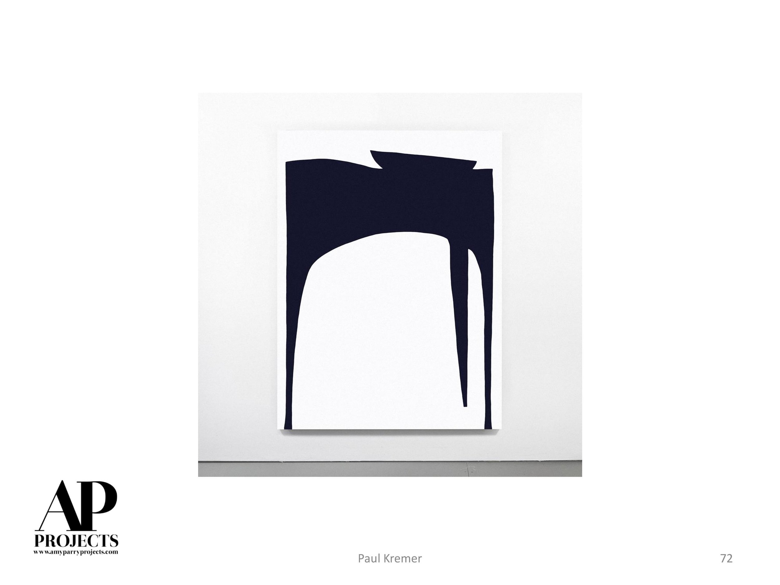
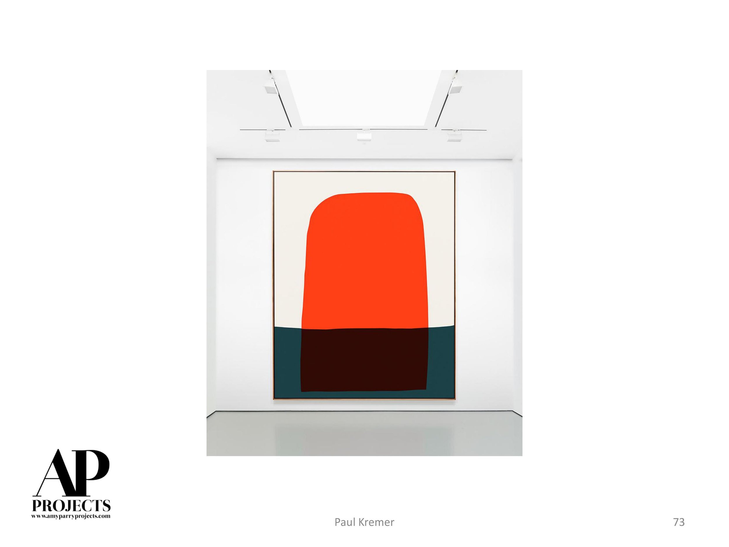
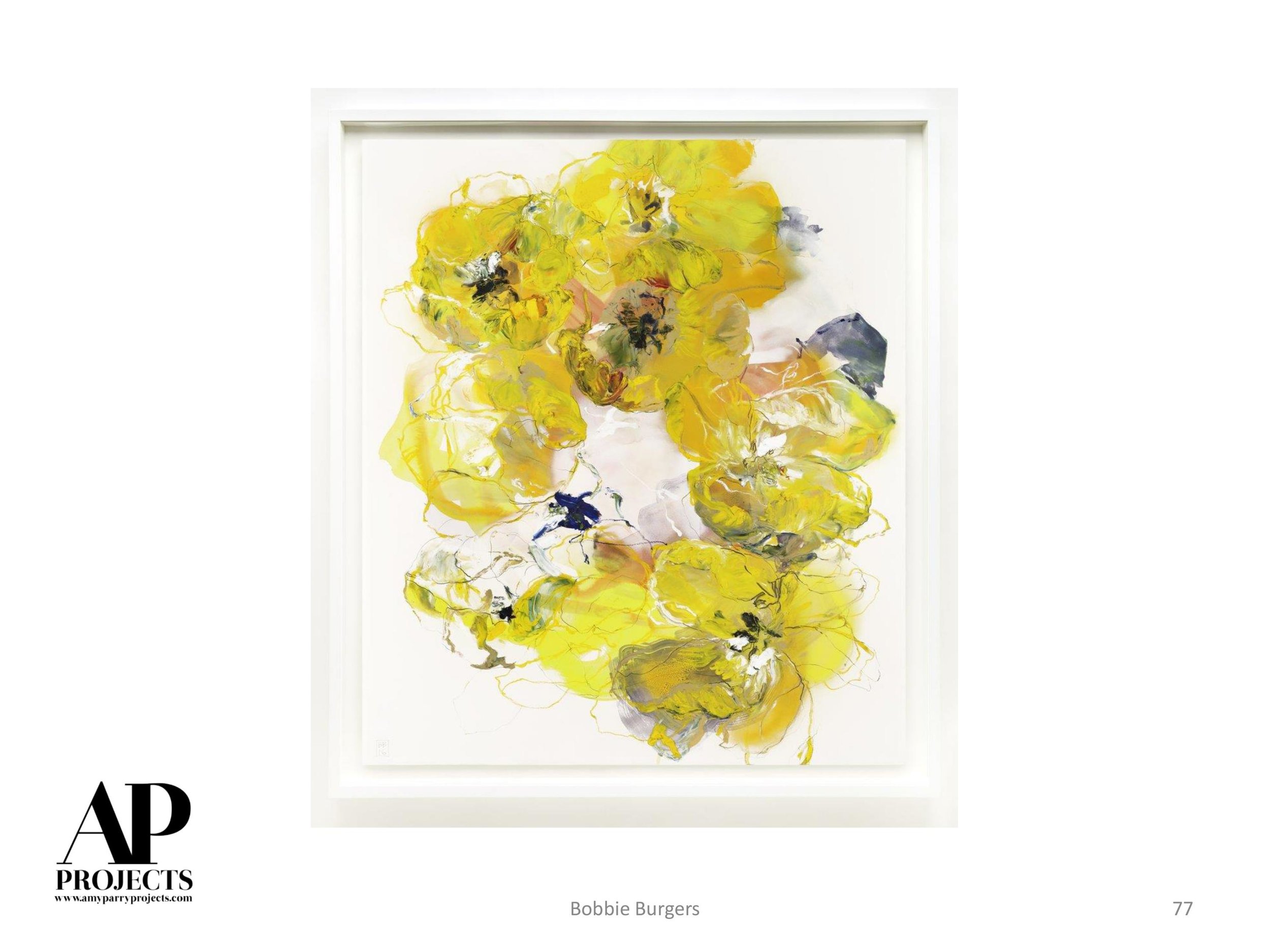
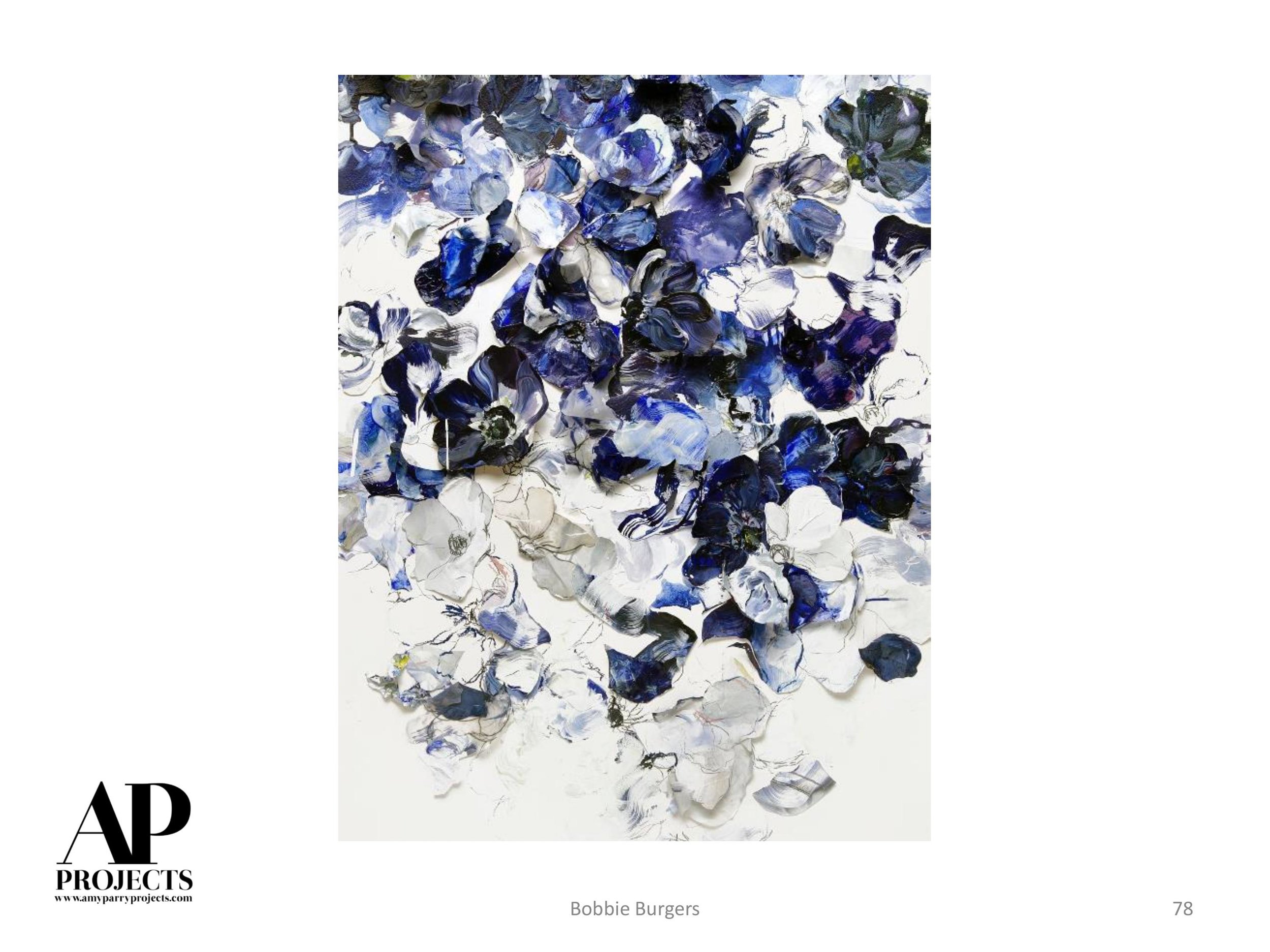
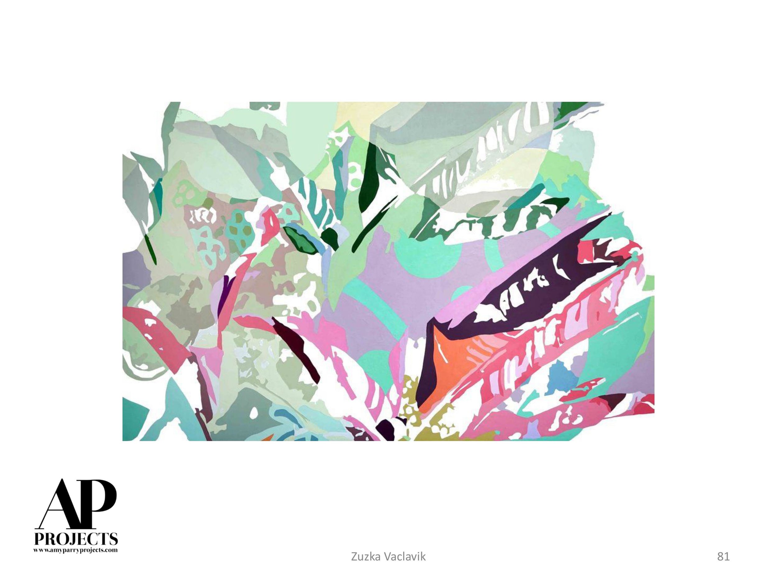
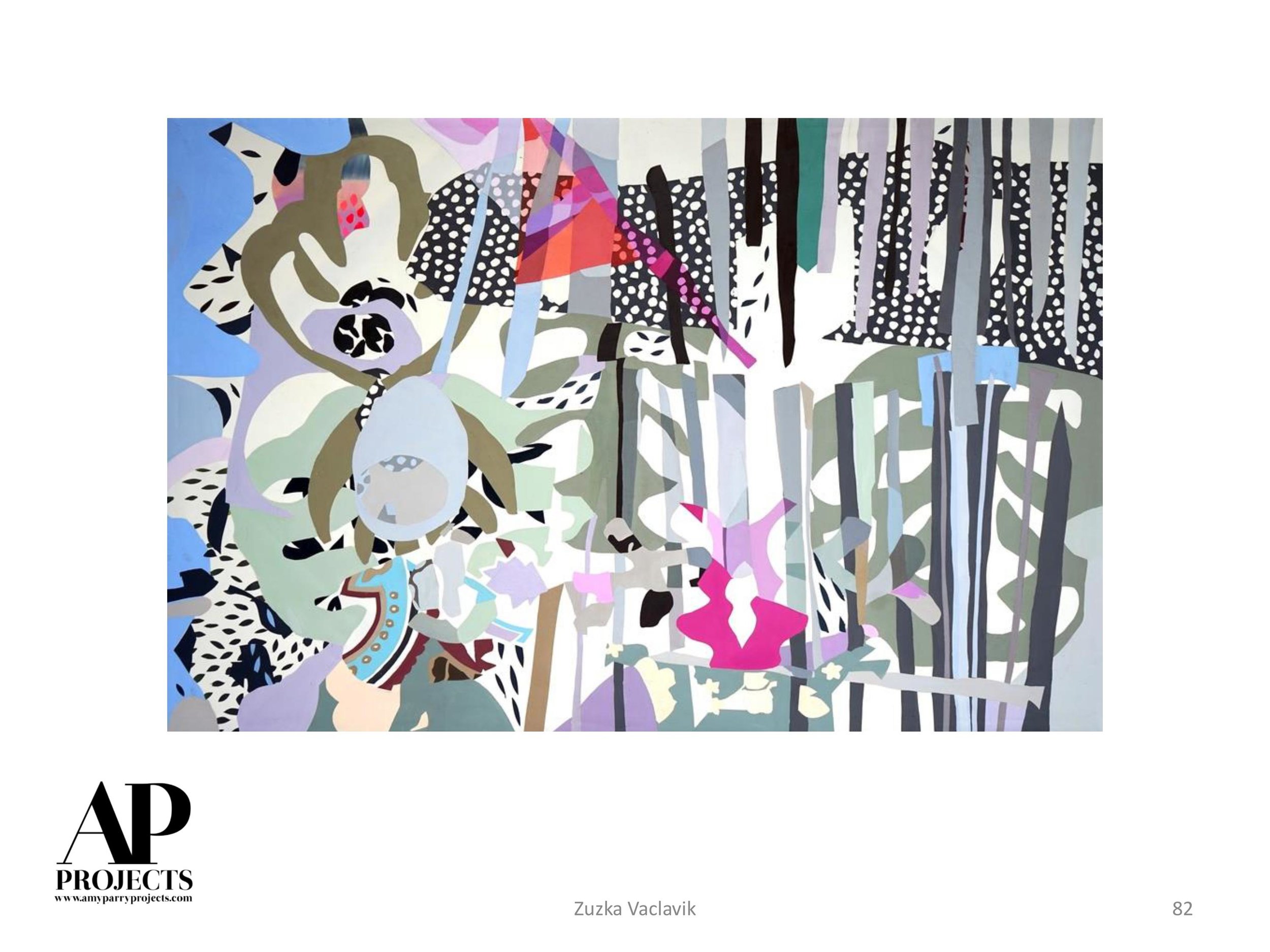
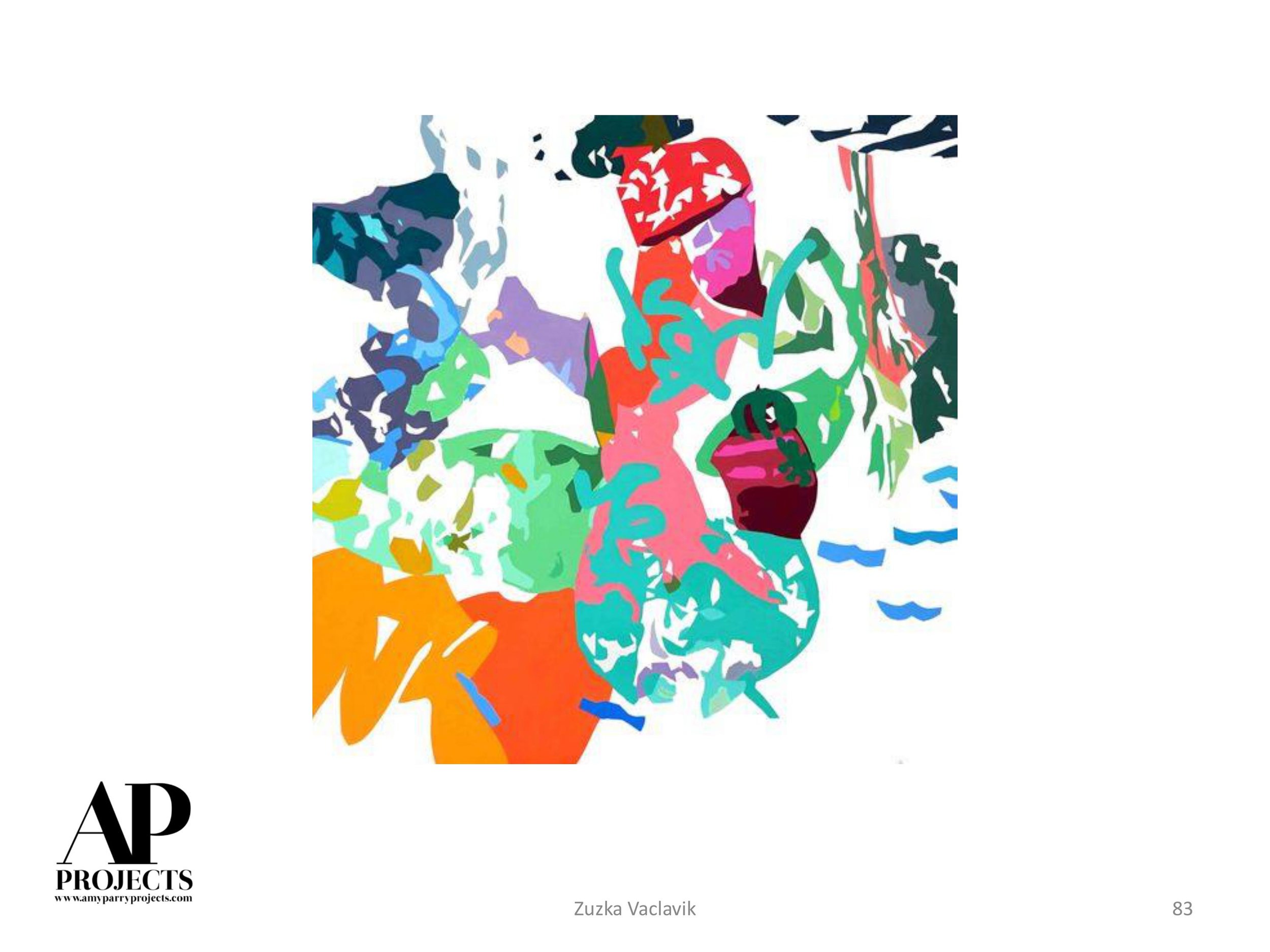
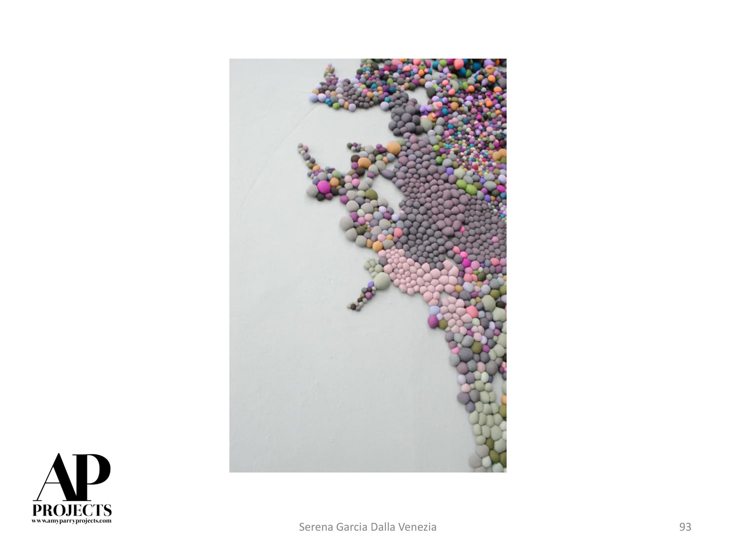
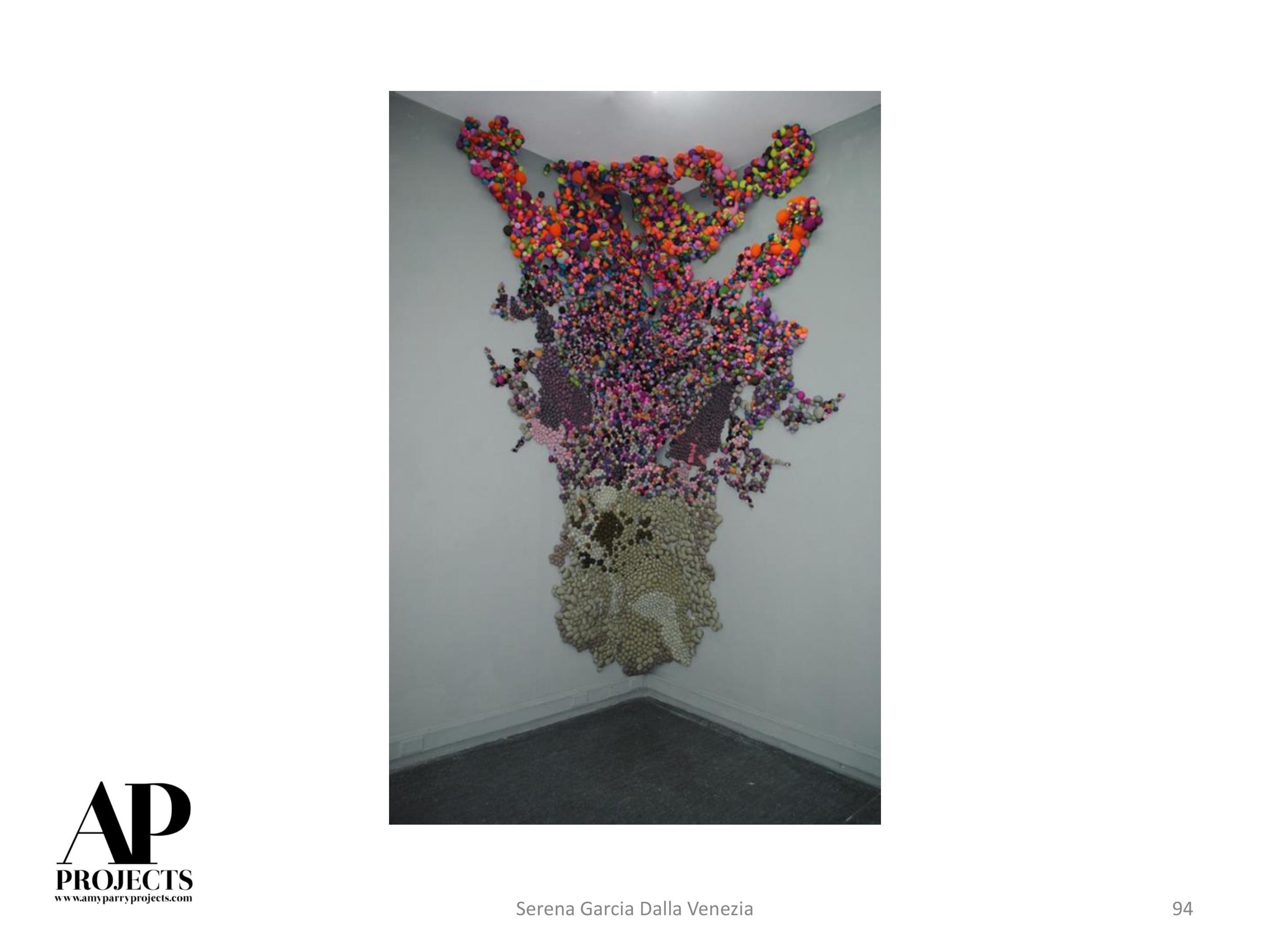
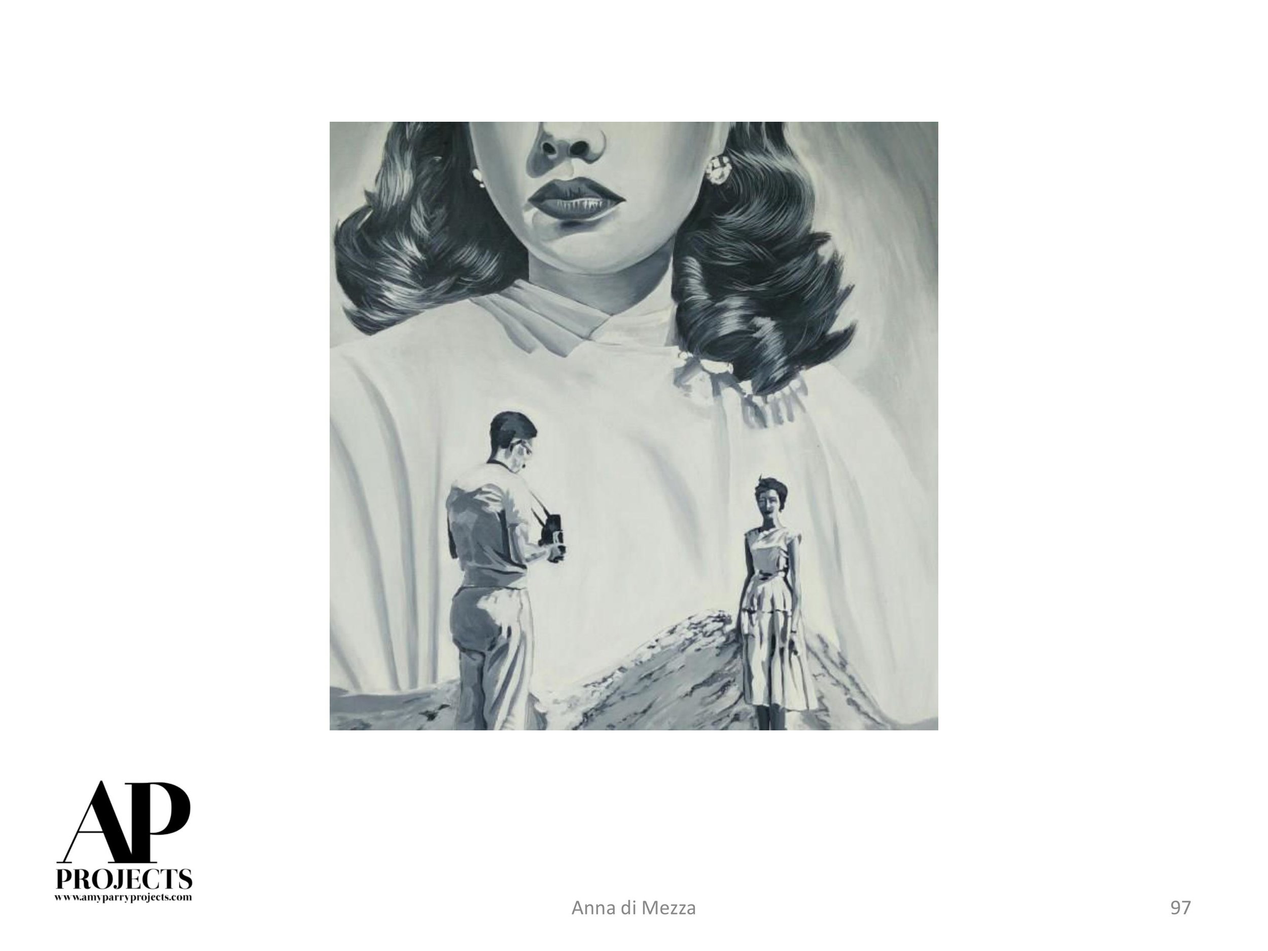
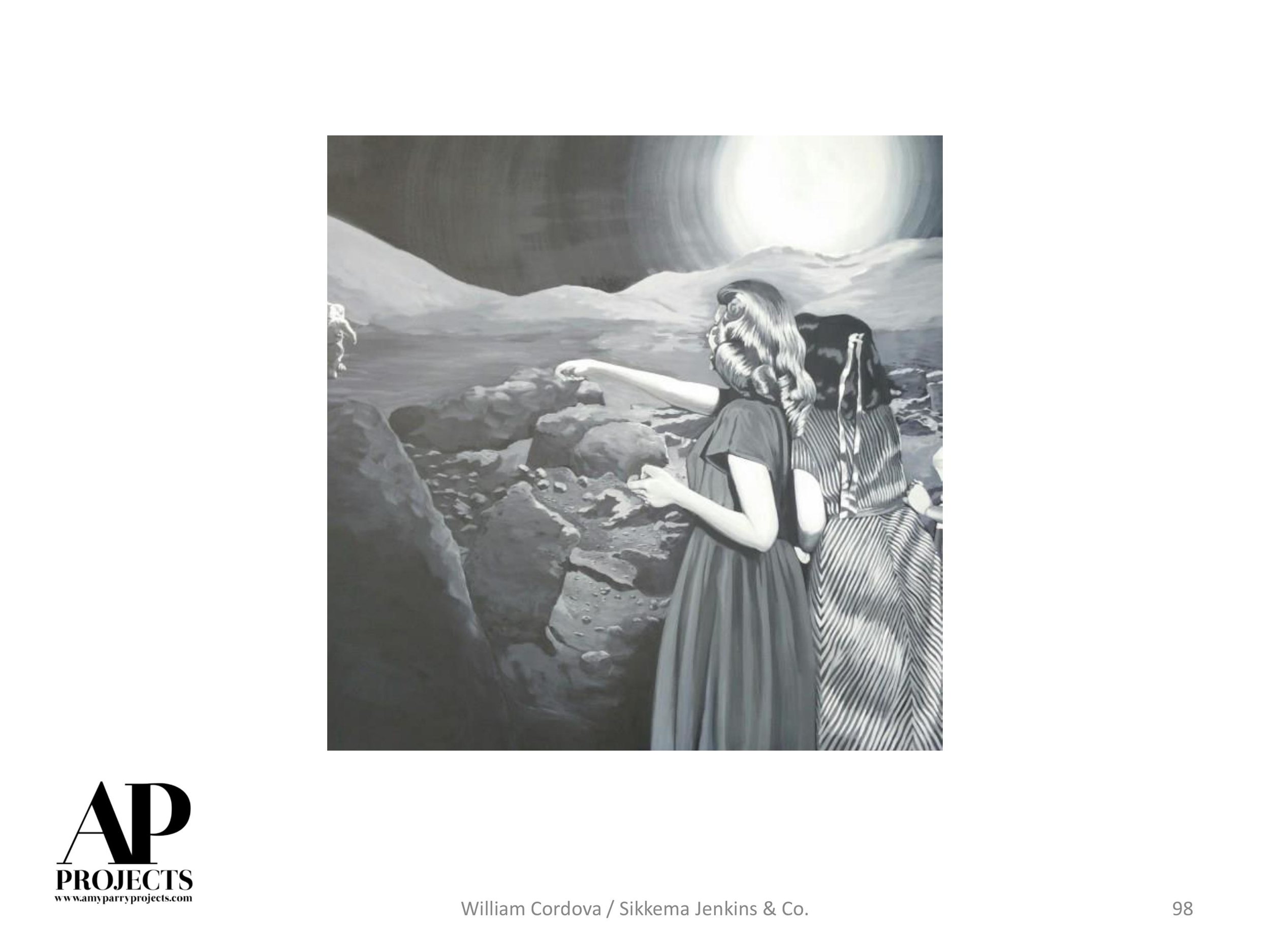
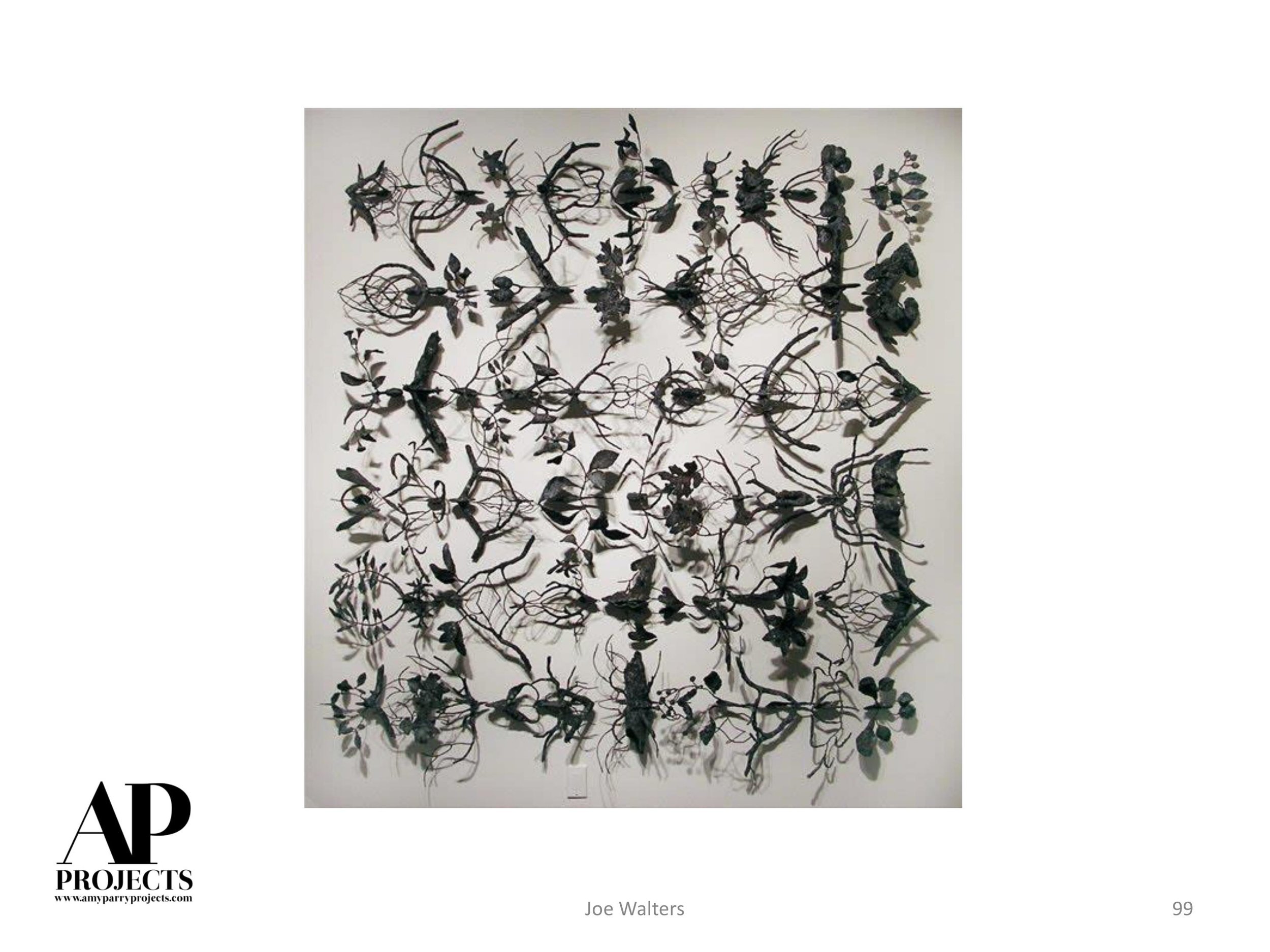
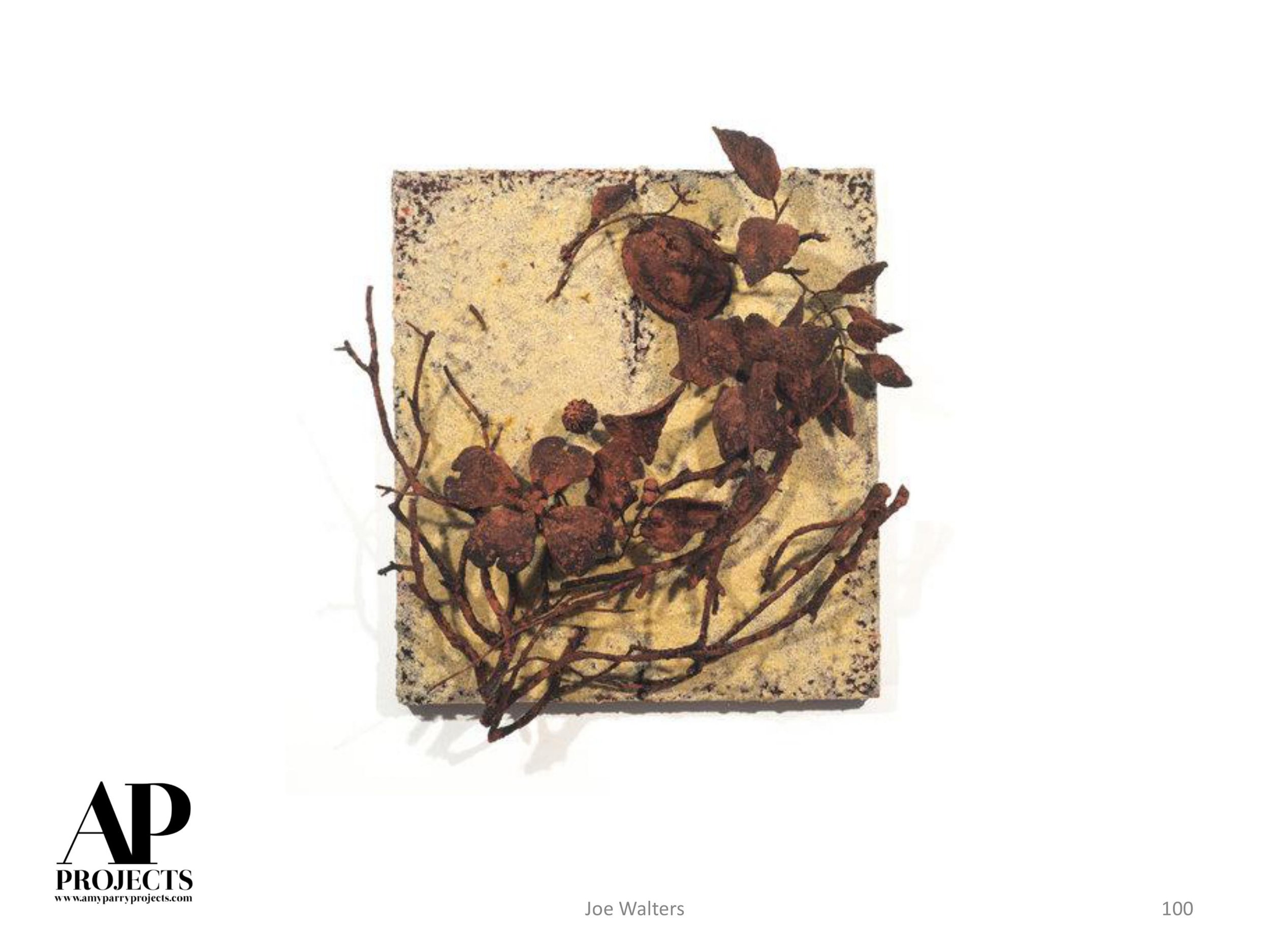
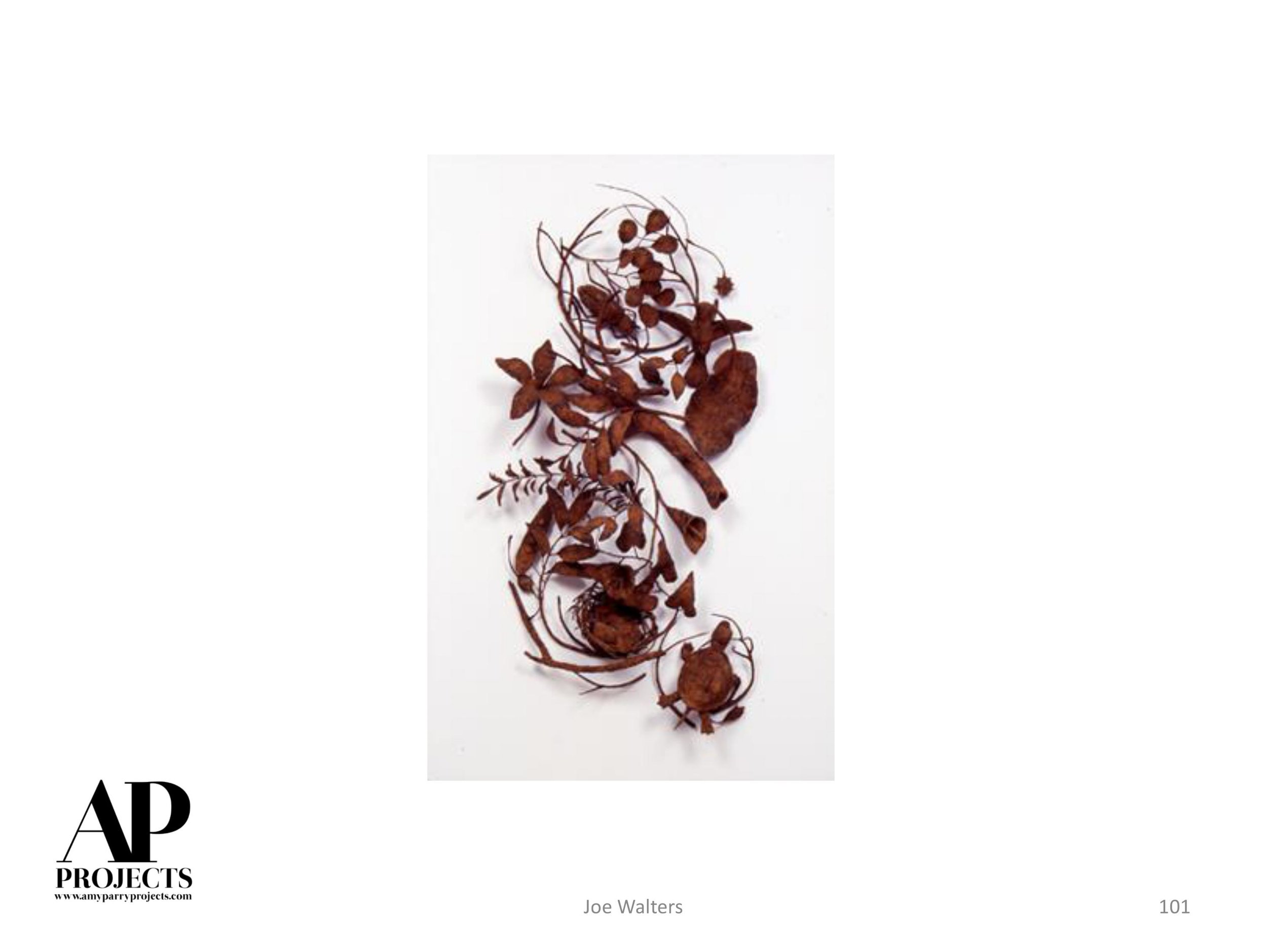
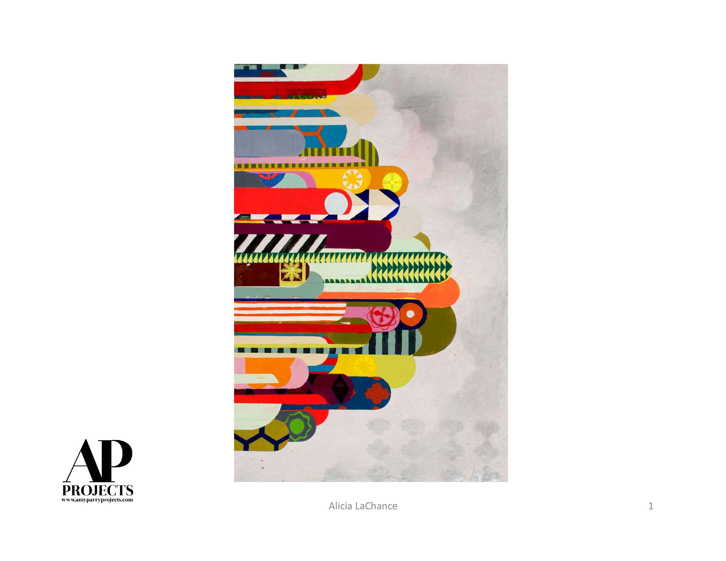
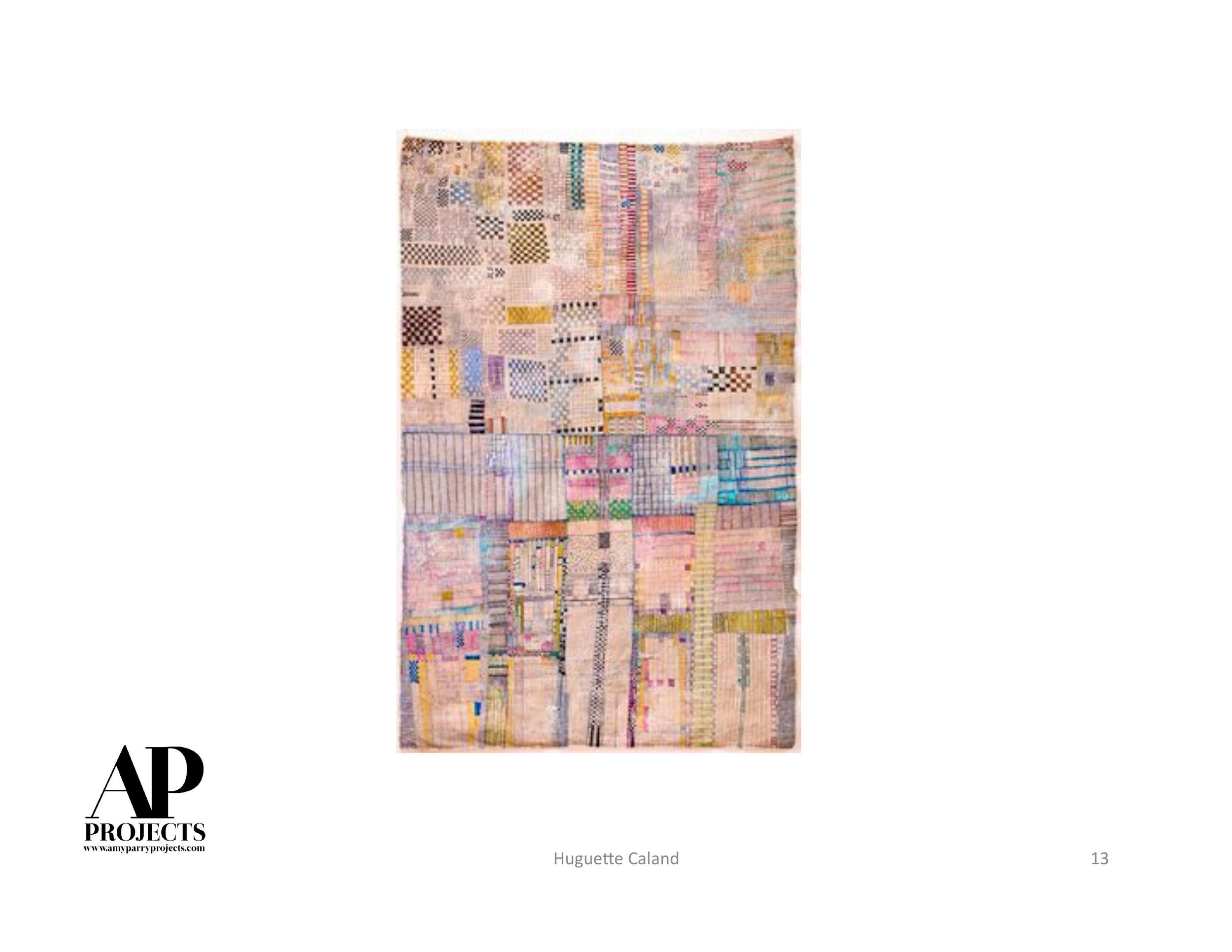
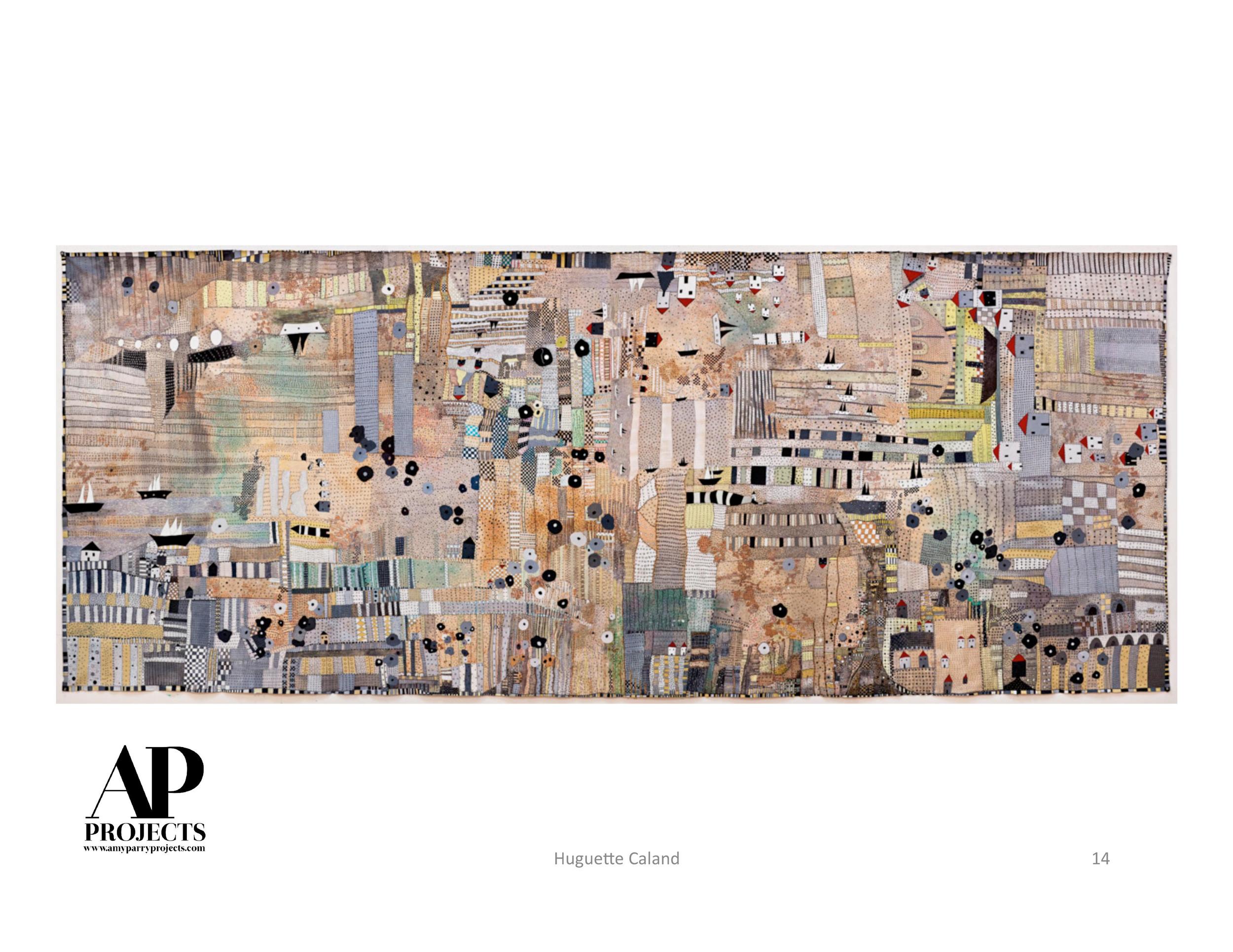
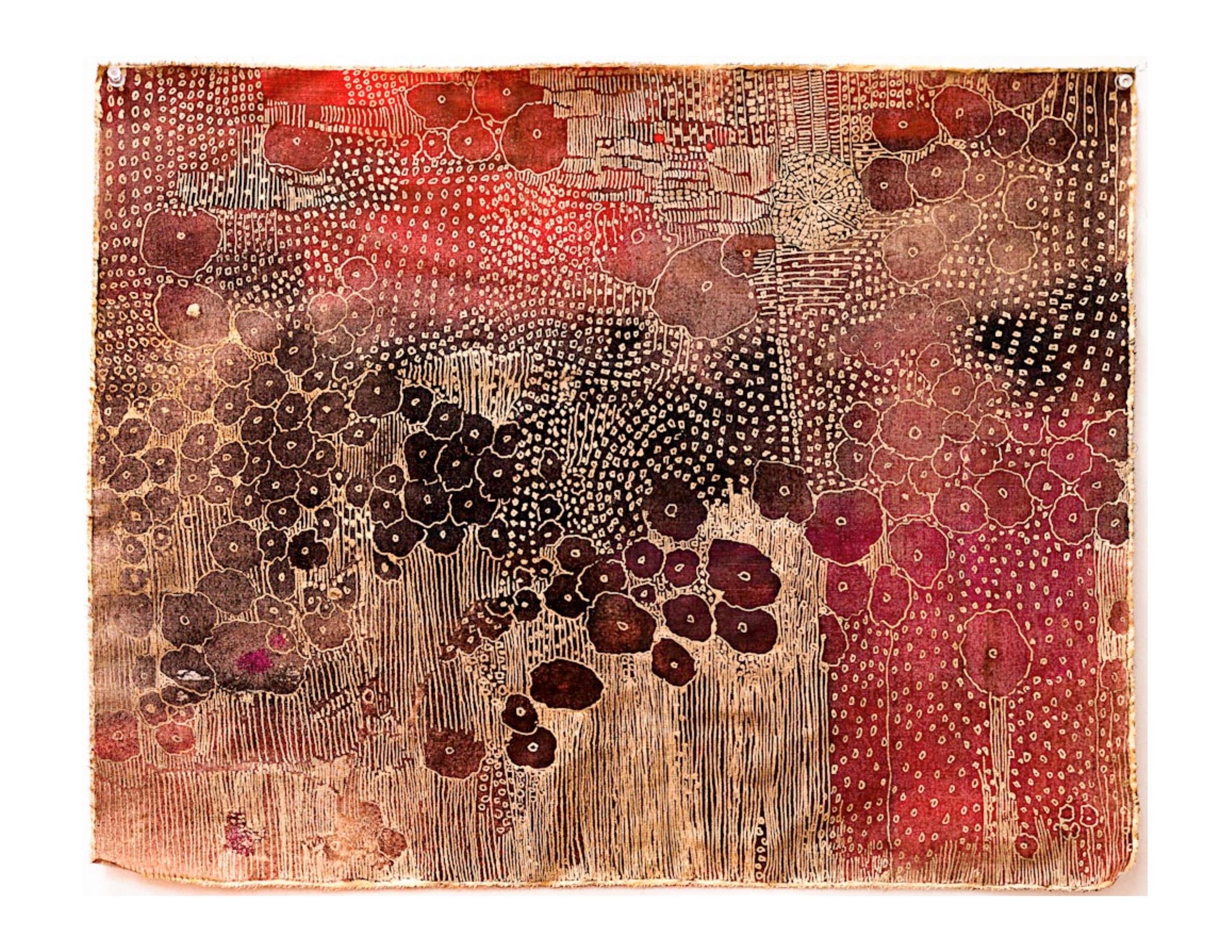
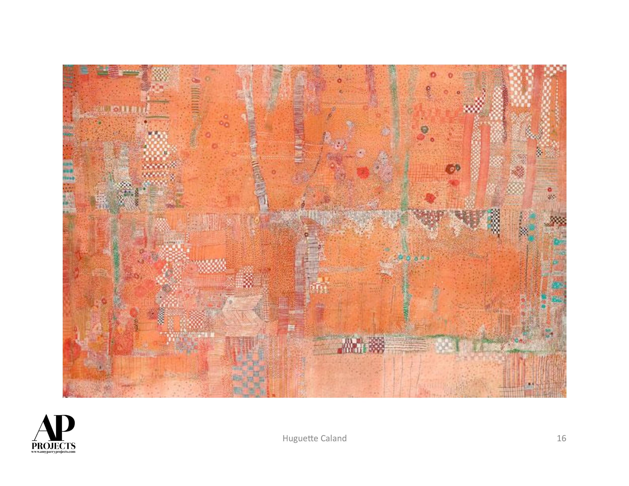
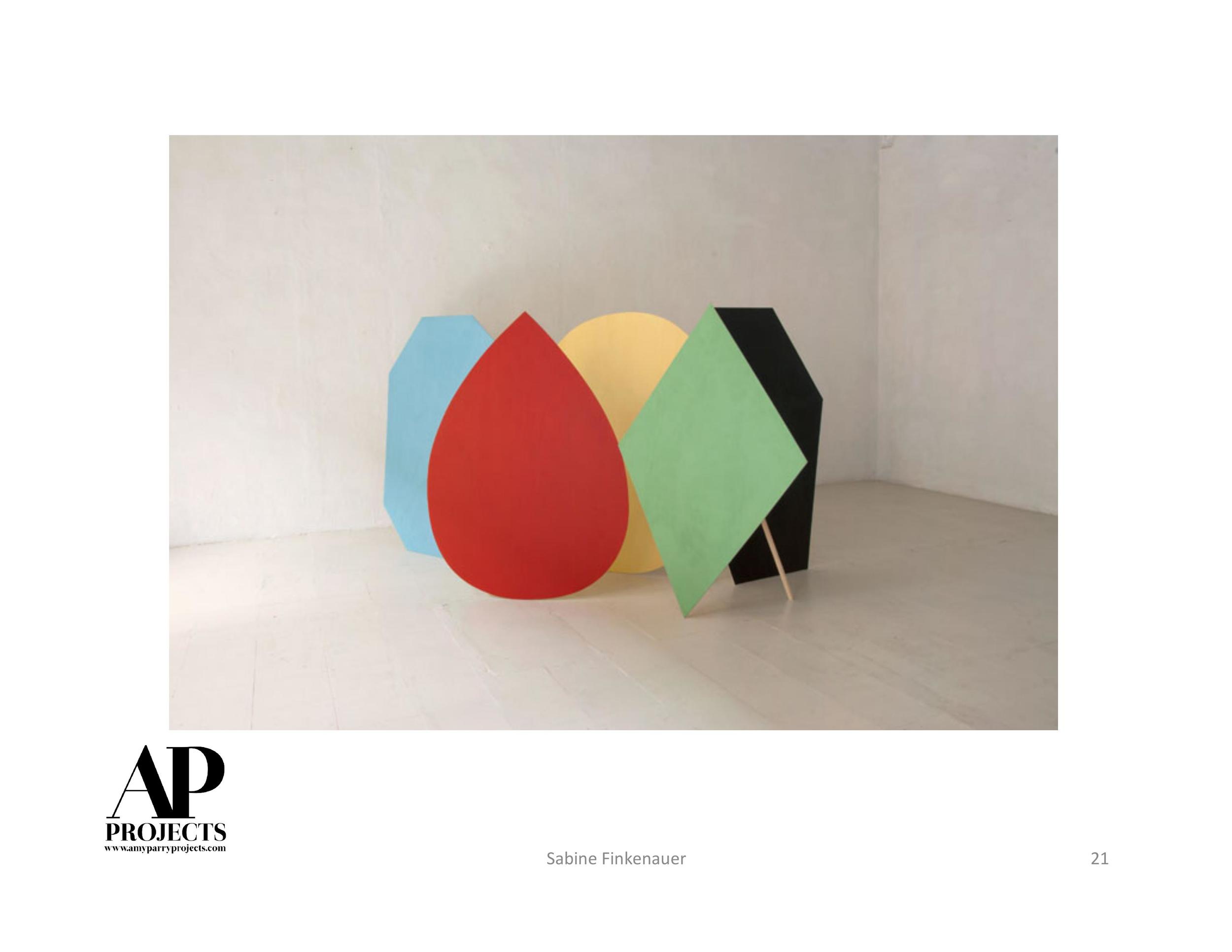
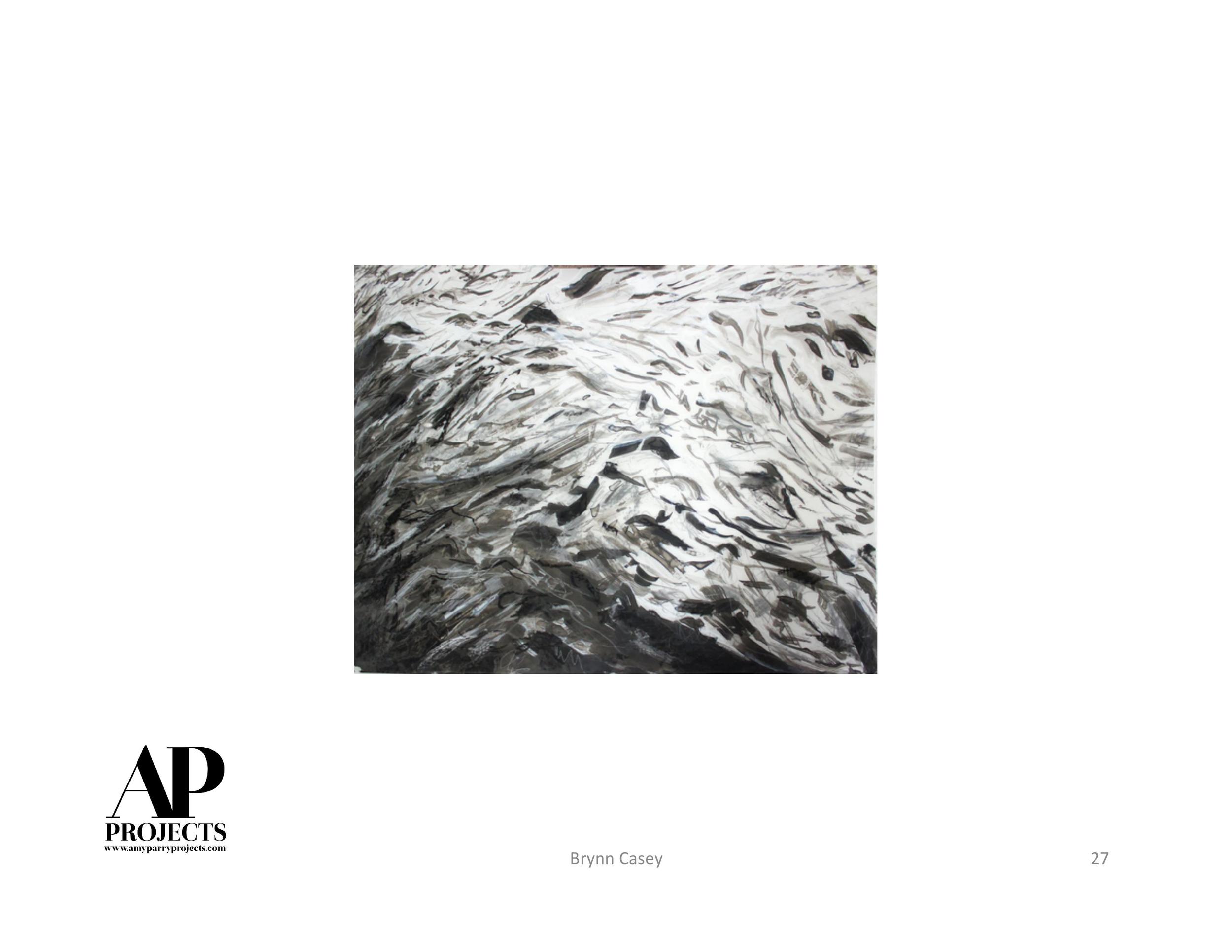
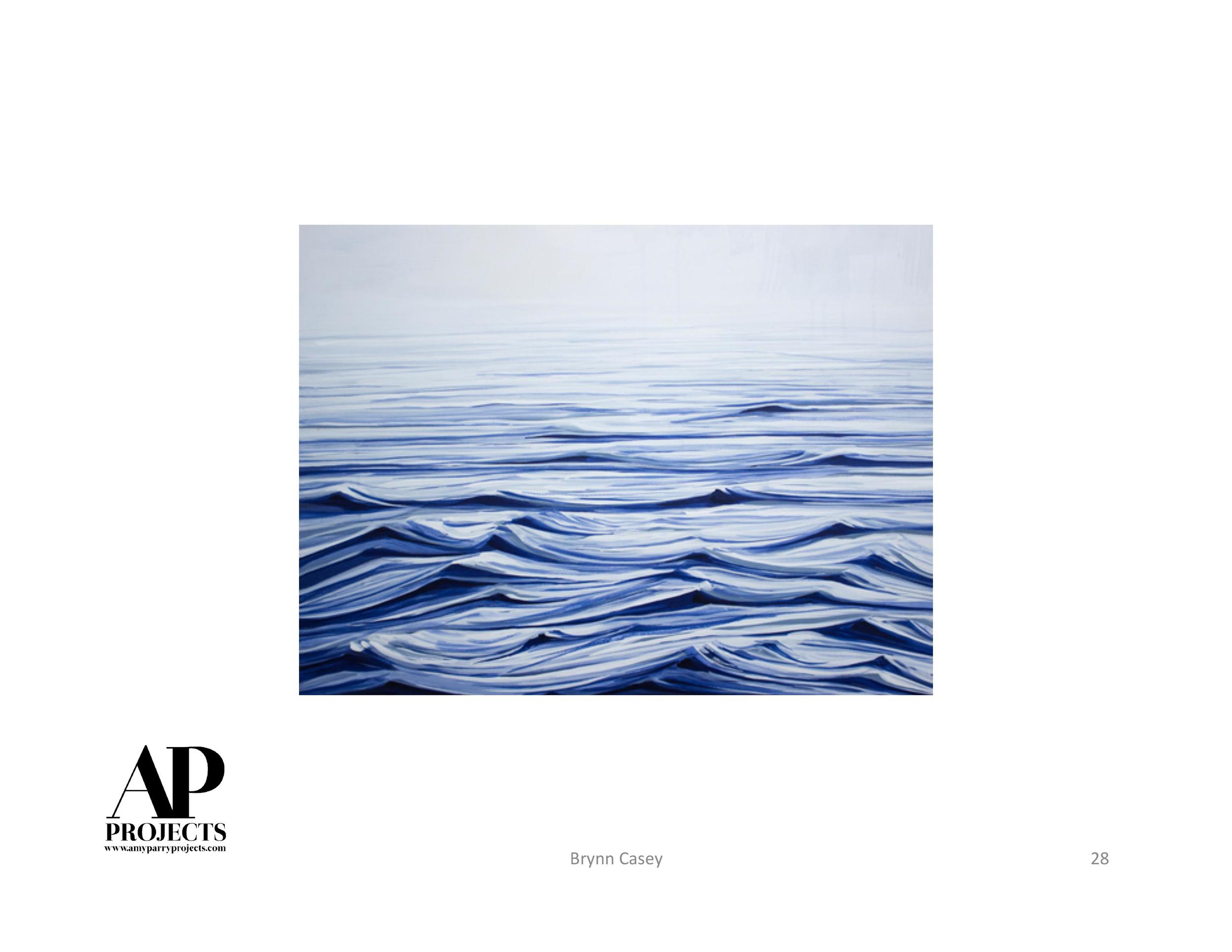
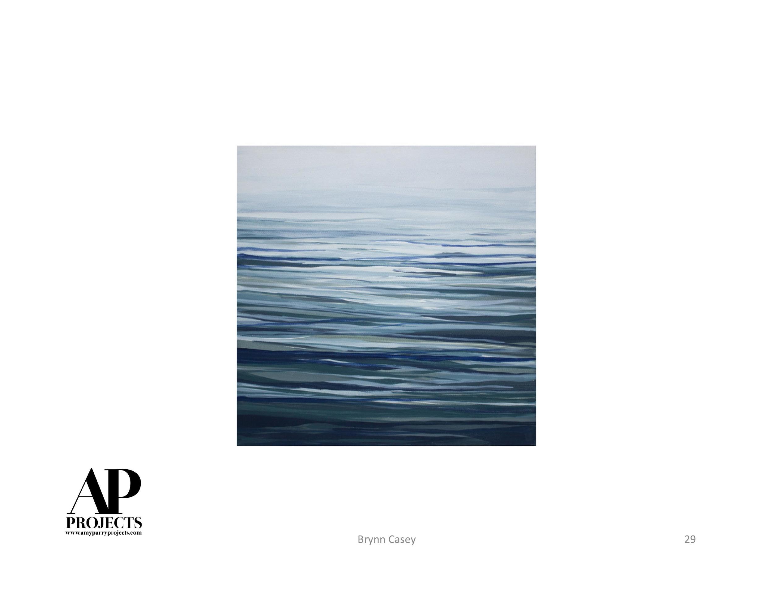
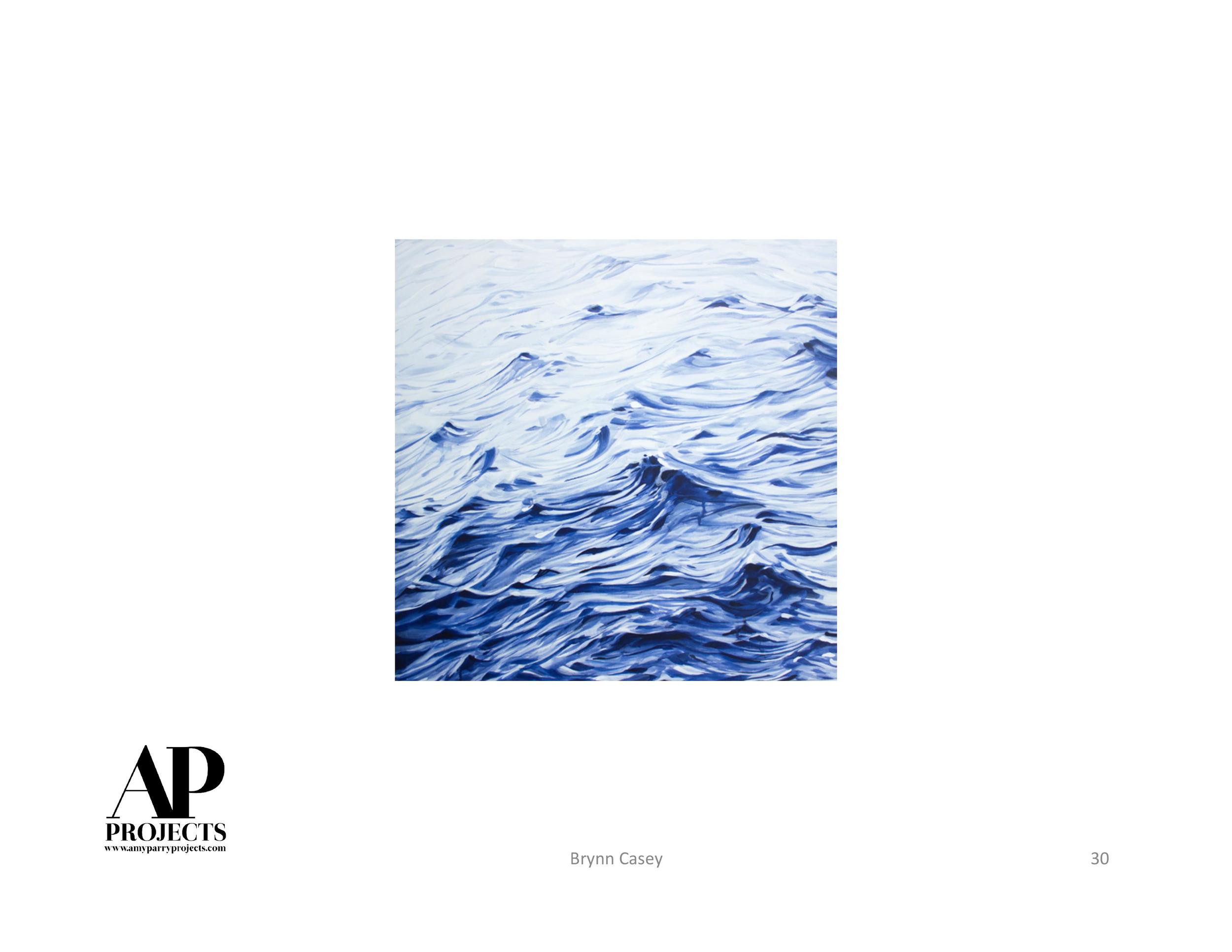
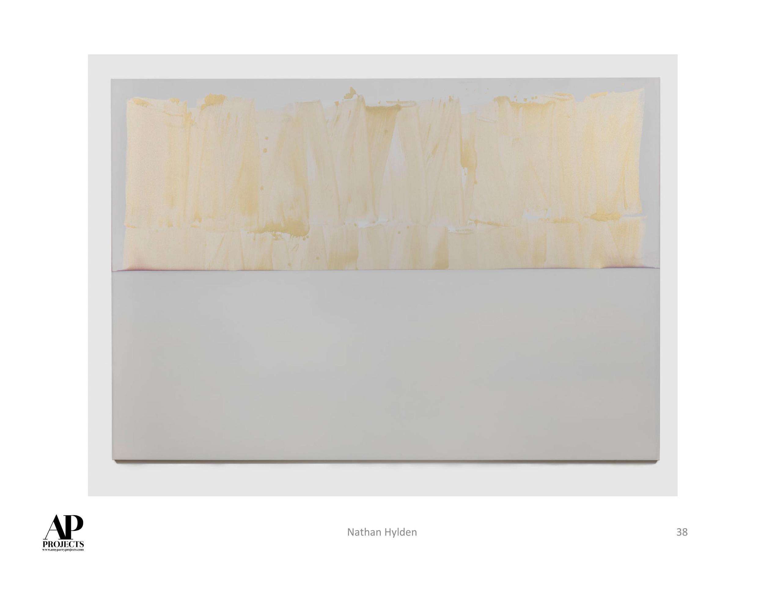
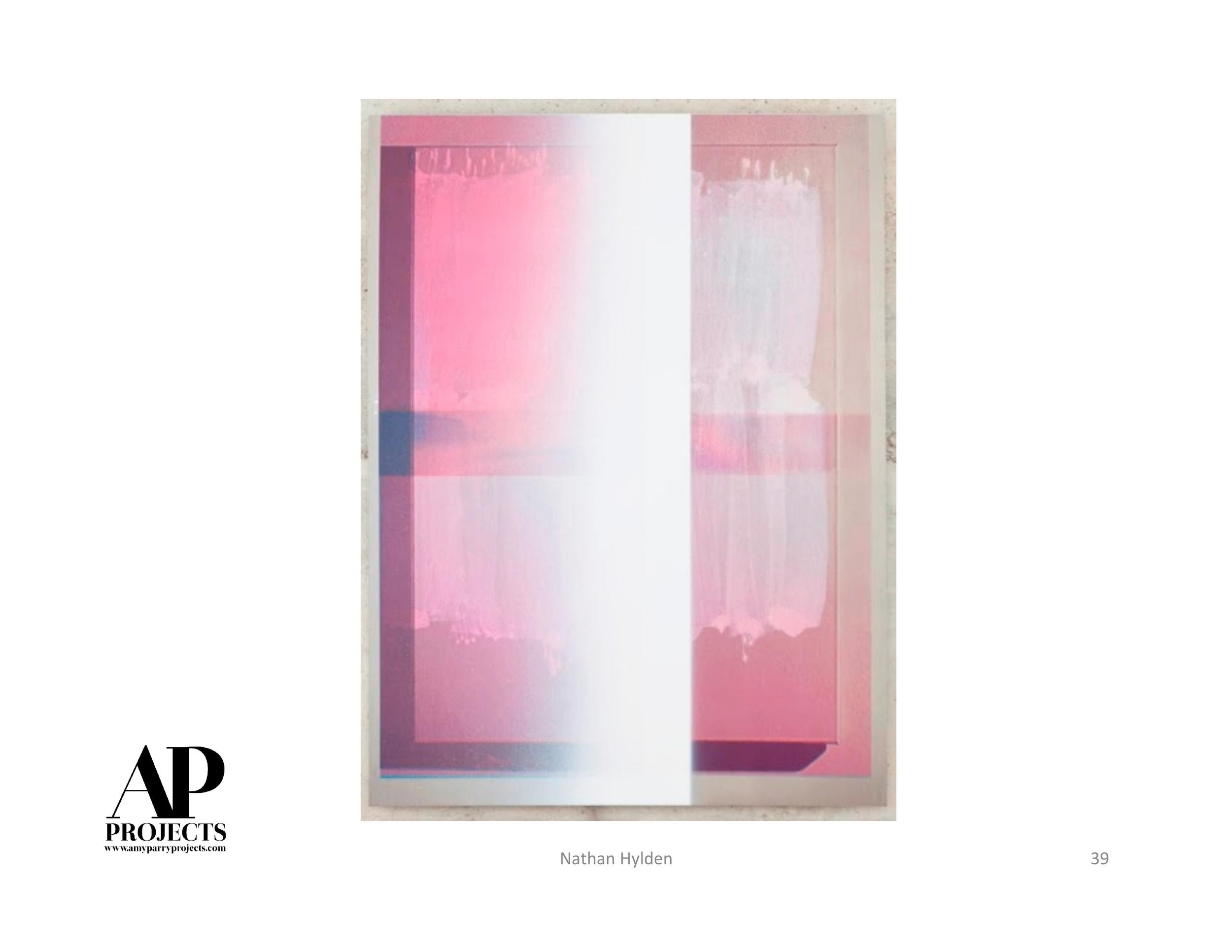
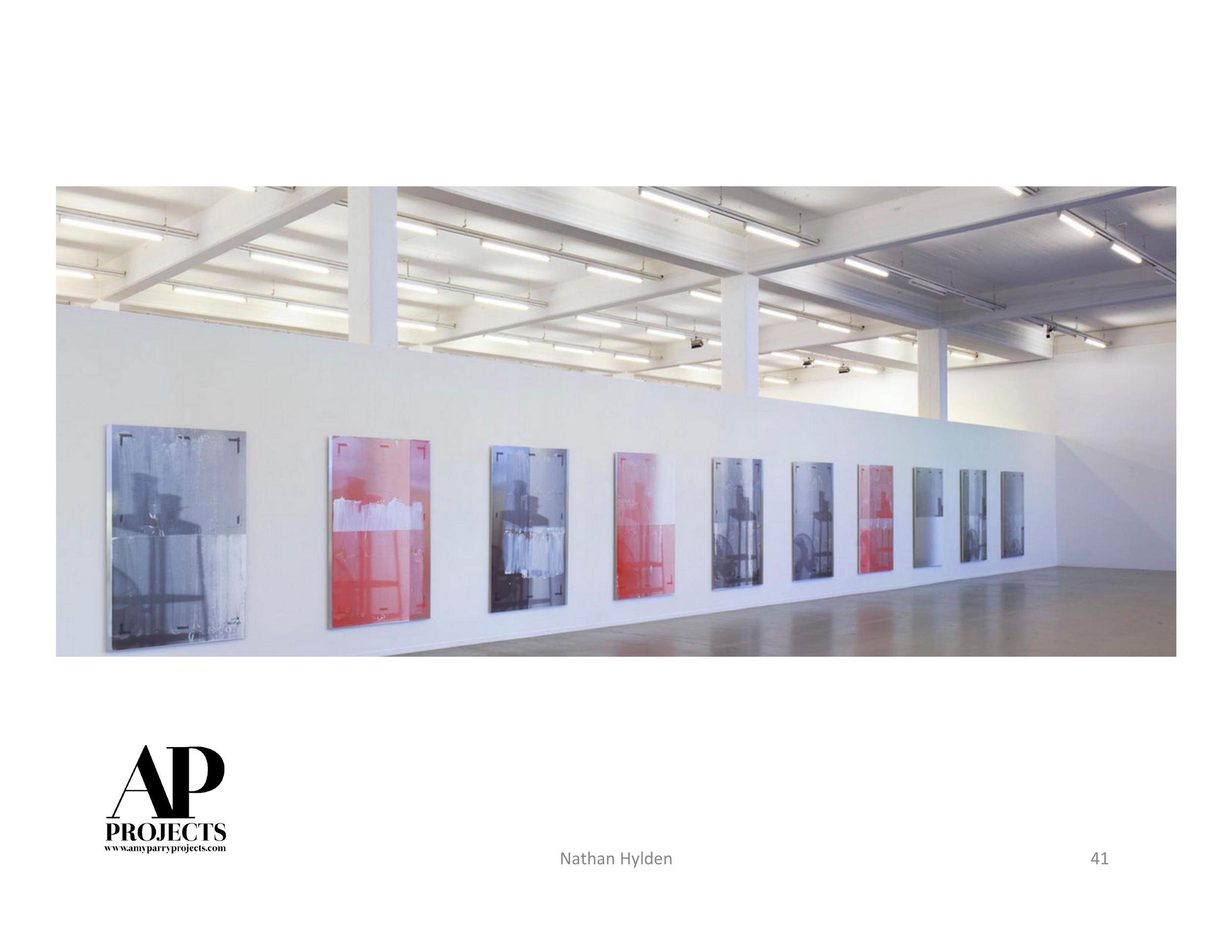
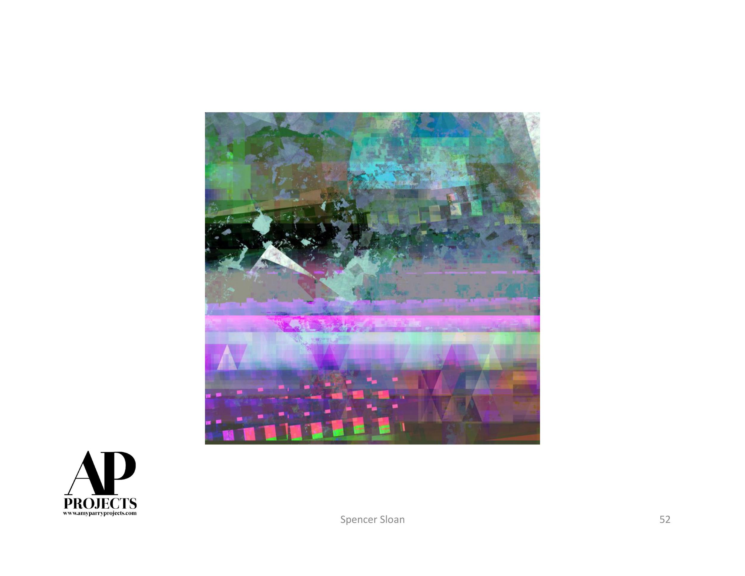
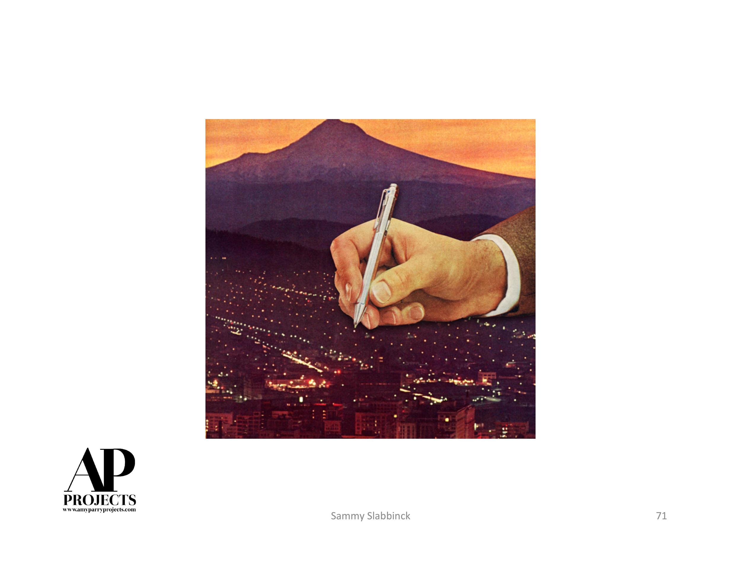
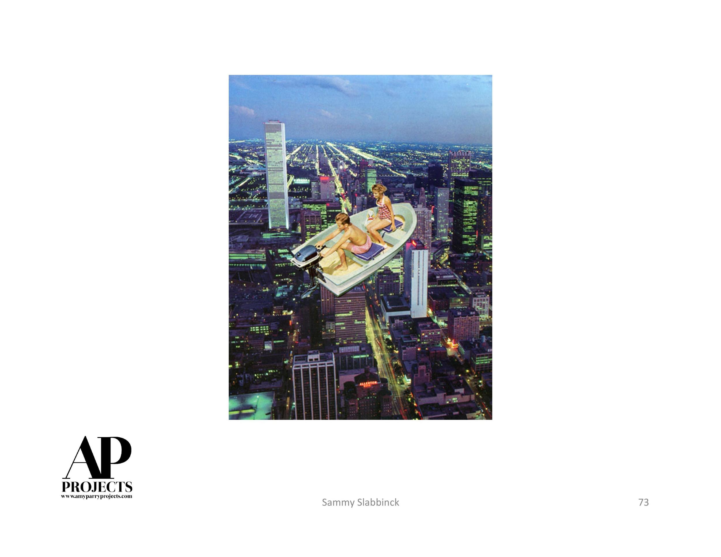
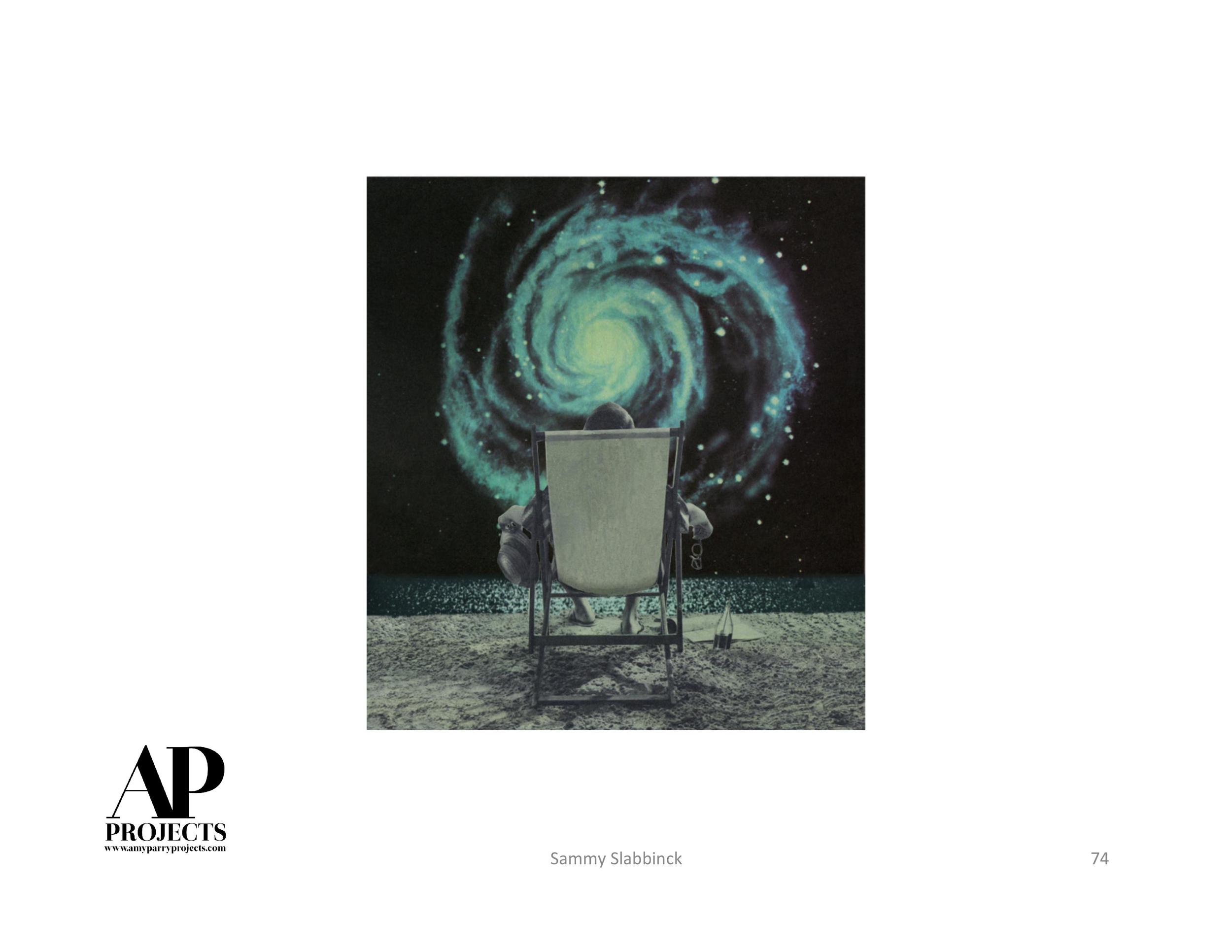
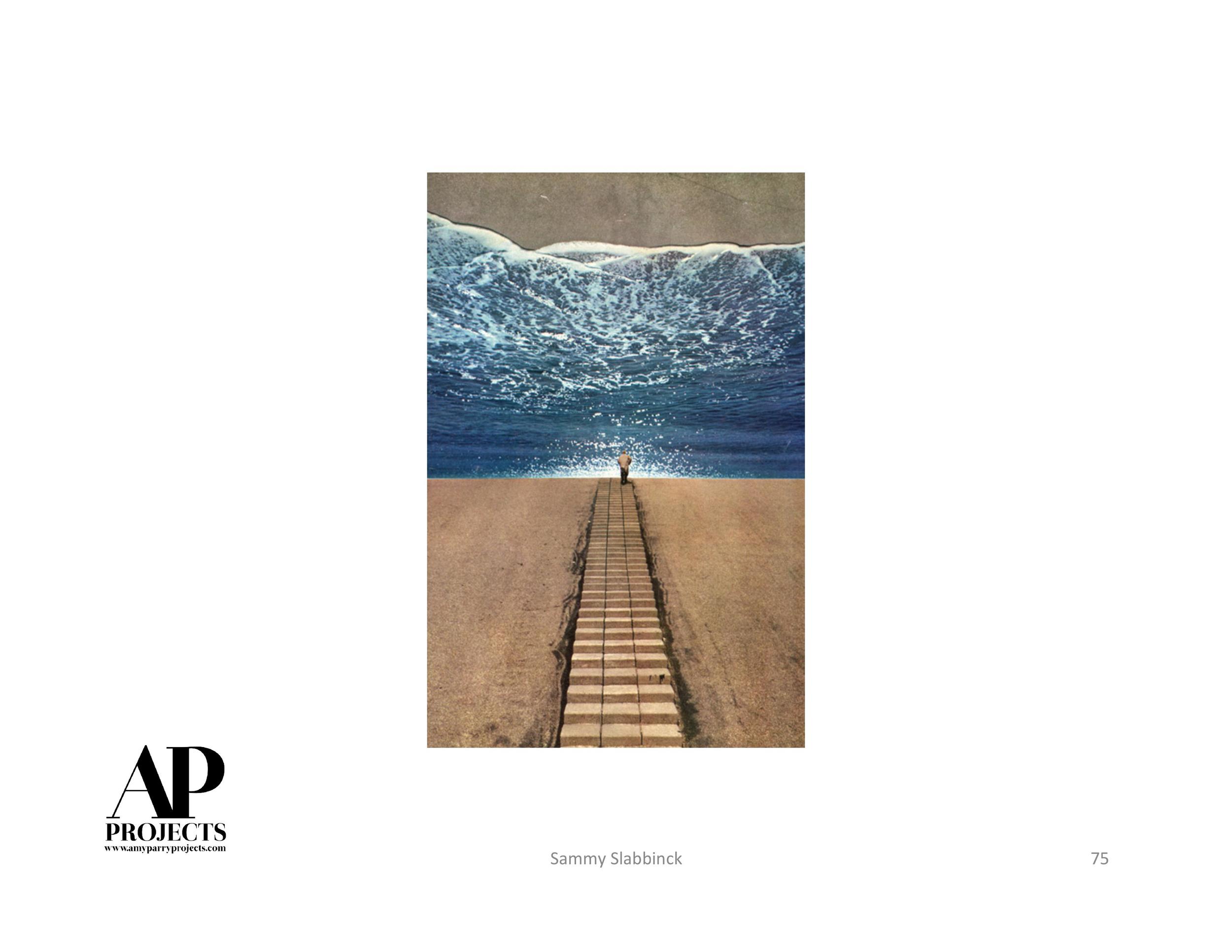
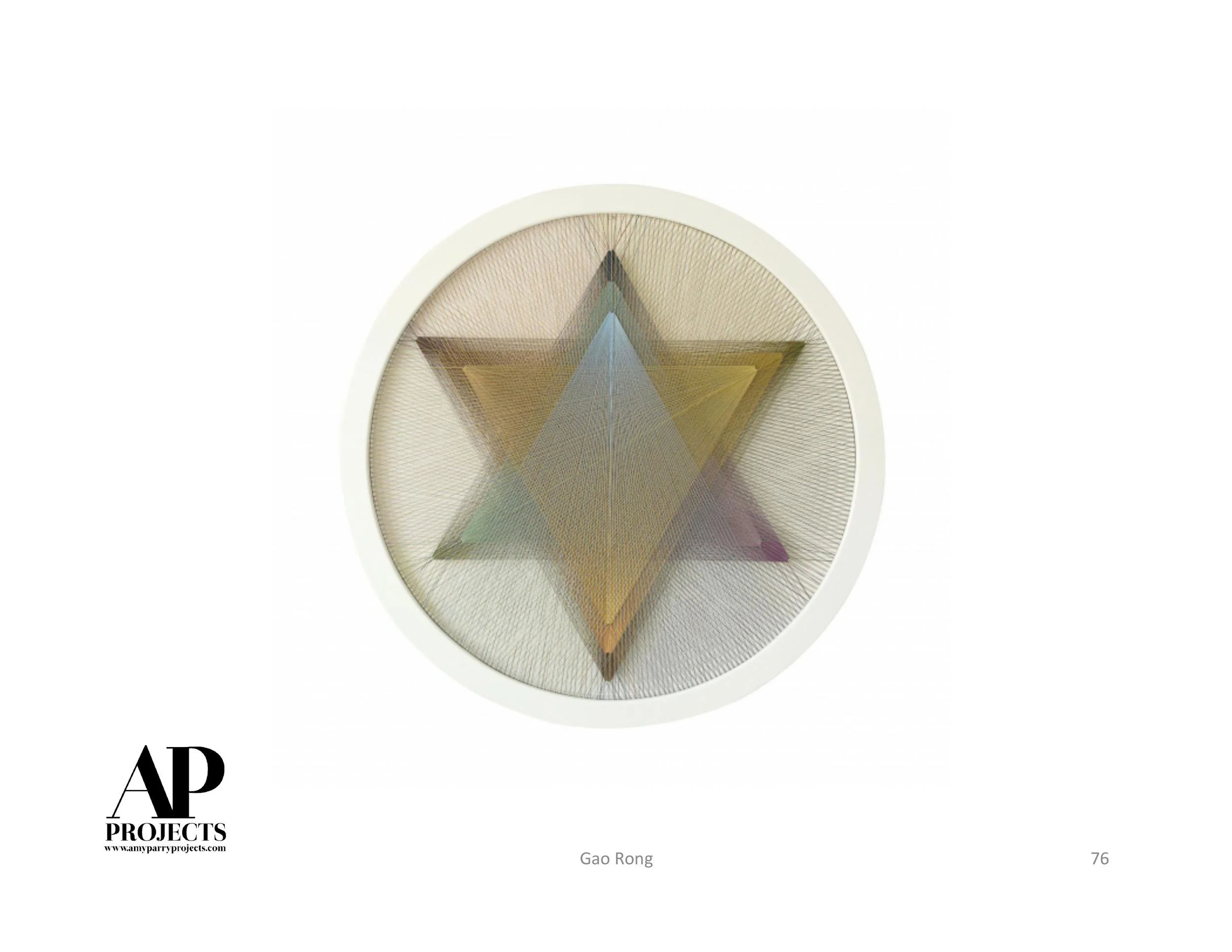
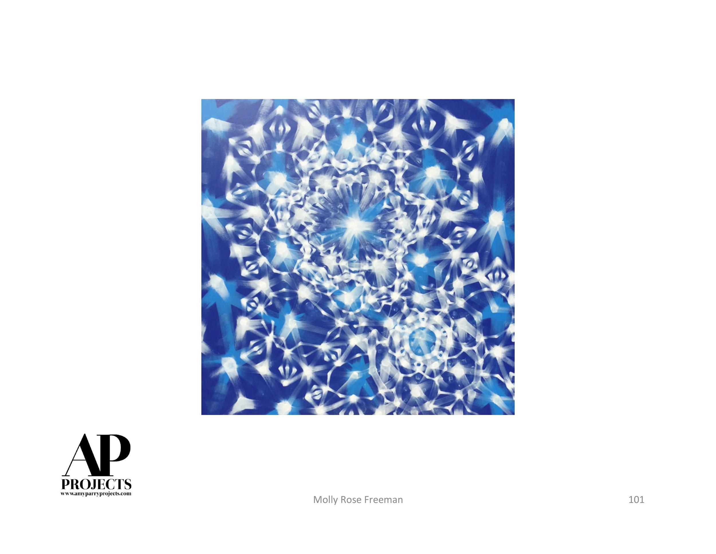
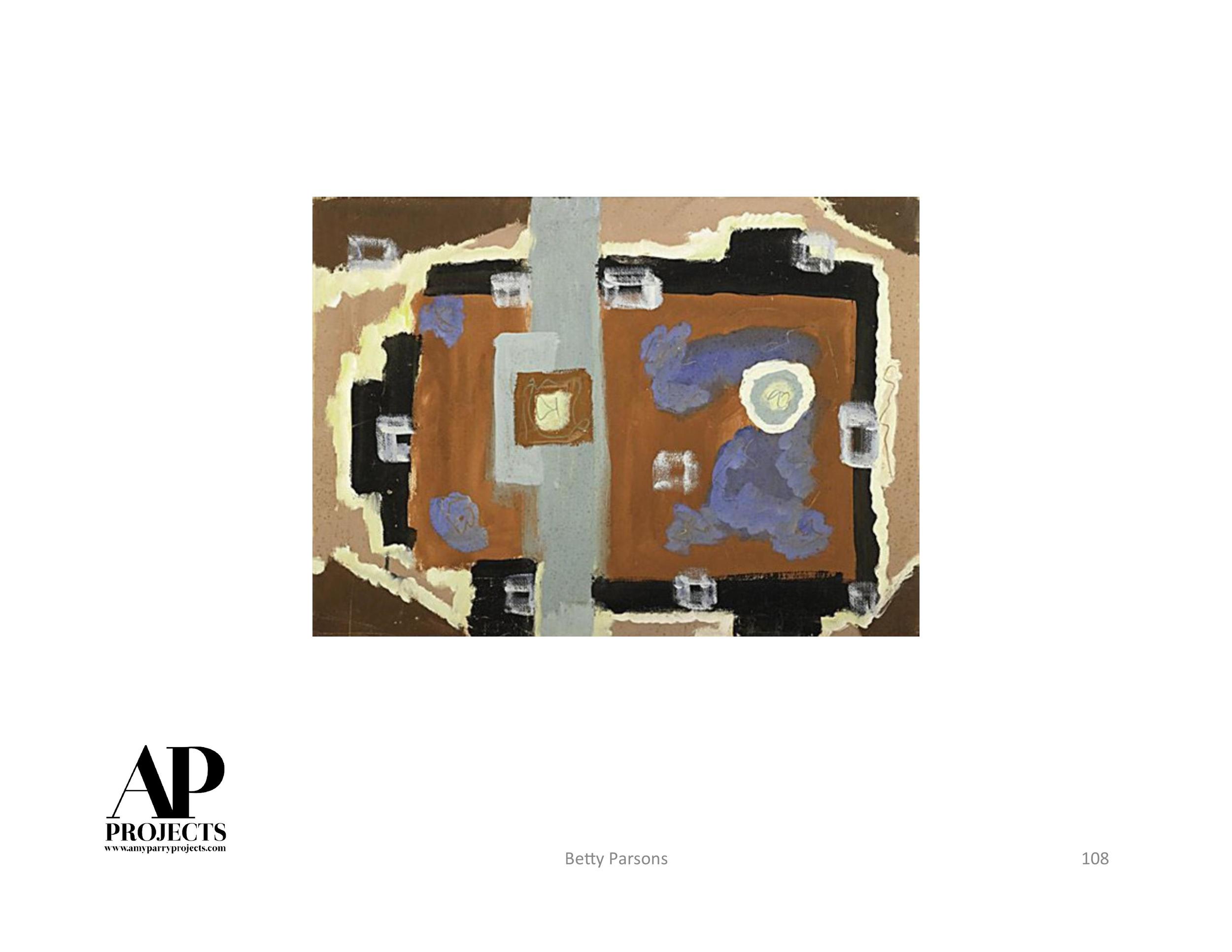
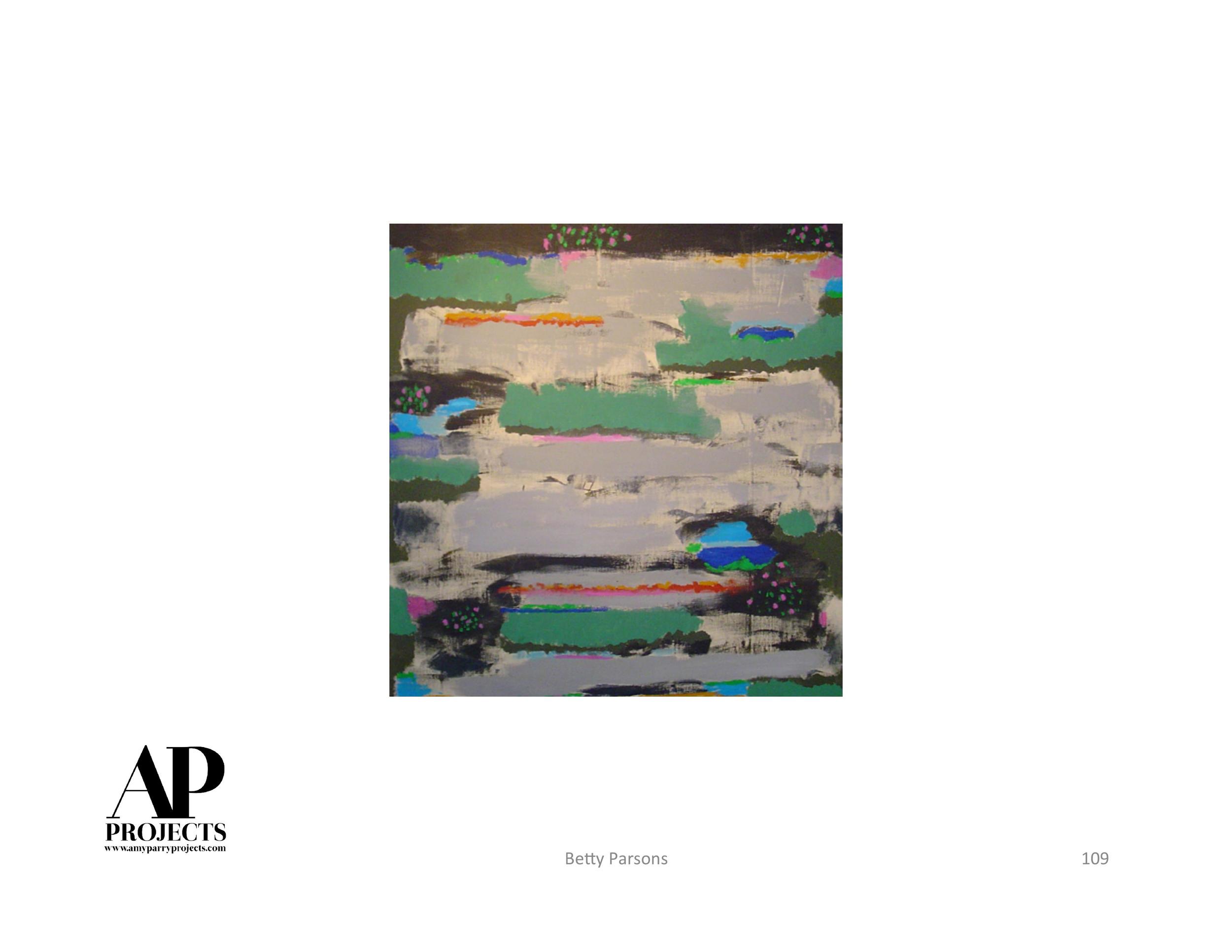
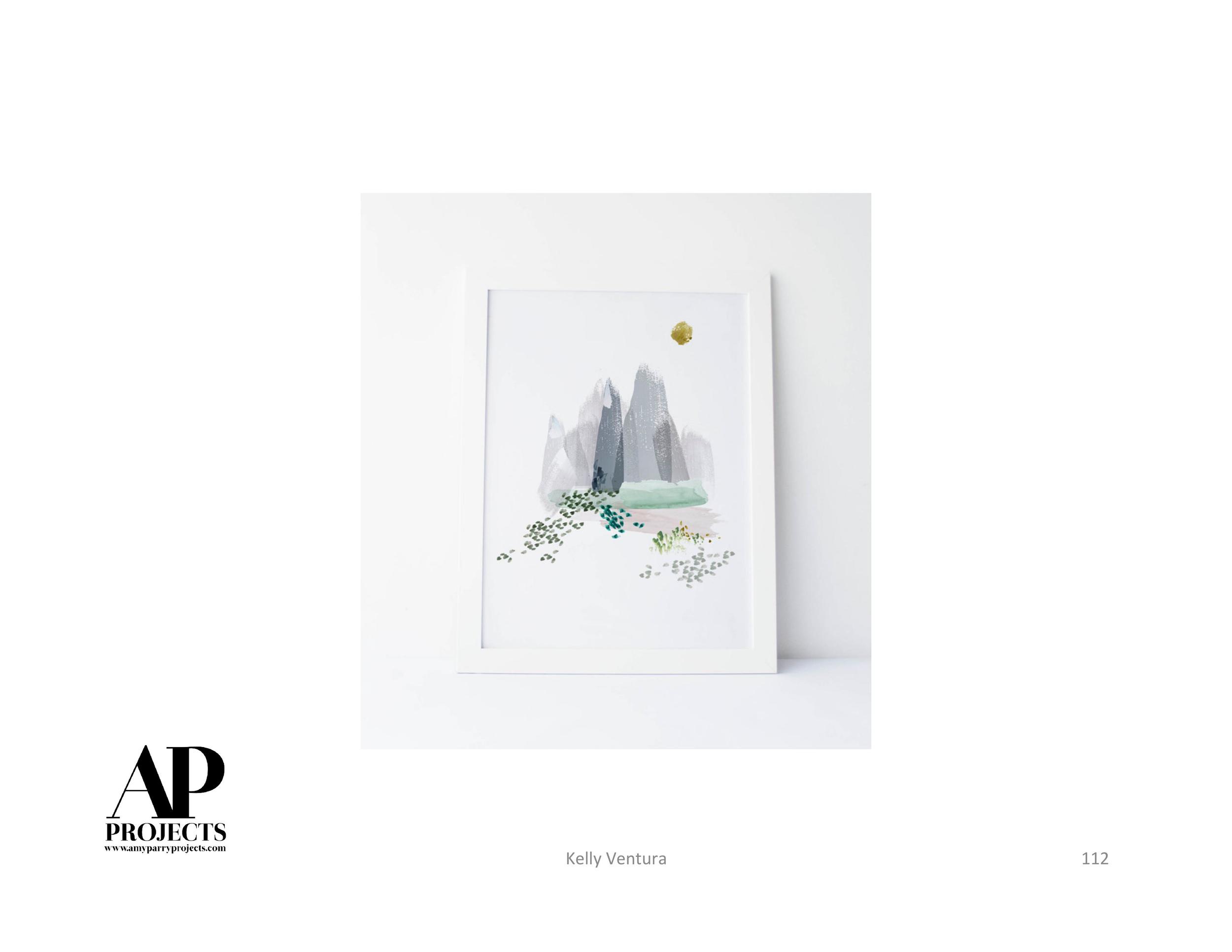
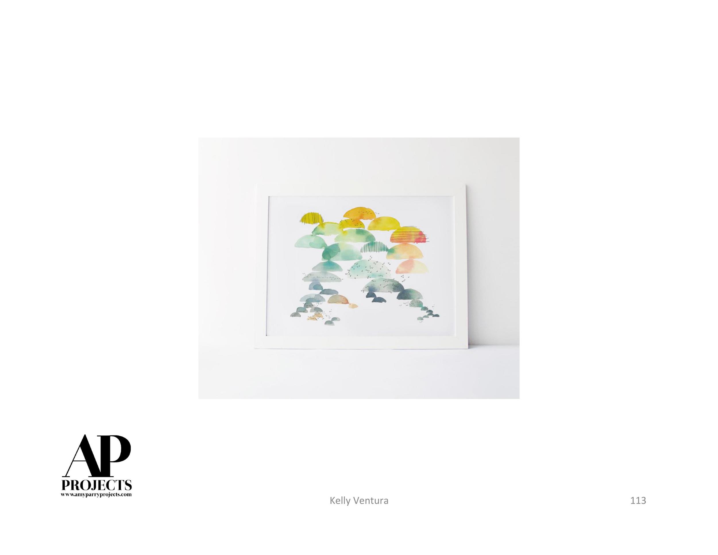
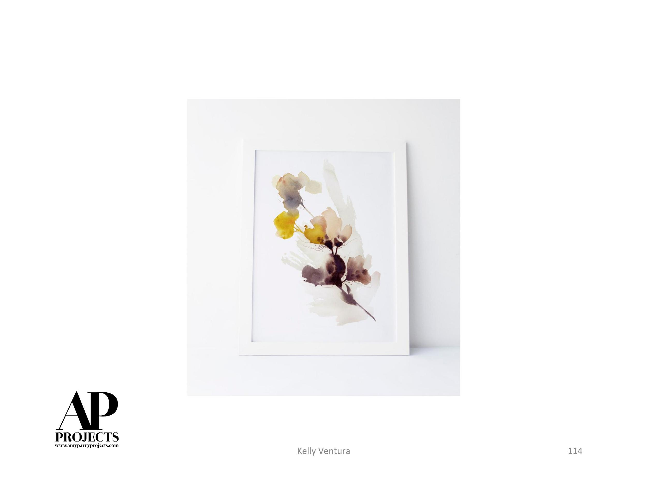
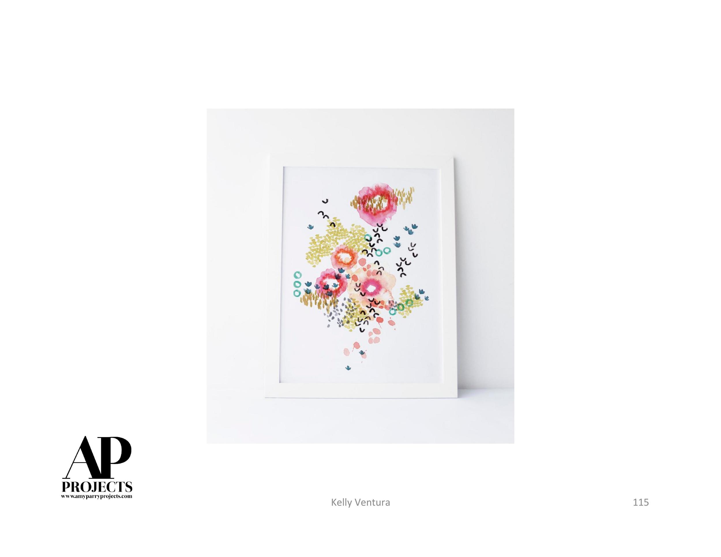
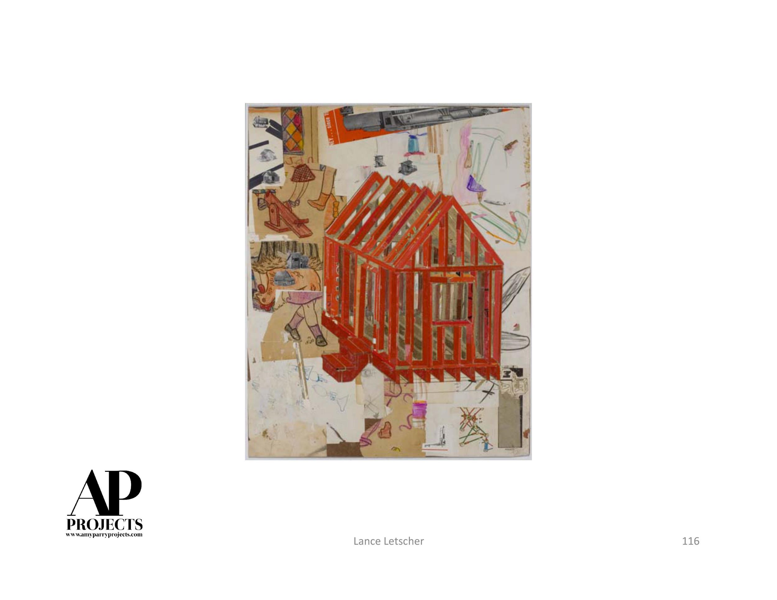
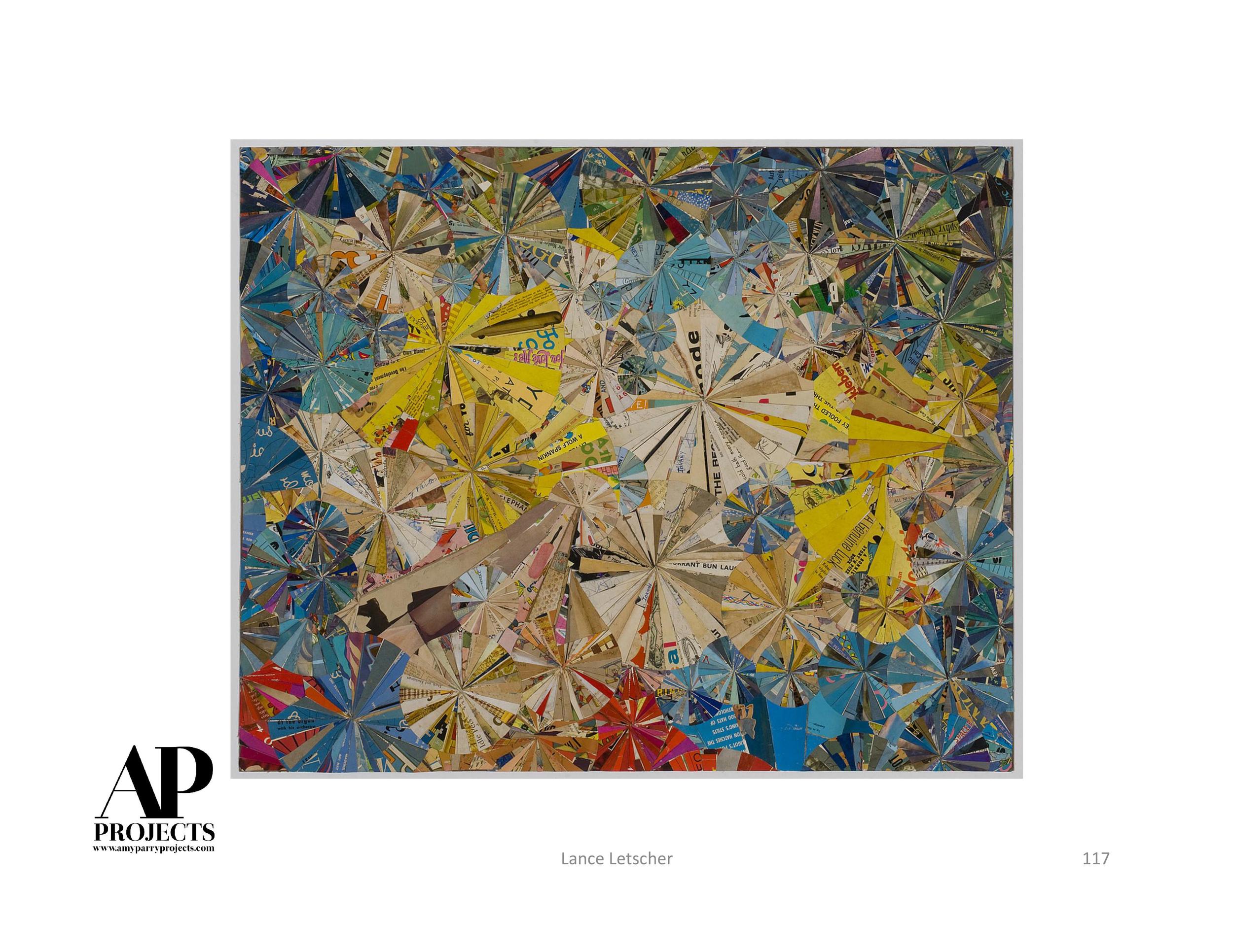
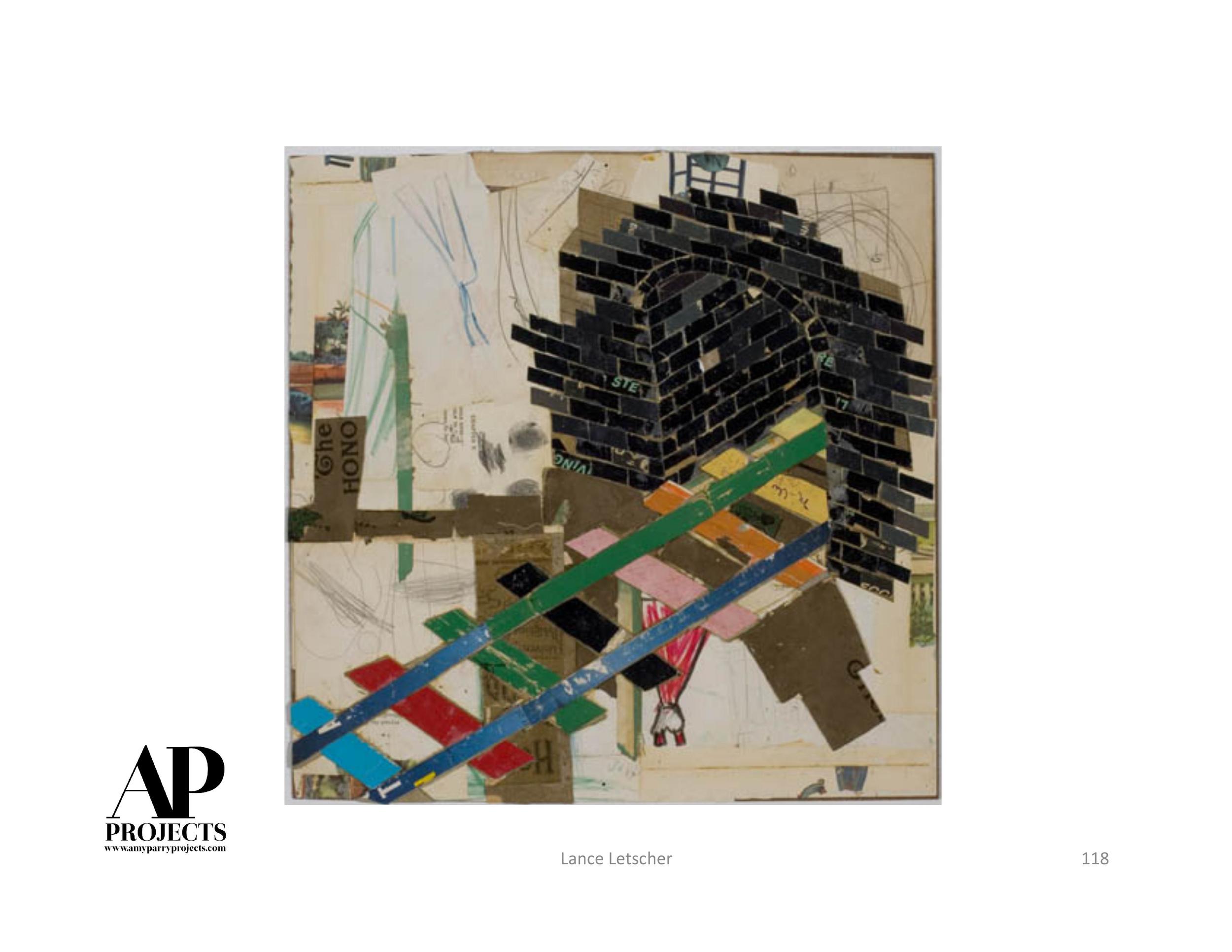
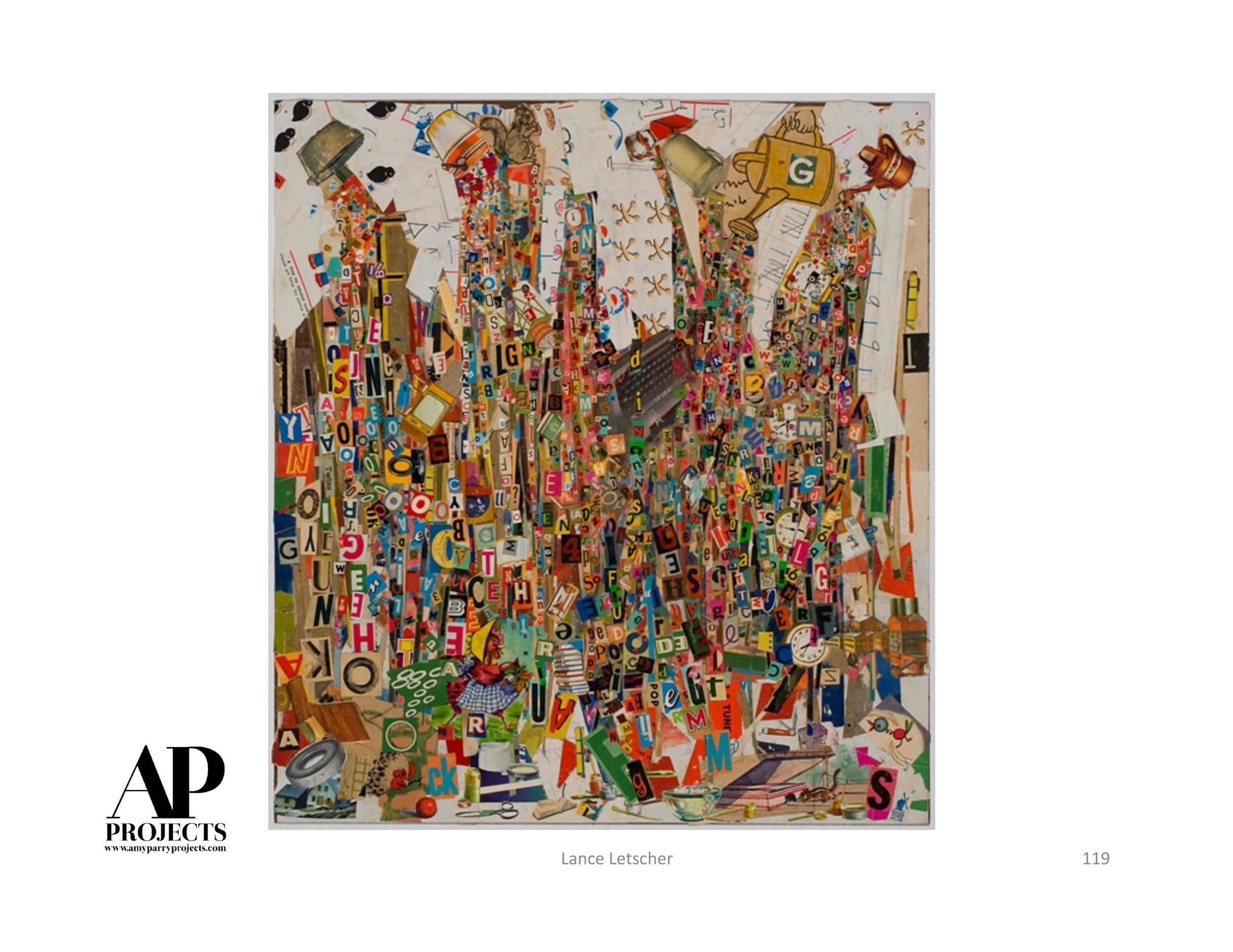
Jim Newbury + Greg Slater
“The aim of art is to represent not the outward appearance of things, but their inward significance.”
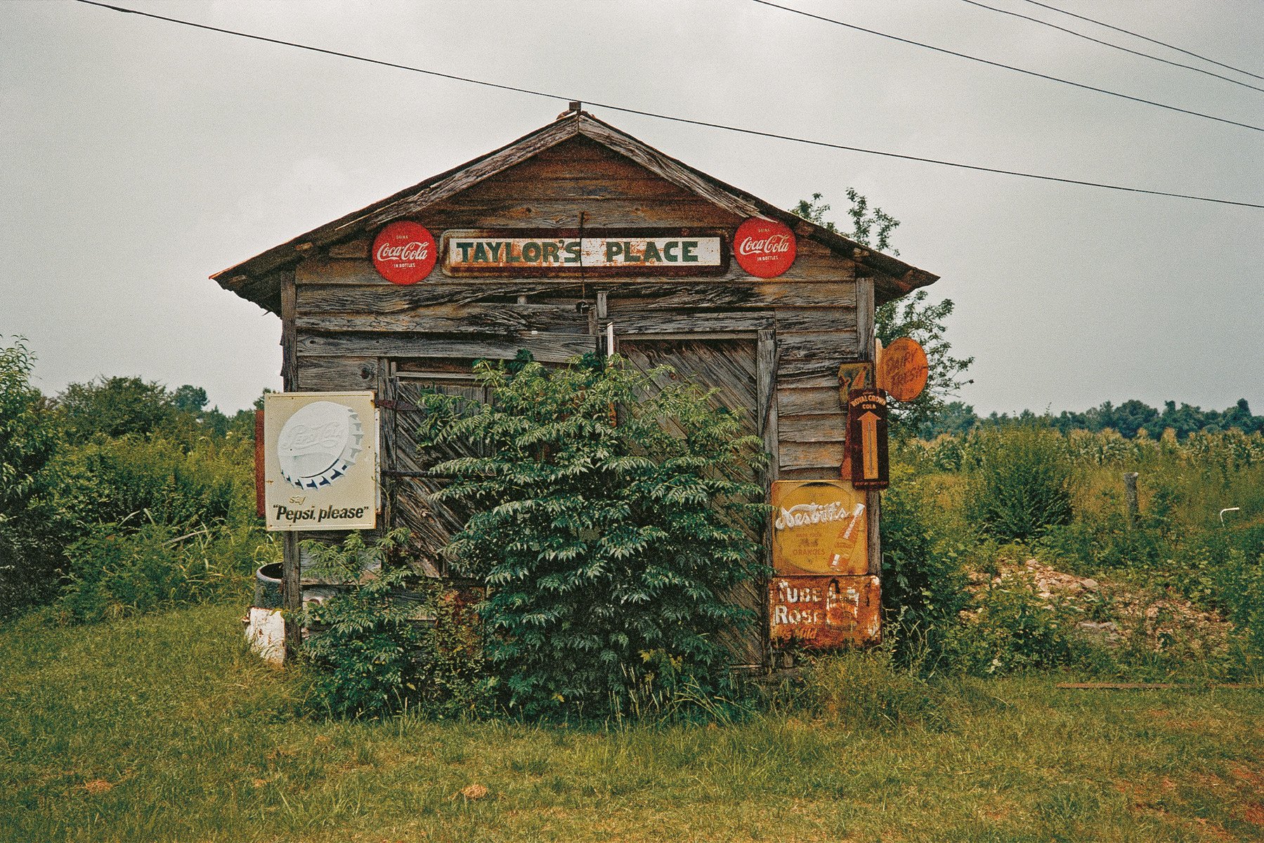
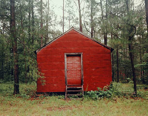
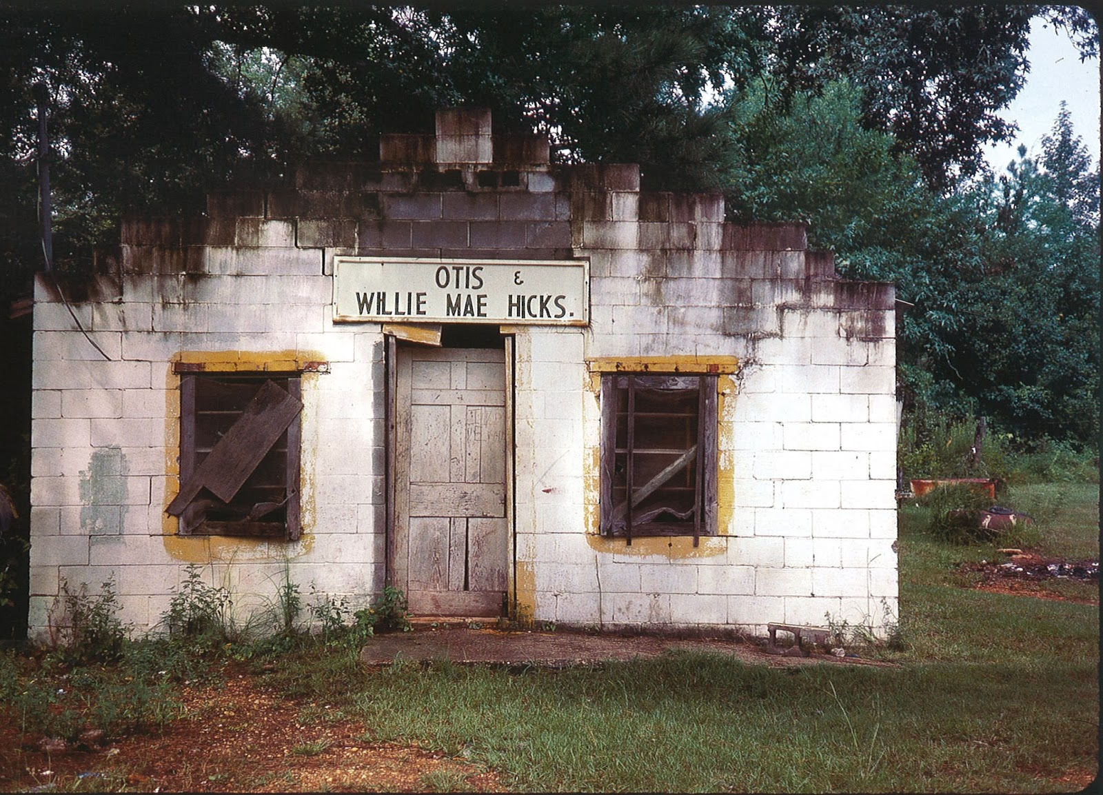
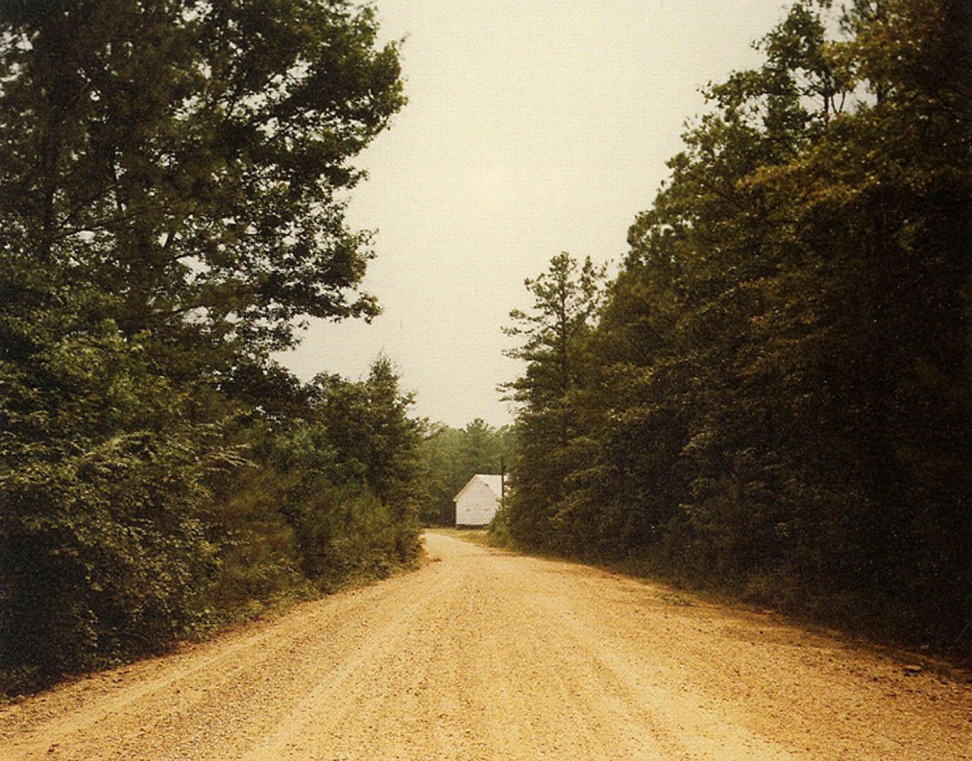
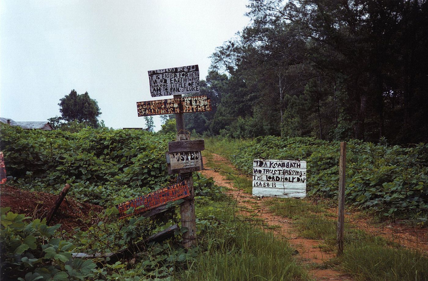
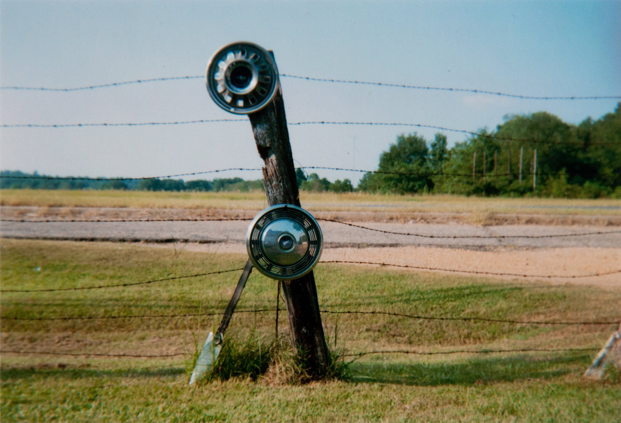
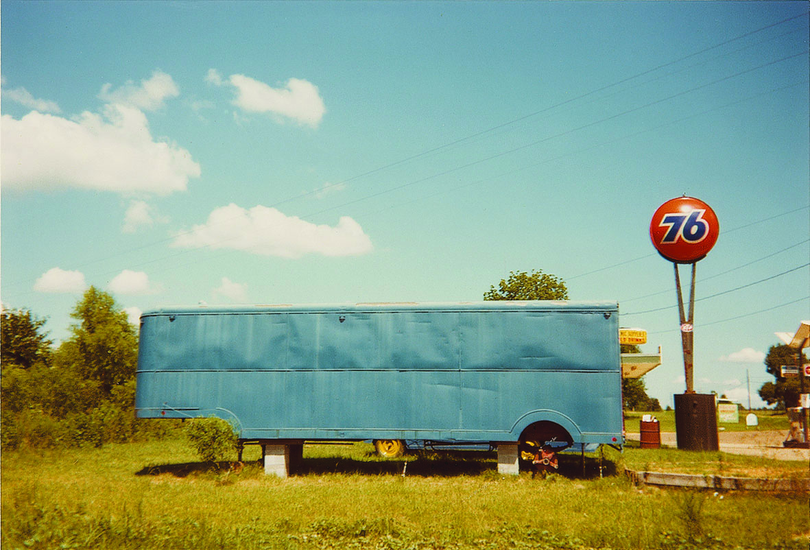
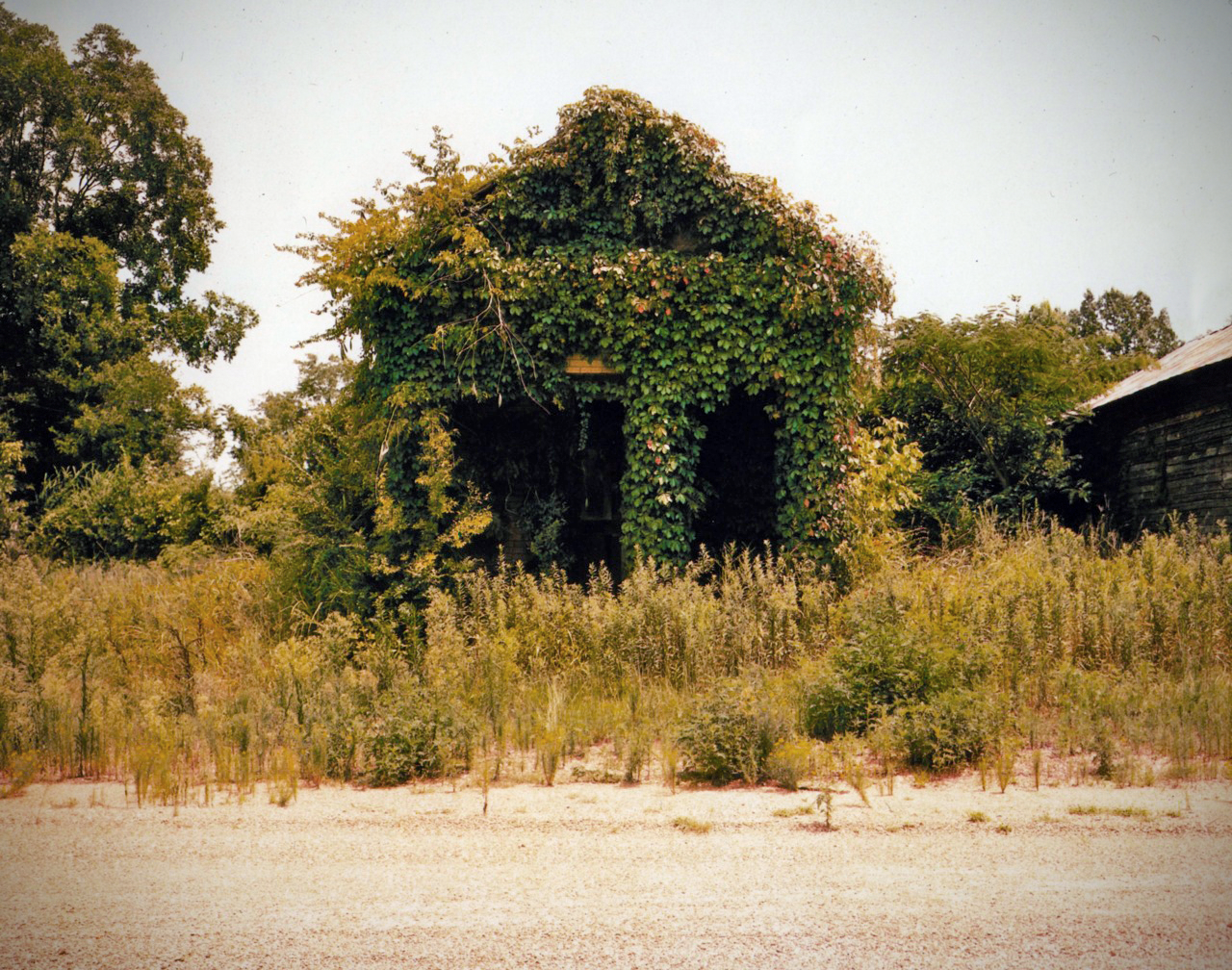
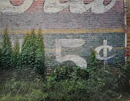
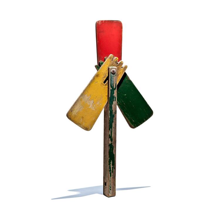
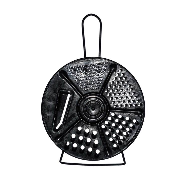
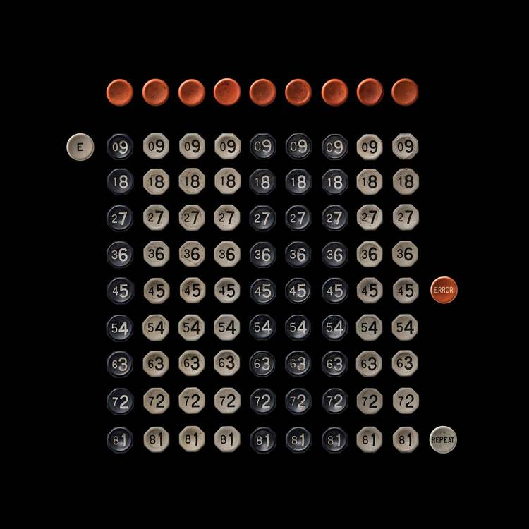
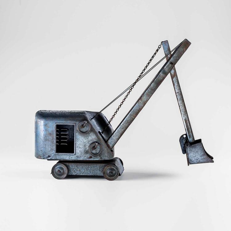
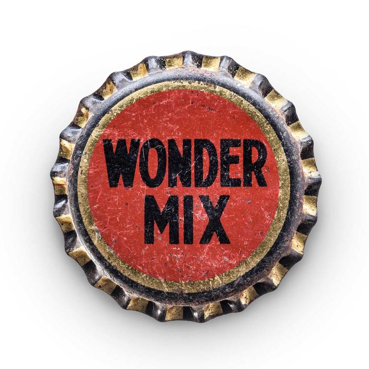
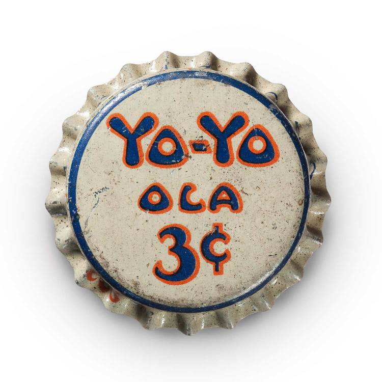
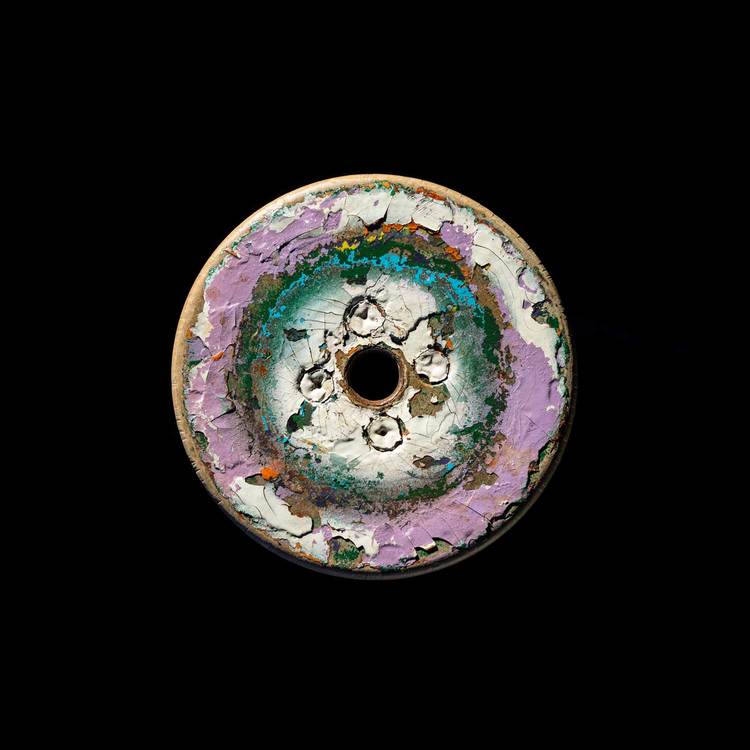
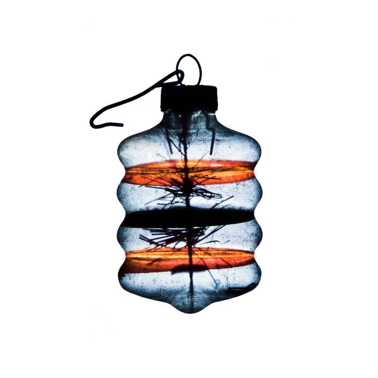
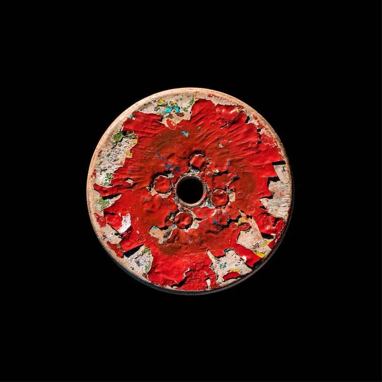
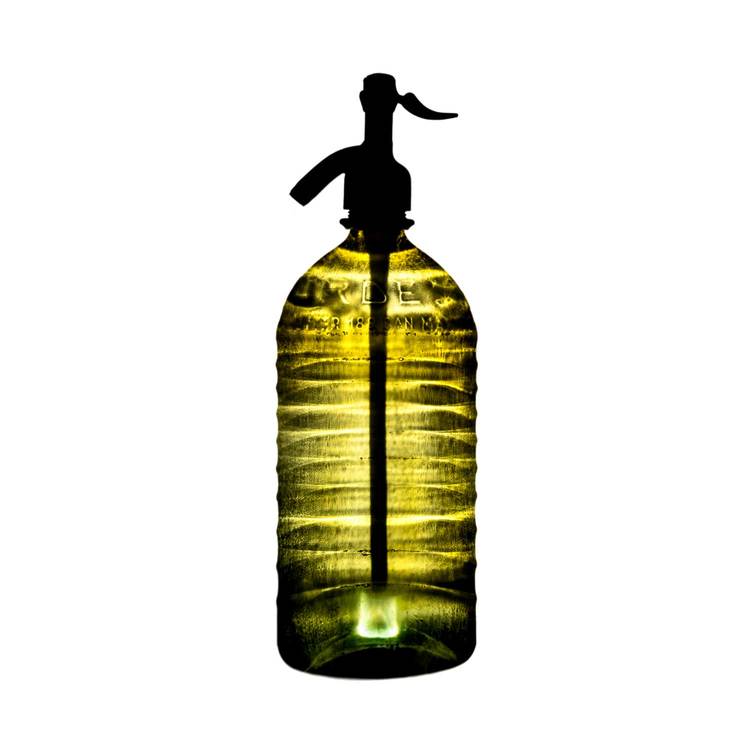
Clearly we see a ton of art, but rarely have we been so instantly drawn in as we were by the photographs of Lost and Found, an artist collective of two. Jim Newbury and Greg Slater, originally ad-agency co-workers now decades-long friends, have amassed an amazing collection of photographs that honor lost objects, found on a series of adventures they have taken across the American South.
Beginning in the mid 80s, Jim and Greg would go on road trips together, surveying the South's folk art meccas, and devoting their leisure time to a mutual appreciation of work by artists like Leroy Almon, RA Miller and Clyde Jones. Their trips consisted of talking in the car, listening to specifically curated music and diving into the culture of the towns they passed through. Jim told stories and struck up conversations with locals, and Greg took photos.

In the early 2000s, they began methodically re-shooting locations originally exposed by photographers they admire: William Christenberry, William Eggleston and Walker Evans to name a few. In addition to capturing American experiences, they picked up interesting objects at antique stores, roadside stands and flea markets. While they had no real agenda setting out, these trips resulted in a plethora of content. The professional affinities of the pair have led to the success of their resulting photos - Jim has an eye for design and direction and Greg has an incredible talent for photographing objects.
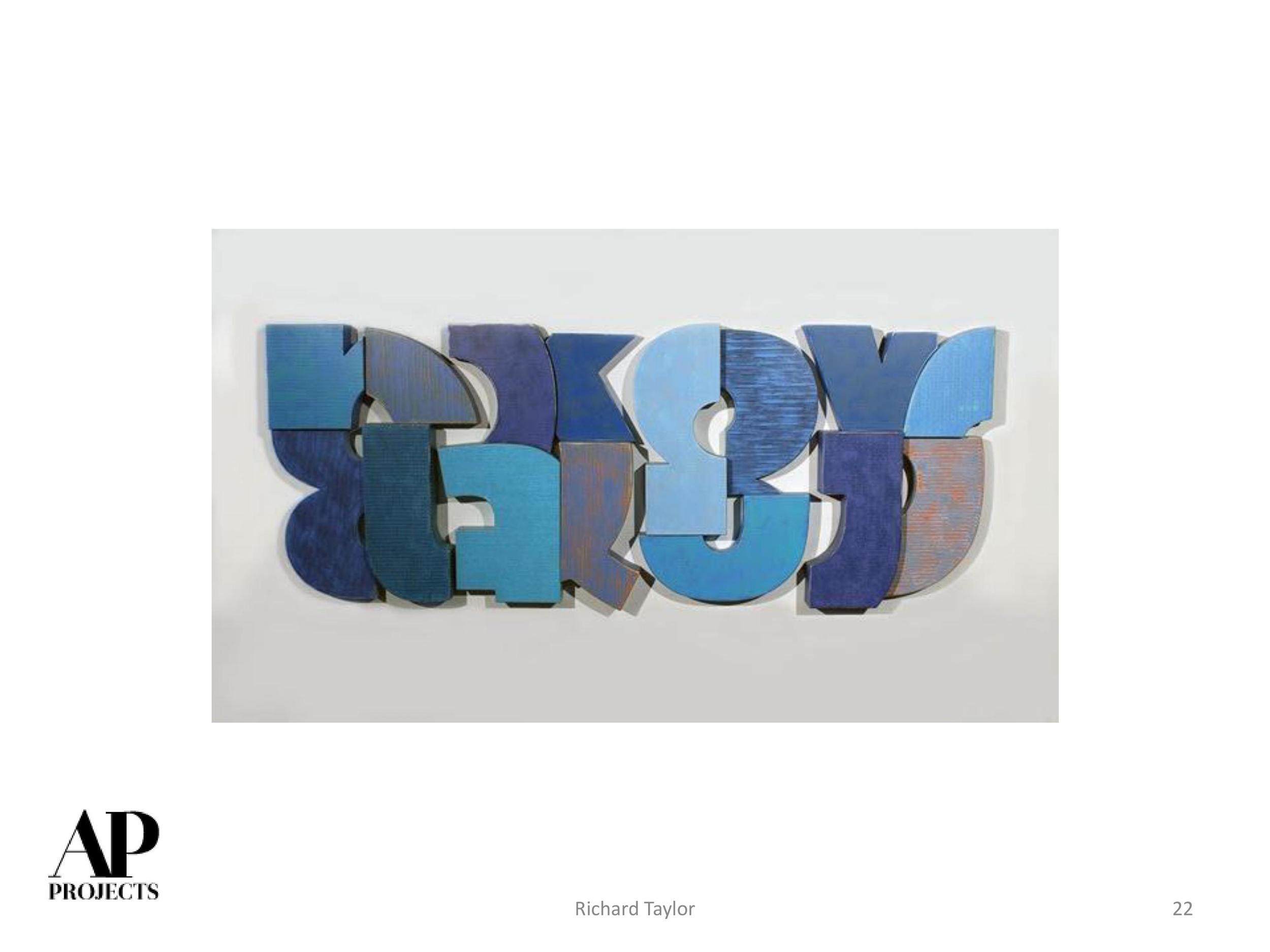
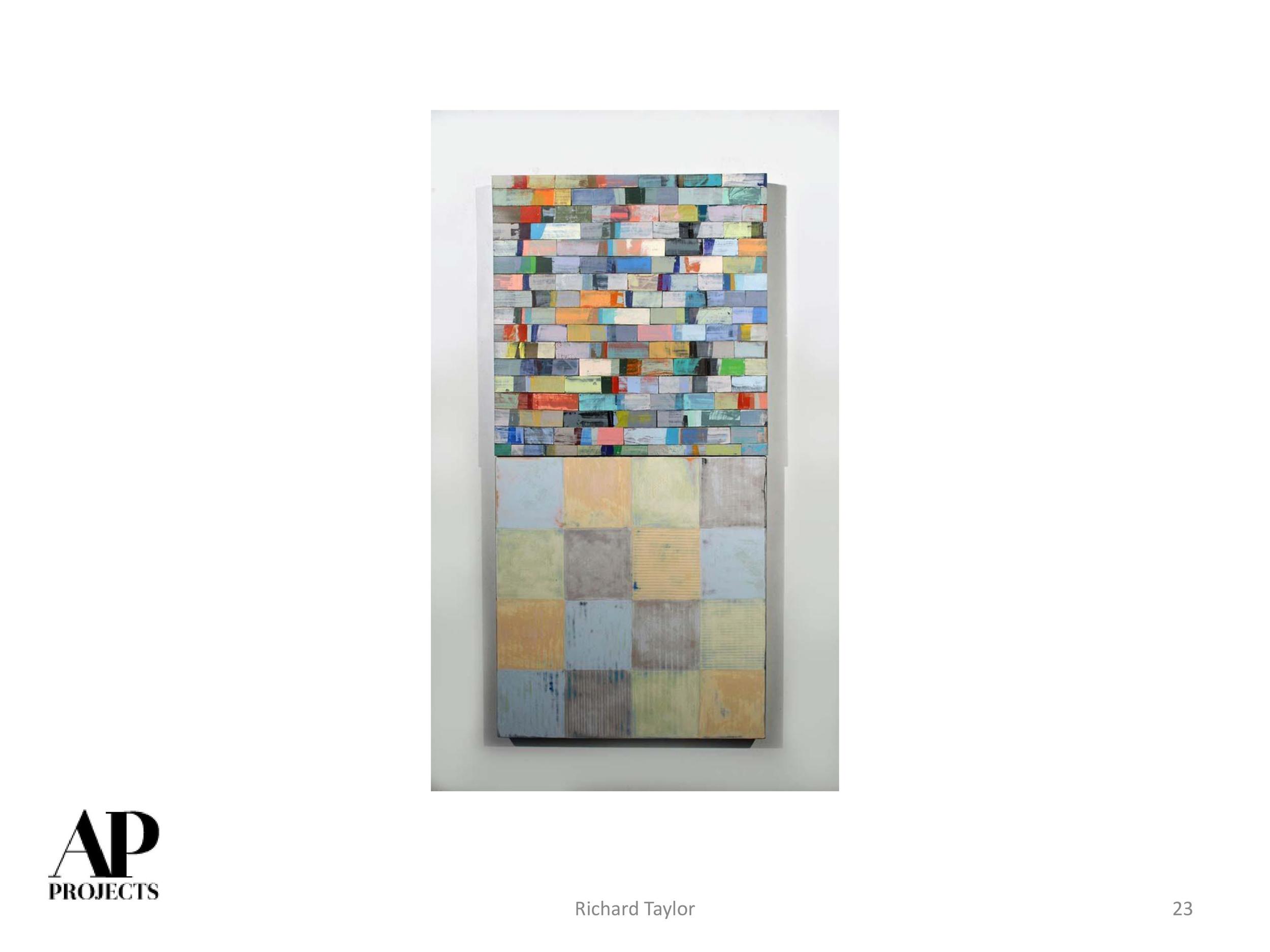
As you can see, the work is both elegant and masculine, and lends itself to many different iterations within the hospitality industry and beyond. The work can be presented in numerous ways, on a myriad of substrates, and really has the ability to punctuate a space and provide a narrative element for any design. Every space has a past and there are so many objects still out there to find and shoot.
Enjoy this selection of their photos and their reverence for time-worn objects...the old, the obsolete. Jim and Greg have managed to elevate these simple, often utilitarian objects, to fine art and to celebrate the patina on America's forgotten "stuff." We love their story and look forward to sharing their work whenever possible. Let us know what you think.
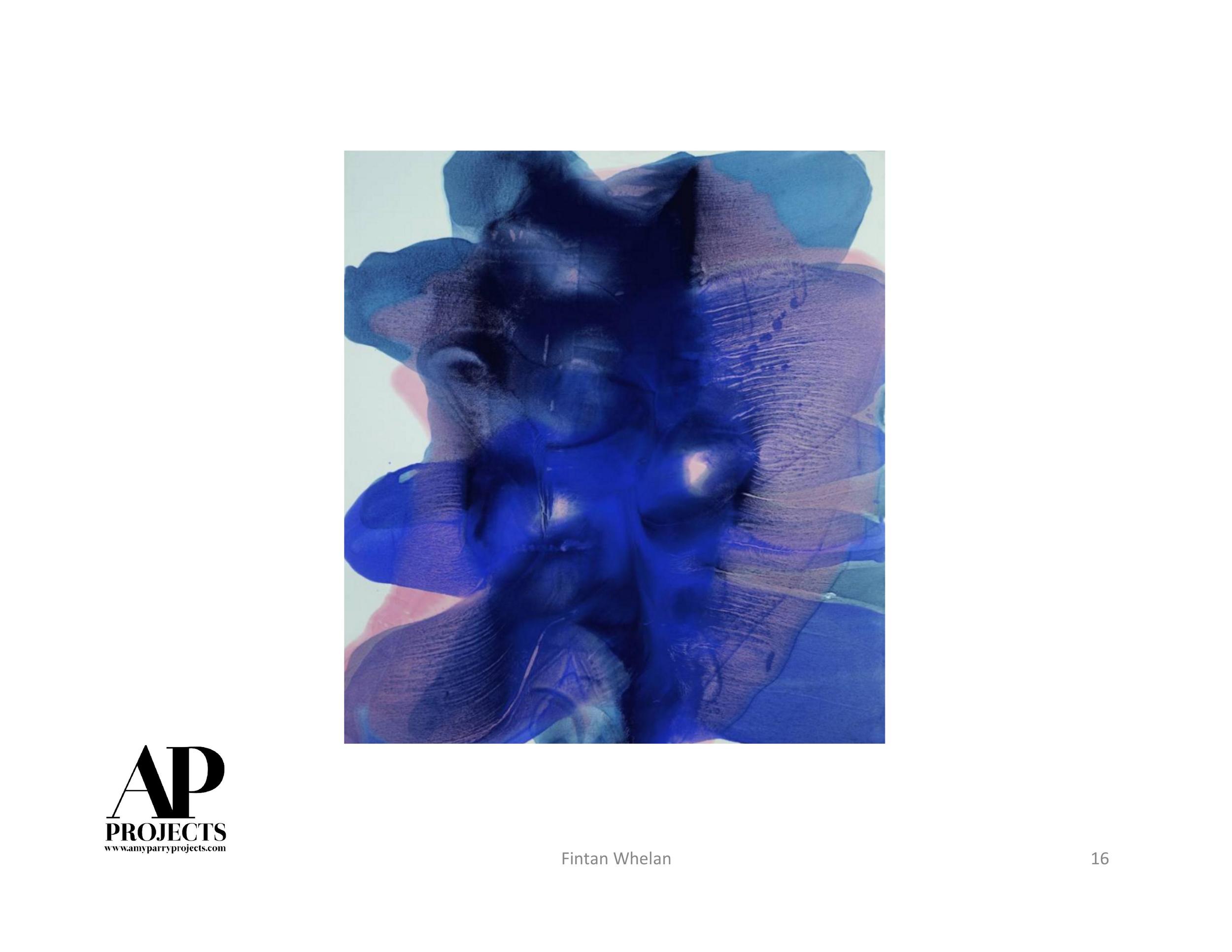
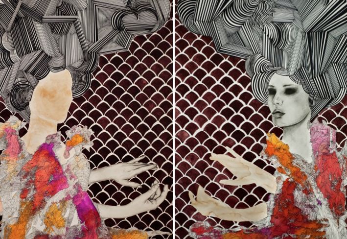
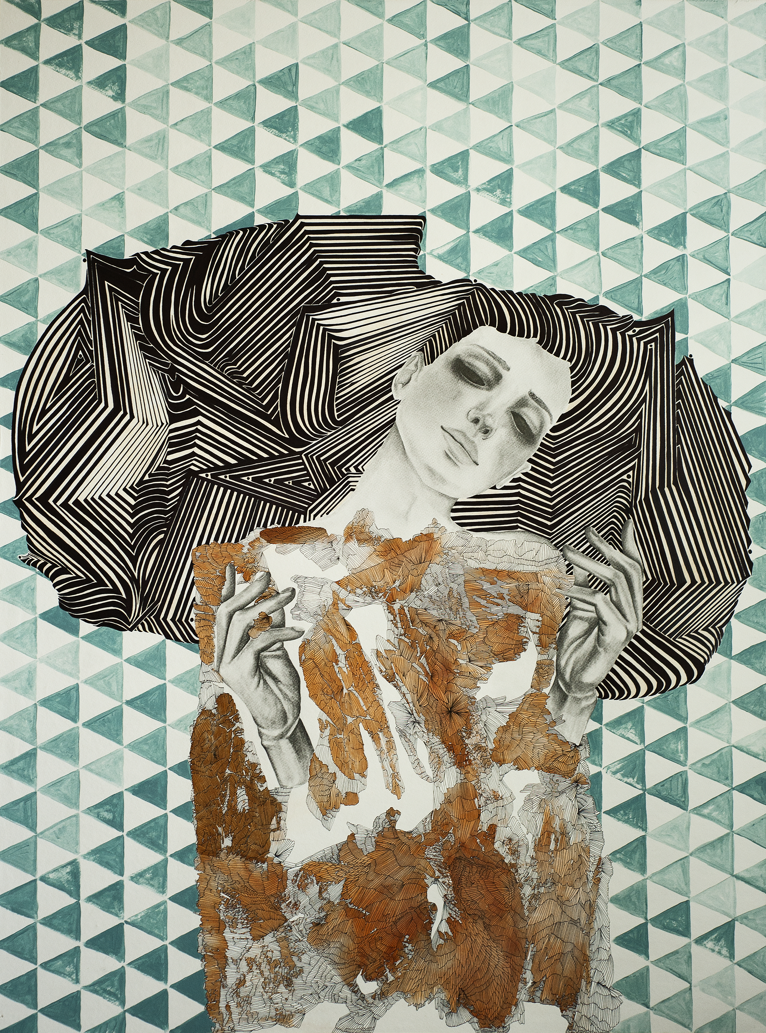
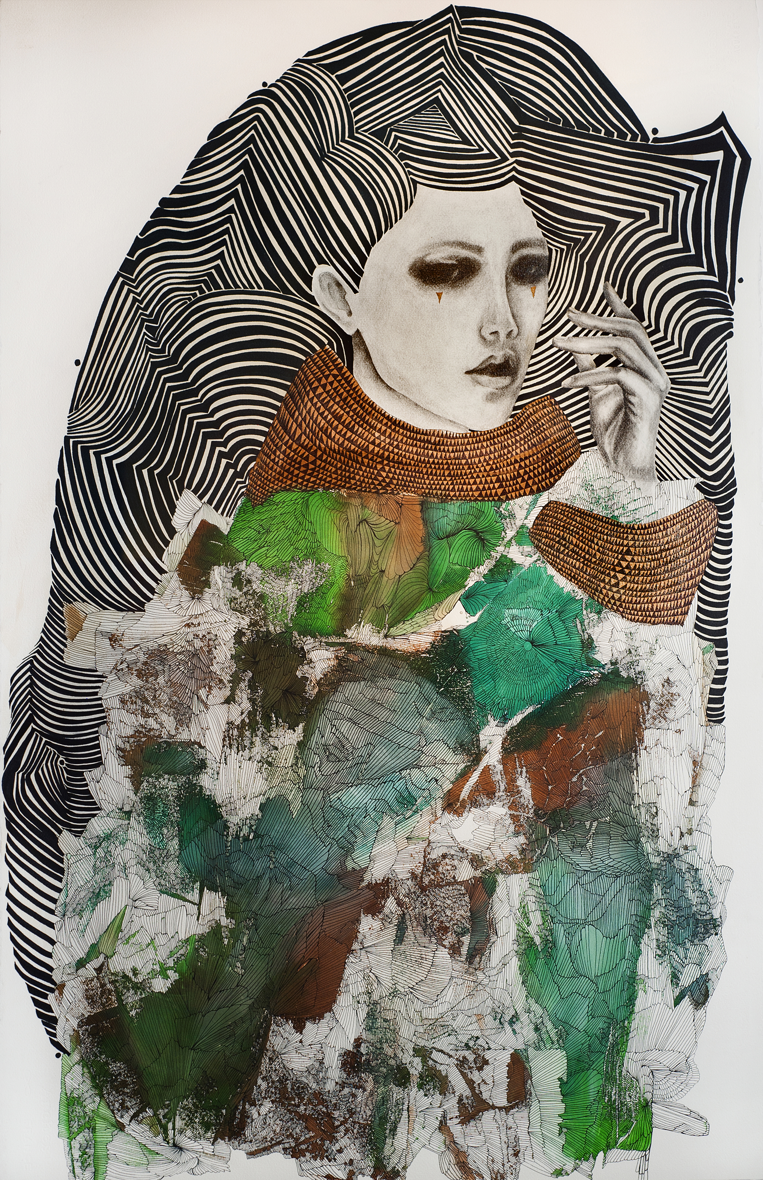
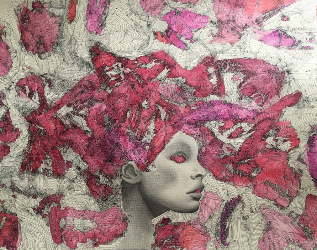
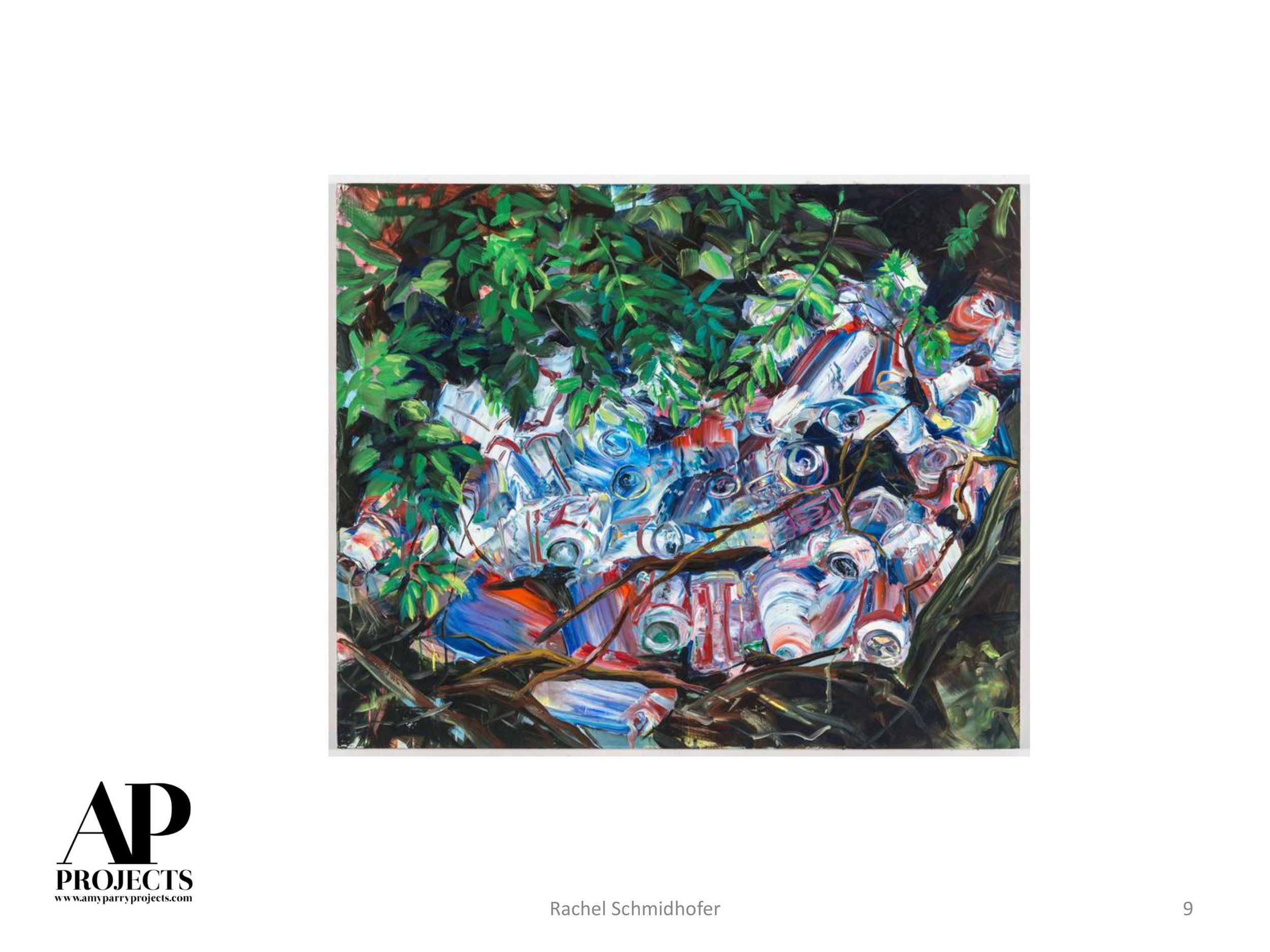
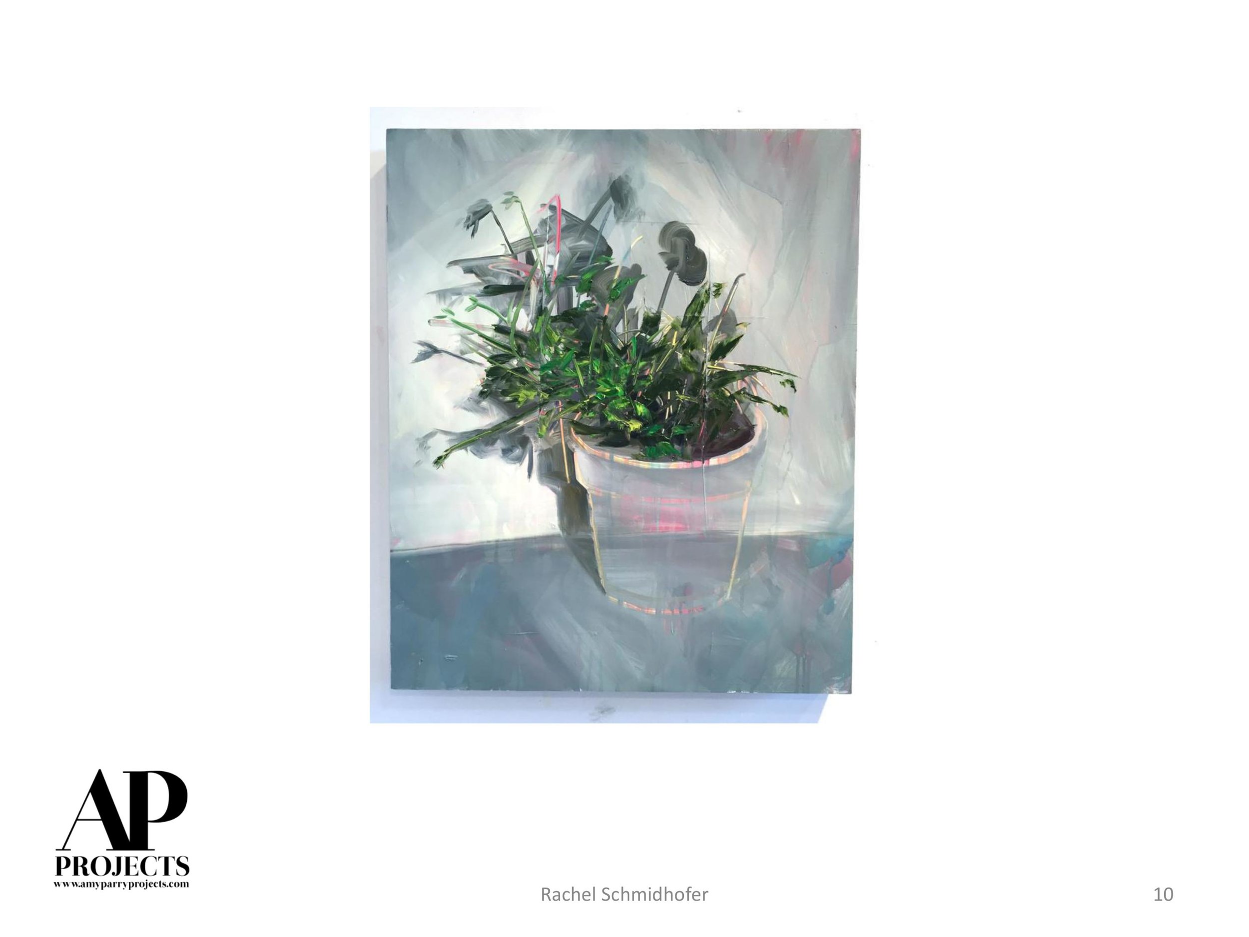
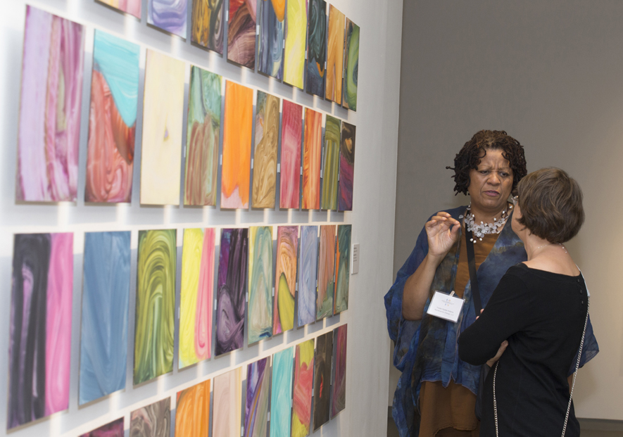
Artists since the beginning of time have attempted to capture their social realities in their work, mimicking their sights and surroundings and offering impressions of the people and places that are important to them. As artists became more experimental and photography emerged as an available method to capture the real, figurative work has often taken a backseat to abstract and conceptual art particularly on display in the world’s museums and galleries.
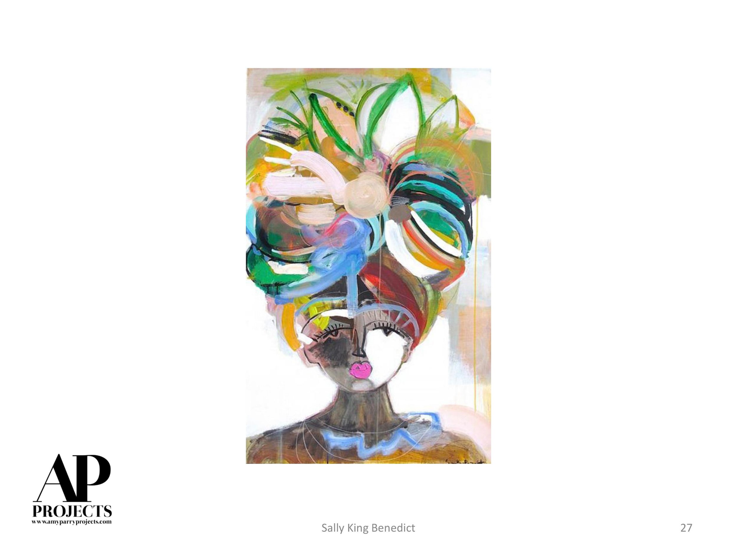
Alice Neel, Lucien Freud, Chuck Close, Kehinde Wiley, Eric Fischl, Fairfield Porter, Marlene Dumas, Wayne Thiebaud, Amy Cutler and Sharon Shapiro, an artist Amy Parry Projects is very fond of, all offer proof that figurative work is still so impactful and significant when done well.
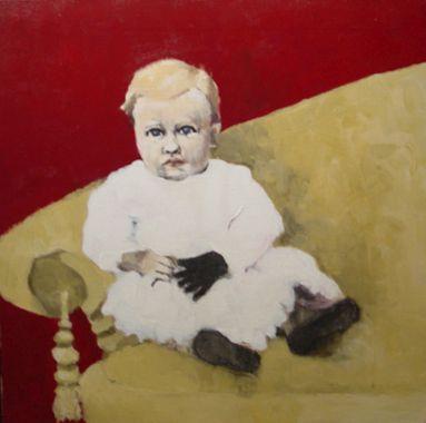
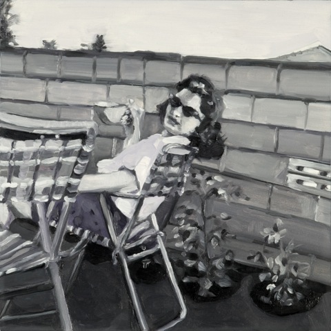
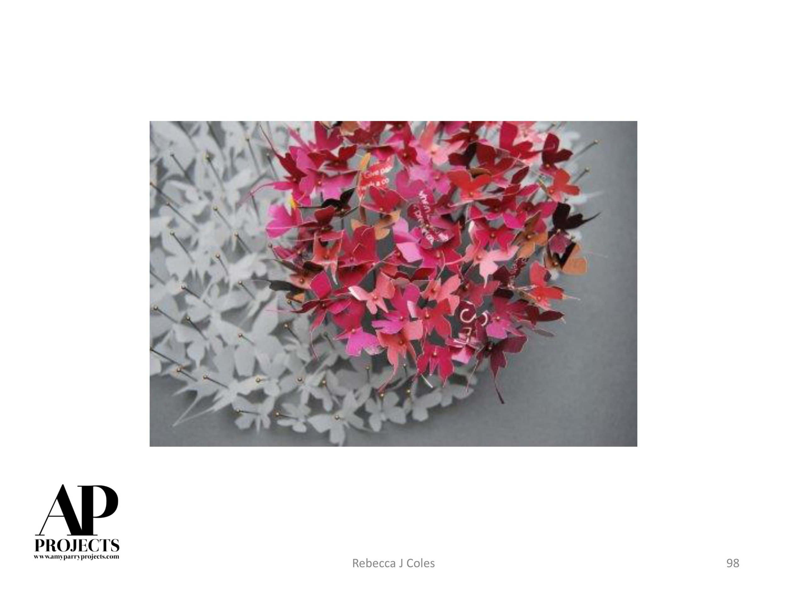
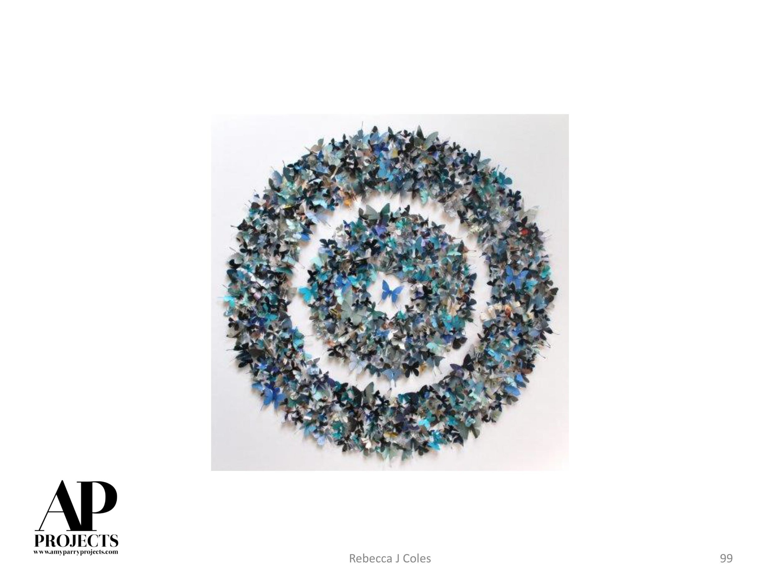
Long Shadow, 1994, acrylic on canvas, 23 x 24 inches
Collection of The Museum of Contemporary Art of Georgia (MOCA GA)
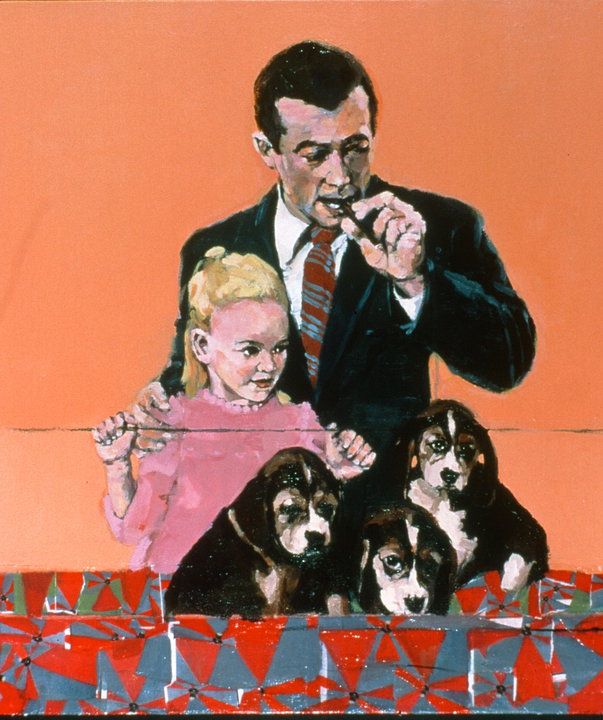
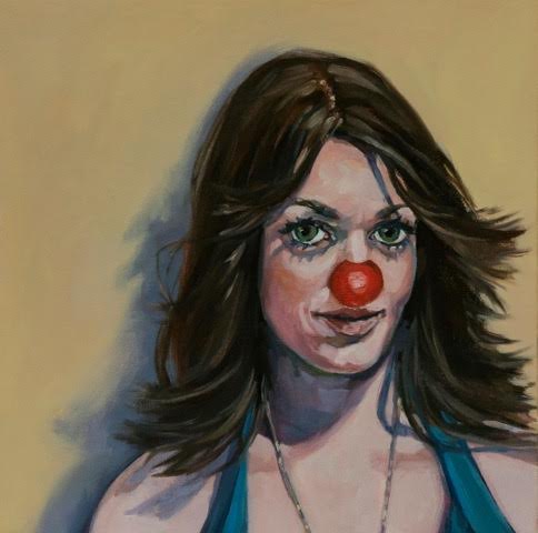
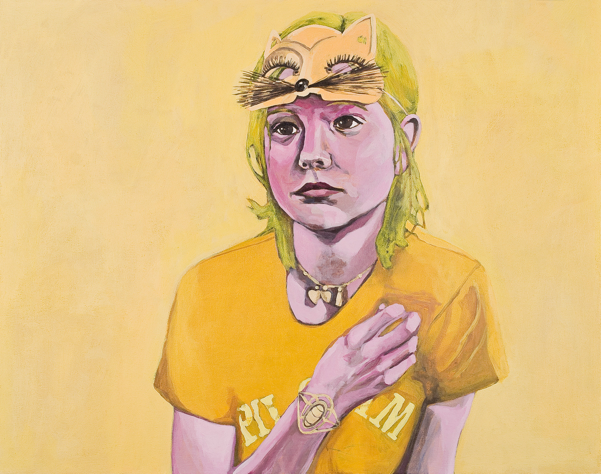
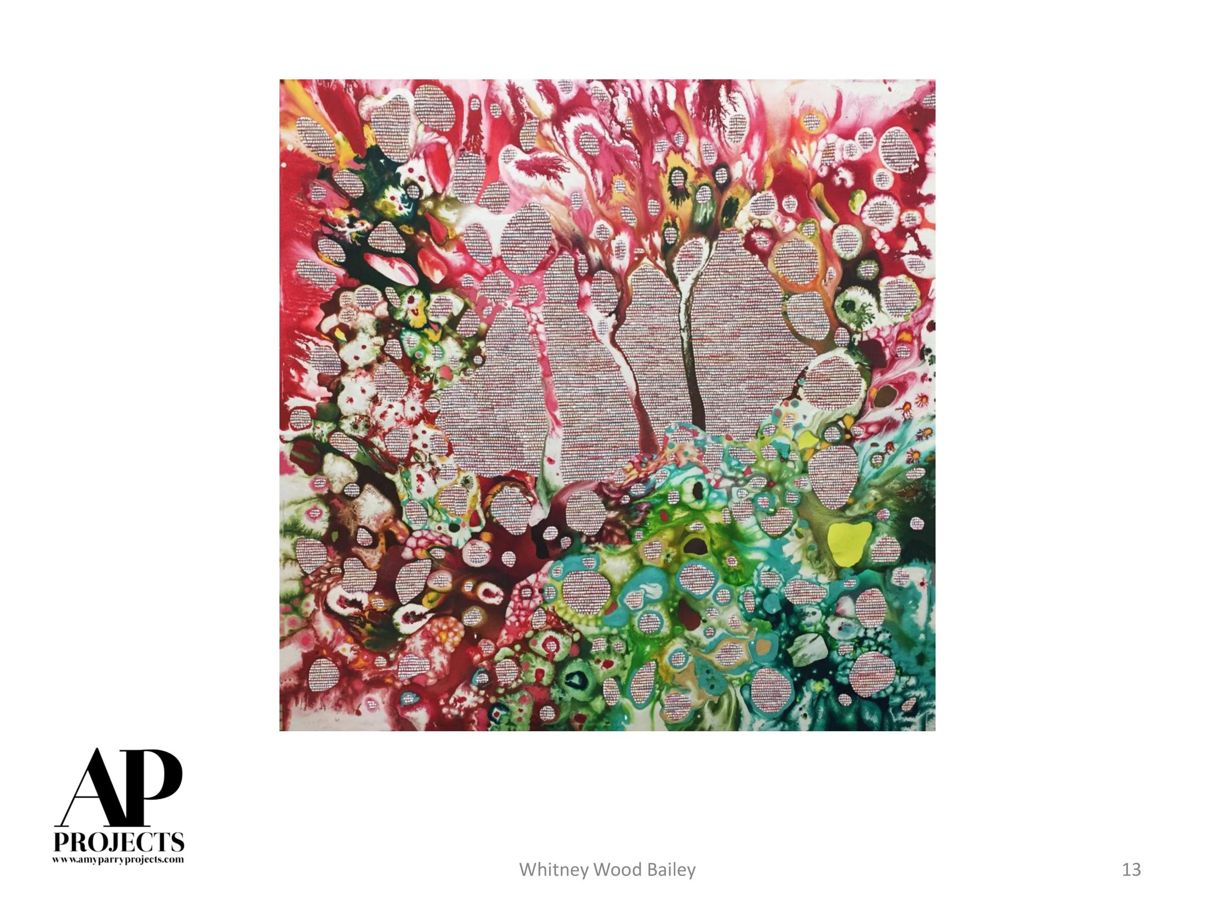
The first painting of Sharon’s I ever saw was Longshadow (above), a very odd little piece featuring a serious baby wearing a black glove. It was reminiscent of a portrait a wealthy family would commission of a child of great birthright, but what the heck was that glove all about? The thoughts that this painting provoked and the enduring uncertainty it offers is what I love most about Sharon’s work.
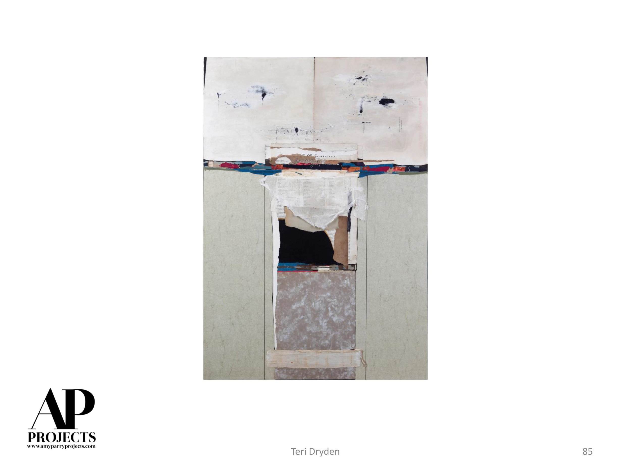
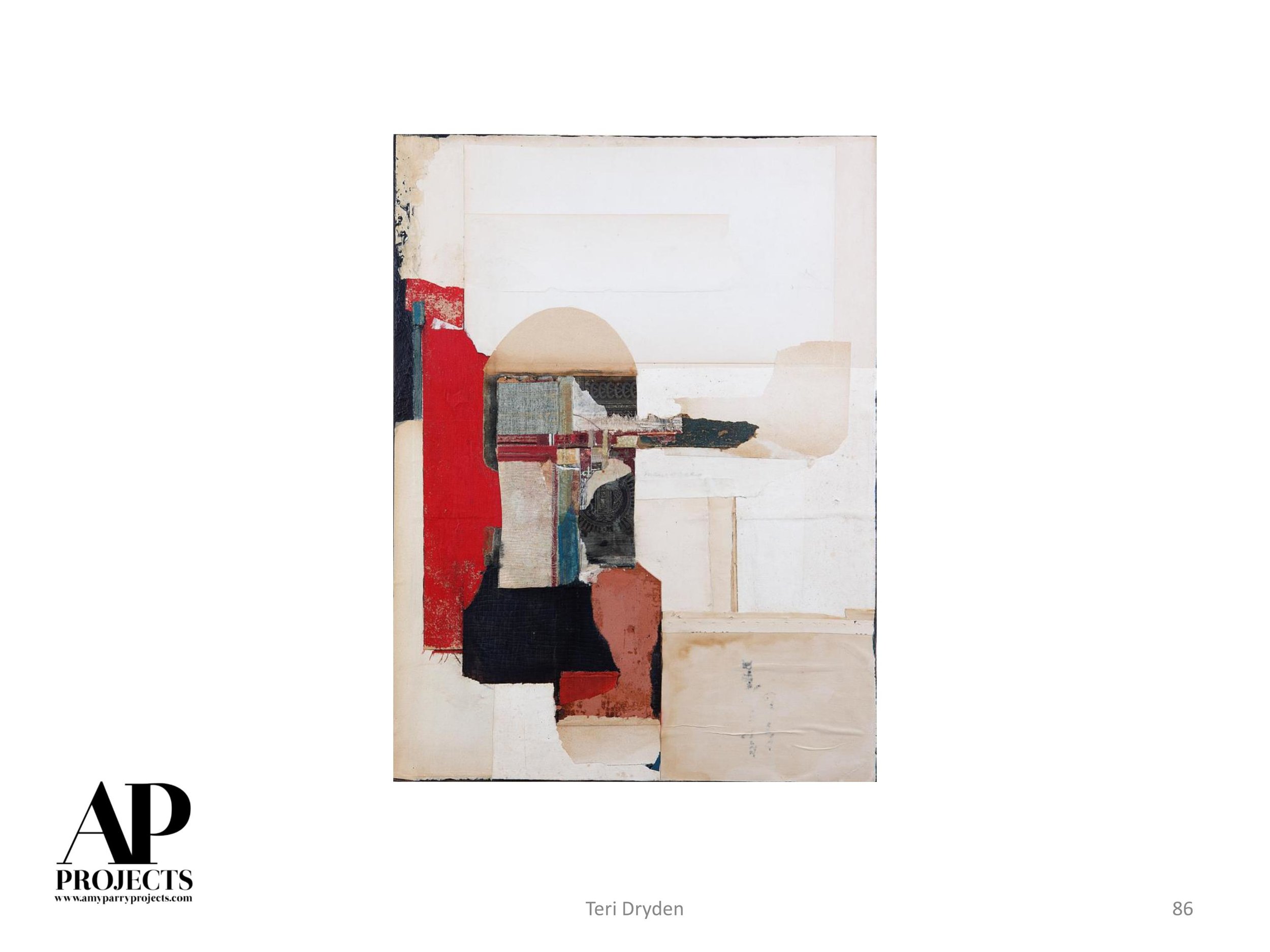
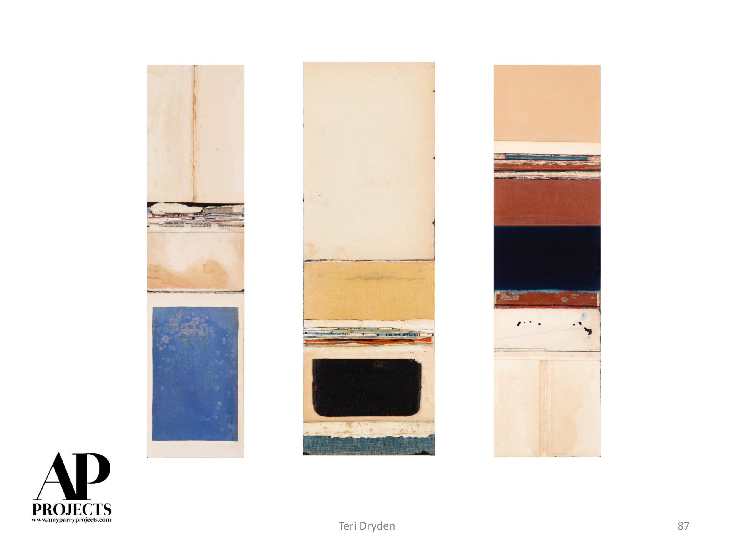
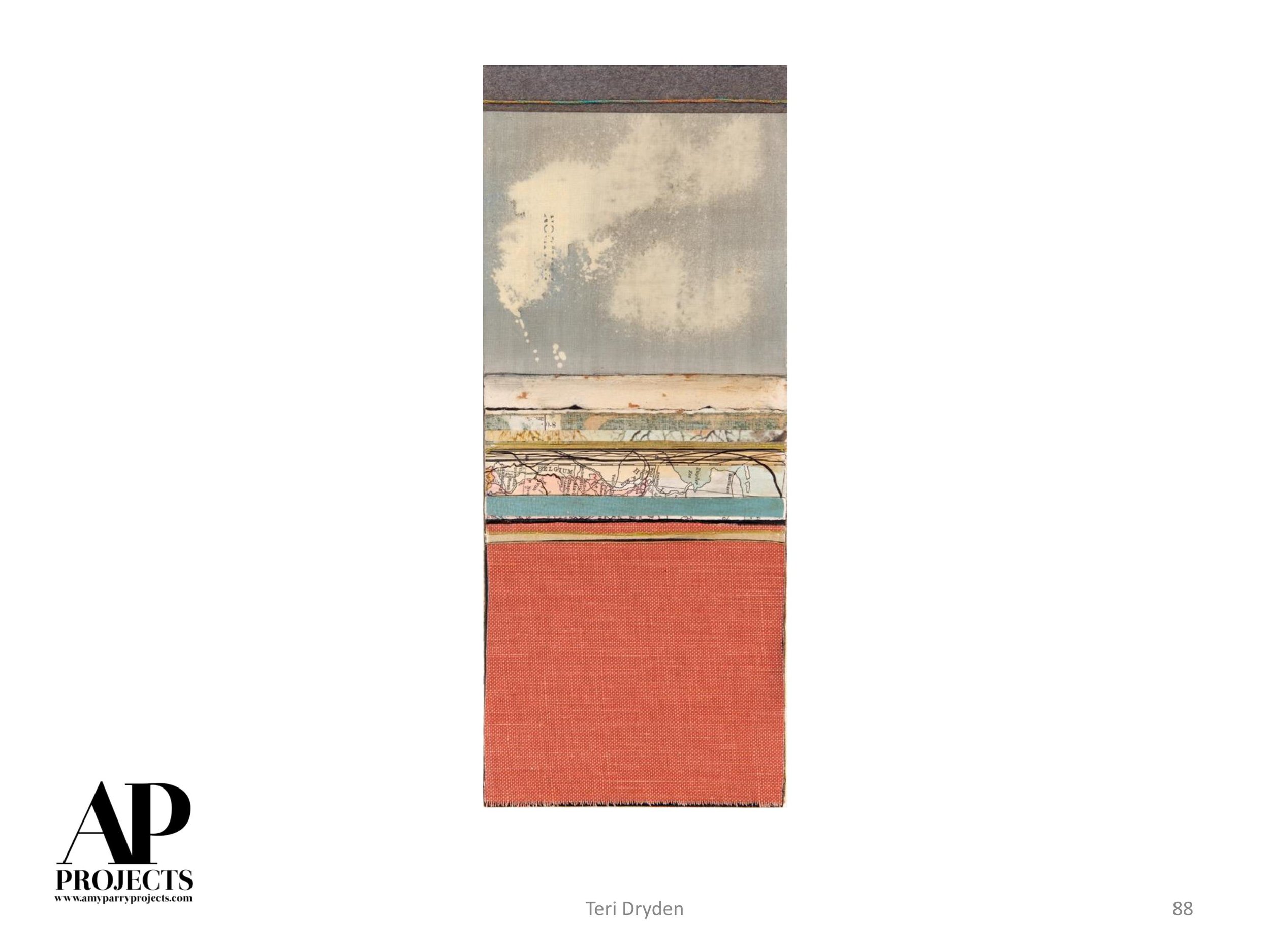
Amy Parry Projects is currently working with Sharon on a trio of layered, framed artworks for the guestrooms of a historic Atlanta hotel being renovated. In defense of figurative painting, and to attempt to explain why it can often be more interesting than a beautifully painted landscape, here are some words from some of Sharon’s collectors.
Please enjoy the thoughts and figures and let us know if we can connect you with Sharon!
I think for art to be serious and important, the kind that asks people to linger before it and really look at it, it has to have some kind of content. Abstract art, if it is more than decoration, makes an argument — i.e. has content — in its purely formal expression. But people can perhaps more easily overlook abstract art, and that is what makes it a safe choice for interiors. It is harder to walk past a face without engaging.
Figurative art demands attention because it opens a dialogue with viewers; it compels questions like who is she? What is she doing? What is she feeling? Where is she? but it doesn’t offer easy answers.

Pilgrimage 4, acrylic on canvas, 56 x 50 inches, Collection of Karen Goodchild
My experience is that people, whether or not they think of themselves as art-lovers or connoisseurs, are eager to enter into these conversations with paintings. They see a work and try out different narratives and meanings for the piece. These possible meanings make them look closely, asking question of the work that ideally will cause them to engage with the work’s formal qualities (how has the artist created the gleam in the figure’s eye? Why do the background trees seem threatening?). These questions will not always be answered, but I don’t find that viewers are upset at the open-endedness of their interaction.
Humans are narrative machines; we produce stories endlessly from the material of own experience, and figurative art offers an intense visual prompt to this story telling. Ultimately, living with Sharon’s work, has helped me see how deeply satisfying it is for people to encounter important art. Even though we are surrounded by endless images of people, a painted or drawn image carries a weight of creative intention through the effort of its facture that is satisfying on so many levels.
- Karen Goodchild, Chair of Art + Art History Departments, Wofford College
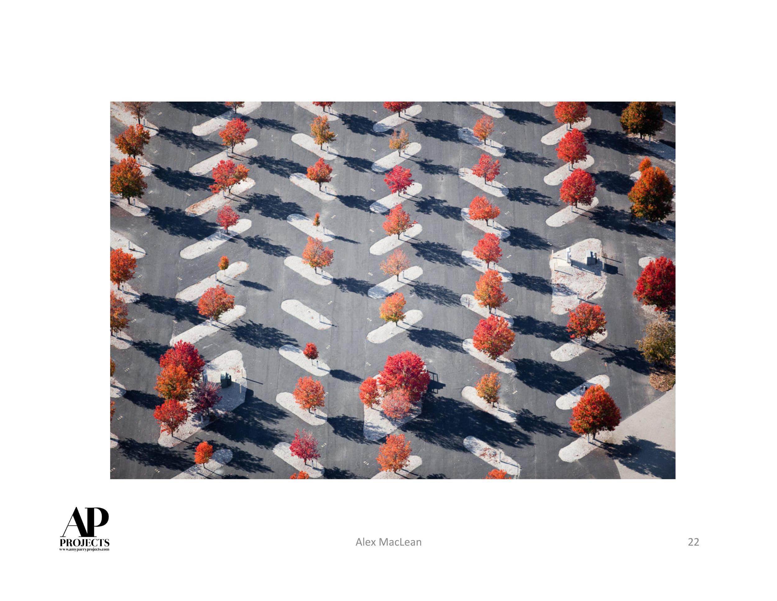
_______
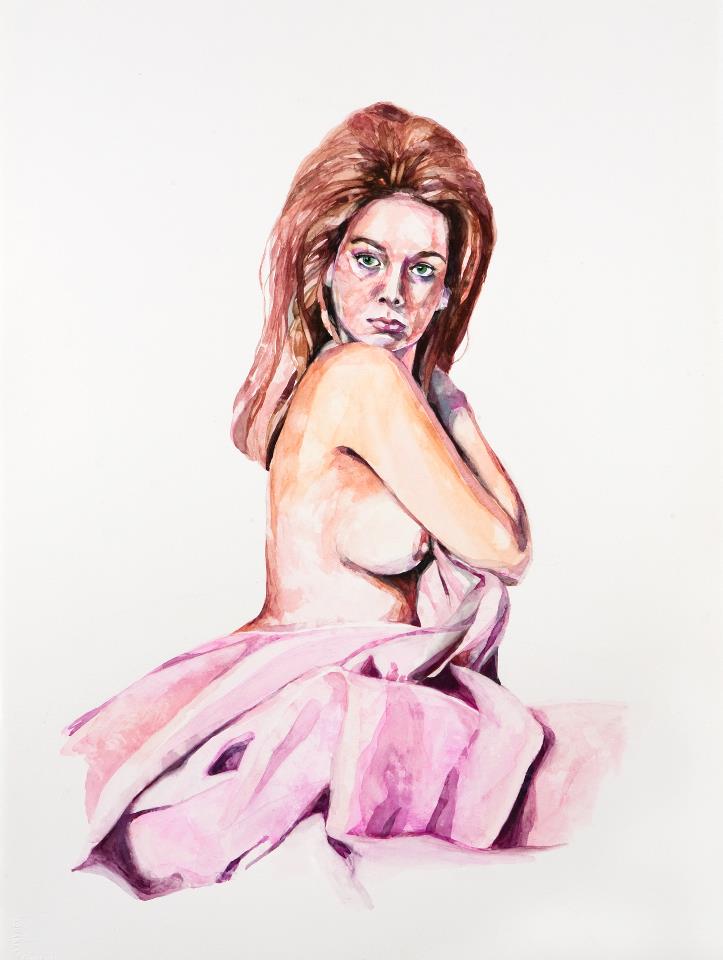
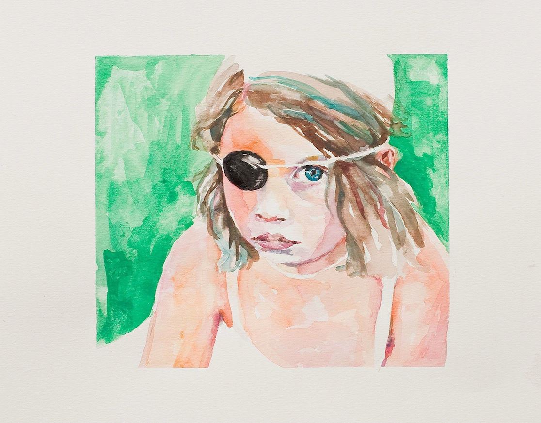
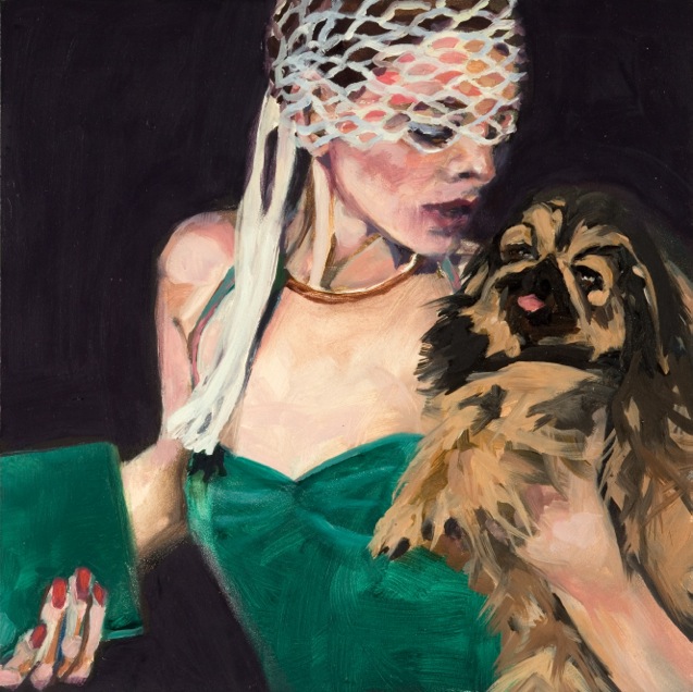
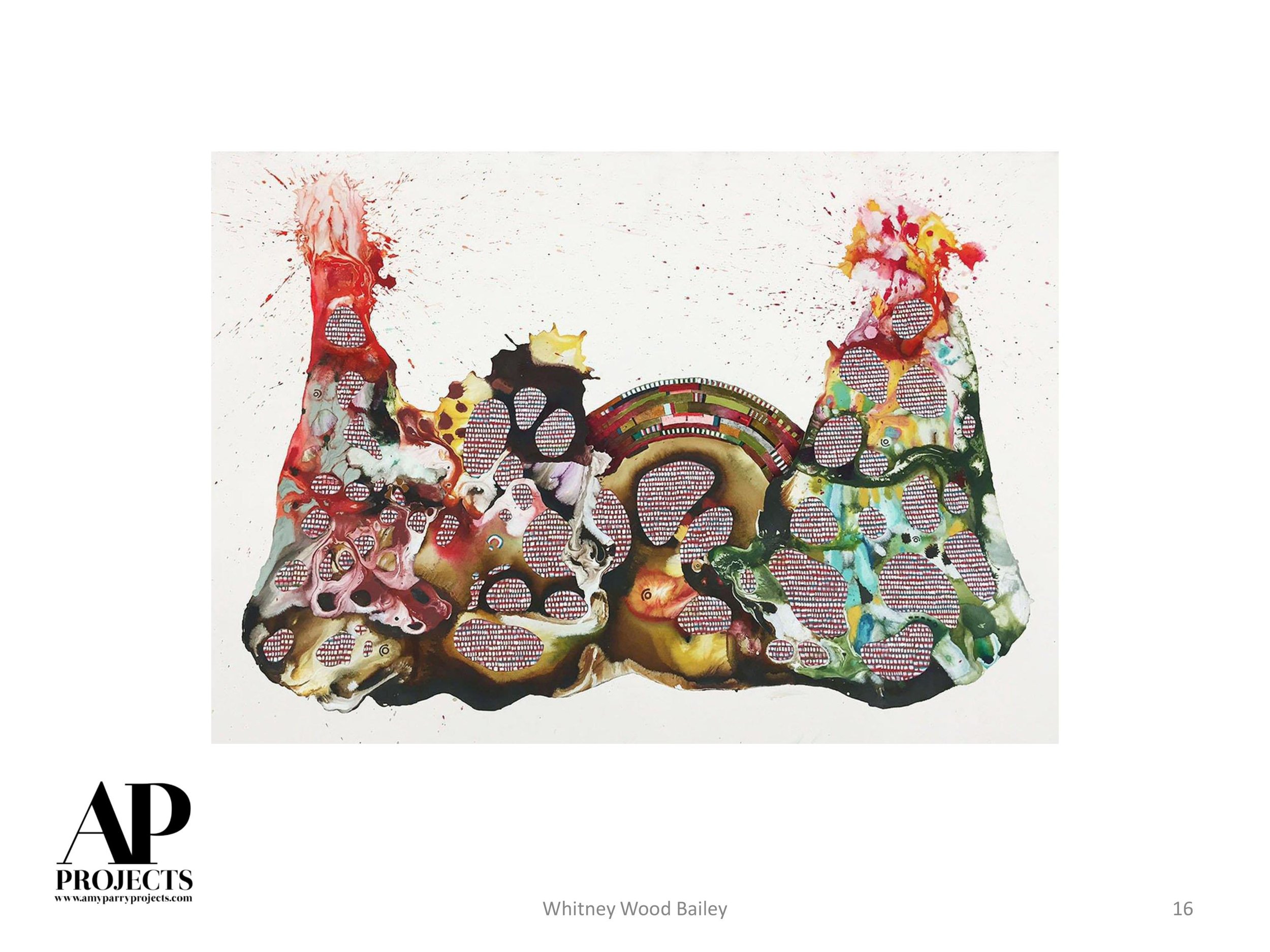
The watercolor I have by Sharon Shapiro, titled 'Heaven,' is one of my most treasured works of art. Based on a vintage photograph, it depicts a topless pin-up girl in a swimming pool with one arm raised in a greeting. Lush greenery surrounds her. It's a charming and funny picture, really. I have it hanging in my dining room in view of another nude painting from the 60s that my aunt painted.
I think most people are a little alarmed when they encounter it in such a prominent spot: I entertain a lot so guests are frequently confronted with it.

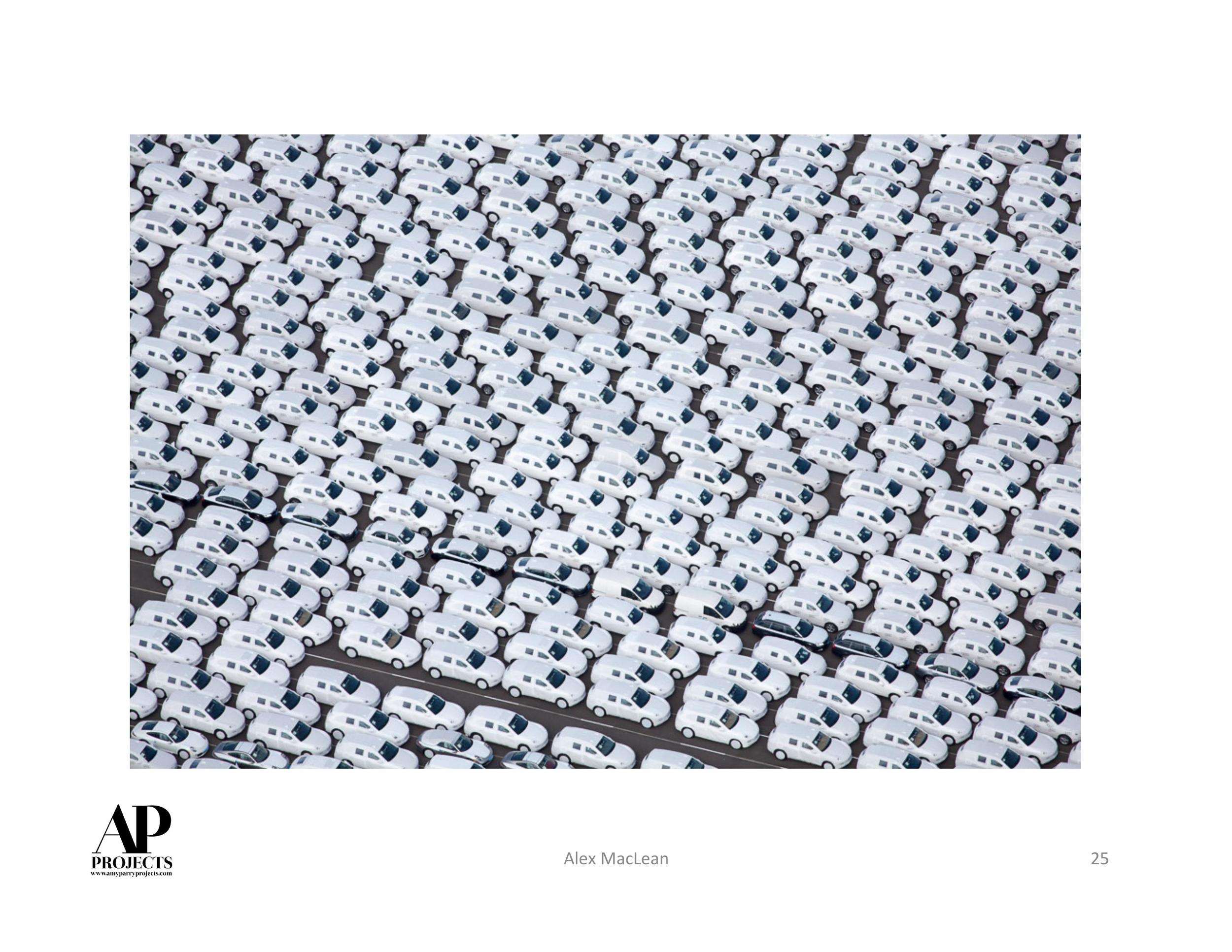
Heaven, 2011, watercolor on paper, 30 x 22 inches, Collection of Robin Bernat
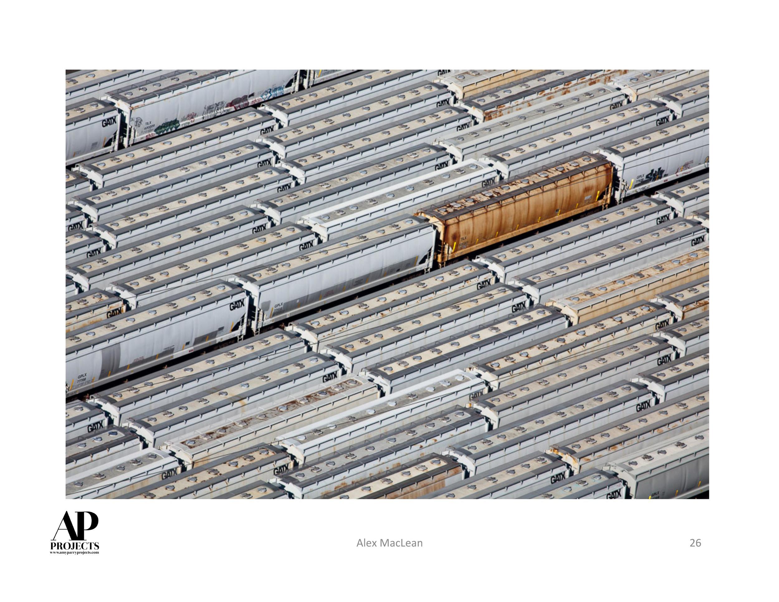
After a while, and in context to the other works in my dining and living rooms, I think they are better able to settle into their enjoyment of the work and whatever initial uneasiness about what might be provocative melts away. Sharon's deft handling of the watercolor is irresistible in my opinion.
- Robin Bernat, Owner/Curator of {Poem88} Gallery
_______
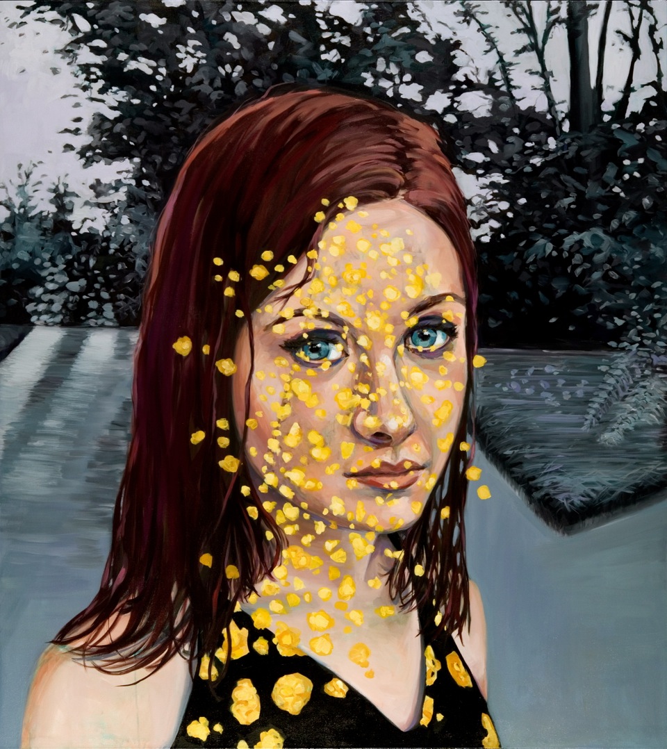
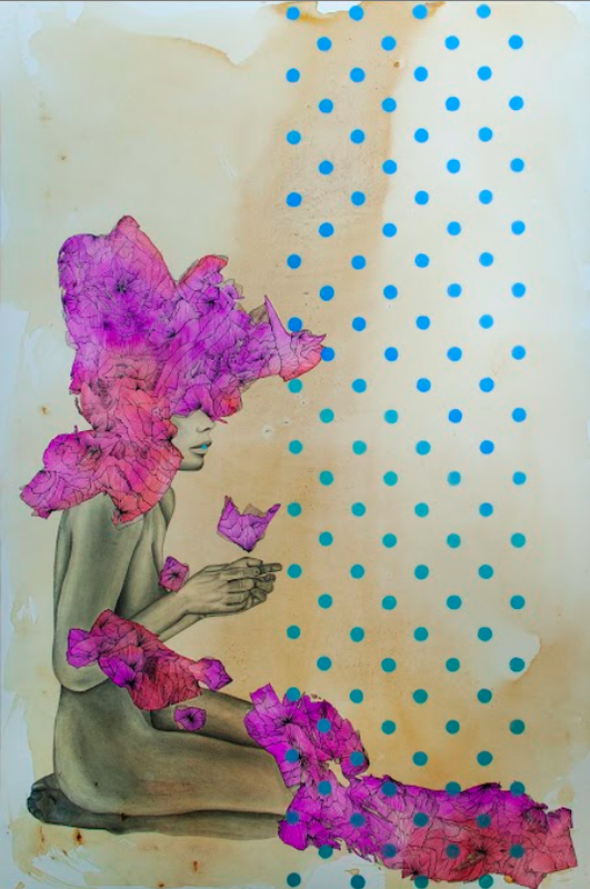
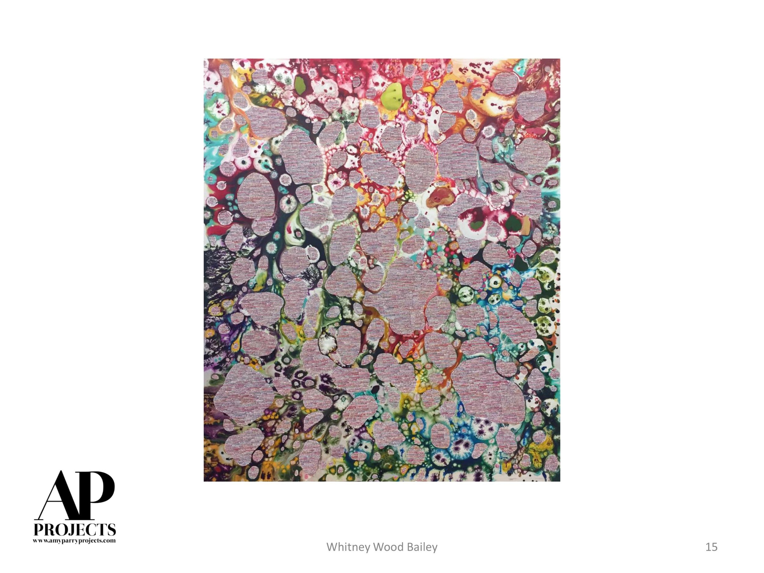
In 2014 I bought the painting 'Seam Splitter' and it has brought me so much joy. Every time I pass it, I notice something new and wonder what this woman is thinking. On top of being really beautiful, it's light and airy and mysterious and intense at the same time.
Seam Splitter, 2013, watercolor on paper, 22 x 30 inches, Collection of Joanne LaMotte
I get positive feedback and comments on this painting a lot. People always ask me who she is and who the painter is. Most of the comments center around the painting being, delicate, beautiful, and intriguing. People wonder what she's thinking. She seems to be a throwback to another era which I like. I've also moved her around several times in my house and she works in every room. She's part of the family now! Folks always stop and pause to look at her, whereas they don't really notice or do that with my abstract art.
- Joanne LaMotte, Jewelry Designer
_______
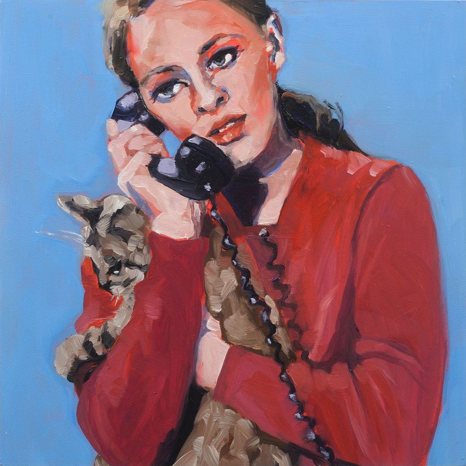
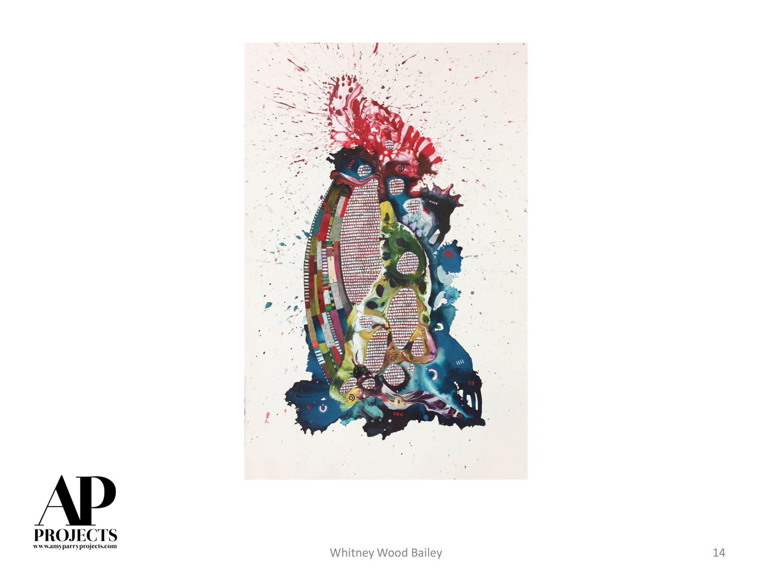
Sharon’s painting 'Burn' has has been in place in my living room for ten years now and has inspired endless reactions and comments as guests have flowed through our home. It has an immediacy that is hard to ignore, and it is actually more than figurative. The geometry of the ovals and stripes gives it a modern feel I think, and during part of the day, sunlight gives the illusion that the woman has temporary wings.

Burn, 2005, acrylic on canvas, 48 x 60 inches, Collection of Wyn Owens
It by far attracts more attention than the large William Albert Allard Montana landscape photo I have in the same room or the Alex Webb photo of school boys, although both are superb pieces in my judgement.
In my experience, Sharon’s works have a way of riveting bystanders. There is some magic there that I’m personally poorly equipped to articulate, but I witness the magic’s effect on people all the time.
- Wyn Owens, Investment Manager / Founding Partner of New Generation Advisors
_______
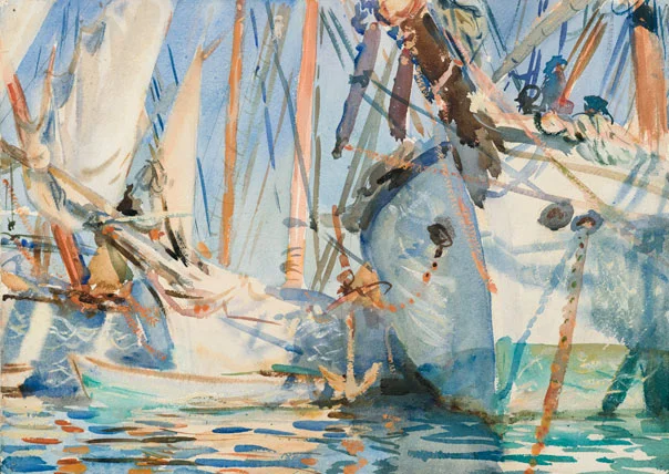
John Singer Sargent (1856-1925), White Ships, ca. 1908, watercolor with wax resist and graphite underdrawing, 14 x 9 inches, Collection of the Brooklyn Museum
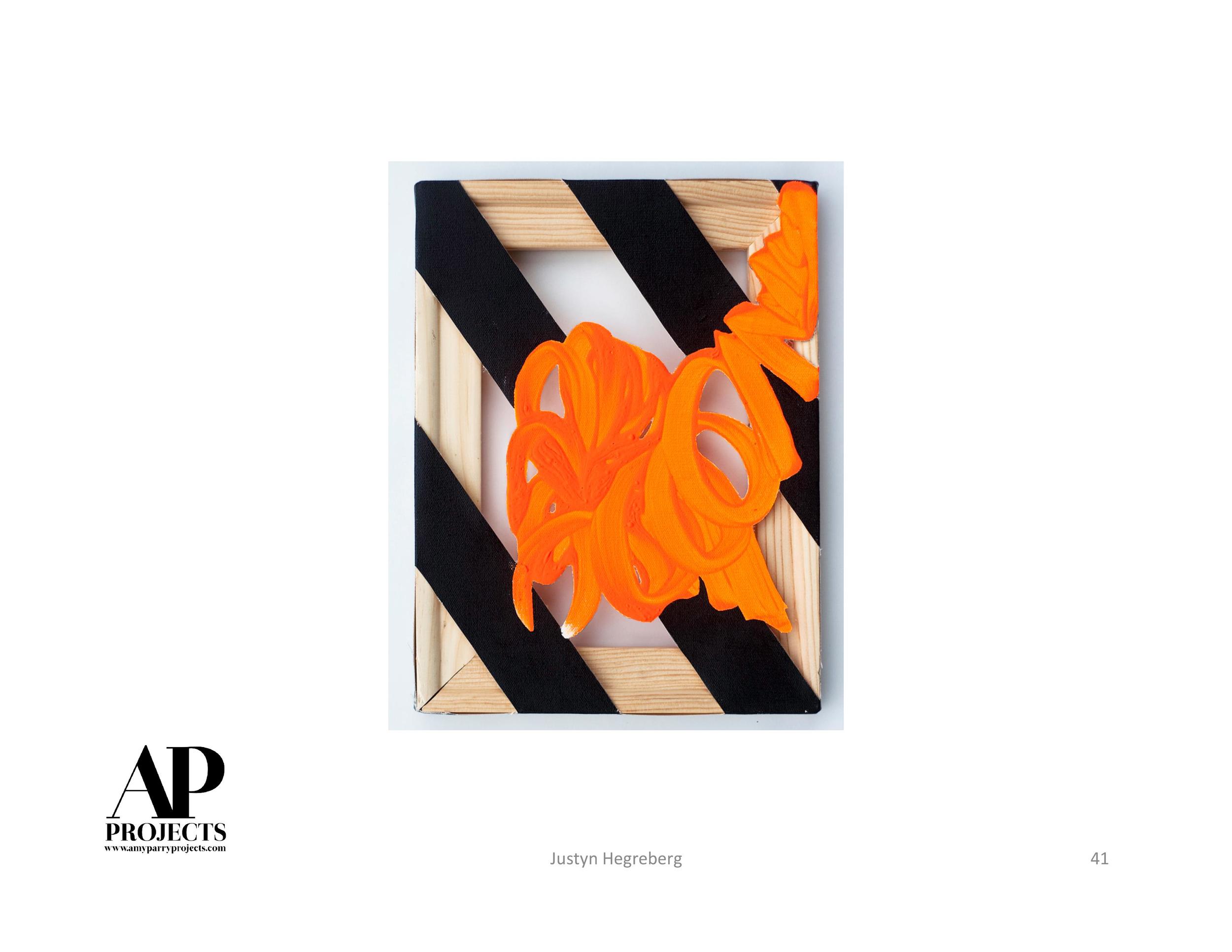
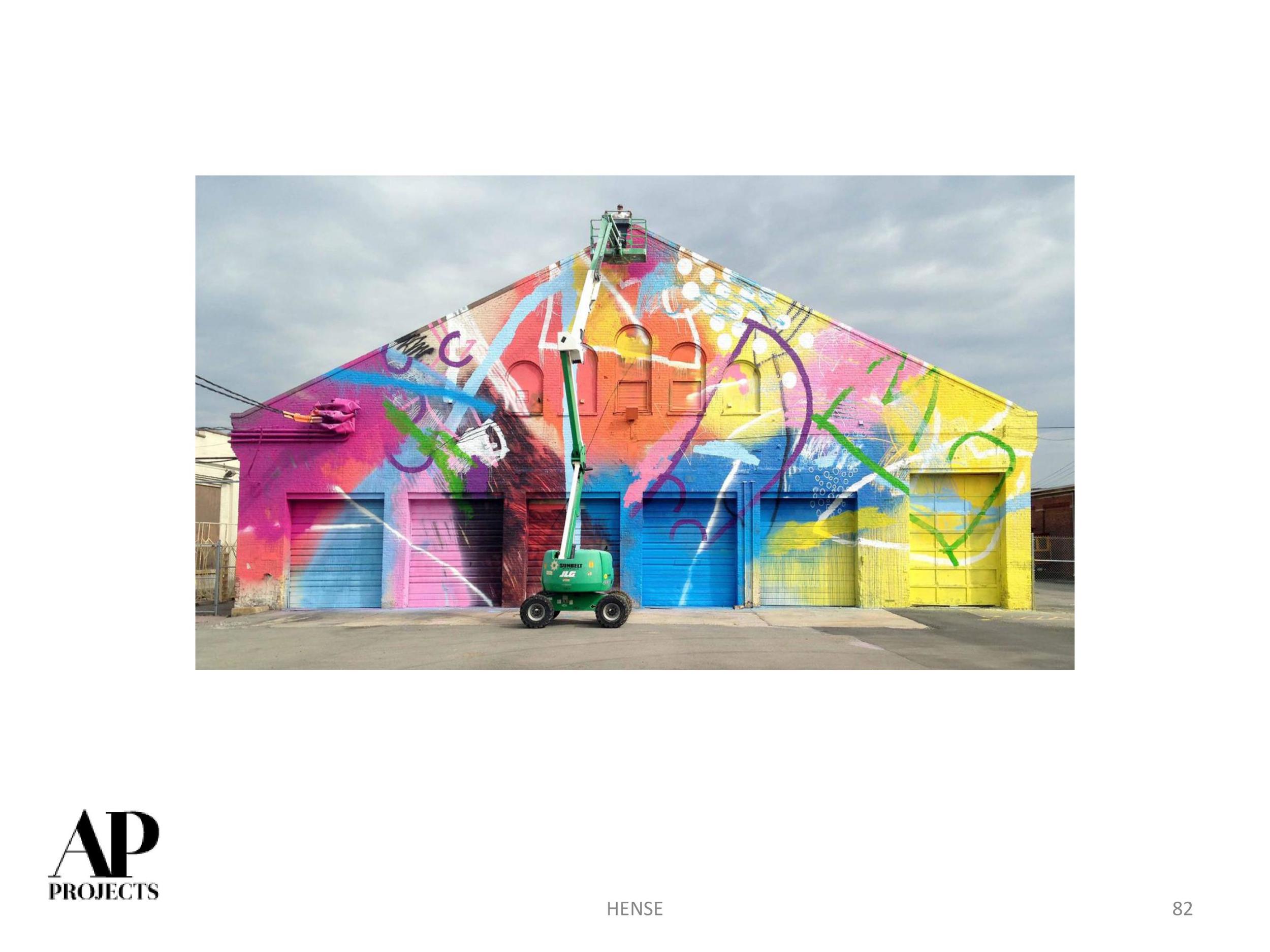
We visited ATL artist Lela Brunet recently - what a treat. We were interested in meeting her to learn more about her striking, figurative work. We left with a new friend and a feeling of excitement about the groundswell of creative energy that can be felt in ATL these days. Lela and her friends are artists who are bridging the gap between street art and fine art, doing their own thing and finding great opportunities for support to continue to do so. Lela spent as much time talking about her people as she did her own work, so as a nod to each of them, their links are shared below.
Video courtesy of Mutiny Artwrx
A recent graduate of Kennesaw State University (College of the Arts) Lela just moved into a new studio space in Mutiny Artwrx, which was developed and founded by JP McChesney, an artist himself. You may also know him from his other endeavors over at Paris on Ponce where Mutiny artists are offered a space to show their work. Lela's studio mate is another artist we have been following, Megan Mosholder, who sounds like she is having an incredibly busy/successful year. We also met Ray Geier, who dropped by the studio during our visit and told us all about the street painting he had completed around East Atlanta Village. He led us through all the great things happening with Elizabeth Jarrett's performance space Downtown Players Club and collaborative entity Deer Bear Wolf, as well as with Notch8 Gallery which opened last year in South Atlanta.
Although we were largely in the dark about most of those, Lela exhibits her work at Kai Lin Gallery and Kibbee Gallery, two venues we know and love. She was very gracious in speaking about Yu Kai and Ben Goldman, respective curators of those spaces and their support and encouragement of her as an artist. Prior to becoming her gallerist, she explained that Kai recommended her to Orpheus Brewing and she has since designed imagery for their labels, painted on site, etc.
In addition to her studio practice and pushing forward into a new body of work, Lela has done murals with Moreland Avenue Mural Project, Forward Warrior, Phoenix Fest and Living Walls.
What is she working on now? She just collaborated with several other ATL artists to coat the exterior walls of Hodge Podge Coffeehouse & Gallery in art and it looks great. She is also preparing to work on a mural for the new Mailchimp offices within Ponce City Market.
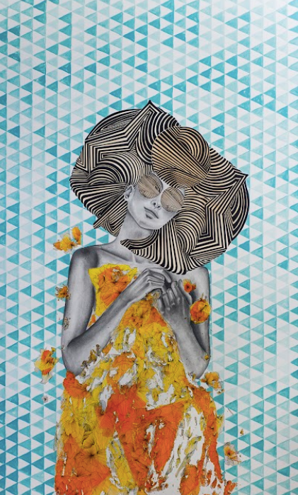
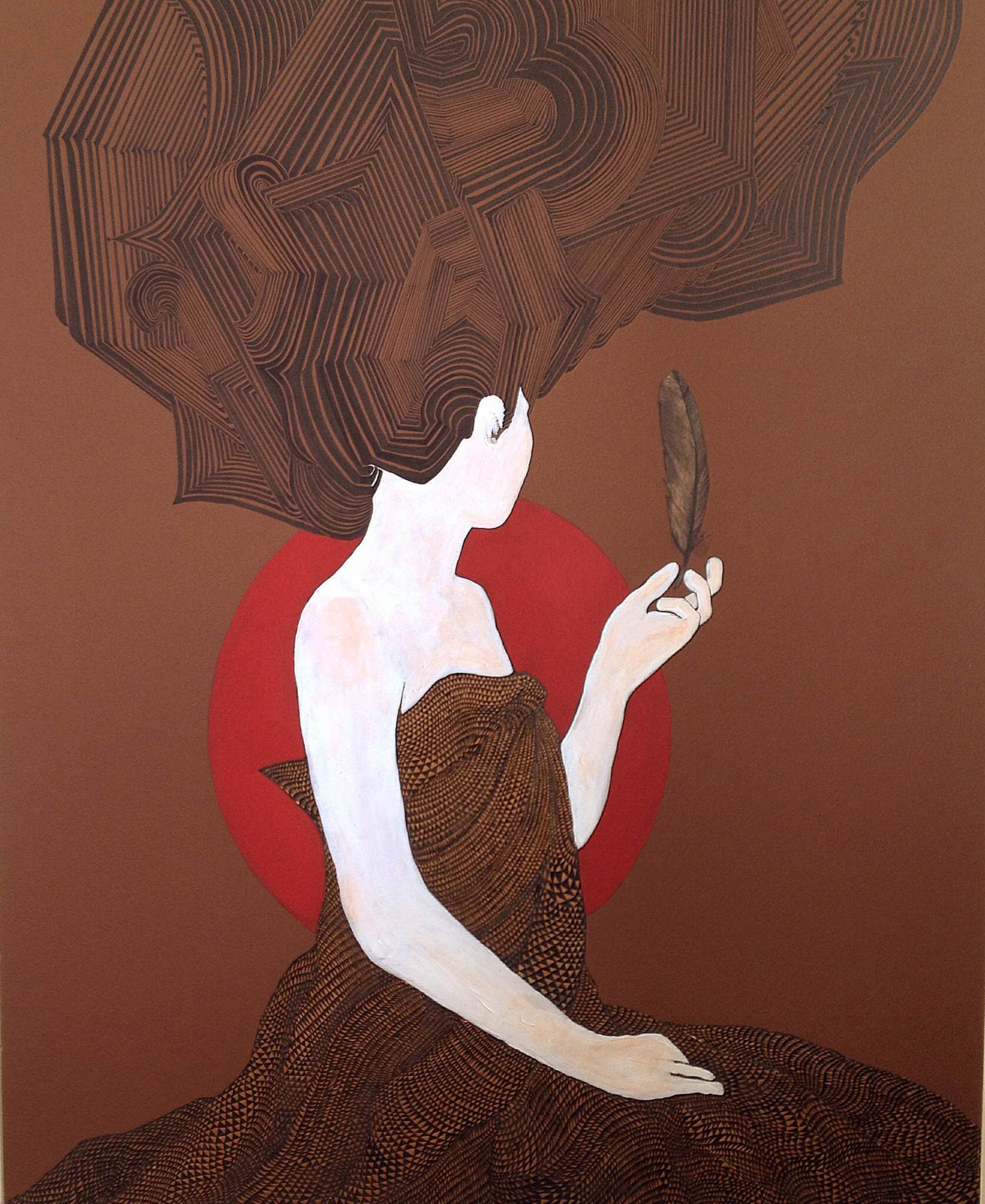
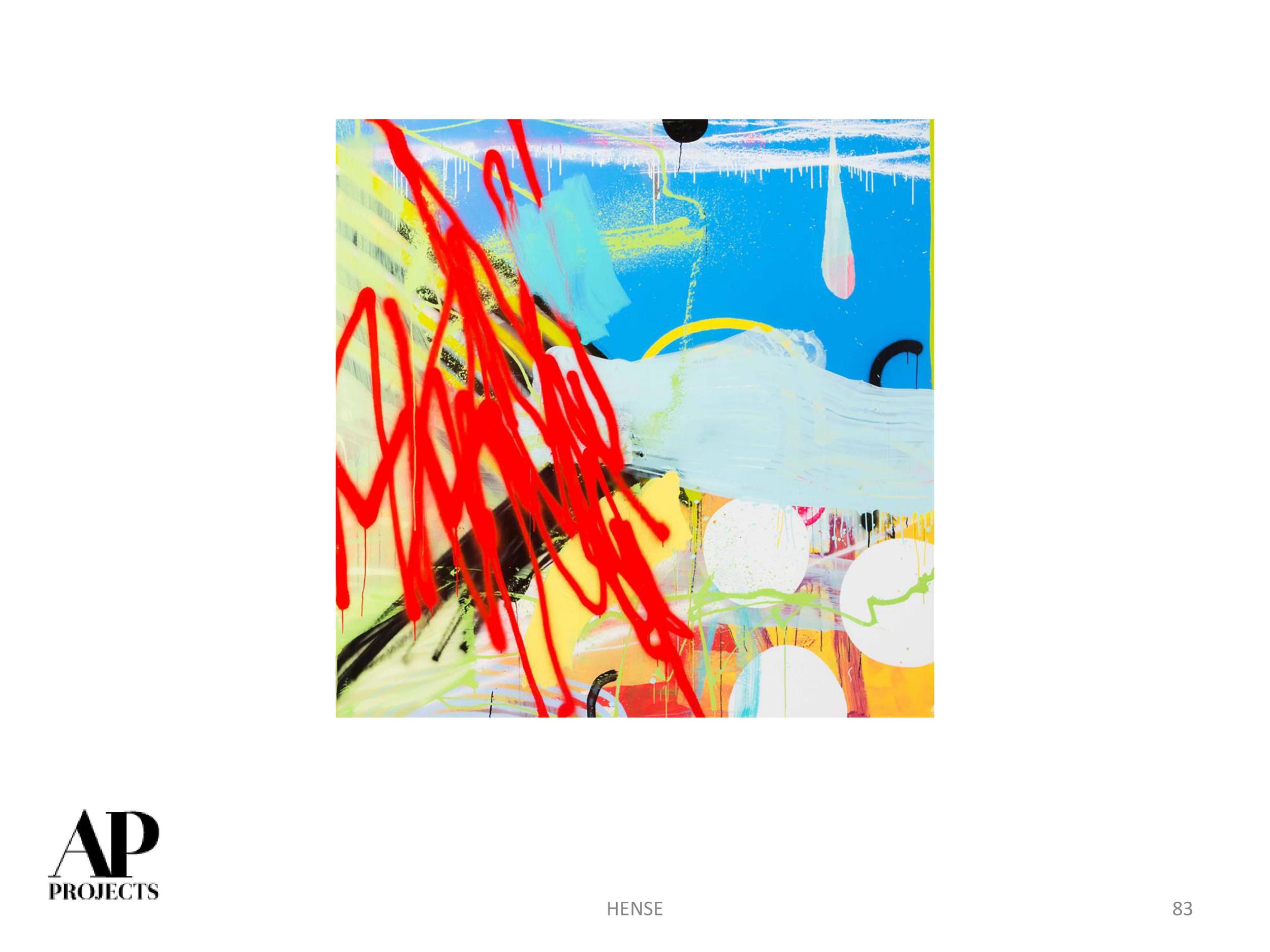
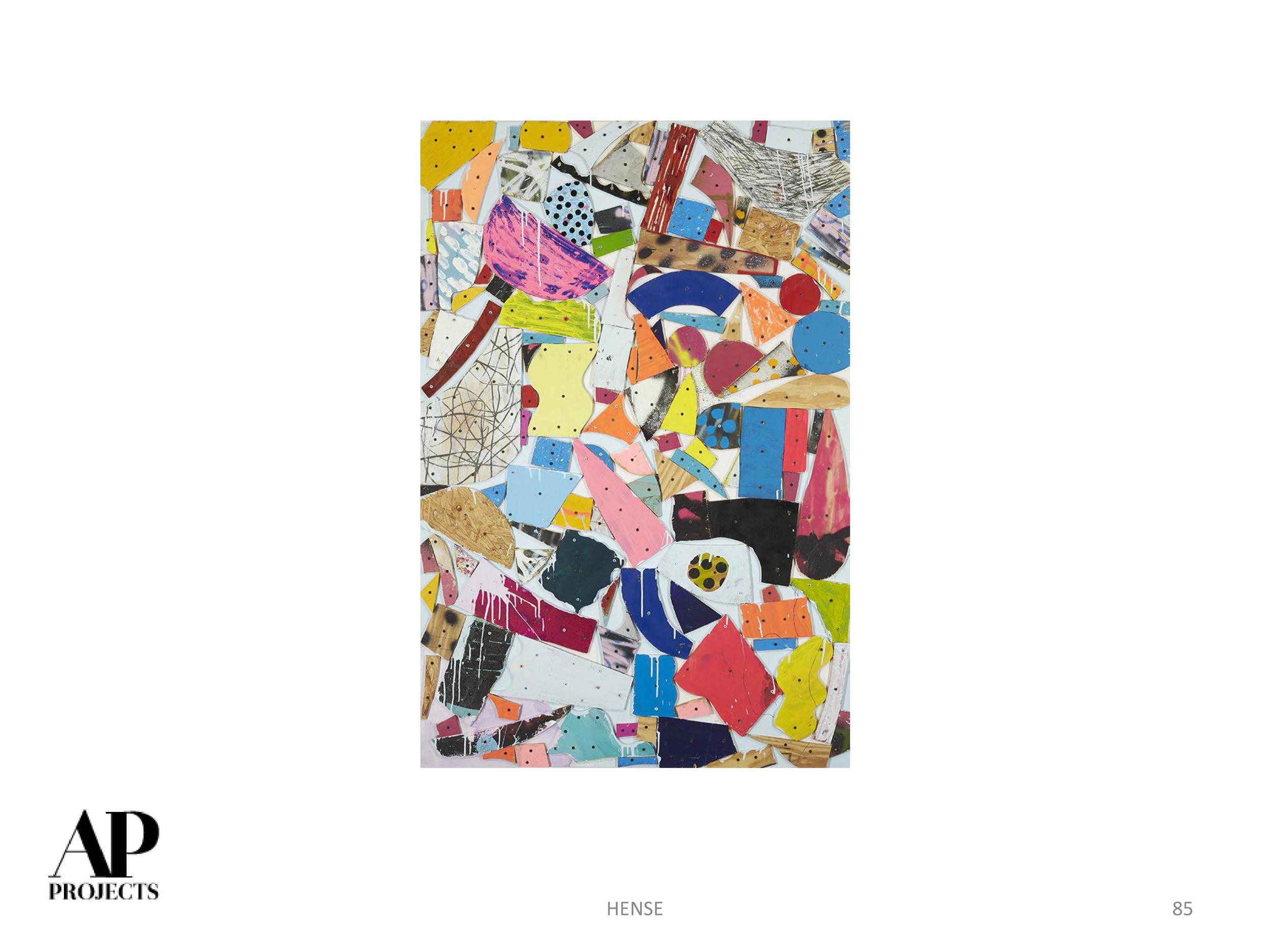
Basically, pretty soon you won't be able to drive around ATL without seeing Lela's work. In the meantime, here is a sampling of our favorite figurative works (available through Kai Lin Gallery).
Go, Lela!
www.lelabrunet.com

James Abbott McNeil Whistler, Nocturne in Black and Gold: The Falling Rocket, ca. 1875, oil on canvas, 24 x 18 inches, Detroit Institute of Arts

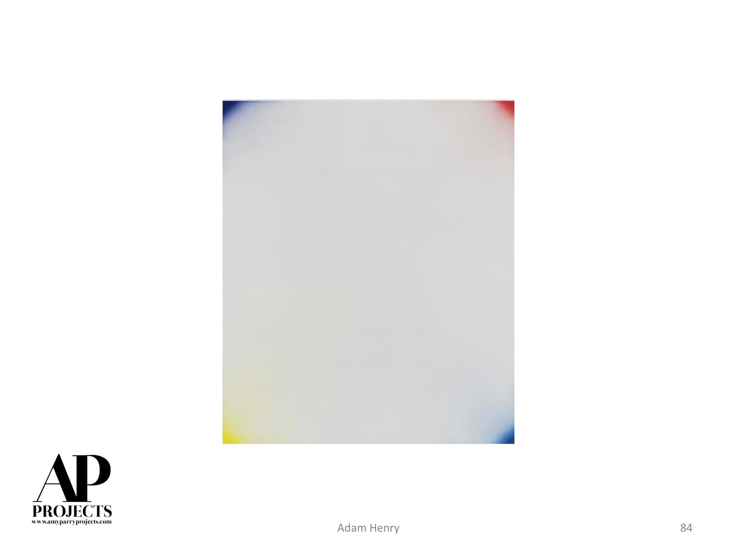
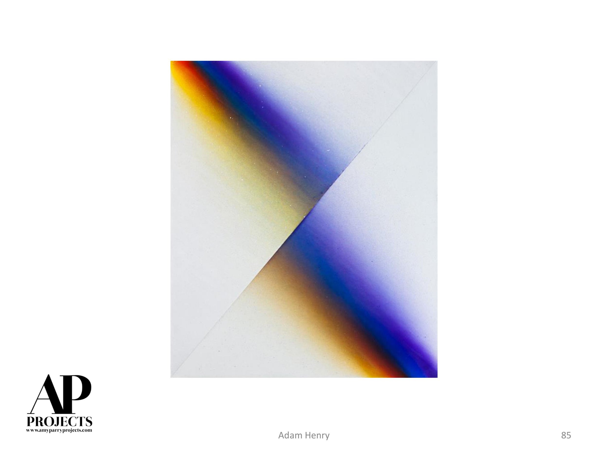
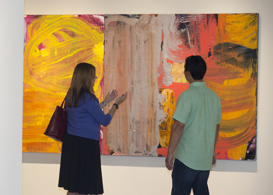
The paintings of Australian-born Fran O'Neill rely upon a construction/deconstruction equation, where she uses her physical body to produce, alter, destroy, and recreate oversized gestures. Layer upon layer, O'Neill applies paint only to swipe, smear, and remove it with her body or another material. Her paintings are as much as an additive process as a subtractive one, where at times she reinvents imagery on the same canvas. In preparation for Confronting the Canvas: Women of Abstraction, O'Neill answered a few questions about her process and the ideas behind her work.
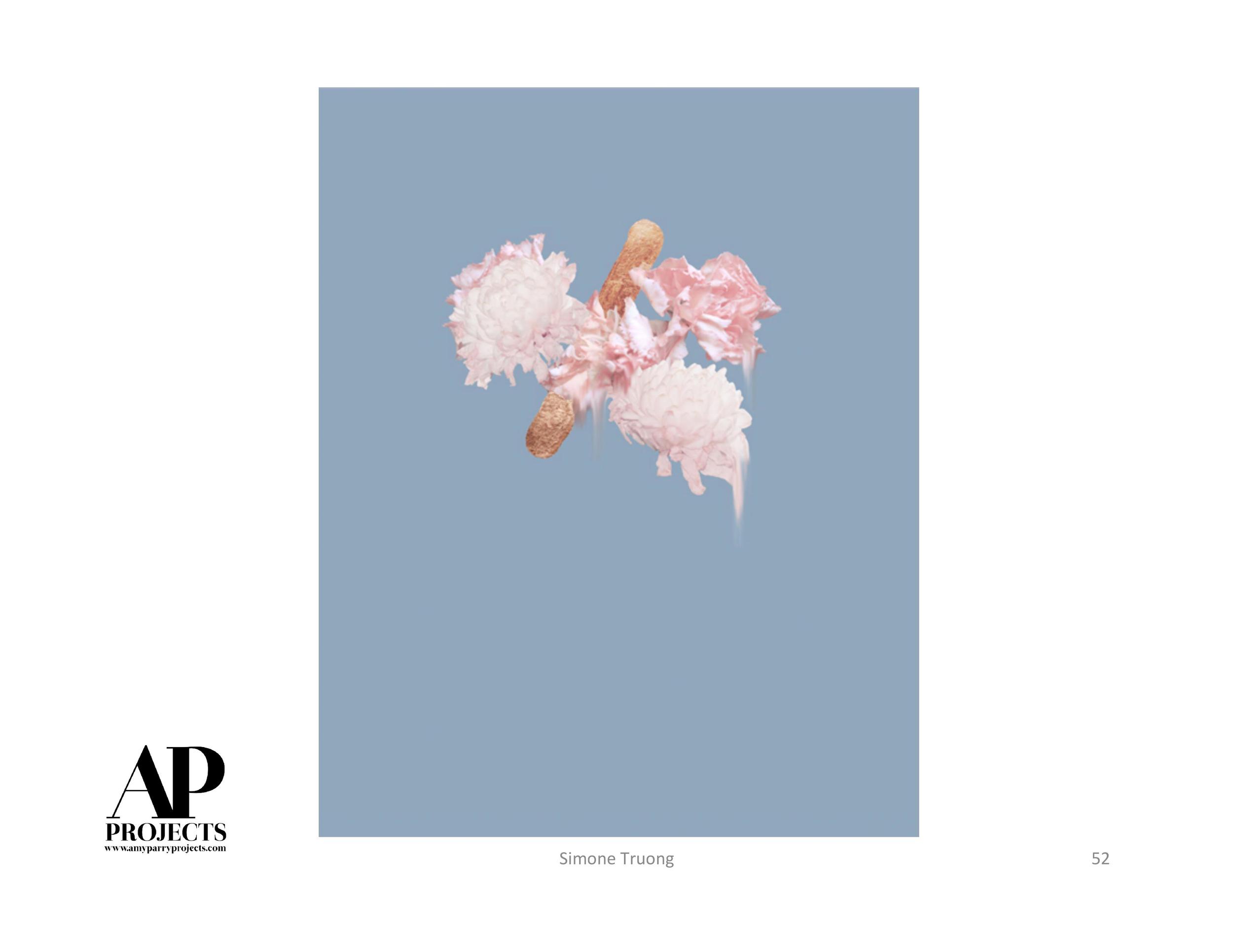
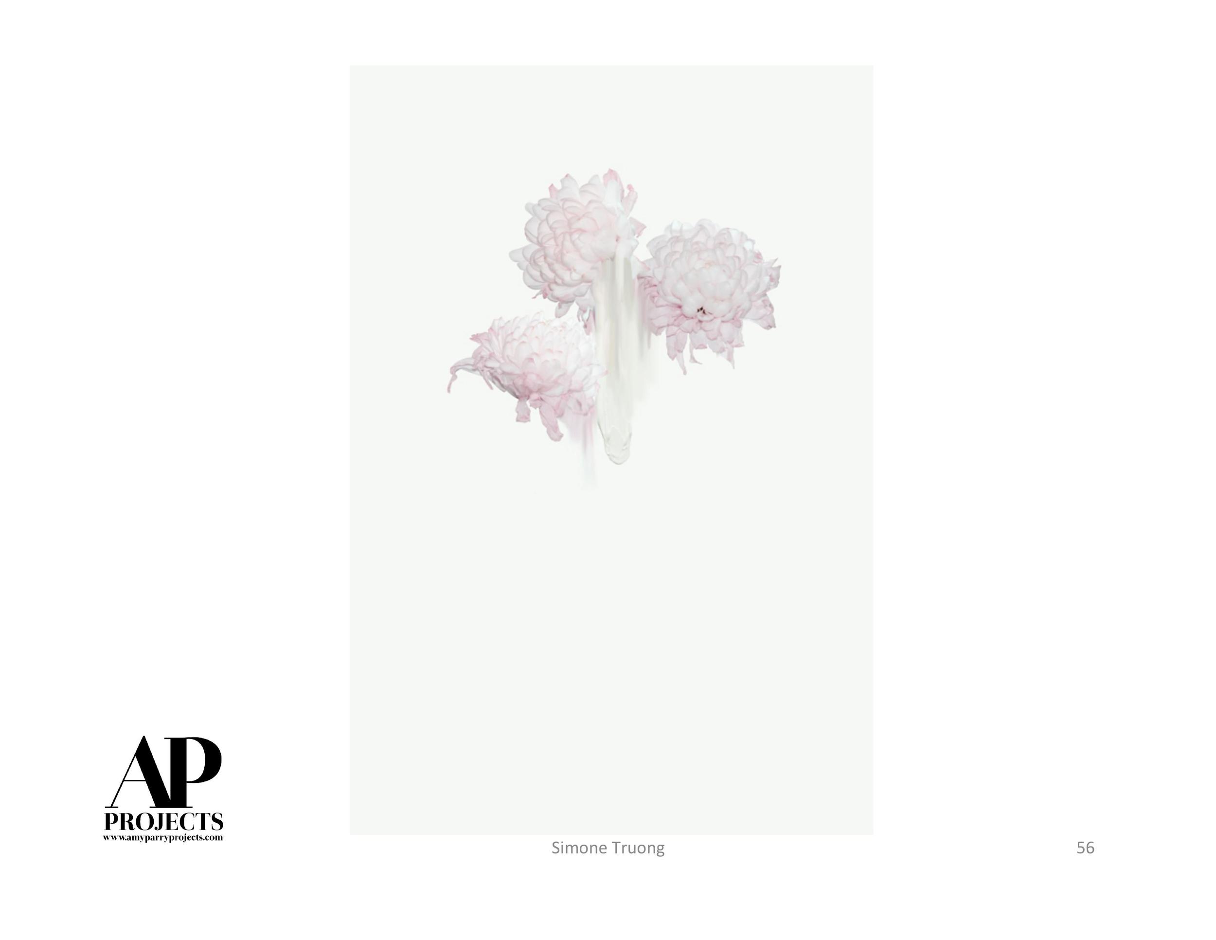
Fran O'Neill attends the members' preview for Confronting the Canvas: Women of Abstraction. Image courtesy of Thomas Hager.
Describe your approach to painting.
Having grown up in Australia and currently living in the city of New York, the mixing of past experiences of my life become and feed my painting. The ability to manipulate oil paint and watercolor is core to my practice; abstraction, color, movement of the paint, and shifting scale all come into play on the canvas/paper. I crave space, and how “space” can be open, compressed, complex, grand, intimate, and sometimes, all within the same image, intrigues me.
I look for moments in life that have a special or unexpected quality about them. Perhaps it is the way that light hits a surface, or the juxtaposition of shapes, textures or a tiny happening, a memory or a fragment of a dream or reality. There are times when I glimpse something, and I have no idea what I am looking at, or when the strangeness of real life seems dreamlike or indescribable for a split second, then materializes into focus. Sometimes it's that fleeting moment that catches my eye and plays in my imagination. I don't necessarily seek to recreate what I have seen but more the experience of how it felt and how I perceived it. I entwine those experiences with others, and as I begin to paint, and with that, the direct application of paint in the moment can add its own dynamic to the image-making process.
The act of creating becomes “all important” in my process, exploring the fluid movement of the paint as I apply it. How to recreate the tension or emotive quality without needing to name, locate, or describe a narrative or an exact experience/memory. Broad movements, simplified palettes versus intricate and sometimes cluttered space(s). Seeing the process take place on the canvas-drips, glimpses of under layers, forms take shape and/or break down on the surface, the rotation of the canvas, all coalesce to make a whole. My process is organic, intuitive, and improvisational.
I seek to always surprise myself, and with that, I am intent on researching beyond my “go-to mediums,” as I believe it is always necessary for an artist to continually reinvent one's imagery and not to be afraid of where that journey takes me. Striving for newness and to be open to change is a necessary part of my practice.
Visitors discuss Fran O'Neill's forty untitled panels at the Confronting the Canvas members' preview. Image courtesy of Thomas Hager.
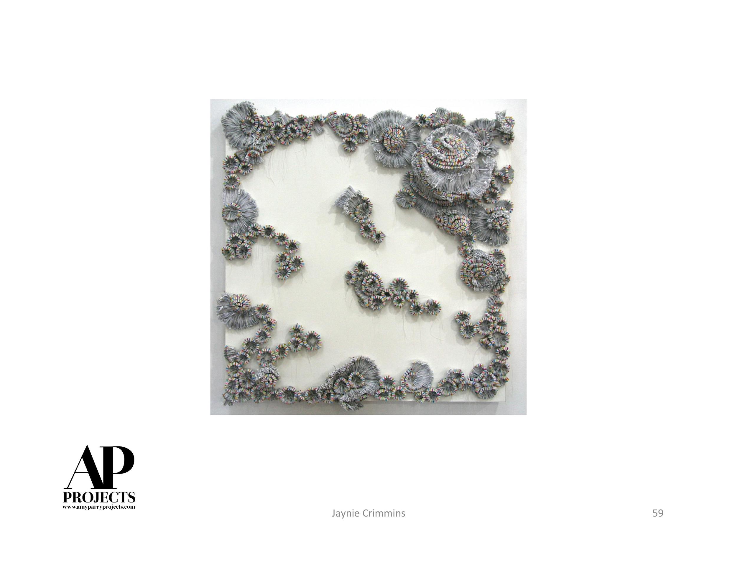
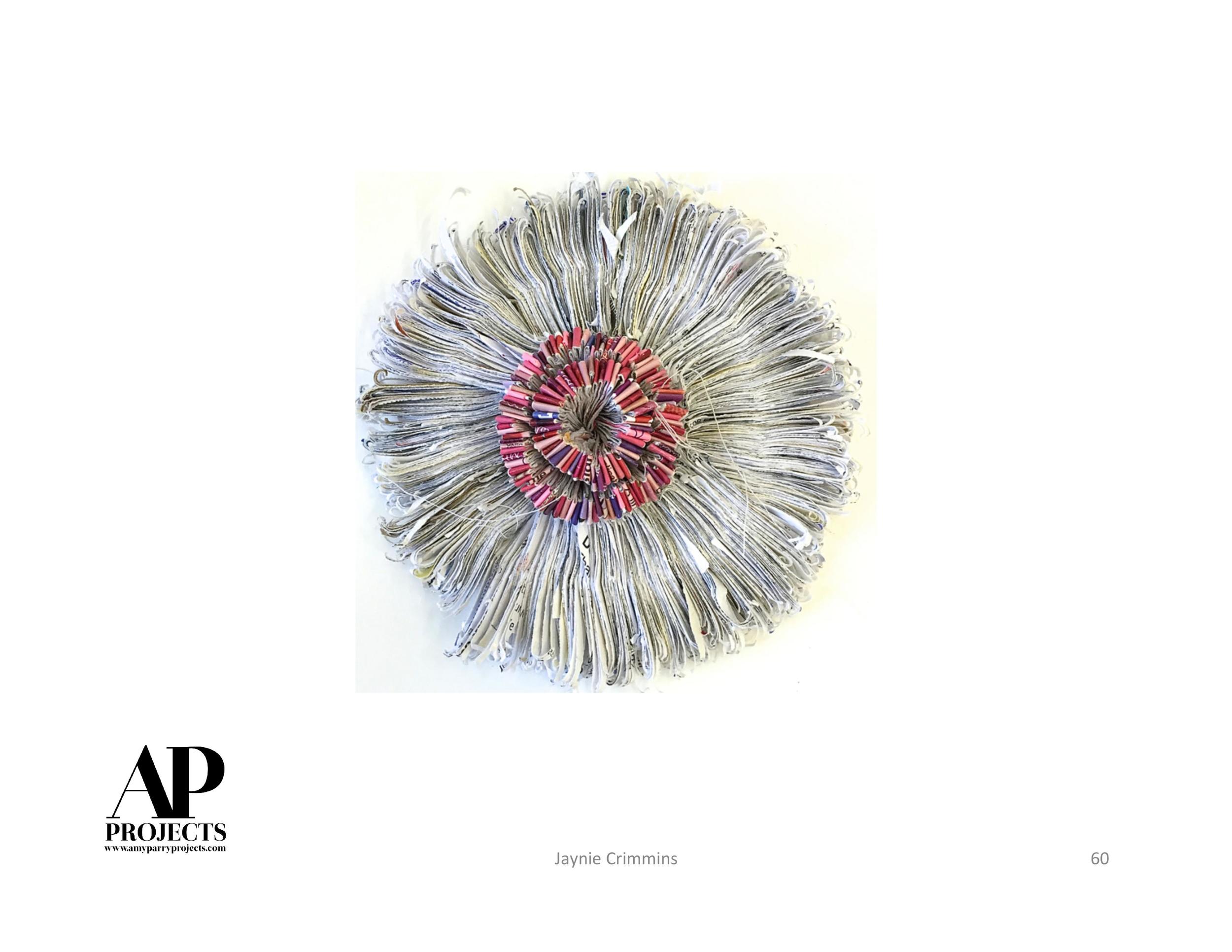
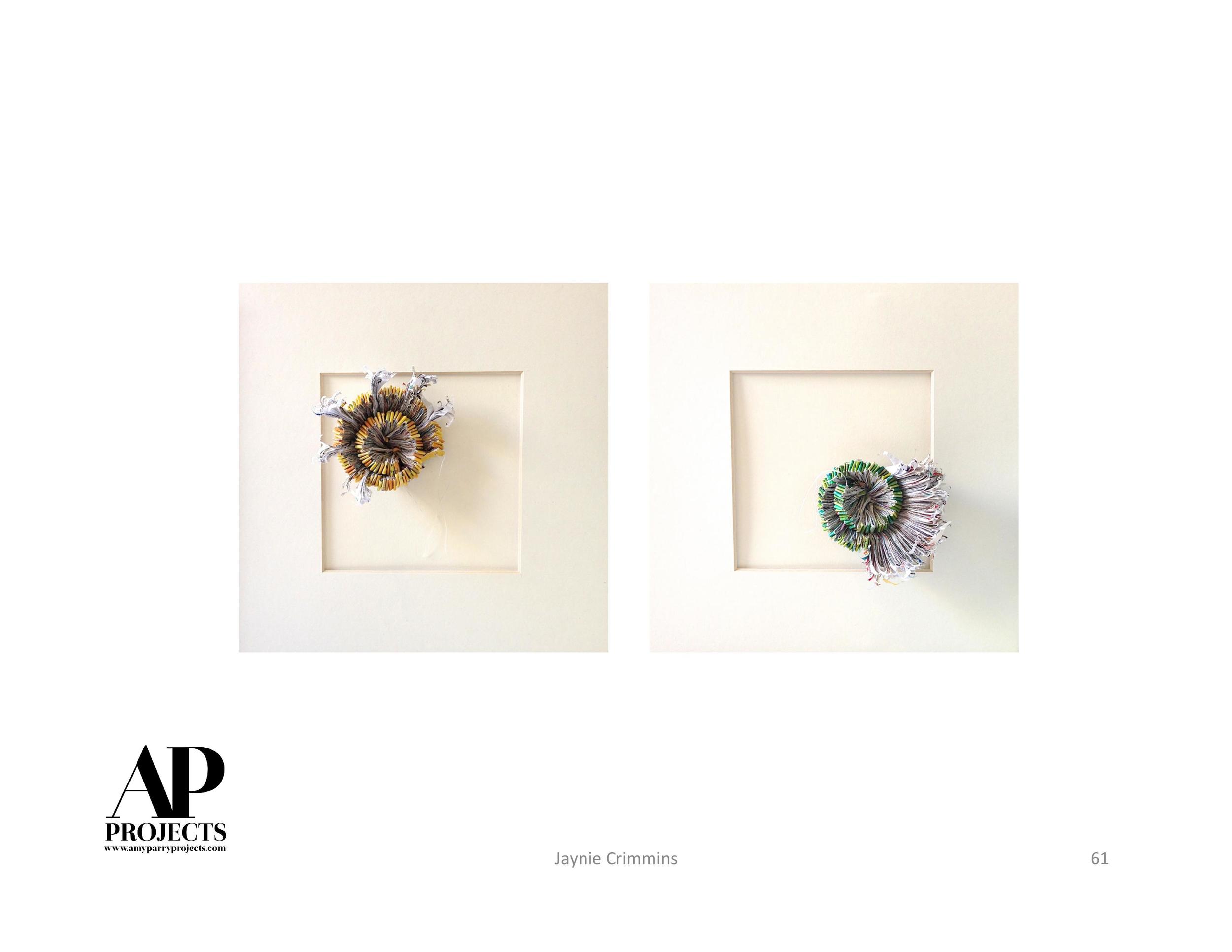
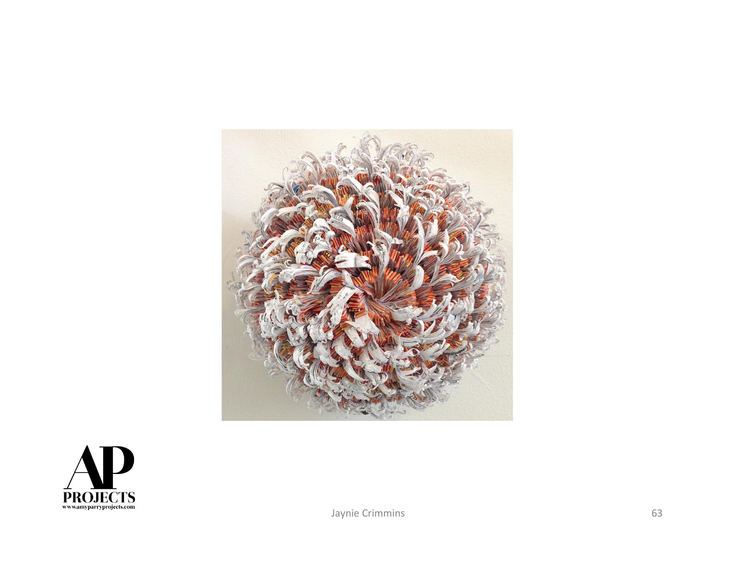
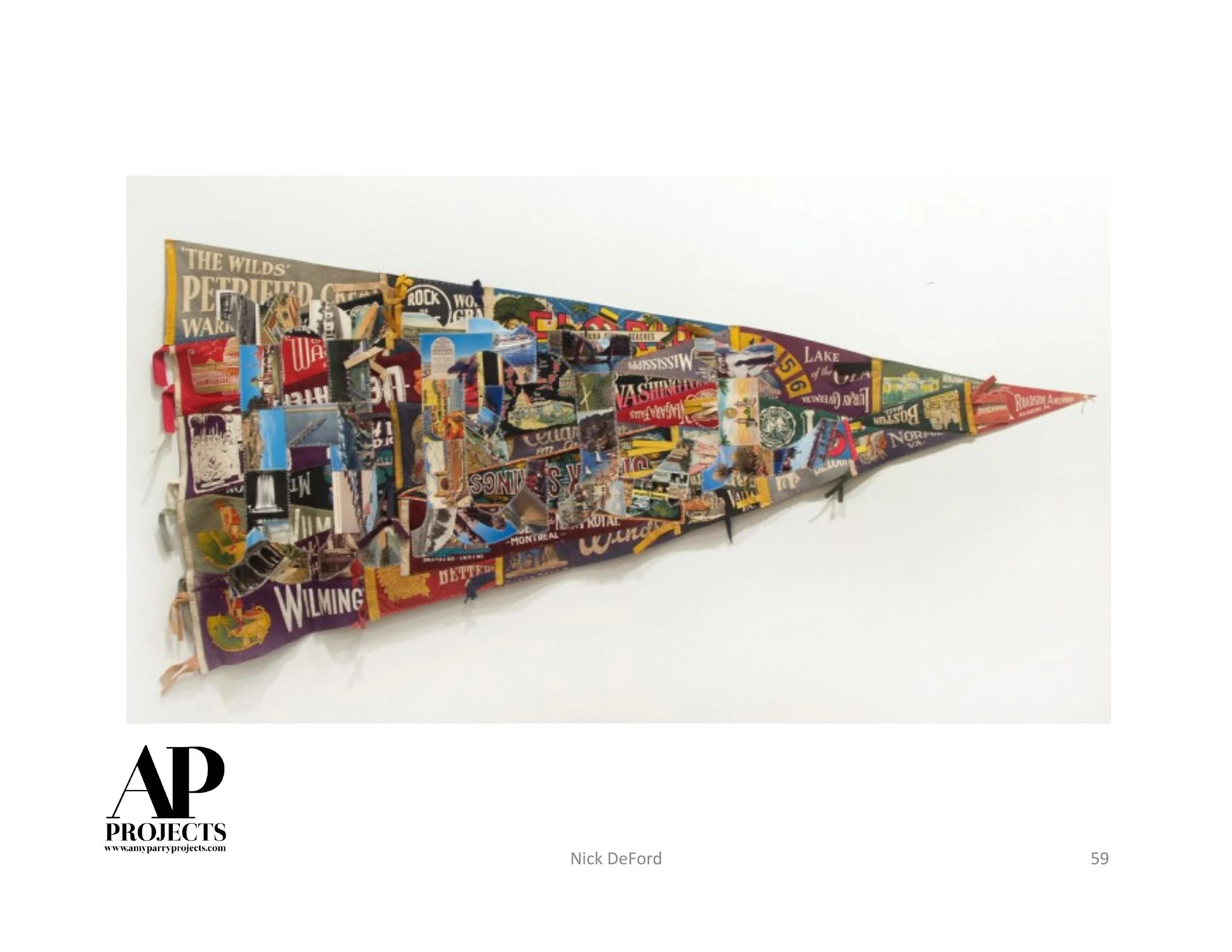
How did you develop this unusual approach to abstraction?
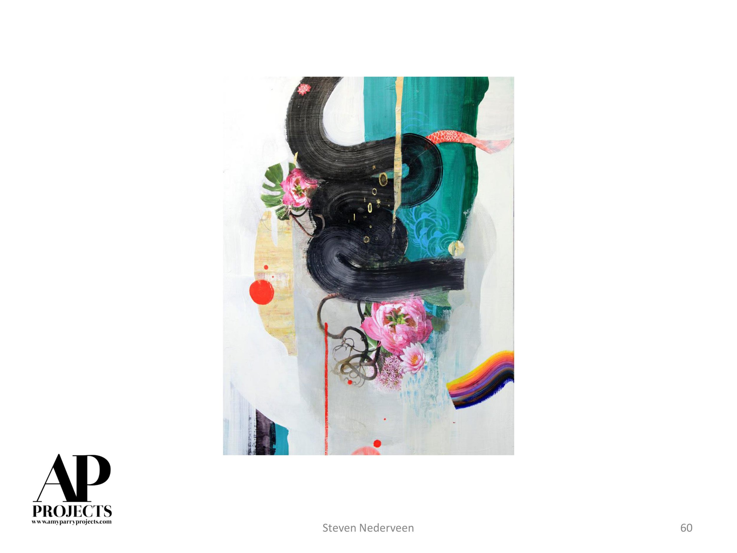
I never planned on being an abstract painter. It was a natural and curious progression that began with working from perception. I began as a figure painter and moved to landscape painting. After a conversation with a friend who knew that I have sewn some of my own clothes, wondered if I'd ever considered using "patterns in my work," and I began to use patterned material from various locations as backdrops, teamed with a Balinese doll. Slowly, the doll began to exit the work, and the patterning took precedent. The use of pattern from highly repetitious work began to be more sporadic, and I discovered that it was “mark-making and movement” of the paint that really excited me. This has kept me occupied for sometime now.
What ideas do you explore in your work?
Movement, scale, light, and color. I'm always seeking to surprise myself.
Describe your color palette.
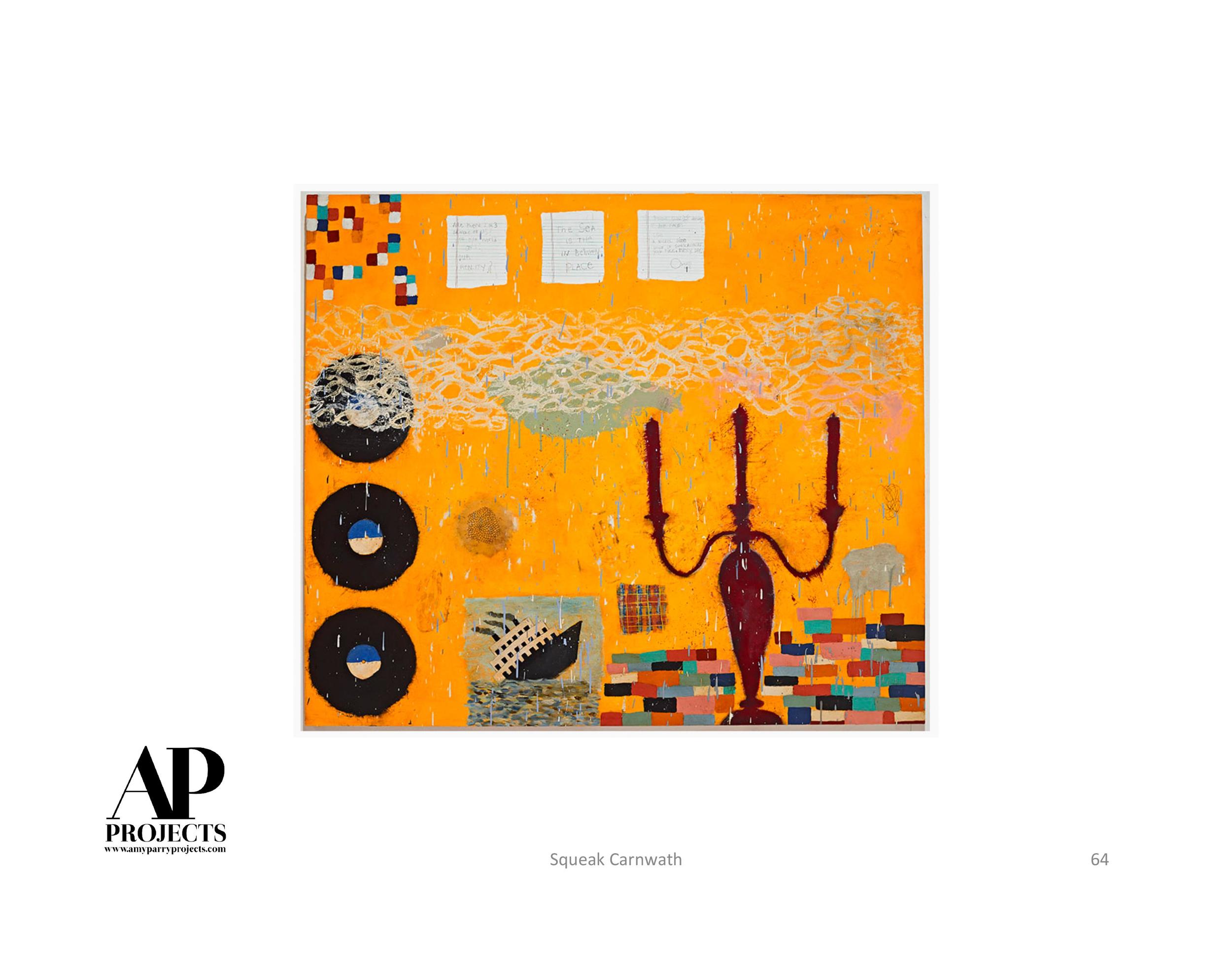
My color palette changes with each painting. I've been known to buy a color that I find ugly or just can't imagine using. Sometimes I use it straight away, other times it sits on my studio table for months, until the moment calls for it. I am after creating light with color and any means necessary to achieve this. No color is out of the question.
Visitors are framed by Fran O'Neill's leading at the Confronting the Canvas members' preview. Image courtesy of Thomas Hager.
Describe your titles. What meaning do they convey?
I deliberately title work in “lowercase,” as I consider the title to be secondary to the painting and more of a way of identifying one from another, not necessarily the “meaning” of the work. I seek simple one- or two-word phrases that don't give too much of a narrative, to allow viewers to have their own experience, not to be swayed by my thinking. Sometimes I use lines from song titles. I've been known to re-title work, until a word or phrase sticks to the image.
What does “abstraction” mean to you?
Now that's a big question. Today, for me it has to do with sensuality and sensibility, in terms of surface. To me there is abstraction in figuration and landscape. It could be the simplification an idea to obtain its essence? Or does that sound just like some “art talk” …
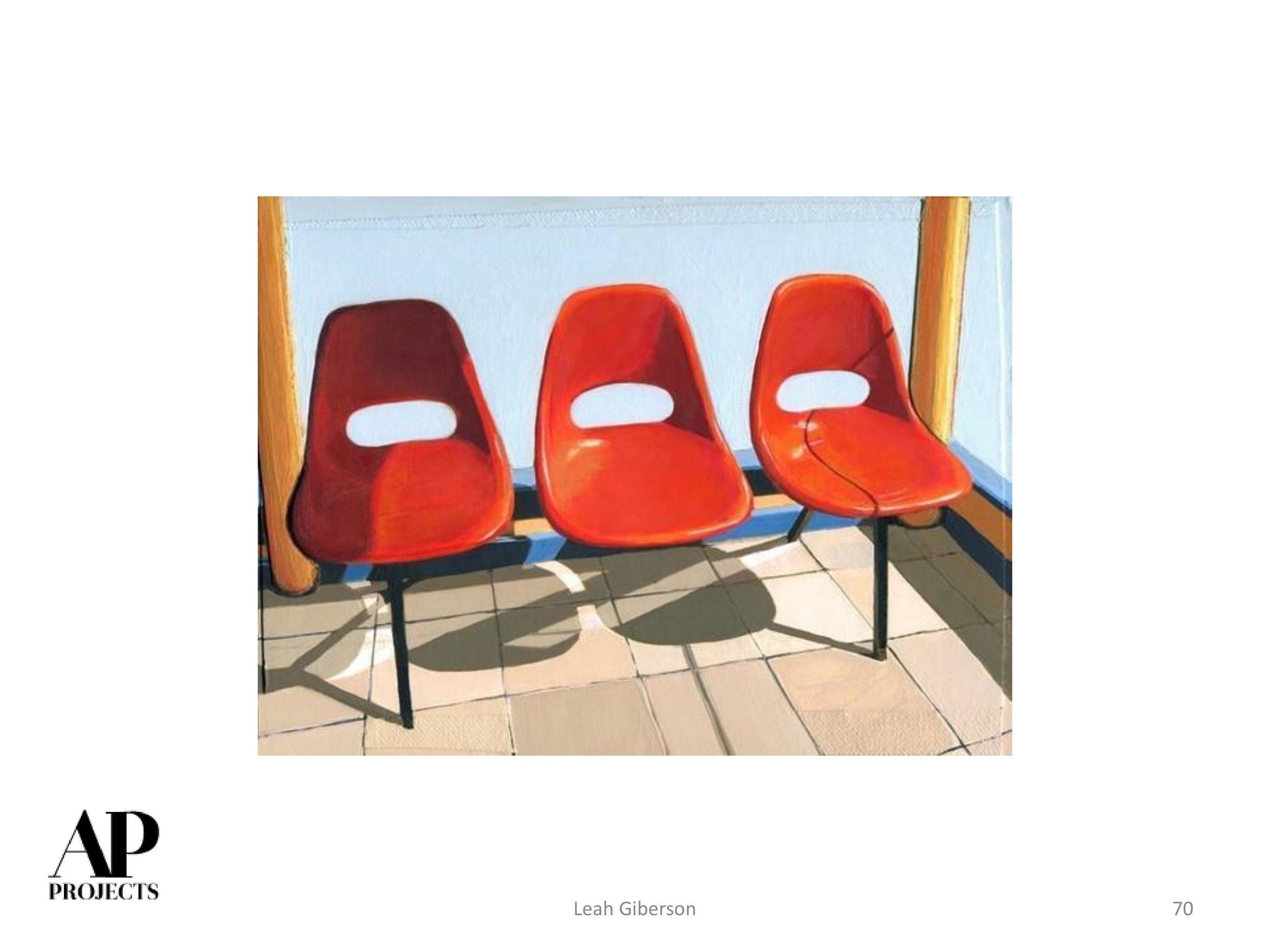
Who, if any, abstract painters have influenced your work?
I've looked at the Abstract Expressionists and others including but not limited to Philip Guston, Joan Mitchell, Lee Bontecou, Helen Frankenthaler, Terry Winters, Elizabeth Murray, Joanne Greenbaum, Amy Sillman, Bill Jensen, Margrit Lewzcuk, and recently Daniel Hesidence. Variations on why they've held my interest include mystery in the making or imagery, a sense of spirit and purpose, along with surprise in the making, and this has allowed me a glimpse into how I see their approach to their vision. This has given me the ability to seek my own voice via paint.
How much do these influences or other inspirations guide your painting process?
We live in such a visual fast-moving word. It is hard to say what doesn't influence my work. In terms of painting and/or painters, I try to see a variety of work, and hoping that on both a conscious and sub-conscious level I am soaking in all that is good, mashing it around and that it comes out in an interesting way on my surfaces.
Do you see yourself as an action painter or one who is continuing the tradition of Abstraction Expressionism?
I don't consider myself an action painter. Though I do recognize and see the link to Abstract Expressionism in my work.
Does being a woman change artistic output?
I don't think it does for me. I just work.
At times, paintings are discussed as masculine; at others, feminine. Are your works gendered?
I've had my work described as “masculine and muscular,” terms that I believe are coined to my work due to the scale and contrast of the mark-making. The connotations associated with gender and any stereotypical ideas are ones that I am not interested in. Either term can be good or bad.
What, if any, is the role of women painters in contemporary art?
I think it is the same as any other gender. To be true to oneself and to seek and go after the journey.
Why do we need this all-female show?
Hmm. Women are still making strides. I do believe that only I can make my work, and this is the same with any other gender. I do think that society does instill ideas regarding gender and that this occurs on a continued and not so subtle way. I struggle with this question. And think back to that quote by Joan Mitchell who was asked to be in a female painting show, to which she declined and said “ask me to be in a painting show” (or something akin to this), and I'm there. There is the chance that someone will not necessarily give it the same credence that they would if it was a male who painted it. I like to think this perception is changing and will continue to change. Like the gun laws, or lack of. Always debatable depending on who is at the table. (An abstract answer?)
Did the feminist movement impact your career?
I've been aware of the feminist movement from undergrad. I use to say that it didn't really affect me as a painter or my career, however, the further I get into my career, that more grateful I am for those women who fought for the right to make work that they wanted and to show the significance of being female. Unfortunately, sexism is still alive. When I teach, I really encourage my female students to find other female artists, present and historical, to enable them to see that anything is possible.

Fran O'Neill discusses her process in front of the grid of forty untitled panels at the Confronting the Canvas members' preview. Image courtesy of Thomas Hager.
Where do you find inspiration?
Anywhere and everywhere.
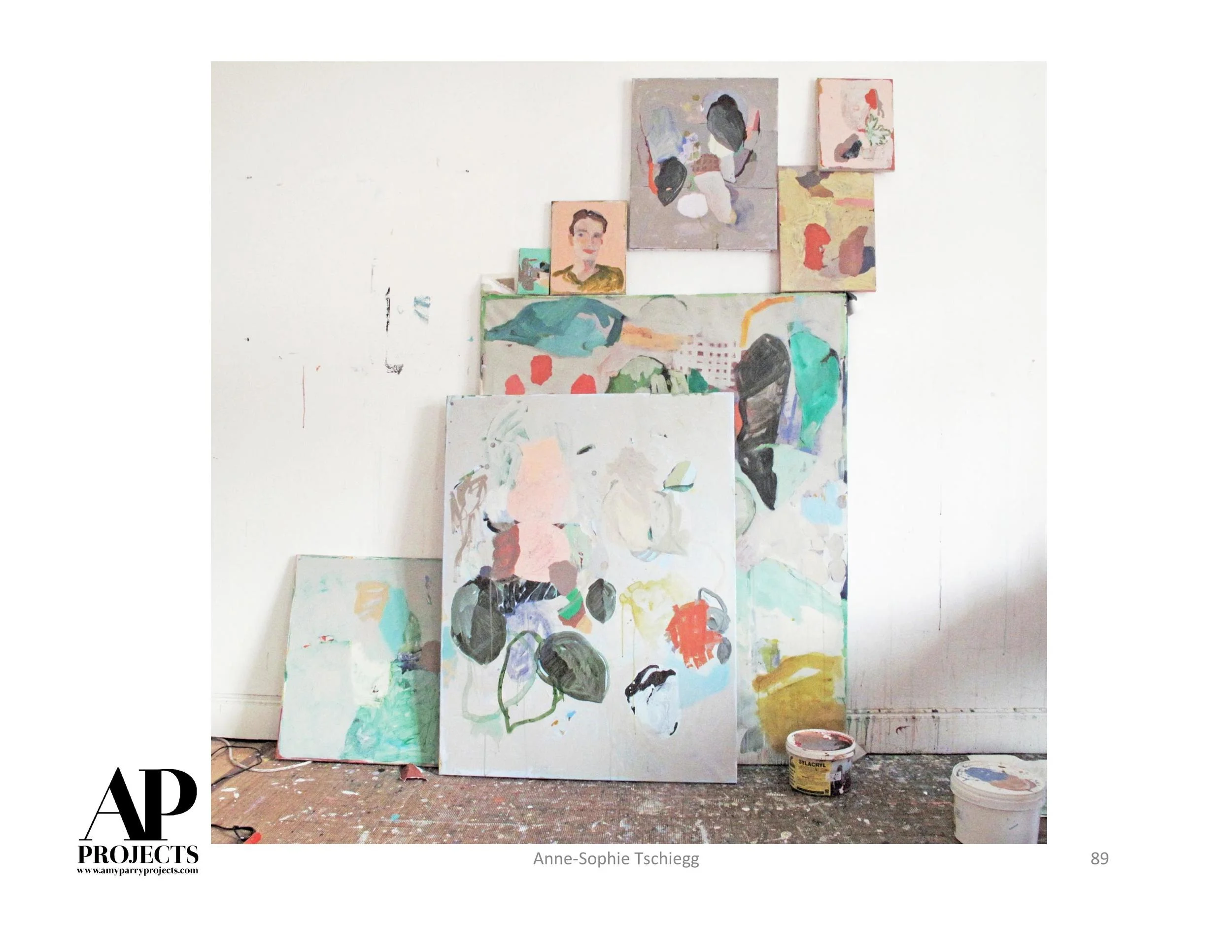
What's your workspace like? When and where do you like to create your art?
I have a studio in Long Island City with great natural light. When the weather is good, I ride my bike and aim to arrive to my studio early in the morning and work to late afternoon. Additionally, I have a very small room at my house that allows me to make work at home at anytime. Riding my bike gives me good thinking and looking time along the way.
What's your next project?
Always ongoing. To date, I would say that I don't have a start or finish of a project, though looking back, I can see moments when the work changed. And in that process, I step forwards and backwards constantly.
How will exhibiting your work at MOCA Jacksonville affect your career?
Exhibiting at MOCA Jacksonville is a tremendous step for my work and for my career. I see it as confirmation that I am on the right track. Exhibiting along side the other artists is a gift and a significant moment for me, and I am excited to see how the works might talk to each other. Ultimately, I hope the exhibition will allow the audience to see the impact and relevance of abstraction today.
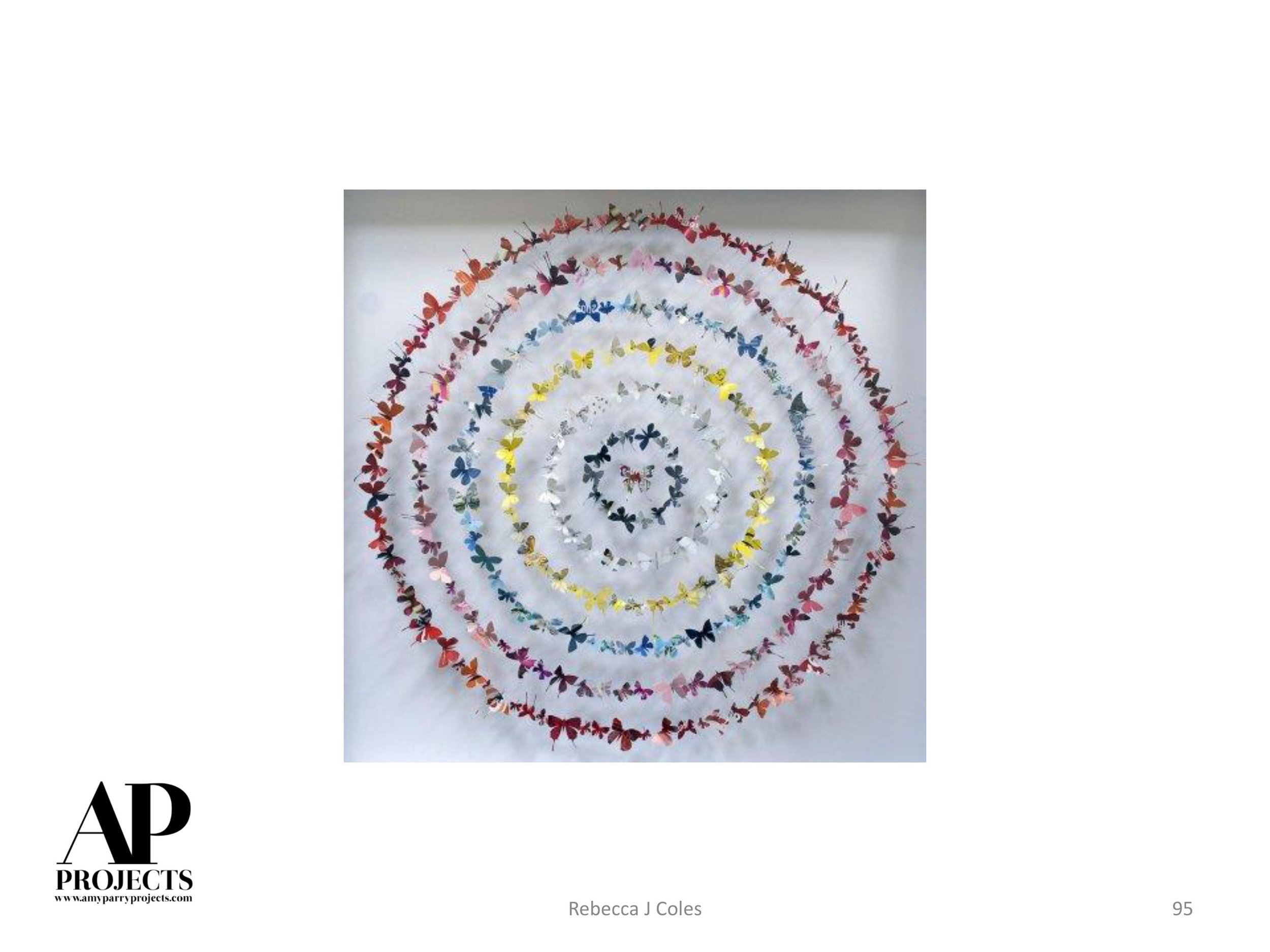
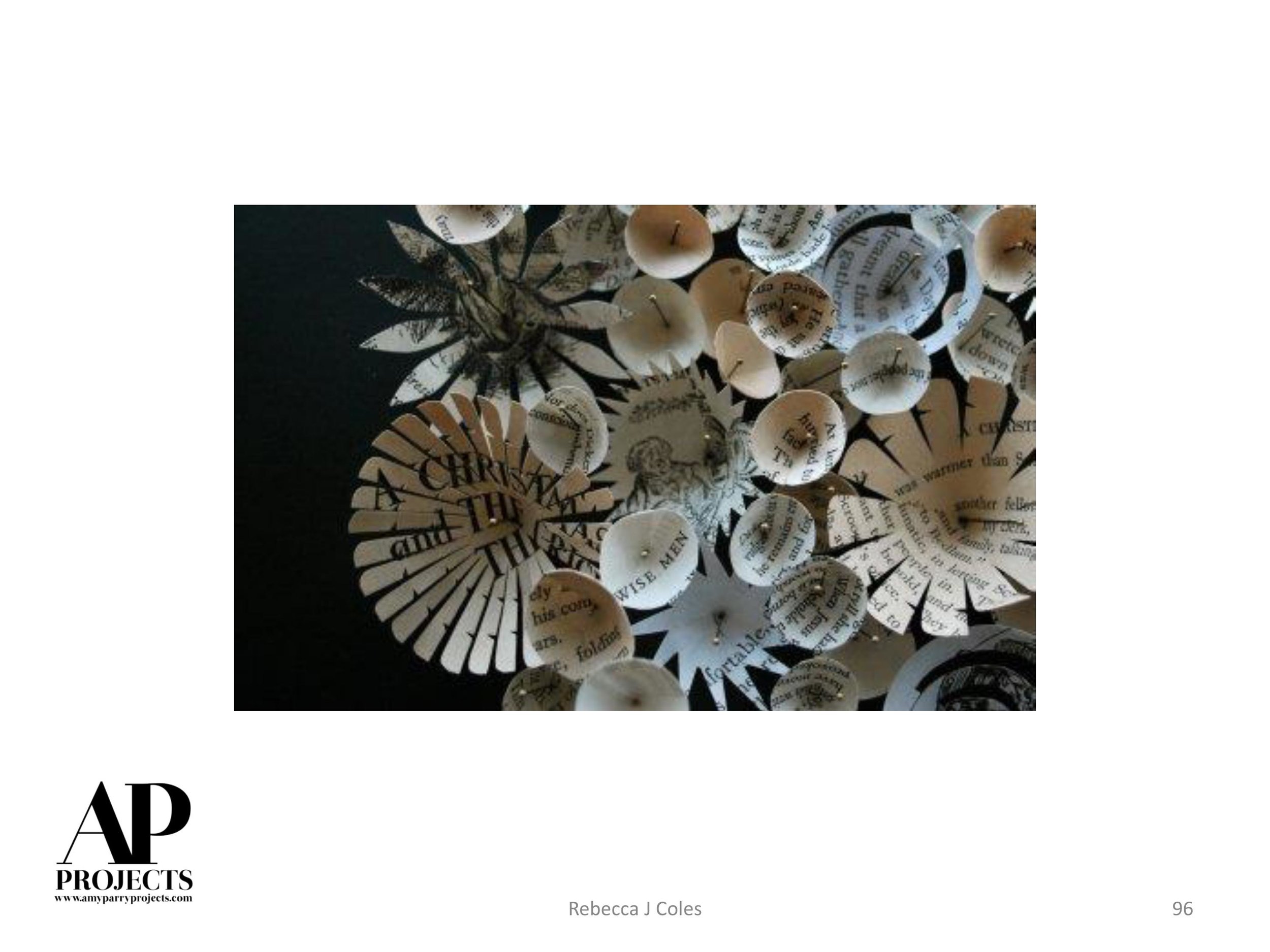
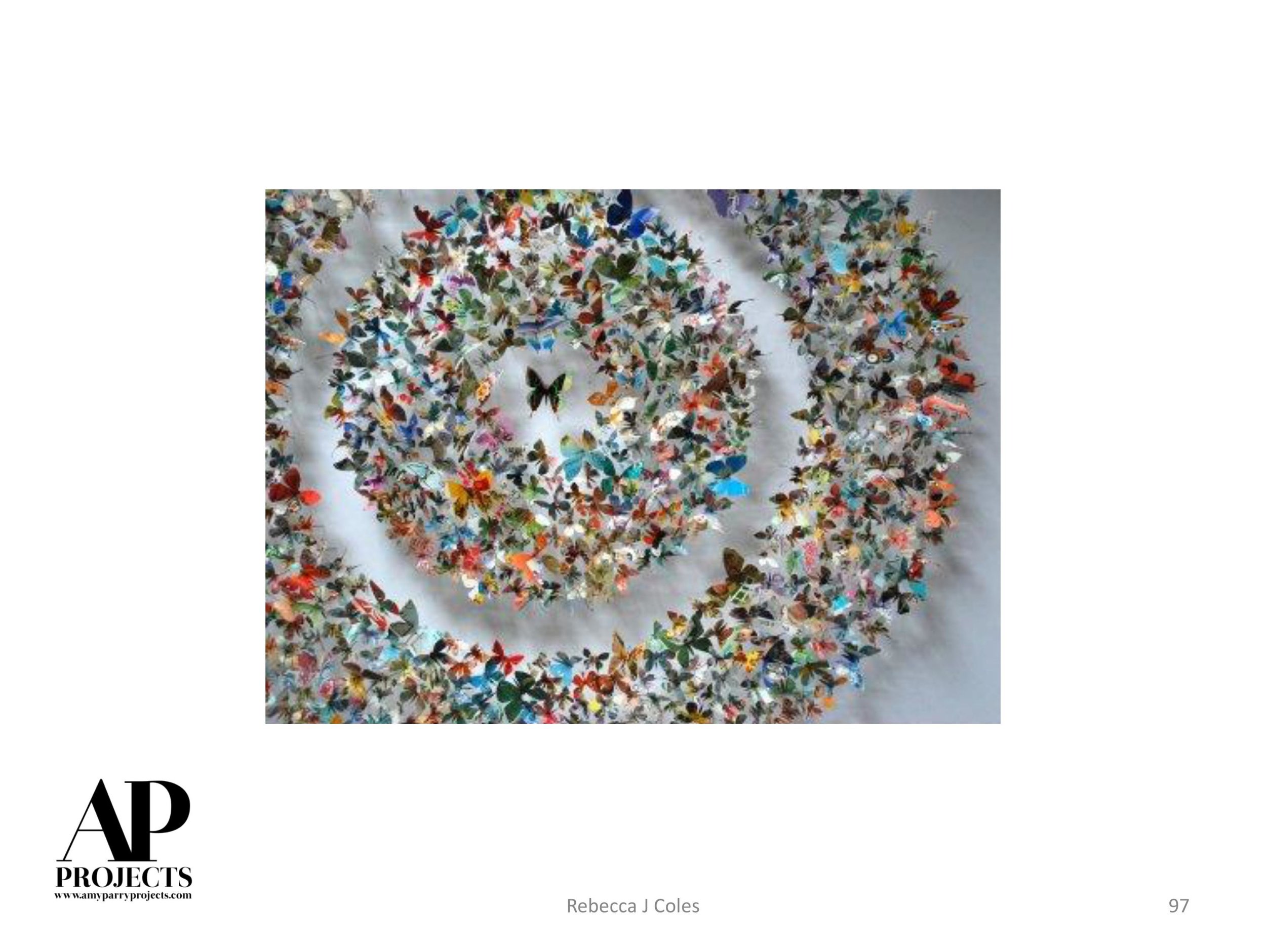
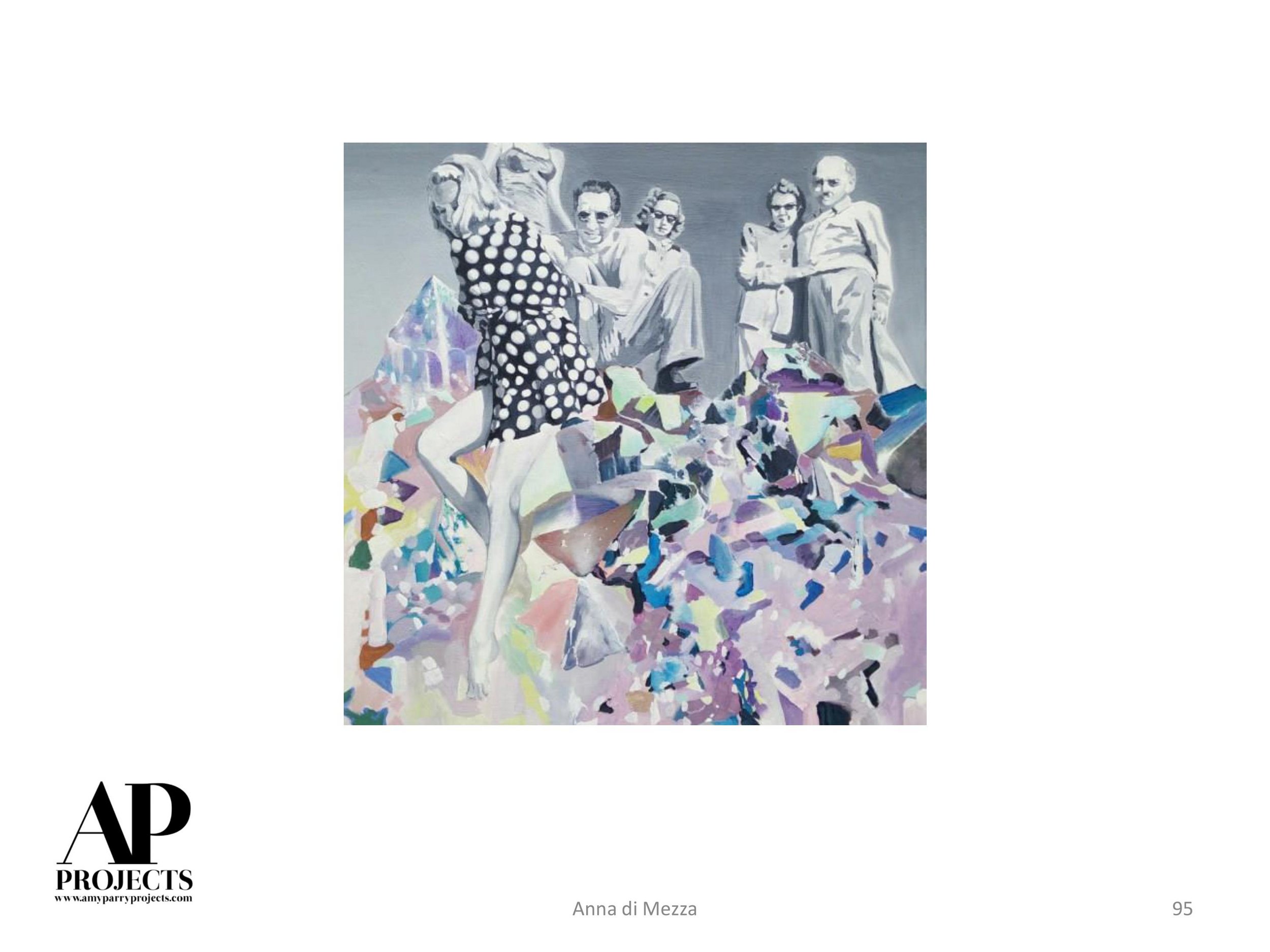
*********
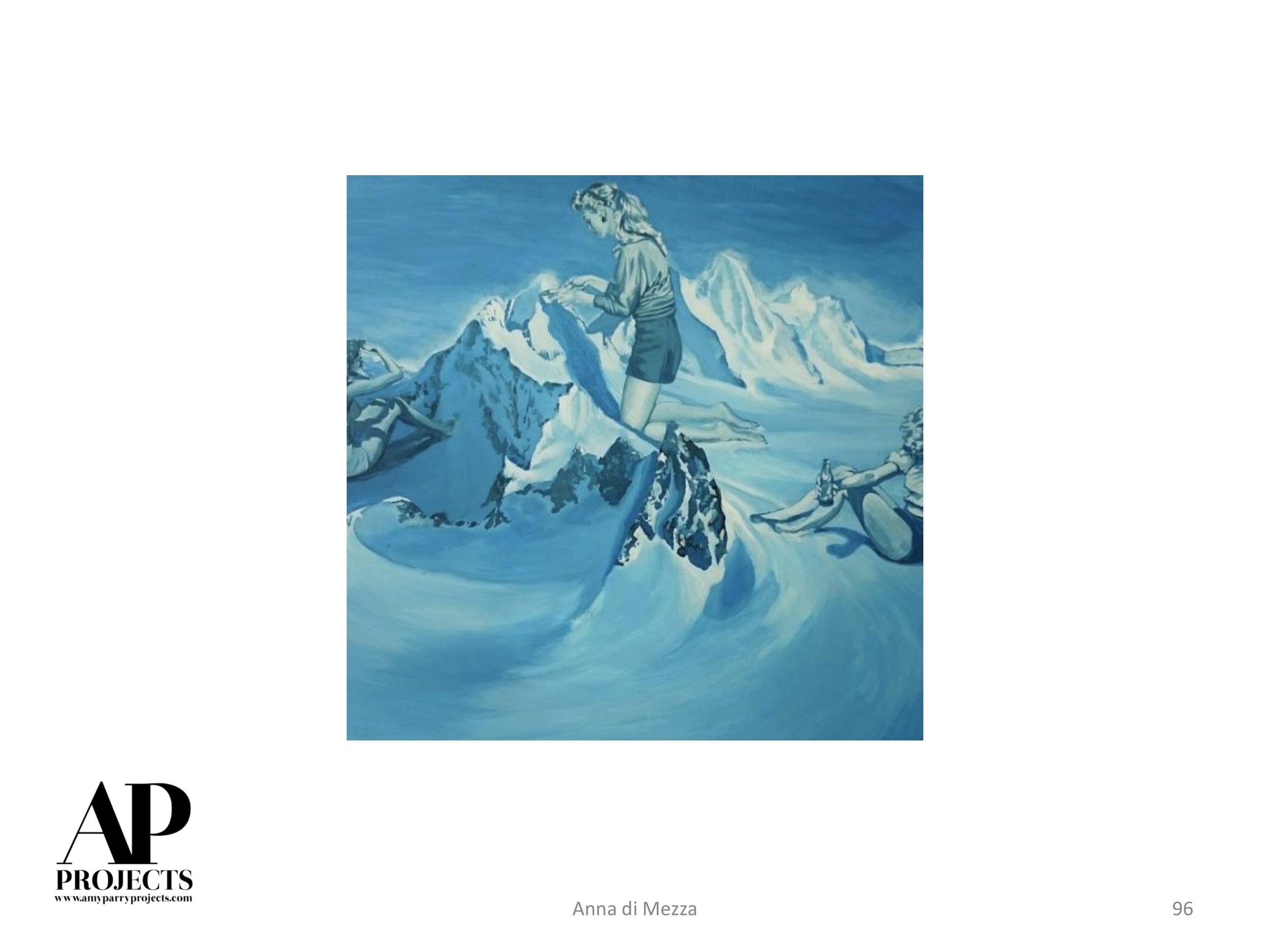
Original post on MOCA Jacksonville site can be accessed here.

O'Neill's work can be seen in the current installation of All Tomorrow's Parties at Hathaway David Contemporary, in Atlanta, GA.
We reached out to Jody Fausett a few weeks ago, asking to start a dialogue with him about his photography, his influences and his fascinating conglomeration of fashion industry styling and Southern nostalgia. The following is what he sent back in response. This vignette, an explanation of his process and an exploration of his work through its pop culture and family muses is everything.
We're obsessed. Enjoy.

Fashion Editorial for Vanidad Magazine
I never had a studio. When I lived in New York and a stylist got a box from Louis Vuitton for an editorial, we would shoot it in somebody’s apartment and order pizza. After the model is lit, nobody worries about those Home Depot cabinets. I love working off of a real space. Interior flaws and knick-knacks add to the model’s character in the story. Kitchen dominatrix: those floors will be spotless, I promise. I always watch the body, especially the fingers in a photo. You don’t want missing digits.
Growing up in a small town, all I wanted was to work in New York. When I got to New York, all I wanted was to return to Georgia and work on my personal projects. My grandparents’ house was my favorite studio – all that stuff that I could light with strobe. It made the familiar become surreal and created a different domestic tension that got shifted into my version of home theater. When my grandfather got sick, I felt that the one trip a year I could afford to come home was not working anymore. I returned to be nearby.
When he passed away, I continued taking pictures there. The airless silence could be too morose, so I pushed for portraits. My favorite model over two decades has been my grandmother. This is how I connect.
When setting up, I work alone and quietly move the lights around to figure out what I feel works. Usually, she mows the grass, her favorite thing, while I work on the pose to find the light. That way I can walk her into the ready shot and not have her wait too long.

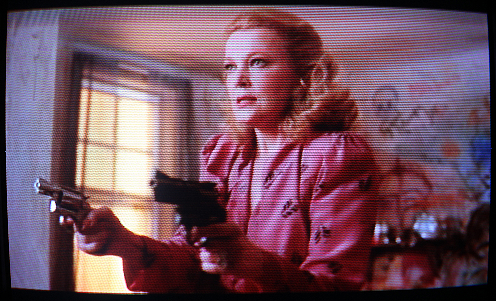
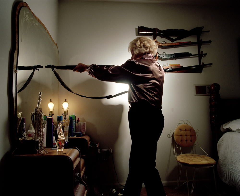
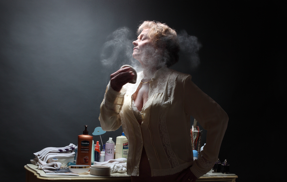
Test Shot // "Gloria" (1980), Directed by John Cassavetes // Five Shotguns, pigment print,
40" x 50"
Decades of guns line the wall next to the vanity. This portrait came up out of the conversation of being a widow and knowing how to handle a weapon. Understanding the weight of the gun, you can take care of yourself. With no more big suppers to cook, she becomes svelte, decisive, and feminine.

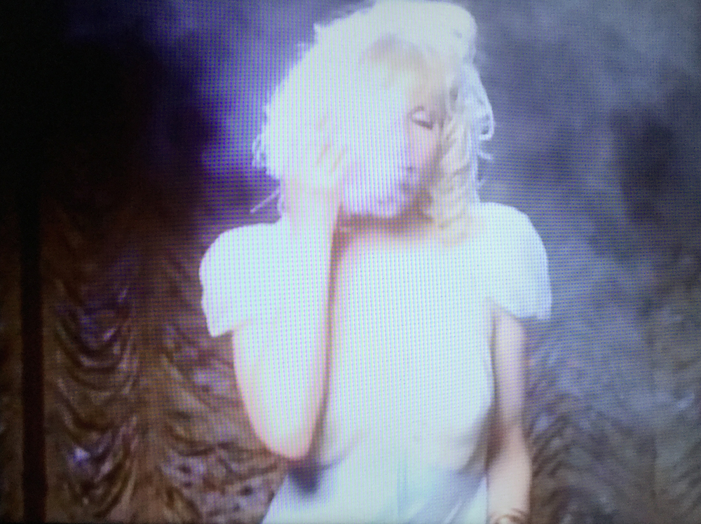
Test Shot // "Siren" (1975), Roxy Music outtake photographed by Graham Hughes // Photoshop screen grab
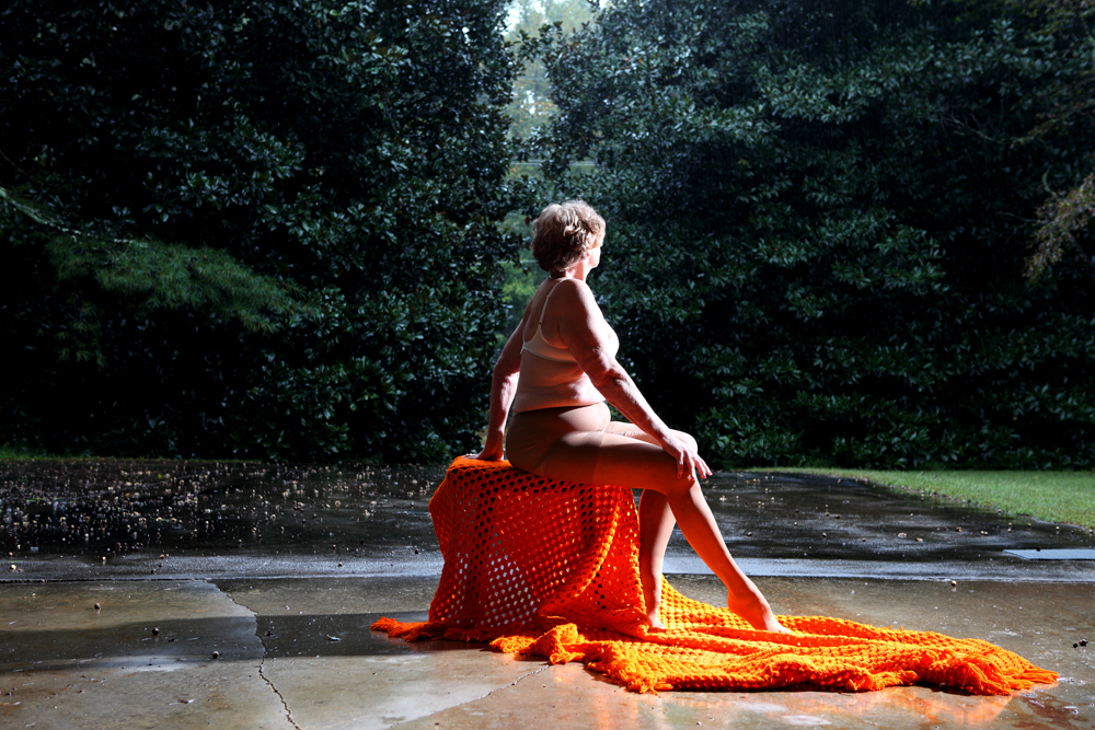
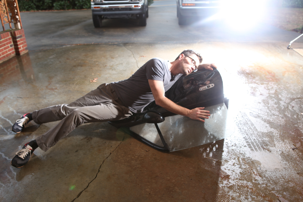
For a long time I shot this perennial series in the interior domestic spaces, but I decided to move outside and capture images without borders, images of infinity. An oil leak that has altered the surface of my grandmother’s carport for over fifty years provided a welcome set for this narrative. I have returned to this space many times for different ideas, but on this shot I saw waves crashing over the rocks. The detached car door found in a shed would do.
From years of fashion work, it’s obvious for me now to retouch. It is not a documentary so much as part biography, part novella.

Occasionally, my grandmother is my assistant with great ideas on how she sees things. When we torched an old chair in storage, she helped with the fire. Later, she told me that the fire was unimpressive and we should try again the next day. We would find another chair in storage, she said. It feels good to catch furniture on fire.
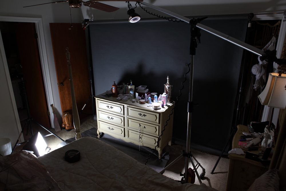
Test Shot // "Miss World" (1994), Hole video Directed by Sophie Muller // Outtake detail
The back bedroom has all the original furniture from when my mother was a teenager. Now it is the secondary vanity with all the perfumes and powders. I use seamless paper to change the reception of the interior, to highlight a specific piece of furniture with all that history (shoelaces used as a drawer-pull now). Even after I stood in to test the lighting on skin, the perfume powders took about 70 times to get the spray right.

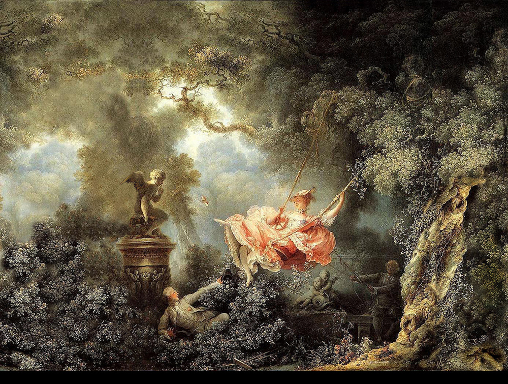
Test Shot // The Swing by Jean-Honoré Fragonard // Wet Driveway, pigment print, 24" x 36"
The final portrait I shot again with the driveway in the background when it was pouring rain. I watched those magnolias tower and slowly cut off the sound of the highway to become something pastoral - this private garden, a place to reevaluate. I carefully directed her fingers in my plein-air studio, the carport off the highway.
- JF
Jody lives in Atlanta. For inquiries about his work please contact Jackson Fine Art.
If you want more, find Jody on Instagram.
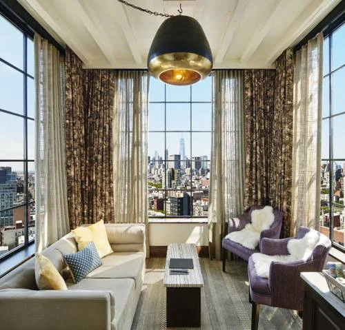
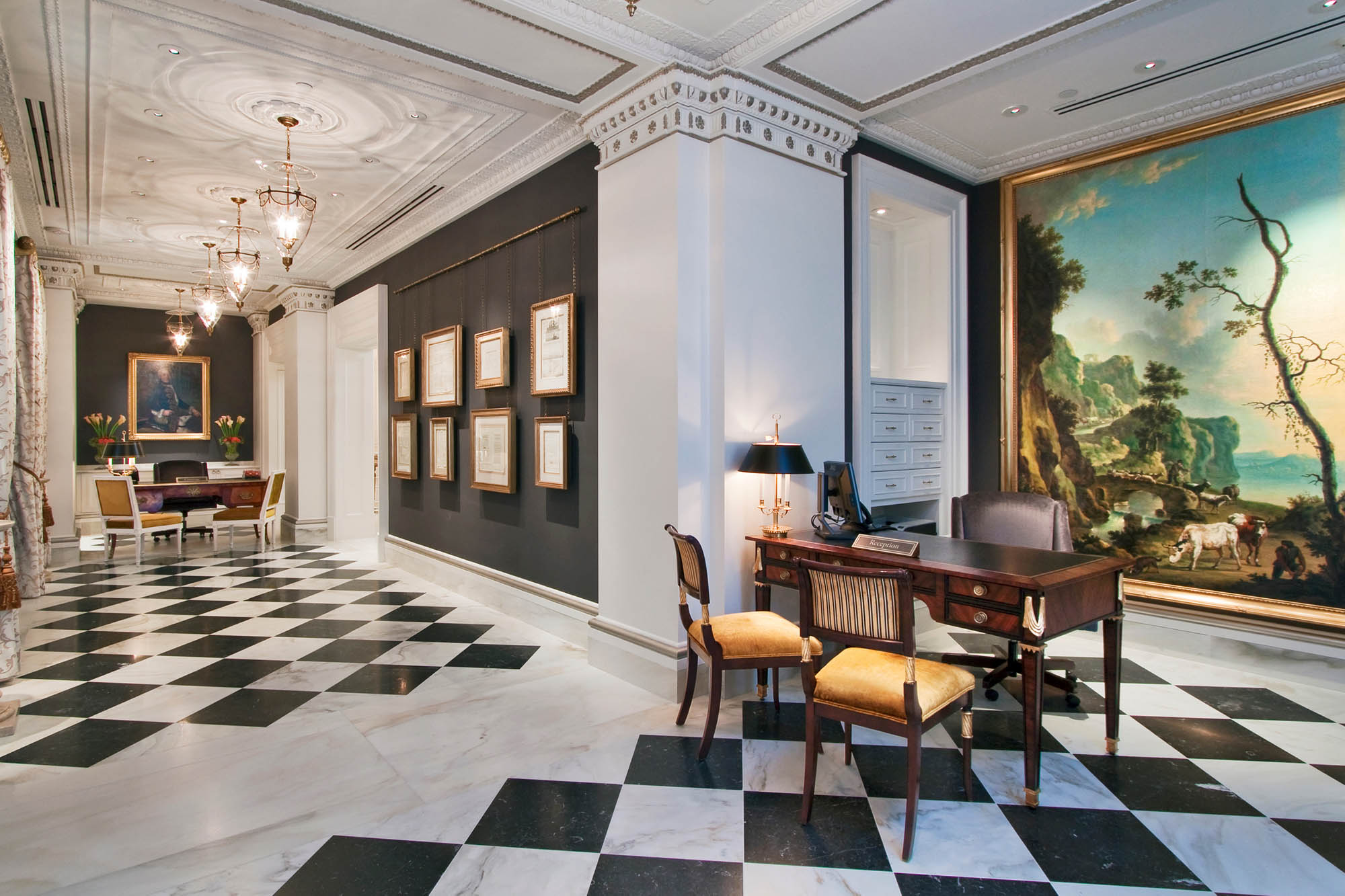
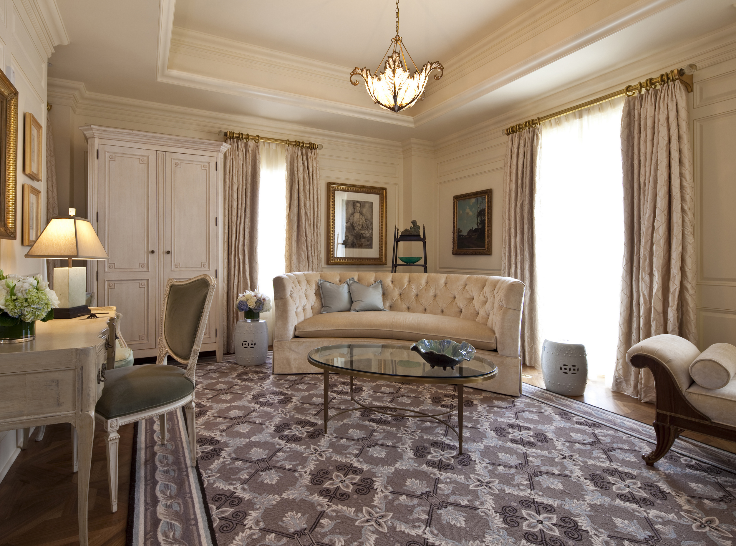
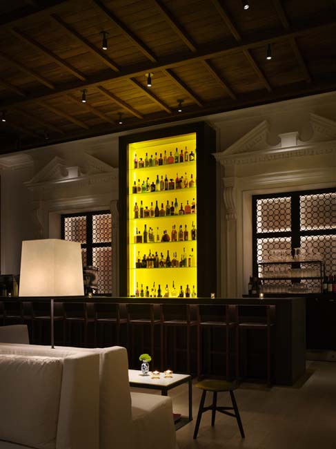
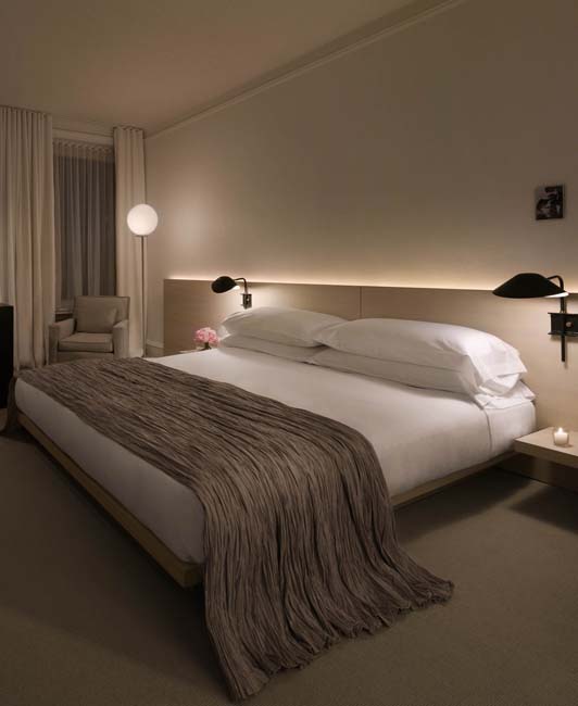
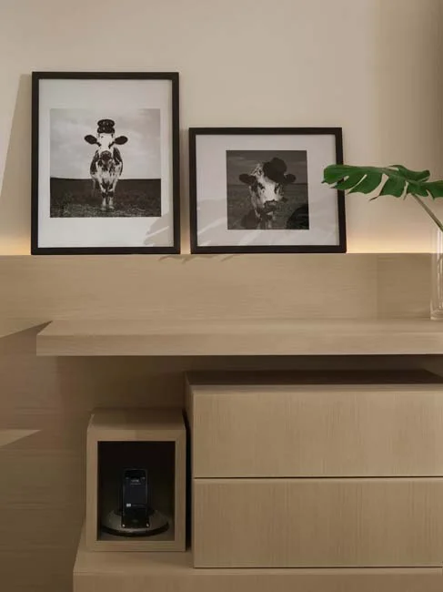
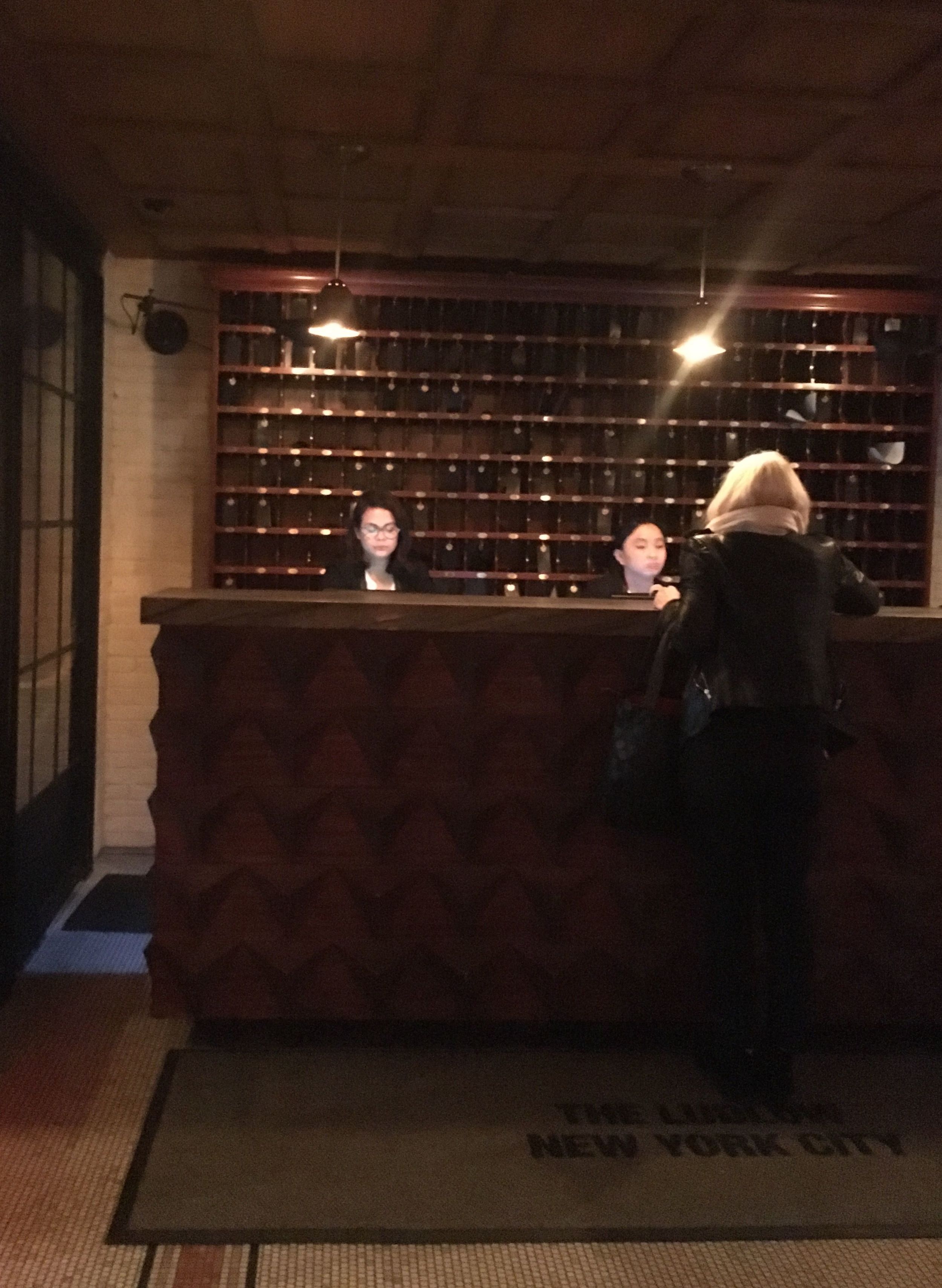
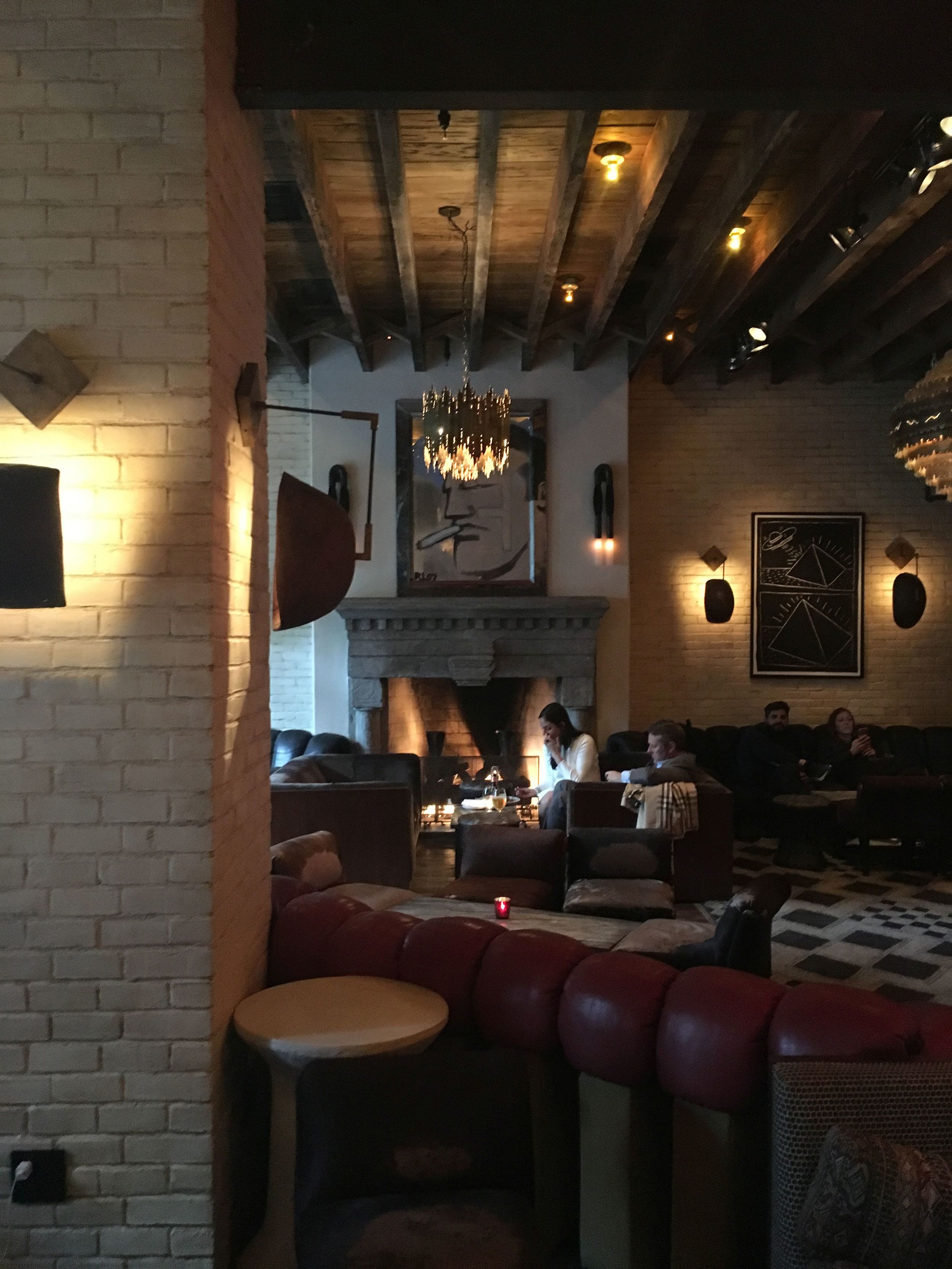
180 degrees of NYC cool
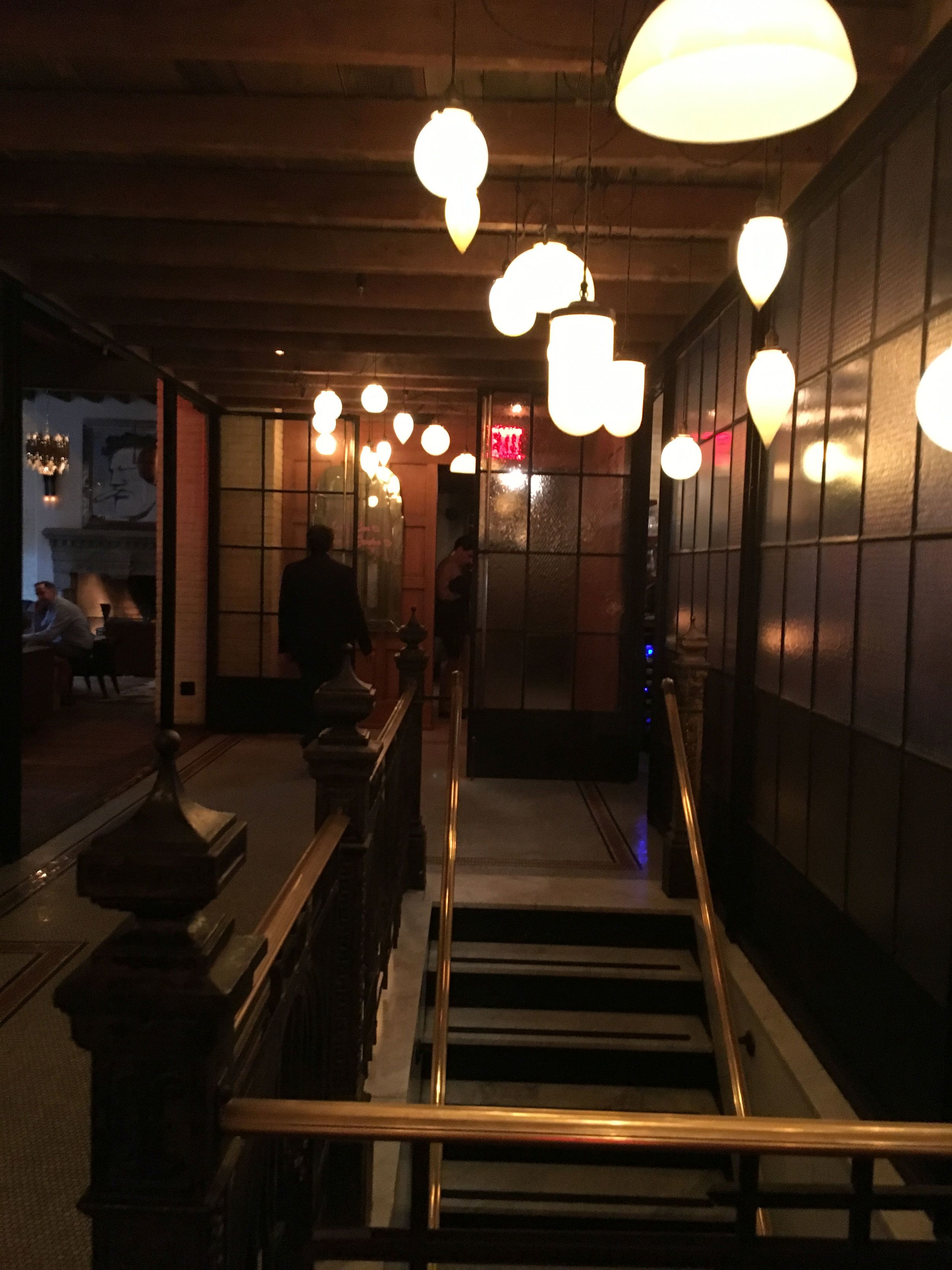
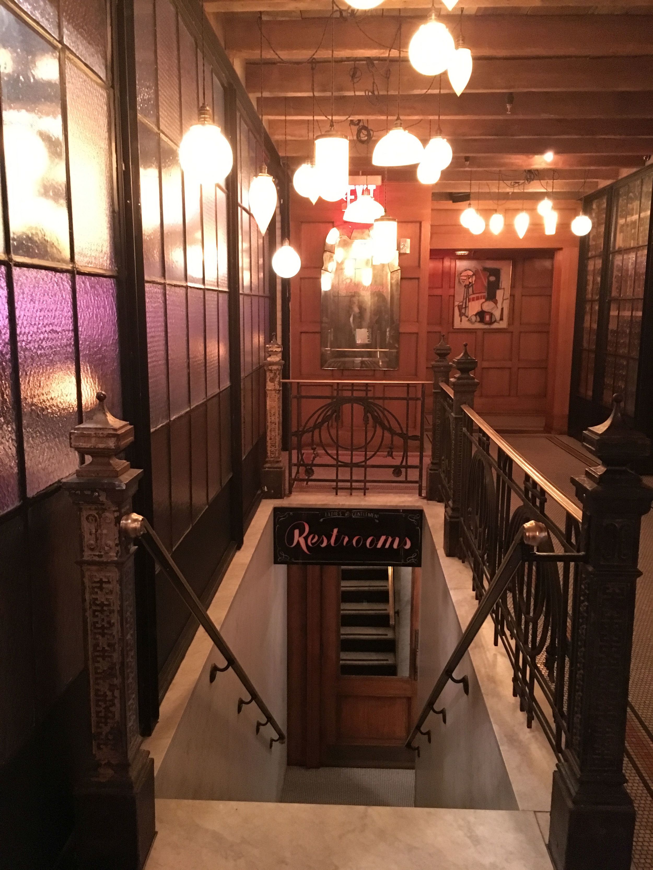
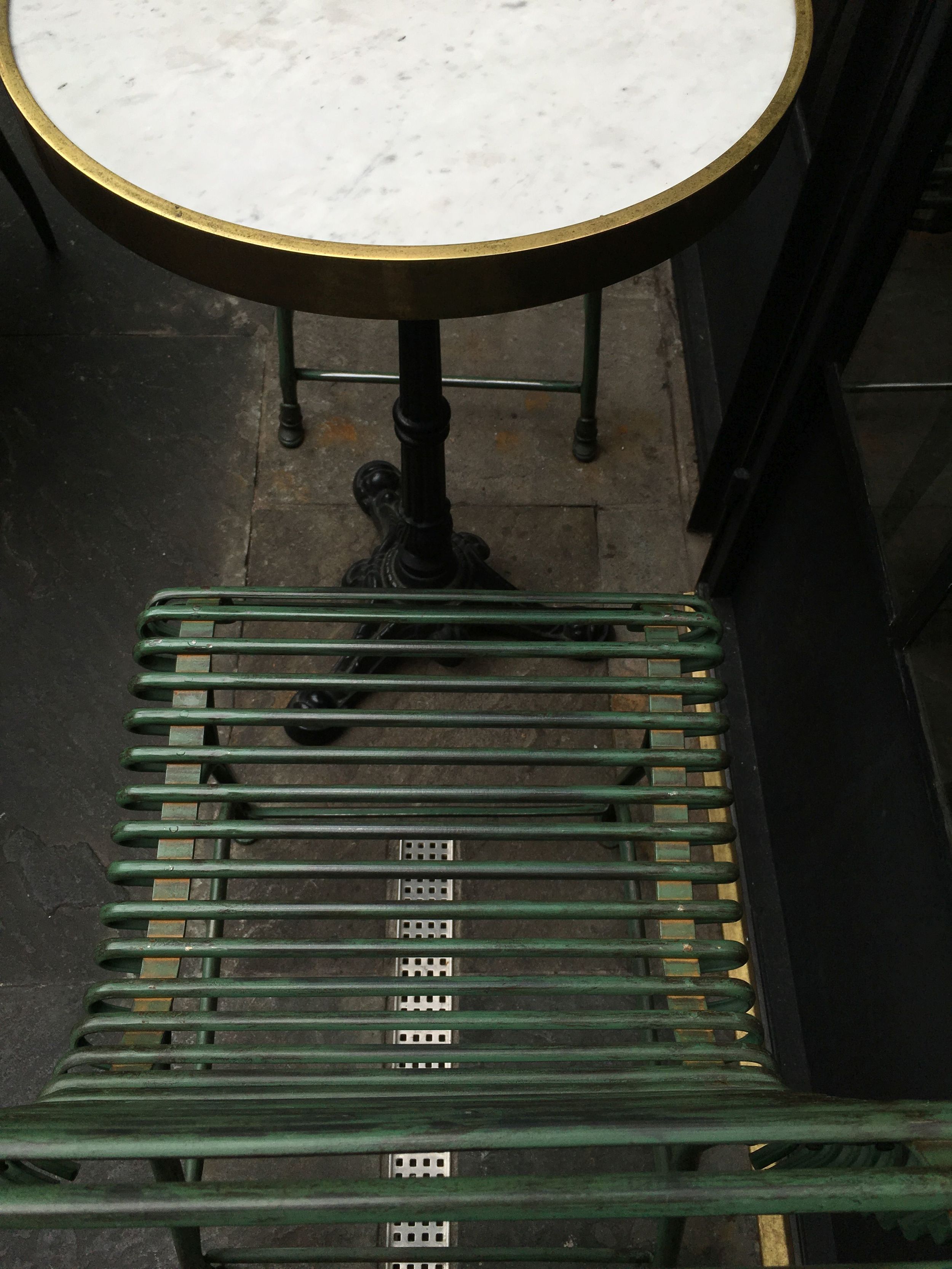
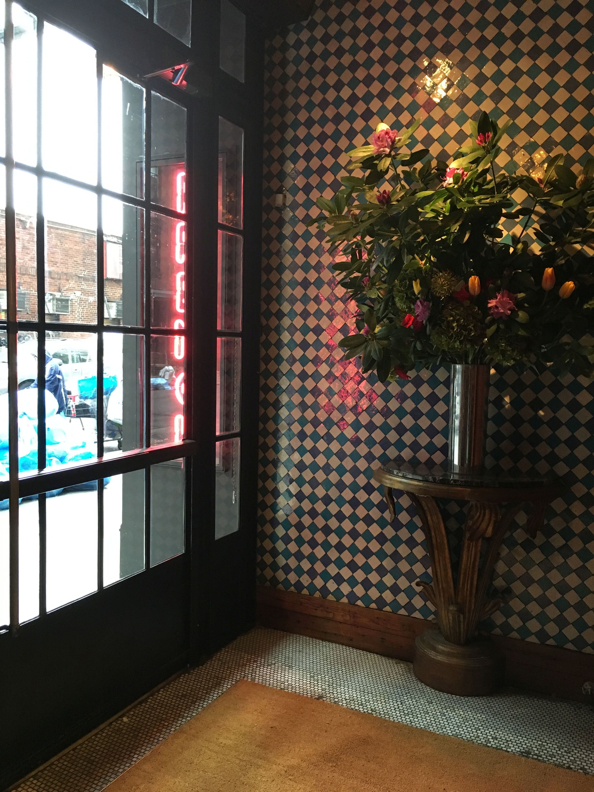
On this most recent NYC visit, we made a stop in the Lower East Side to see this boutique hotel gem which was completed in summer of 2014. Hotelier Sean MacPherson (also known for the Bowery and Maritime Hotels among others) turned an empty, concrete building into an effortlessly cool and comfortable hotel offering 184 rooms in 10 different types. While the spaces of the Ludlow look great, what the entire hotel offers most importantly, is an amazing, whole-picture feel - like you’re staying in NYC as a local. You can really slip into the feel of the neighborhood and MacPherson’s impression of it from the gritty, glory days of the 1980s. In fact, MacPherson has gone on record explaining his wish that the lobby serve over time as a living room for the neighborhood. The mix of new and vintage furniture in mahogany and cognac leathers, printed tweed, purple velvet, animal hides and fur seem inherited down many times from a favorite relative, and no detail (hand-stitched curtains, worn and whimsical tchotchkes, Indian rugs, tiny iridescent tiles) seems the least bit out of place, contrived or curated. It all just works.
What to notice...
1) Check out the custom reception desk and admire the old school drawers behind it.
2) Enjoy the legit, word-burning limestone fireplace, flanked by burnt out brass sconces and Marshall speaker cabinets hanging down from chains. Look around for a Ron Gorchov painting and freak out a little.
3) Try to think of a place in your house you can work in one of the vintage de Sede Snake Non Stop Sofas and how you would ever be able to afford one.
4) Imagine the past life of the recycled factory windows separating the Lobby from the Dirty French restaurant and all the stories they reflect.
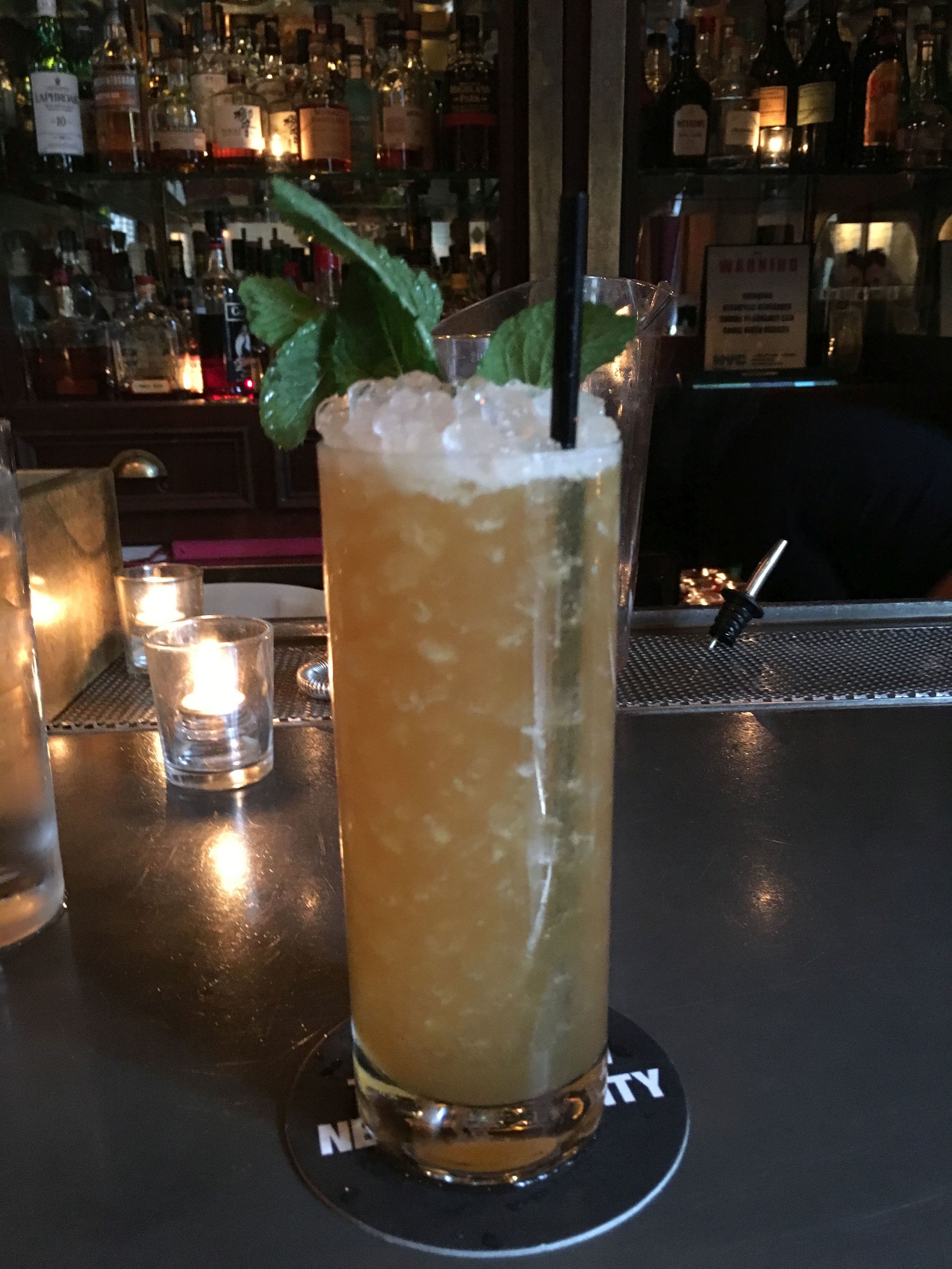
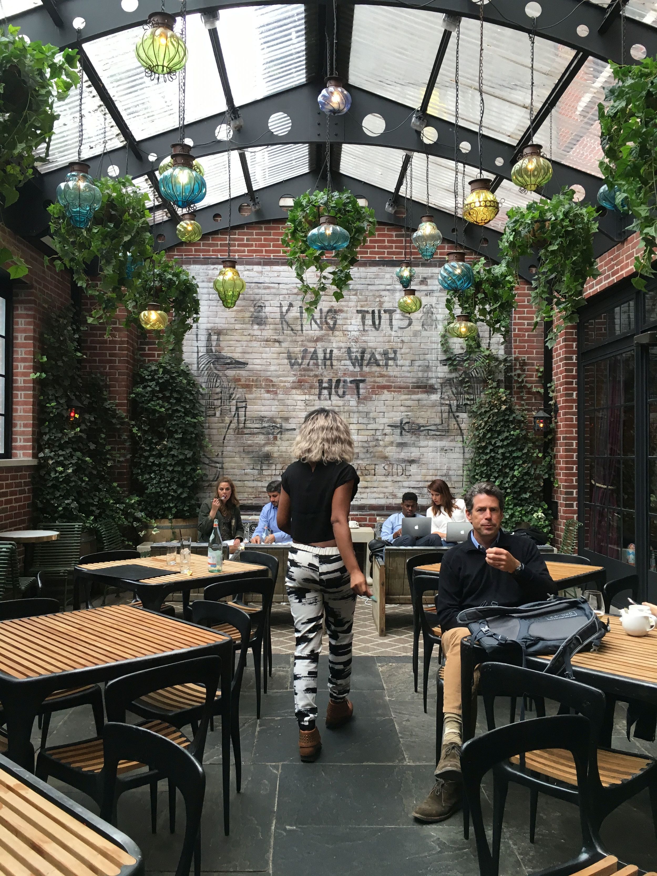
5) Order a $16 Lilikoi cocktail at the zinc coated bar in the corner and enjoy it sitting under the hotel’s greenhouse structure that is apparently pleasant year-round.
6) Covet the black and white brushstroke pants of the cocktail waitress.
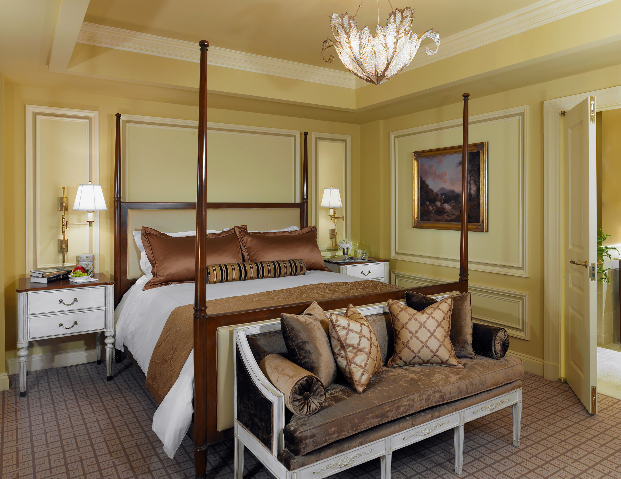
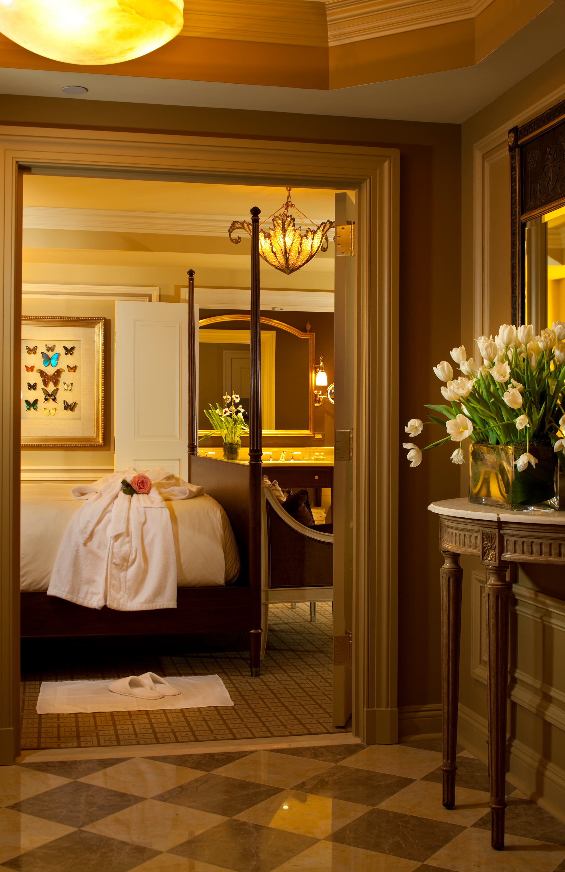
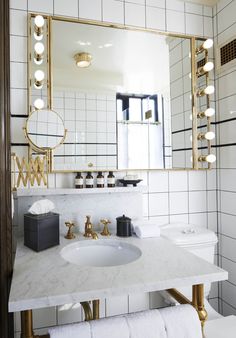
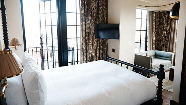
7) If you stay the night, you’ll sleep on a four poster bed from Portugal, surrounded by inserted and white-washed ceiling beams and even more amazing brass fixtures (including Hollywood style vanity lights in the bathrooms).
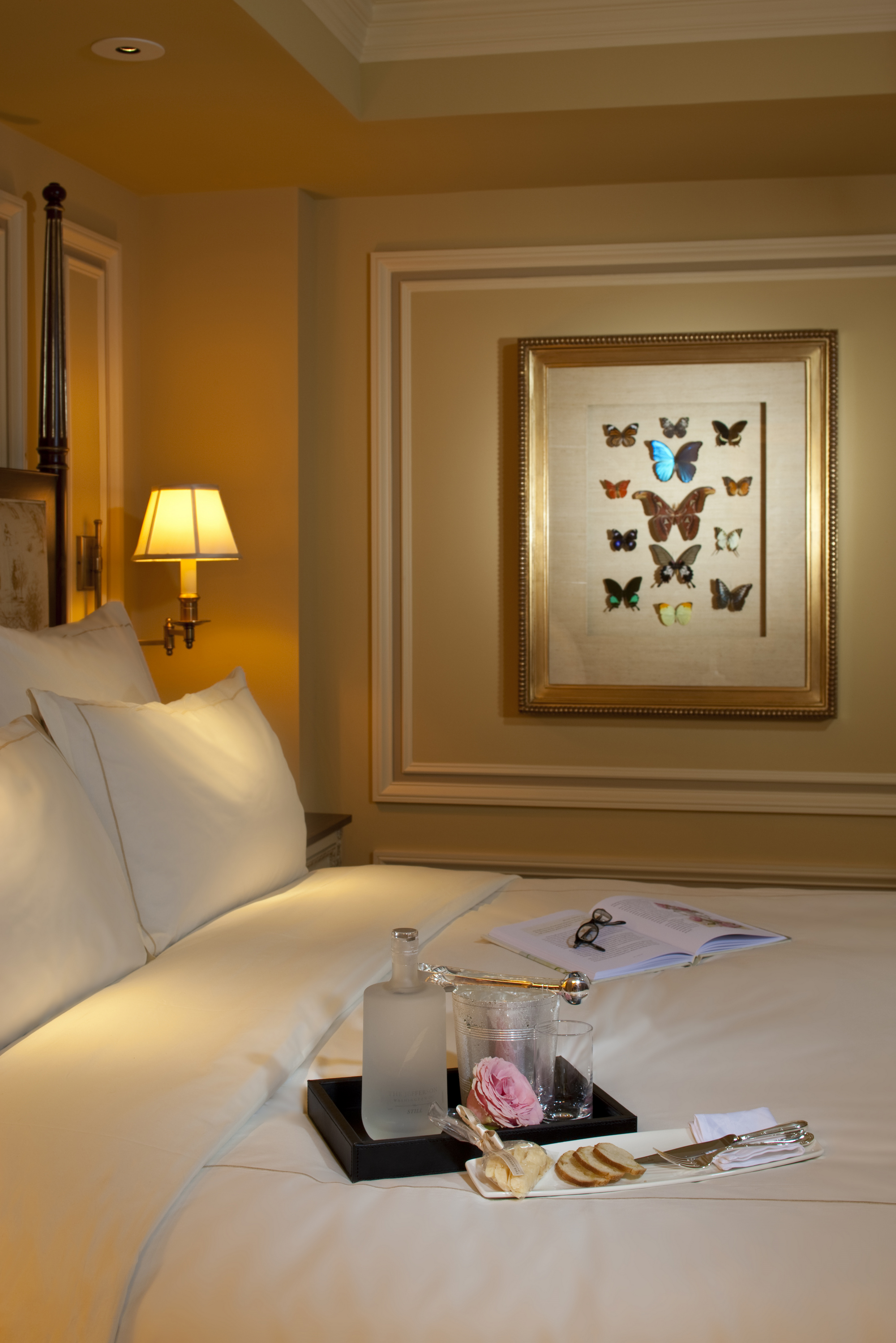
8) Marvel at the museum-quality guestroom art, curated by the NYC magnate, Vito Schnabel.
9) Witness the room literally expand after dark as the city view becomes the centerpiece of the small, simple space.
10) Enjoy the authentic, surprisingly low-key street, capped off by the iconic Katz’s Deli on your way to the F or the 6 and the rest of the great city where unique experiences are the norm.


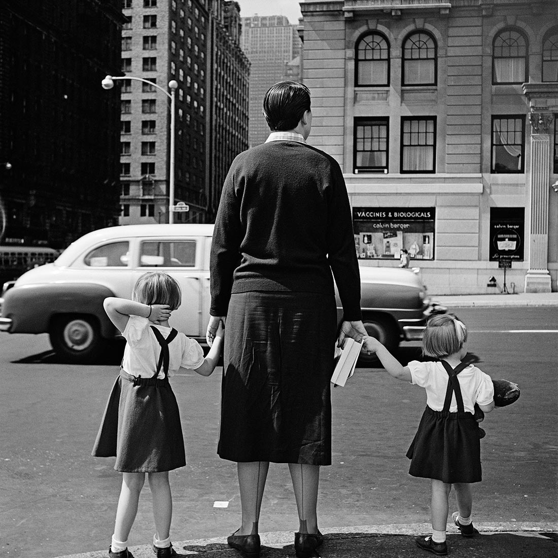
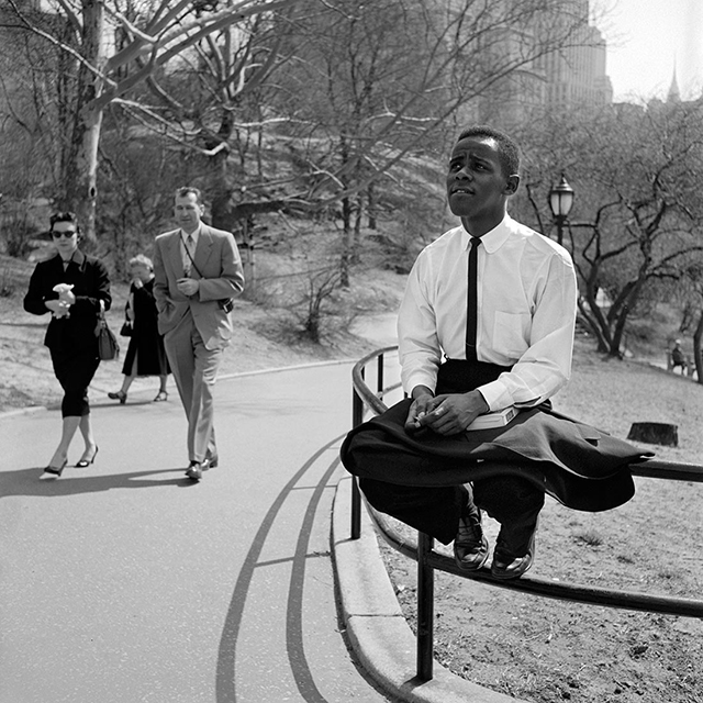
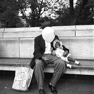
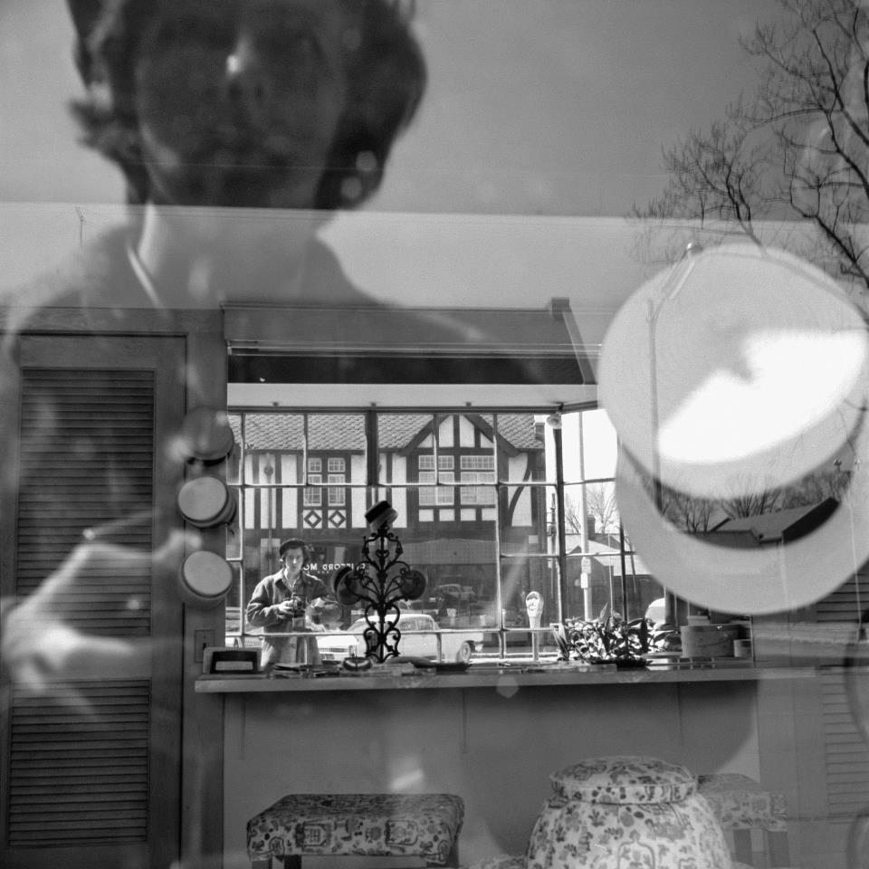
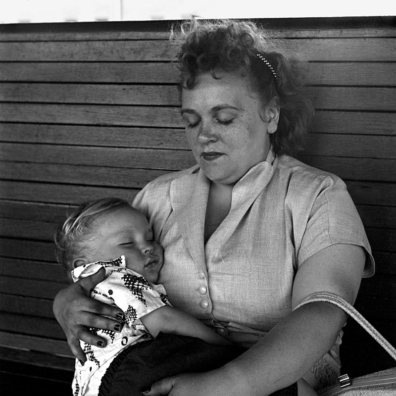
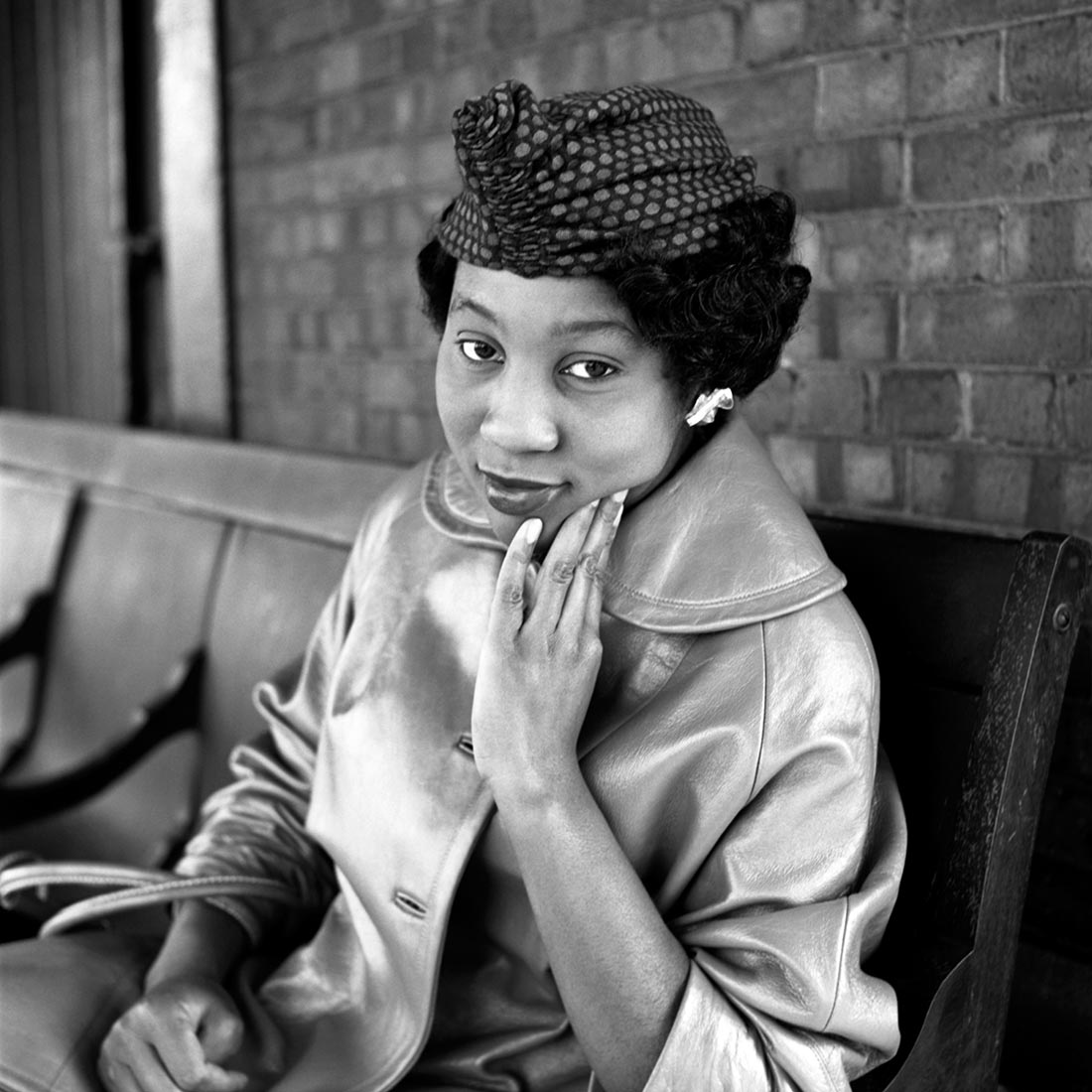
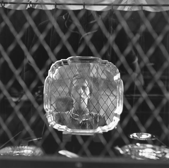
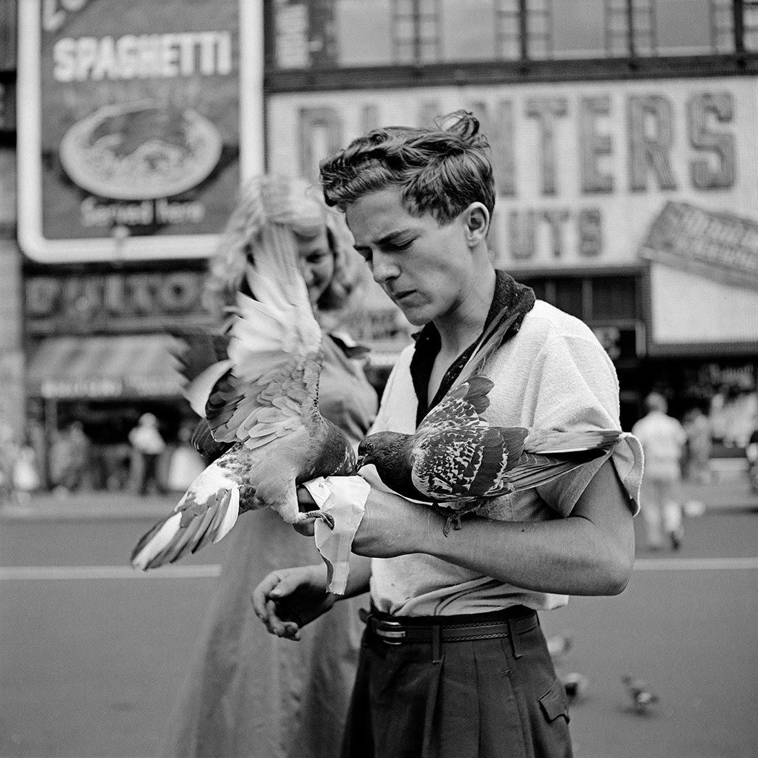
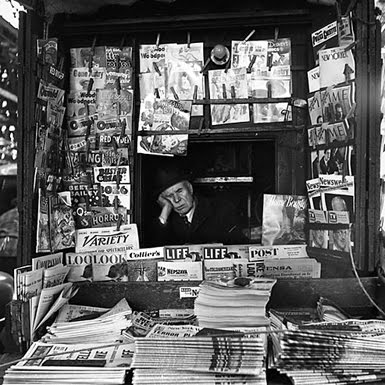
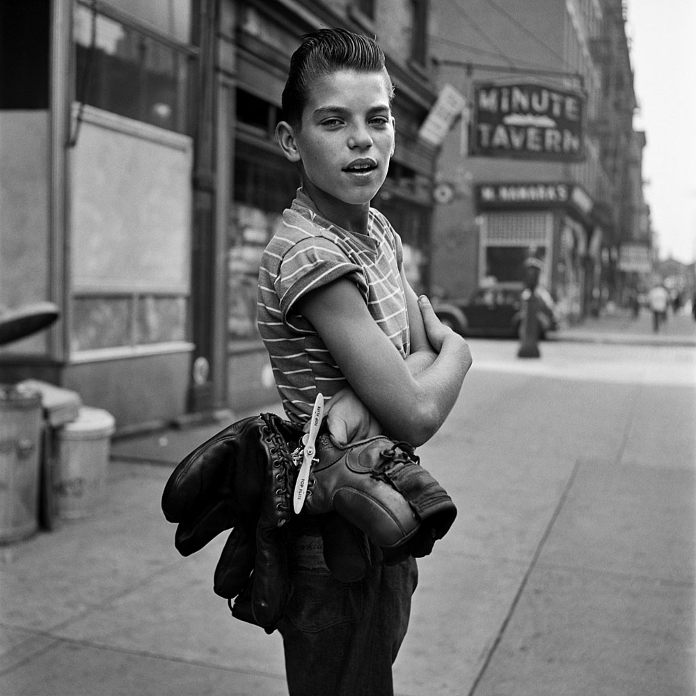
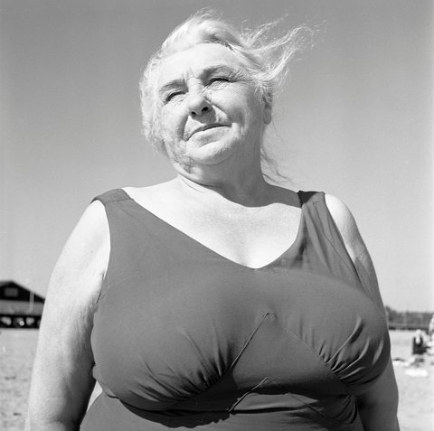
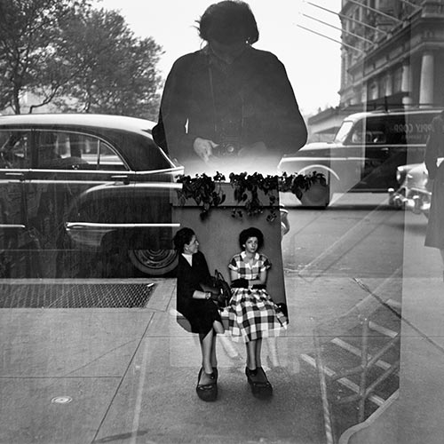
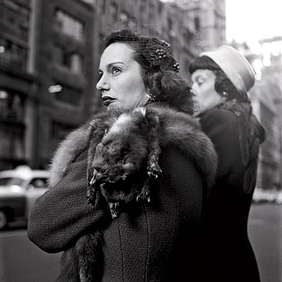
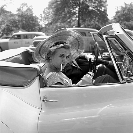
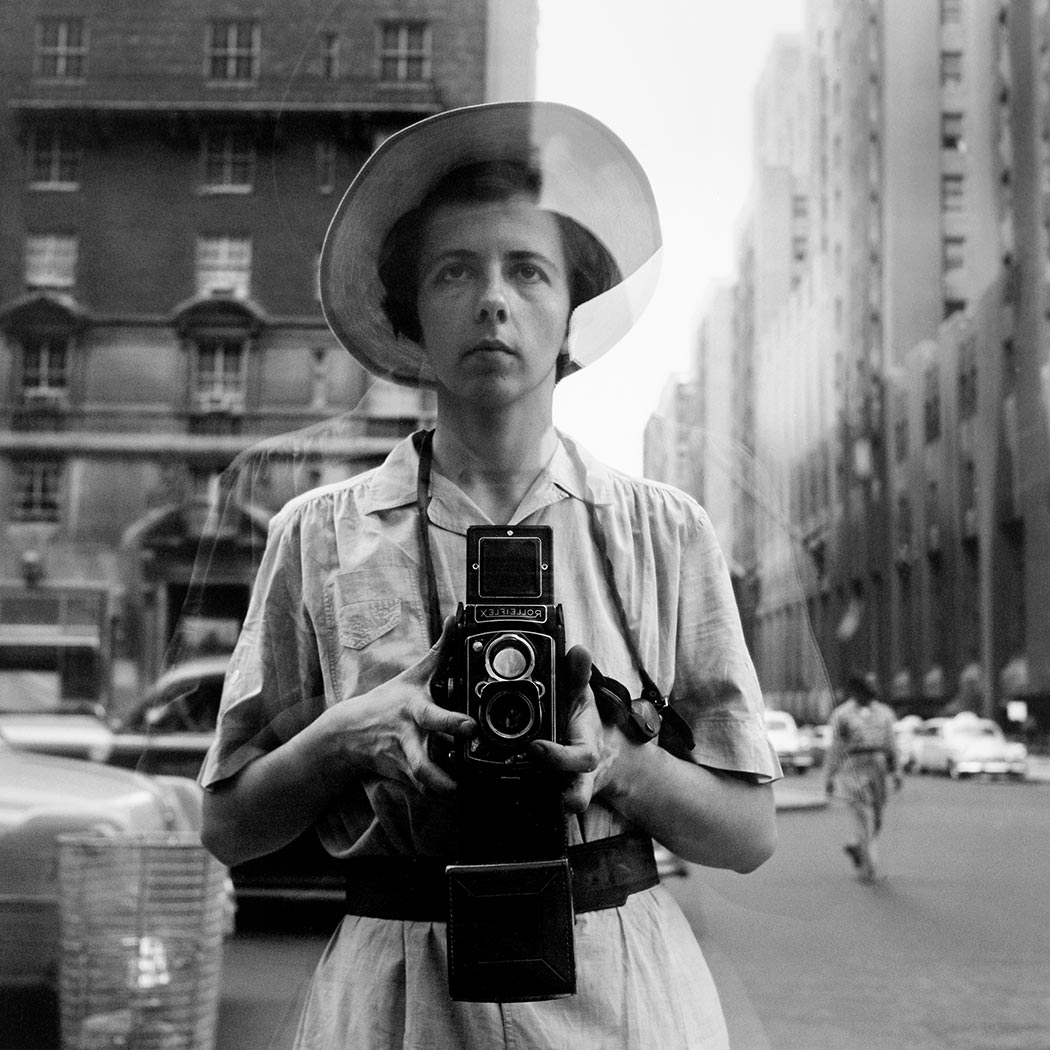
© Vivian Maier/Maloof Collection, Courtesy Howard Greenberg Gallery, New York